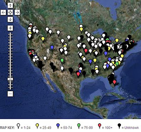
Paper Cuts is tracking the ongoing labor carnage in the newspaper industry in the US. They've got an interactive map with details on newsroom job losses around the country.
The South Florida Sun Sentinel. The Rockingham News. The Washington Post. The Pocono Record. The Atlanta Journal-Constitution. These are only some of the papers that have announced layoffs just since Saturday. The combination of the wan economy and the outmoded business model of newspapers has meant disaster for this industry. It looks increasingly like US newspapers in their present form may not be long for this world.
But is that such a bad thing? It would certainly be a terrible thing if journalism didn't survive. But there's surely no chance of that happening - there will always be a demand for journalism. In the future, though, it's likely to be hosted by media other than cheap, inky paper delivered in a bundle to your doorstep. The web is the obvious new venue for journalistic content, and that medium's been growing for years now, of course. But the real interesting test for the future of journalism will be what happens when a major city finds itself without any major newspaper. What will fill the void? My guess is: a proliferation of publications, especially online but in print as well, focused on much narrower niches. This, of course, has been the trend on the internet - the proliferation of micro-focused content venues (ahem) with little or no overheard costs, often motivated by individuals' passions rather than profit. The upshot has been that there's an incredibly richer array of content available to consumers now than there was ten years ago, even as newspapers have declined. (I've just been surfing around for information on Houston's light rail plans, for instance, and I've found way more information than I ever could have by simply waiting around for the paper to show up every day.)
This is the way media content is produced now, and in this context newspapers (like network television) are an anomaly: they offer breadth, not depth, as they rely on serving the interests of a mass audience. But there's nothing especially natural about combining news with sports scores, book reviews, classified ads, real estate listings, comics and all the rest of it, like a typical big-city paper does. The only reason to do so is if the medium that is best suited to distribute lots of information quickly and cheaply does not allow the consumer to exert selective control over content - then an editor has to decide what will appeal to the greatest audience, and deliver it all together in a big bundle. That was the best system for quick and thorough information dispersal during the 20th Century, but it no longer is.
The fact that this anachronistic and quirky medium is unlikely to last much longer in its present form doesn't, as I said, mean the end of journalism. But the questions are, over the long term: will journalism (of the 'serious' investigative sort) become a non-profit enterprise? And are we likely to suffer in the short-term from a lack of established journalistic institutions to act as a watchdog against corporations and government? But of course, for everyone in the industry who are currently suffering from the turbulence of economic and technological change, the questions are much more immediate and personal.
UPDATE: For an interesting and much more comprehensive expression of this general line of thinking, see Steven Berlin Johnson.
Tuesday, March 31, 2009
Monday, March 30, 2009
(Another) Unemployment Map of the US
Via Matt Yglesias, the Center for American Progress has an interactive map of unemployment and job losses across the fifty states.
It doesn't have the fine-grain data of this unemployment map, but it does have a timeline which allows you to watch the job situation in every state evolve (i.e., deteriorate) over the last four years. And bar graphs for every state, too. Here's Florida:
Brutal - just like the rest of the country, except the Plains, though even there the job losses have started to mount in the past couple of months.
One thing that'll be interesting to watch over the next few years is how the geography of the recession affects population movements. Some places that have been hit especially hard, like Michigan, already had shrinking population shares. But other places that were hit hard by the housing kerblooey had been some of the fastest growing parts of the country - Nevada, Arizona and Florida, especially. Will there be a mass exodus from those states? Meanwhile, the least scathed of the large states so far has been Texas, which was already growing superfast. Will the rate of growth there become even growthier? We shall see.
Sunday, March 29, 2009
More on the Geography of Incarceration: The Disappearing Men of New York City
Or rather: the disappearing men of Harlem, the South Bronx, and north Brooklyn. Another map - this one from Matt Kelley's Criminal Justice blog - reinforces the phenomenon of the heavy geographic concentration of the neighborhoods that are the source of prisoners.
Says Kelley:
I don't know what the best policies would be to develop these neighborhoods into stable, functioning urban environments, as well as to reduce urban crime. But it seems worth pointing out that at least a necessary, if not a sufficient, condition for that to happen would be the stabilization of the social networks which comprise those neighborhoods. I think both liberals and conservatives would agree to that. But high incarceration rates are surely working at cross-purposes to that goal. One might argue anyways that those high rates are necessary, on either moral or practical grounds; but their socially disruptive effect should at least be part of the conversation.
Says Kelley:
The circled areas above have just 17% of the city's male residents, but 50% of its male prisoners. In two districts just above Harlem, 6% of men are sent upstate. [The Justice Mapping Center] has coined the term "million-dollar blocks" for single city blocks where the city is spending over $1 million to incarcerate former residents.I just want to expand a little bit on what I said yesterday. The high cost of security nad incarceration for the prisoners who come from these sorts of neighborhoods is a considerable social cost in itself. But a further social cost is the disproportionate disruption of these communities: most people who go to prison belong to significant social networks; lots of them have families for whom they provide economic and emotional support, etc. Every time a person gets sent to prison, those social networks get disrupted. And when those disrupted social networks are heavily concentrated, it's easy to see how those social disruptions can take a cumulative toll on the neighborhood, and set off positive feedbacks which reinforce the patterns of crime, incarceration, and recidivism.
I don't know what the best policies would be to develop these neighborhoods into stable, functioning urban environments, as well as to reduce urban crime. But it seems worth pointing out that at least a necessary, if not a sufficient, condition for that to happen would be the stabilization of the social networks which comprise those neighborhoods. I think both liberals and conservatives would agree to that. But high incarceration rates are surely working at cross-purposes to that goal. One might argue anyways that those high rates are necessary, on either moral or practical grounds; but their socially disruptive effect should at least be part of the conversation.
Saturday, March 28, 2009
The Uneven Geography of Incarceration
The Atlantic maps a phenomenon of displacement in New Orleans that's wholly unrelated to the aftermath of Katrina.
The map shows the residences of people who entered prison in 2007, and the cost of housing prisoners over their entire sentence by block. Says the Atlantic:
Given the heavy concentrations of prisoners in these neighborhoods, it seems that a relatively small amount of investment targeted at these places might be able to break the vicious cycle of crime, incarceration and community disruption. And indeed, says the Atlantic, that's just what some people are arguing:
The map shows the residences of people who entered prison in 2007, and the cost of housing prisoners over their entire sentence by block. Says the Atlantic:
Nationwide, an estimated two-thirds of the people who leave prison are rearrested within three years. A disproportionate number of them come from a few urban neighborhoods in big cities. Many states spend more than $1 million a year to incarcerate the residents of single blocks or small neighborhoods.The Columbia Spatial Information Design Lab has a similar graphic for Brooklyn:
One such “million-dollar neighborhood” is shown above—a half-square-mile portion of Central City, an impoverished district southwest of the French Quarter. In 2007, 55 people from this neighborhood entered prison; the cost of their incarceration will likely reach about $2 million.
Given the heavy concentrations of prisoners in these neighborhoods, it seems that a relatively small amount of investment targeted at these places might be able to break the vicious cycle of crime, incarceration and community disruption. And indeed, says the Atlantic, that's just what some people are arguing:
Some New Orleans officials and community groups are now using prison-admission maps like these to explore new investments—block by block—in the social infrastructure of these damaged neighborhoods. Plenty of money is already being spent on these neighborhoods, in the form of policing and prison costs; the hope is that by spending more money in them, in a highly targeted fashion, the release-and-return-to-prison cycle can eventually be broken.Taking a preventive rather than reactive approach to problems is not exactly a classic American virtue. Here's to hoping it works.
The G20
The Times Online has a flash map of the participants in the upcoming G20 meeting in London.
The color scheme is as exciting as befits a meeting of heads of state from 20 large economies to discuss things like IMF policy and credit market liquidity. But it has interesting little snippets on what each of the parties wants to get out of the meeting. (To summarize: in the face of the economic crisis, Canada wants the US to do more; the US and Japan want Europe to do more; the UK wants everyone else to do more; Russia wants to hang out with the US and also undermine the dollar as a global reserve currency (very teenage girlish of them); Mexico, Brazil, and Argentina want more power; China wants to be left alone to pursue their gradual path towards world domination; Australia, oddly, also wants to help China pursue their gradual path towards world domination; and India wants to look pretty and gloat. Everyone else pretty much just wants more money.)
Friday, March 27, 2009
The Sitcom Map of America
Dan Meth has made a sitcom map of the United States.
Naturally, New York City requires its own map.
Mr. Meth makes a cogent observation: "The untapped Williamsburg Hipster sitcom setting is plain to see."
Indeed. By the way, I'm surpised at the proportion of Midwestern to Southern sitcoms, especially given that the South is an inherently funnier region of the country.
UPDATE: Ha! Meth also maps the stunning diversity of first-floor layouts in sitcom houses.
Yet More on the 2008 Election
It's not actually possible, it turns out, to run out of maps of the 2008 US election. To wit:
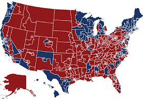
Congressional Quarterly has an interactive map that lets you see how Obama and McCain did by congressional district. You can see, for instance, that McCain won West Virginia's 3rd Congressional District 56-42%, even as Democratic congressguy Nich Rahall carried the district with 67% of the vote. Or that B. Obama won New York's 23rd by 5% while Republican representative John McHugh skated by Democrat M. Oot by more than 30 points in the same district.
The map looks redder than you might expect, but that's due to the fact that - to quote Wee Willie Keeler, who said it in a different context - the Republicans tend to "hit 'em where they ain't"; they do better in the parts of the country where people tend not to live, and where the congressional districts eat up more of the map. In fact, Obama won 242 of the 435 districts in the country (though he actually underperformed congressional Democrats, who won 257 districts).
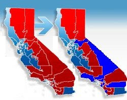
Meanwhile, Beyond Chron notices that Republicans in California, already a threatened species, may need to claim full endangered status in the near future:
Barack Obama carried eight Congressional Districts that had long voted for Republican presidential candidates, and John McCain came close to losing three more. All these districts are currently represented in Congress by Republicans, but a few incumbents came close last year to losing to Democratic challengers. It’s only a matter of time before some of these districts will eventually flip. None of this is a surprise, however, because the state’s Republican base is older, whiter and shrinking in size.Old, white, and shrinking. Forget politics - I don't think anything that can be described that way is in good shape.
Thursday, March 26, 2009
On the Other Hand, We Did Already Save the World Once...
All right, so that last post was a bit of a downer. Here's some news of a more upbeat nature, from Science Blogs: we've saved the ozone layer. Some researchers
In this animation, put together by the NASA/Goddard Space Flight Center Scientific Visualization Studio, reds denote high concentrations of stratospheric ozone; blues denote lower concentrations. The Earth on the right is what would have happened if the Montreal Protocol, which banned CFCs, had not been signed. By the middle of this century, the difference is pretty shocking, as you can see in these images captured by Chris Rowan:
So, no future of dressing our children in astronaut suits to walk a scalded earth. That's one dystopia avoided; only a few more to go...
ran two scenarios in the same climate model, and charted the evolution of stratospheric ozone in each. The first model was based on the current (low) emissions of ozone-destroying chemicals resulting from the implementation of the Montreal Protocol; in the second, rather poetically named "world avoided" model, CFC emissions increase by 3% a year ("business as usual") after 1974, when the ozone alarm was first sounded (and was presumably ignored in this parallel universe).Their results are published in Atmospheric Chemistry and Physics. This is what they found:
In this animation, put together by the NASA/Goddard Space Flight Center Scientific Visualization Studio, reds denote high concentrations of stratospheric ozone; blues denote lower concentrations. The Earth on the right is what would have happened if the Montreal Protocol, which banned CFCs, had not been signed. By the middle of this century, the difference is pretty shocking, as you can see in these images captured by Chris Rowan:
So, no future of dressing our children in astronaut suits to walk a scalded earth. That's one dystopia avoided; only a few more to go...
Wednesday, March 25, 2009
Survival Map for the Apocalypse
New Scientist maps the global warming apocalypse.
The accompanying article, by the aptly named Gaia Vince, depicts a scenario in which Earth warms by 4C by the end of this century. The future she foretells is a grim one: most of the world between about 40 degrees north and 40 degrees south will have become a vast desert, uninhabitable by humans, rendering most of the world's food-producing regions barren wastelands. The Sahara will spread into central Europe, and Japan and eastern China will become Gobified. South Asia will suffer from a fiercer but briefer monsoon, producing both more floods and more drought; much of Bangladesh will disappear altogether under rising seas. Rivers in Europe and Asia will wither. The Amazon might simply go up in a vast inferno. Vince suggests that 90% of the human population won't make it through these calamities.
Interestingly, there's a precedent for this kind of scenario:
Some of these predictions are a bit... horologically aggressive, let's say. Sky-rise cities popping up throughout a verdant West Antarctica? Not in this millennium. And even with a 10C rise, is it really reasonable to envision Siberia as the breadbasket of the world? A Siberia that's 10C warmer is still pretty damn cold. It's also unclear to me why there'd be total desertification near the equator; why would the tropical rain belt shut down? Nonetheless, it's worth noting that the 4 degree rise in global temperatures out of which this scenario is built is actually on the conservative side of current climate change predictions; a rise of 5 or 6C might be more likely. In any event, wake me when it is no longer conventional wisdom that the destruction of the planet is necessary to support a healthy global economy. Until then, I'll continue to assume that something like this apocalyptic scenario is pretty much destined to occur.
Incidentally, for some reason the article also has an interactive google map, which is mostly redundant.
The accompanying article, by the aptly named Gaia Vince, depicts a scenario in which Earth warms by 4C by the end of this century. The future she foretells is a grim one: most of the world between about 40 degrees north and 40 degrees south will have become a vast desert, uninhabitable by humans, rendering most of the world's food-producing regions barren wastelands. The Sahara will spread into central Europe, and Japan and eastern China will become Gobified. South Asia will suffer from a fiercer but briefer monsoon, producing both more floods and more drought; much of Bangladesh will disappear altogether under rising seas. Rivers in Europe and Asia will wither. The Amazon might simply go up in a vast inferno. Vince suggests that 90% of the human population won't make it through these calamities.
Interestingly, there's a precedent for this kind of scenario:
The last time the world experienced temperature rises of this magnitude was 55 million years ago, after the so-called Palaeocene-Eocene Thermal Maximum event. Then, the culprits were clathrates - large areas of frozen, chemically caged methane - which were released from the deep ocean in explosive belches that filled the atmosphere with around 5 gigatonnes of carbon. The already warm planet rocketed by 5 or 6 °C, tropical forests sprang up in ice-free polar regions, and the oceans turned so acidic from dissolved carbon dioxide that there was a vast die-off of sea life. Sea levels rose to 100 metres higher than today's and desert stretched from southern Africa into Europe.But of course, human civilization wasn't around back then to be shepherded through the bottleneck of dramatic ecological change. (Nor, presumably, did it happen as quickly as our present blitzkrieg against climatic stability.) How humans might adapt to a recapitulation of such changes will be, Vince suggests, the story of humanity over the next few centuries. The key to it will be an unprecedentedly massive migration. Even as the mid-latitudes wither into desiccated husks, storm systems will wander closer to the poles. With rising temperatures and greater precipitation, Canada, Scandinavia, and Siberia will become the most habitable places on the planet. They'll be our breadbaskets - vast agricultural areas peppered by dense, high-rise cities where most people will live.
Some of these predictions are a bit... horologically aggressive, let's say. Sky-rise cities popping up throughout a verdant West Antarctica? Not in this millennium. And even with a 10C rise, is it really reasonable to envision Siberia as the breadbasket of the world? A Siberia that's 10C warmer is still pretty damn cold. It's also unclear to me why there'd be total desertification near the equator; why would the tropical rain belt shut down? Nonetheless, it's worth noting that the 4 degree rise in global temperatures out of which this scenario is built is actually on the conservative side of current climate change predictions; a rise of 5 or 6C might be more likely. In any event, wake me when it is no longer conventional wisdom that the destruction of the planet is necessary to support a healthy global economy. Until then, I'll continue to assume that something like this apocalyptic scenario is pretty much destined to occur.
Incidentally, for some reason the article also has an interactive google map, which is mostly redundant.
The Newseum Maps the News
The Newseum (which is a museum of news, you see) has a nice feature: a map that lets you see front pages from around the world.
It's mad user-friendly - you can just scroll over the dots to see one of more than 750 front pages from around the world. The coverage of newspapers is best in North America, good in Europe, South America, and the Antipodes, and spotty in Asia and Africa. But overall, it's a pretty great feature: did you know that the big story today in Chelyabinsk, Russia is "собакa докторy не друг"? Well, now you do, and aren't you the better for it. (By the way, I think that means "Doctor Dogs Are Not Our Friends," and I believe it.)
Tuesday, March 24, 2009
Political Instability
These are, as the Chinese might say, interesting times. And, against the backdrop of global economic cardiac arrest, war and terrorism in South and Central Asia and the Middle East, and the chronic malaise of the African continent, ViewsWire takes a look at political instability around the world.
ViewsWire is produced by The Economist Intelligence Unit, which is associated with the eponymous magazine. In this report they've rated countries in terms of their susceptibility to social and political unrest on the basis of quantitative models. They define unrest as
They've also got a table which ranks the 165 countries they've rated by their instability index. The twelve most unstable are:
1. Zimbabwe - 8.8
2. Chad - 8.5
3. Democratic Republic of Congo - 8.2
4. Cambodia - 8.0
4. Sudan - 8.0
6. Iraq - 7.9
7. Cote d'Ivoire - 7.8
7. Haiti - 7.8
7. Pakistan - 7.8
7. Zambia - 7.8
7. Afghanistan - 7.8
7. Central African Republic - 7.8
And the twelve most stable:
165. Norway - 1.2
164. Denmark - 2.2
163. Canada - 2.8
162. Sweden - 3.2
162. Finland - 3.2
160. Switzerland - 3.4
159. Mauritius - 3.5
159. Costa Rica - 3.5
157. New Zealand - 3.6
157. Luxembourg - 3.6
157. Austria - 3.6
157. Australia - 3.6
Other notables include Russia (66th most unstable country, at 6.5), Mexico (79th, at 6.1), Brazil (105th, at 5.4), France (110th, at 5.3), United States (also 110th, at 5.3), China (124th, at 4.8), and the UK (132nd, at 4.6).
ViewsWire is produced by The Economist Intelligence Unit, which is associated with the eponymous magazine. In this report they've rated countries in terms of their susceptibility to social and political unrest on the basis of quantitative models. They define unrest as
those events or developments that pose a serious extra-parliamentary or extra-institutional threat to governments or the existing political order. The events will almost invariably be accompanied by some violence as well as public disorder. These need not necessarily be successful in the sense that they end up toppling a government or regime. Even unsuccessful episodes result in turmoil and serious disruption.It's sort of the PECOTA of political instability. Countries are rated on a scale of 0 to 10 (the latter being the highest vulnerability), which is determined by averaging two sub-indexes: the country's underlying vulnerability and an economic distress index. Underlying vulnerability is comprised of measurements of economic inequality; state history (longer-lasting states are considered more stable); corruption; ethnic fragmentation; trust in institutions; discrimination against minorities; history of political instability; history of labor unrest; levels of social provision (as extrapolated from infant mortality rate); the average instability of a country's neighbors; regime type (democracies and full-fledged authoritarian regimes are considered more stable); and political factionalism. The economic distress sub-index is comprised of measurements of growth in GDP per capita; unemployment; and actual GDP per capita.
They've also got a table which ranks the 165 countries they've rated by their instability index. The twelve most unstable are:
1. Zimbabwe - 8.8
2. Chad - 8.5
3. Democratic Republic of Congo - 8.2
4. Cambodia - 8.0
4. Sudan - 8.0
6. Iraq - 7.9
7. Cote d'Ivoire - 7.8
7. Haiti - 7.8
7. Pakistan - 7.8
7. Zambia - 7.8
7. Afghanistan - 7.8
7. Central African Republic - 7.8
And the twelve most stable:
165. Norway - 1.2
164. Denmark - 2.2
163. Canada - 2.8
162. Sweden - 3.2
162. Finland - 3.2
160. Switzerland - 3.4
159. Mauritius - 3.5
159. Costa Rica - 3.5
157. New Zealand - 3.6
157. Luxembourg - 3.6
157. Austria - 3.6
157. Australia - 3.6
Other notables include Russia (66th most unstable country, at 6.5), Mexico (79th, at 6.1), Brazil (105th, at 5.4), France (110th, at 5.3), United States (also 110th, at 5.3), China (124th, at 4.8), and the UK (132nd, at 4.6).
Monday, March 23, 2009
The Map of Human Knowledge
All right, we're back. My computer - actually an abacus scotch-taped to a pair of rabbit ears - finally pooped out, so I set an infinite number of monkeys the task of devising a new machine out of materials found in nature. It took a few days, but the plan has worked. So: back to business.
Via The New York Times, the journal PLoS One has published a map of human knowledge (if by human, you mean: academicians who read english-language journals; and if by knowledge, you mean: what that narrow subset of humans is interested in whilst journal-surfing). The researchers who put the map together combed a year's worth of user interaction data of the most popular academic journal web portals. They marked instances where a user clicked from one journal to another; every dot in the map represents a journal, and links indicate likely paths for users to click from one journal to another. The idea, then, is that this image represents the relations of the various disciplines to one another, and the extent to which they are interconnected.
The arrangement of dots - with the humanities forming a hub at the center and the natural sciences forming a perimeter around them - fell out naturally from the data. To say more than this would require that I pretend to understand terms in the PLoS One article, such as "betweenness centrality" and "first-order Markov chain," which I plainly do not. But if you're game and have a bit of calculus under your belt, then have at it. For the rest of us, here is what the pretty colors of the dots mean:
light purple - physics
blue - chemistry
green - biology
red - medicine
yellow - social sciences
white - humanities
purple - mathematics
pink - engineering
Full-size image of the map is here.
Wednesday, March 18, 2009
Programming Note
We're having some technical difficulties here at Map Scroll Int'l HQ. We'll be back soon. Ish.
Sunday, March 15, 2009
Missed Connections By State
From Very Small Array (via Greater Greater Washington), a map of "missed connections" on Craigslist, with states depicted by most common location at which connections were missed.
Many a Dixie romance has sprung from the fluorescently gleaming corridors of Walmart, I see. Except in Texas, where the men seem to have some trouble understanding the fundamentally commercial premise of the Hooters chain. For women, though, it seems to be more about love on the highway.
VLA also has M4M and W4W maps.
Saturday, March 14, 2009
Air Traffic in the US
Via The Map Room, an article in Wired Magazine discusses artist Aaron Koblin, who "used images from his piece, Flight Patterns, to create a Google map representing air traffic across the United States over a 24-hour period. The map displays the flight paths for more than 205,000 aircraft the FAA tracked on August 12, 2008." You can check it out at the Wired link.
According to Wired, "Koblin layers flight patterns by altitude, aircraft model and manufacturer. Use the navigation on the right to toggle between each view." Dark colors indicate a higher altitude and lighter colors a lower altitude - hence the lighter shades around airports. On the airplane model layer, each of 573 models of airplane has its own color, as in the detail at the left from the area around Washington, DC (that node in the lower right part of the image is presumably Dulles). And the "make" layer details flights by aircraft manufacturer. Some pretty astonishing images: there are a lot of planes out there! Koblin has some more fun graphics at his site.
Friday, March 13, 2009
The Disappearance of the English Countryside
A study from the Campaign to Protect Rural England maps the effect of urbanization and development on the english countryside.
From the summary of the report:
The maps are interesting in their own rights; but I'm also intrigued by the difference in the premise of this study from what you might see coming from a conservationist society in the U.S. In the States, you don't see much of this sort of concern with the aesthetic corruption of the countryside; what you do see is a concern for keeping areas in a state of uncorrupted wilderness (however that is defined). The American approach may be sentimental, in some ways, but it's not particularly aestheticist. I'm sure this has to do with the fact that the U.S. has an enormous amount of rural land, and it's not under threat of being consumed whole by a nation-swallowing urban conglomeration; and then, too, there's the fact that England doesn't really have any wilderness left to preserve. But I wonder if there's also a different approach to nature going on here: Americans see nature as an Eden to be preserved, or exploited for its resources; Brits see it as a garden to be managed. But this is just an idle hypothesis - anyone have any thoughts on this (poossible) cultural difference?
From the summary of the report:
We have developed a method of mapping areas of intrusion in England. These are areas disturbed by the presence of noise and visual intrusion from major infrastructure such as motorways and A roads, urban areas and airports. The resulting maps show the extent of intrusion in the early 1960s, early 1990s and 2007.The report also has extensive data tables so you can see, for instance, that Oxfordshire County has gone from 75.45% undisturbed in the 1960s, to 54.63% in the early 1990s, to 41.45% today. It has such figures for all counties in England.
The maps are interesting in their own rights; but I'm also intrigued by the difference in the premise of this study from what you might see coming from a conservationist society in the U.S. In the States, you don't see much of this sort of concern with the aesthetic corruption of the countryside; what you do see is a concern for keeping areas in a state of uncorrupted wilderness (however that is defined). The American approach may be sentimental, in some ways, but it's not particularly aestheticist. I'm sure this has to do with the fact that the U.S. has an enormous amount of rural land, and it's not under threat of being consumed whole by a nation-swallowing urban conglomeration; and then, too, there's the fact that England doesn't really have any wilderness left to preserve. But I wonder if there's also a different approach to nature going on here: Americans see nature as an Eden to be preserved, or exploited for its resources; Brits see it as a garden to be managed. But this is just an idle hypothesis - anyone have any thoughts on this (poossible) cultural difference?
Thursday, March 12, 2009
The Geography of Personality
A fascinating study (pdf link) by Peter J. Rentfrow, Samuel D. Gosling, and Jeff Potter looks at the geographical variation of "the big five" personality traits: Extraversion, Agreeableness, Conscientiousness, Neuroticism, and Openness. From the abstract:
Extraversion is generally associated, as the authors say, with "sociability, energy, and health." And the study found that states with higher levels of extraversion tended to be the states with higher levels of social involvement, such as participating in clubs and hanging out at bars. (They note, though, that it didn't correlate with the amount of time spent with friends; thus, "individuals appear to spend more time socializing in states where E is high than they do in low-E states, but their socializing is apparently somewhat indiscriminate and is not restricted to close friends.") You can clearly see the most extraverted states are in the Upper Midwest and northern Plains and parts of the South - and, a bit to my surprise, in the mid-Atlantic region. (And does anyone have a good explanation for Maine?) Another interesting note: state-level extraversion is positively correlated with robbery and murder rates.
Agreeableness "reflects warmth, compassion, cooperativeness, and friendliness." The authors found that high levels of agreeableness in states correlated with social involvement and religiosity. It was also positively correlated with spending time with friends and having guests over, but negatively with going to bars and joining clubs. Highly agreeable states also had fewer deaths from cancer and heart disease. Among the researchers' unpredicted findings was that these states also have a disproportionate number of artists and entertainers (which is a bit surprising just looking at the map).
Conscientiousness at the individual level "reflects dutifulness, responsibility, and self-discipline [and] it is positively associated with religiosity" and health-promoting behavior. The study found that conscientiousness had a positive correlation with religiosity at the state level and a slight correlation with the amount of exercise people did. Conscientiousness was also negatively correlated with going to bars and, for some reason, with frequency of having guests over. You can see that high-conscientiousness states tend to cluster in the Plains, the Southwest, and parts of the Southeast; the northeast is very unconscientious, evidently.
Neuroticism is characterized by "anxiety, stress, impulsivity, and emotional instability and is related to antisocial behavior, poor coping, and poor health." Unsurprisingly, the study found that highly neurotic states had lower rates of exercise, higher rates of disease, and a shorter life expectancy. In these states, people are less likely to join clubs and spend time with friends. The geographic clustering of neuroticism is strong: it's prevalent in the Northeast and much of Appalachia, and, for some reason, in the states of the lower Mississippi Valley. The West is decidedly less neurotic than the East, you may be unsurprised to hear.
Openness "reflects curiosity, intellect, and creativity at the individual level." The researchers predicted that highly open states would have high levels of liberal values, and a disproportionate number of people in the "artistic and investigative professions," and that is indeed what they found. People in these states are more tolerant of homosexuality, more likely to support legalization of marijuana, and more likely to be pro-choice. However, more open states tend to have lower rates of social involvement. and are considerably less religious. These states cluster on the West Coast and in the Bos-ny-wash megaregion, with a more scattered distribution elsewhere.
But why do these regional differences exist in the first place? The paper proposes a number of possible reasons, including selective migration (e.g., an open personality type moves from their dull Kentucky town to a "creative capital" like New York City or the Bay Area); social influence (a certain personality trait becomes more predominant in a given region simply be re-inforcing itself through repeated exposure to individuals, creating a self-perpetuating cycle of reinforcement); and environmental influence (people in cold, dreary climates like the Pacific Northwest or New England might be more prone to depression, or less aggressive).
It's fascinating stuff, and there's lots more in the (rather long) paper. The topic could be the subject of just about endless study and debate. And a natural next step would be to extend this study across countries - wouldn't maps like this of Europe or Asia be fascinating?
Volumes of research show that people in different geographic regions differ psychologically. Most of that work converges on the conclusion that there are geographic differences in personality and values, but little attention has been paid to developing an integrative account of how those differences emerge, persist, and become expressed at the geographic level... We present a theoretical account of the mechanisms through which geographic variation in psychological characteristics emerge and persist within regions... Results provided preliminary support for the model, revealing clear patterns of regional variation across the U.S. and strong relationships between state-level personality and geographic indicators of crime, social capital, religiosity, political values, employment, and health.So by looking at the distribution of personality traits, we may be able to discover something about broad social factors like health, crime, and economic development. The authors place their work in the context of the long history in anthropology of describing personality differences among nations, but their work is focused on regions within the United States. The paper includes five maps of their results, clsasifying states by quintile, and I can't resist posting all five of them. The first shows extraversion:
Extraversion is generally associated, as the authors say, with "sociability, energy, and health." And the study found that states with higher levels of extraversion tended to be the states with higher levels of social involvement, such as participating in clubs and hanging out at bars. (They note, though, that it didn't correlate with the amount of time spent with friends; thus, "individuals appear to spend more time socializing in states where E is high than they do in low-E states, but their socializing is apparently somewhat indiscriminate and is not restricted to close friends.") You can clearly see the most extraverted states are in the Upper Midwest and northern Plains and parts of the South - and, a bit to my surprise, in the mid-Atlantic region. (And does anyone have a good explanation for Maine?) Another interesting note: state-level extraversion is positively correlated with robbery and murder rates.
Agreeableness "reflects warmth, compassion, cooperativeness, and friendliness." The authors found that high levels of agreeableness in states correlated with social involvement and religiosity. It was also positively correlated with spending time with friends and having guests over, but negatively with going to bars and joining clubs. Highly agreeable states also had fewer deaths from cancer and heart disease. Among the researchers' unpredicted findings was that these states also have a disproportionate number of artists and entertainers (which is a bit surprising just looking at the map).
Conscientiousness at the individual level "reflects dutifulness, responsibility, and self-discipline [and] it is positively associated with religiosity" and health-promoting behavior. The study found that conscientiousness had a positive correlation with religiosity at the state level and a slight correlation with the amount of exercise people did. Conscientiousness was also negatively correlated with going to bars and, for some reason, with frequency of having guests over. You can see that high-conscientiousness states tend to cluster in the Plains, the Southwest, and parts of the Southeast; the northeast is very unconscientious, evidently.
Neuroticism is characterized by "anxiety, stress, impulsivity, and emotional instability and is related to antisocial behavior, poor coping, and poor health." Unsurprisingly, the study found that highly neurotic states had lower rates of exercise, higher rates of disease, and a shorter life expectancy. In these states, people are less likely to join clubs and spend time with friends. The geographic clustering of neuroticism is strong: it's prevalent in the Northeast and much of Appalachia, and, for some reason, in the states of the lower Mississippi Valley. The West is decidedly less neurotic than the East, you may be unsurprised to hear.
Openness "reflects curiosity, intellect, and creativity at the individual level." The researchers predicted that highly open states would have high levels of liberal values, and a disproportionate number of people in the "artistic and investigative professions," and that is indeed what they found. People in these states are more tolerant of homosexuality, more likely to support legalization of marijuana, and more likely to be pro-choice. However, more open states tend to have lower rates of social involvement. and are considerably less religious. These states cluster on the West Coast and in the Bos-ny-wash megaregion, with a more scattered distribution elsewhere.
But why do these regional differences exist in the first place? The paper proposes a number of possible reasons, including selective migration (e.g., an open personality type moves from their dull Kentucky town to a "creative capital" like New York City or the Bay Area); social influence (a certain personality trait becomes more predominant in a given region simply be re-inforcing itself through repeated exposure to individuals, creating a self-perpetuating cycle of reinforcement); and environmental influence (people in cold, dreary climates like the Pacific Northwest or New England might be more prone to depression, or less aggressive).
It's fascinating stuff, and there's lots more in the (rather long) paper. The topic could be the subject of just about endless study and debate. And a natural next step would be to extend this study across countries - wouldn't maps like this of Europe or Asia be fascinating?
Wednesday, March 11, 2009
Immigration to the US
Sigh. If the New York times keeps publishing these fantastic interactive maps, I'm going to have to keep posting them.
This one depicts immigrant communities in the US in typical Timesian detail: with the biggest contributor to and population of the immigrant commnities in every single county in the country, and for every decade going back to 1880.
There are also maps showing the distribution of immigrant groups across the country, like this one showing population born in Mexico by county.
The Times map lets you mouse over the bubbles to see county and immigrant populations for every dacade.
The Well-Being of America
First, apologies right off the bat for these maps having the ugliest color scheme in the history of the world. (The color spectrum is right there in nature, people - you just have to use it.) The maps come from a poll done by Gallup for AHIP (America's Health Insurance Plans, which could perhaps explain the colors (insurance analysts not being known, generally, for their refined sense of design)).
The maps show well-being by state and congressional district based on interviews with 350,000 people during 2008. Says Gallup:
The Well-Being Index score for the nation and for each state is an average of six sub-indexes, which individually examine life evaluation, healthy behaviors, work environment, physical health, emotional health, and access to basic necessities. The questions in each sub-index are asked nightly of 1,000 national adults, aged 18 and older.So the ratings of well-being are inferred rather than derived from self-reporting. That's good.
The Western states tend to rate the highest, along with a couple eastern states with more post-industrial economies. The being is most well in Utah, followed by Hawaii, Wyoming, Colorado, and Minnesota. The unhappiest states tend to be the poorer ones, and the ones with more manufacturing-based economies; no surprises there. The least well state in the union is West Virginia, with Kentucky, Mississippi, Ohio, and Arkansas rounding out the bottom five.
As for the wellest congressional district? Honors go to California's 14th, which runs along the Pacific coast between San Francisco and San Jose and contains part of Silicon Valley. And the least well district is Kentucky's 5th, in the eastern part of the state, deep in the heart of darkest Appalachia.
Tuesday, March 10, 2009
Place of the Week: Lake Vostok
Once more into the breach - and this time the breach is a watery one: a very, very cold lake; a lake the size of Lake Ontario which has never been seen by human eyes; and the largest geographic feature on the planet discovered since the 19th century. I'm talking about the place of the week: Lake Vostok.
Area: 15,690 Sq. km.
Population: either 'none' or 'very interesting,' but probably nothing bigger than microbes
Volume: 5,400 cu. km.
Maximum depth: 1,000 m
Rank among world's largest lakes (area): 15
Rank among world's largest lakes (volume): 7
Forty million years ago, Antarctica was a rather balmier place than it is today. It was still attached to South America and Australia, a tectonic configuration that diverted warm oceanic currents toward the south pole, keeping the continent warm and ice-free, even lush. But South America and Australia wouldn't stand for this; they sailed off towards the equator, stranding Antarctica in a ring of cold ocean (the jerks). It wasn't long before a crown of ice began to bloom at the south pole; it would continue to grow until it smothered nearly the entire landmass, crowding out whatever flora and fauna had once made the place home, and even depressing the continent itself; much of Antarctica - the ground way below all that ice - has been dunked below sea level by the incredible weight pressing down on it.
Among the features of the Antarctic landscape which were rolled over by the advancing ice was a lake - one of the largest in the world, in fact: 250 km long and 50 km wide. But rather than gouging out the lakebed or freezing it to the bottom, the glaciers built on top of the lake. By 500,000 to as many as 25 million years ago, the lake was completely sealed off from the external environment, entombed in utter darkness. But it's still a liquid body of water; the water temperature is -3C, but the intense pressure from the weight of the ice keeps it from freezing.
The lake wasn't discovered until the 1990s, when some Russians happened to be drilling the world's deepest ice core directly above the lake. They came within a hundred yards of piercing the lake's surface before their colleagues persuaded them to quit the effort. (The drilling hole was filled with a slurry of chemicals to keep it from re-freezing: to have pierced the surface would have been to pollute the world's most uncontaminated environment.)
The environment of Lake Vostok is utterly unique, and it raises an intriguing question: is anything alive down there? If anything is, it would represent a genetic cul-de-sac cut off from the rest of life on Earth for perhaps millions of years, evolving in an environment that for all intents and purposes is an alien world. And indeed, life down there would have to have evolved: another effect of the extreme pressure in Lake Vostok is a level of oxygen which would be lethal to anything living on the surface. But life is stubborn. Once it insinuates itself into an environment it tends to stick around, and living stuff has been found in lots of weird places, including in the microscopic crevasses between snow crystals at the south pole; and indeed, nearly 12,000 feet below the surface of the ice directly above Lake Vostok. As Damn Interesting says:
Take note, Europa.
Area: 15,690 Sq. km.
Population: either 'none' or 'very interesting,' but probably nothing bigger than microbes
Volume: 5,400 cu. km.
Maximum depth: 1,000 m
Rank among world's largest lakes (area): 15
Rank among world's largest lakes (volume): 7
Forty million years ago, Antarctica was a rather balmier place than it is today. It was still attached to South America and Australia, a tectonic configuration that diverted warm oceanic currents toward the south pole, keeping the continent warm and ice-free, even lush. But South America and Australia wouldn't stand for this; they sailed off towards the equator, stranding Antarctica in a ring of cold ocean (the jerks). It wasn't long before a crown of ice began to bloom at the south pole; it would continue to grow until it smothered nearly the entire landmass, crowding out whatever flora and fauna had once made the place home, and even depressing the continent itself; much of Antarctica - the ground way below all that ice - has been dunked below sea level by the incredible weight pressing down on it.
Among the features of the Antarctic landscape which were rolled over by the advancing ice was a lake - one of the largest in the world, in fact: 250 km long and 50 km wide. But rather than gouging out the lakebed or freezing it to the bottom, the glaciers built on top of the lake. By 500,000 to as many as 25 million years ago, the lake was completely sealed off from the external environment, entombed in utter darkness. But it's still a liquid body of water; the water temperature is -3C, but the intense pressure from the weight of the ice keeps it from freezing.
The lake wasn't discovered until the 1990s, when some Russians happened to be drilling the world's deepest ice core directly above the lake. They came within a hundred yards of piercing the lake's surface before their colleagues persuaded them to quit the effort. (The drilling hole was filled with a slurry of chemicals to keep it from re-freezing: to have pierced the surface would have been to pollute the world's most uncontaminated environment.)
The environment of Lake Vostok is utterly unique, and it raises an intriguing question: is anything alive down there? If anything is, it would represent a genetic cul-de-sac cut off from the rest of life on Earth for perhaps millions of years, evolving in an environment that for all intents and purposes is an alien world. And indeed, life down there would have to have evolved: another effect of the extreme pressure in Lake Vostok is a level of oxygen which would be lethal to anything living on the surface. But life is stubborn. Once it insinuates itself into an environment it tends to stick around, and living stuff has been found in lots of weird places, including in the microscopic crevasses between snow crystals at the south pole; and indeed, nearly 12,000 feet below the surface of the ice directly above Lake Vostok. As Damn Interesting says:
It is not unreasonable to suggest that cold-tolerant creatures could thrive in the waters of Lake Vostok, overcoming the oxygen saturation with extraordinary natural antioxidants. But millions of years of evolutionary isolation in an extreme environment may have created some truly bizarre organisms. This notion is supported by the ice samples drawn from the ice just above Lake Vostok, where some unusual and unidentifiable microbial fossils have been found. But the possibility that they are merely contaminates has not yet been completely ruled out.It would be interesting to take a peek down there, though hard to do without contaminating the most pristine body of water on Earth - and contamination in this case might mean the introduction of a few microbes which could wreak havoc with whatever ecosystem might exist down there. The Jet Propulsion Lab has worked on plans for a "cryobot" - a probe that would melt its way down to the lake like an atomic gopher; it would then swim around and see if it could find anything lively. And if by chance it did, then our conception of the sorts of places that life might call home will, once again, have expanded.
Take note, Europa.
The Melting Arctic
The LA Times looks at one of the more terrifying wild cards in the climate cataclysm that continues to bear down on us like a powerful but highly visible and potentially thwartable locomotive.
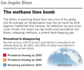
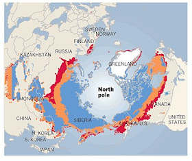
The trouble is that the Arctic is warming faster than anywhere in the world. And there are tons - literally, hundreds of billions of tons - of global warming gases currently sequestered in the permafrost there. And if the permafrost were to melt, all those gases would be released, which would warm the arctic, which would melt the permafrost, which would release more greenhouse gases... you see the problem. From the article:
It's that positive feedback potential that's so terrifying. Sometimes I like to reassure myself by thinking, well, global warming may leave civilization a crippled wreck, but it's not as af if it will lead to the end of life as we know it. But do we know that for sure? Do we have any sort of grasp on what the upper bound of global warming effects might be? These sorts of positive feedbacks (and there are others, such as the possibility of the Amazon turning into a tinderbox) suggest the possibility that there may be a tipping point beyond which our ability to counter climate change will have evaporated. And no one knows when that day might come.
The trouble is that the Arctic is warming faster than anywhere in the world. And there are tons - literally, hundreds of billions of tons - of global warming gases currently sequestered in the permafrost there. And if the permafrost were to melt, all those gases would be released, which would warm the arctic, which would melt the permafrost, which would release more greenhouse gases... you see the problem. From the article:
Methane (CH4) has at least 20 times the heat-trapping effect of an equivalent amount of carbon dioxide (CO2). As warmer air thaws Arctic soils, as much as 55 billion tons of methane could be released from beneath Siberian lakes alone, according to Walter’s research. That would amount to 10 times the amount currently in the atmosphere...
Today, 20% of Earth's land surface is locked up in a deep freeze. But scientists predict that air temperature in the Arctic is likely to rise as much as 6 degrees Celsius, or 10.8 degrees Fahrenheit, by the end of the century. That is expected to boost the emission of carbon compounds from soils.
The upper 3 meters -- about 10 feet -- of permafrost stores 1.9 trillion tons of carbon, more than double the amount in the atmosphere today, according to a recent study in the journal Bioscience.
"We are seeing thawing down to 5 meters," says geophysicist Vladimir Romanovsky of the University of Alaska. "A third to a half of permafrost is already within a degree to a degree and a half [Celsius] of thawing."
If only 1% of permafrost carbon were to be released each year, that could double the globe's annual carbon emissions, Romanovsky notes. "We are at a tipping point for positive feedback," he warns, referring to a process in which warming spurs emissions, which in turn generate more heat, in an uncontrollable cycle.
It's that positive feedback potential that's so terrifying. Sometimes I like to reassure myself by thinking, well, global warming may leave civilization a crippled wreck, but it's not as af if it will lead to the end of life as we know it. But do we know that for sure? Do we have any sort of grasp on what the upper bound of global warming effects might be? These sorts of positive feedbacks (and there are others, such as the possibility of the Amazon turning into a tinderbox) suggest the possibility that there may be a tipping point beyond which our ability to counter climate change will have evaporated. And no one knows when that day might come.
Monday, March 9, 2009
The Atheist Map of America
A new survey shows that the US is growing less religious; USA Today maps it.
It's an interactive map that lets you plot the percentages of the states' populations that are Catholic, other Christian, other religions, or belong to no religion for both 1990 and 2008. This image shows the non-religious populations as of 2008.
They're a much larger percentage of the population than they were even one generation ago: 15%, compared to 8% in 1990. That makes them a larger bloc than every other group except Catholics and Baptists. In 1990, fewer than 10% of the population was non-religious in 36 states, not counting Alaska and Hawaii (the least important states, according to this and many other maps); by 2008, that was the case in just 6 states. Oregon was the least religious state in 1990, with 18% claiming no religion; there are now a dozen states above 20%. These numbers are pretty remarkable.
The geographic distribution of non-religion is pretty unsurprising. States in New England and the West are the least religious; states in the South and the Plains are the most religious. The least religious state in the country is now Vermont, where a full 34% of people claim no religion, up from 13% in 1990. At the other end of the spectrum, just 5% of Mississippians claim no religion. Overall, the percentage of the population that calls itself Christian has shrunk by 11%
Through a Map Darkly
Wonderful. Matthew Bloch, the graphics editor at the New York Times, has "a collection of accidents that happened while working on maps and other graphics." Here, for instance, is a "1917 map of Beijing (after trying to use spline-based georeferencing in ArcGIS)."
And something has gone dreadfully wrong with this map of electoral votes:
I can't quite put my finger on it, but there's something disconcertingly plausible about the chaos of these images. You know what I mean? As if the maps weren't just defective representations, but accurate representations for someone who's actually mad.
They're delightful, at any rate.
Sunday, March 8, 2009
New York: New York
Another typically excellent interactive map from the New York Times; this one reveals New Yorker's attitudes about their city across a number of dimensions.
Overall, according to the accompanying article, 51% of the 25,000 New York households surveyed rated quality of life good or excellent, but that obviously varies considerably across neighborhoods.
The article discusses one of the "happy" neighborhoods, Greenwich Village and environs:
Overall, according to the accompanying article, 51% of the 25,000 New York households surveyed rated quality of life good or excellent, but that obviously varies considerably across neighborhoods.
The article discusses one of the "happy" neighborhoods, Greenwich Village and environs:
There are more street fairs in the square bordered by the Hudson River and the Bowery, from Canal Street to West 14th Street, than in any other place in the city. The area has the highest concentration of civic organizations in the five boroughs, and among the highest number of sidewalk cafes. Sixty percent of the buildings here have landmark status, according to Bob Gormley, district manager at the local community board.Thirty-seven percent rated the area an excellent place to live (though you sort of have to wonder about those other 63% - where, exactly, do they believe would be a better place to live? And why don't they live there?) The article also discusses one of the least satisfied neighborhoods, which is rated poor by 43% of residents:
The neighborhoods within this square — SoHo, Greenwich Village, the West Village and Little Italy — are among the city’s most visited and photographed, and their names are virtual synonyms for New York.
“This is probably the best part of Manhattan to live in,” Daryl Wein, 25, a filmmaker, said as he savored a burrito from the back of an empty U-Haul truck parked on Hudson Street, not far from his apartment. “It’s the prettiest and most relaxed, and it’s cool. You have restaurants. You have the river and the jogging path that runs along it. You have everything.”
This swath of the Bronx — roughly bordered by the Cross Bronx Expressway to the north, East 159th Street to the south, the Sheridan Expressway to the east and Webster Avenue to the west — has endured the fires of the 1970s, the crack epidemic of the 1980s and the crime wave that accompanied it. It survived the recession of the early 1990s and now faces another one, with the borough now posting the city’s highest unemployment rate.To paraphrase Frank Sinatra, New York is a commendable locale. But then, he was rich.
Atayla Suazo, 21, a math and reading tutor who lives on East 164th Street, said that the police chase away bands of youths who go around making noise and causing mischief in the summertime. But what she does not understand, she said as she folded her clothes at the Laundry Day Superstore on Boston Road, “is why the city doesn’t give these kids something to do.”
The area has no malls, no bowling alleys, no movie theaters and only a handful of community organizations that offer summer programs, she lamented. There used to be a skating rink nearby, but it closed “because there were too many fights,” Ms. Suazo said.
The streets offer a mix of hope and despondency: newly built homes across from fenced-in lots sprinkled with garbage and roamed by rats. At the intersection of Union Avenue and Freeman Street, prostitutes walked the sidewalks on a recent frigid afternoon as mothers passed by escorting their children home from school.
Saturday, March 7, 2009
Innovation Centers
Again via The Urbanophile, here's a graphic of rates of innovation in cities around the world:
The y-axis measures "momentum: average growth of US patents in cluster, 1997-2006." Say the authors:
Innovation clusters around the world can be classified based on their growth and diversity dynamics: 'hot springs' are small, fast-growing hubs on track to become world players; 'dynamic oceans' consist of large and vibrant ecosystems with continuous creation and destruction of new businesses; 'silent lakes' are older, slower-growing hubs with a narrow range of large established companies; 'shrinking pools' have been unable, so far, to expand beyond their start-up core and so find themselves slowly migrating down the value chain.The concept here is interesting enough, though I'm not sure what the point of going to all the trouble of presenting this much data is if you're not going to label most of it. There are a bunch of cities that are classified as shrinking pools? Well, bully. Now which ones are they? The graphic doesn't say. Anyways, you can read the article at What Matters for details on their methodology.
The Housing Bubble, Mapped
From USA Today (via The Urbanophile.):
I think we all have a pretty good sense by now that the housing market went through a bit of a maniacal phase in the recent past. But it's interesting to note that the distribution of mania was far from geographically uniform: it was a phenomenon of the West more than the East (including the interior West to a greater extent than I'd realized); of Minneapolis more than Chicago, and Chicago more than the rest of the Midwest; of Boston and DC more than Philadelphia. And Texas appears to be entirely blameless in the whole fiasco.
And here's a similar map for England:
It's a bit of an apples to oranges comparison, as this map shows housing prices rather than mortgage rates, but it seems that the bubble in England was much more geographically uniform.
Two maps, one from 2000 and the other from 2007, show the share of Americans taking on huge new debt to buy a home increasing dramatically across the country. By 2007, the national average was 9% of all borrowers, a rate higher even than at the peak of the U.S. housing boom in 2006.
I think we all have a pretty good sense by now that the housing market went through a bit of a maniacal phase in the recent past. But it's interesting to note that the distribution of mania was far from geographically uniform: it was a phenomenon of the West more than the East (including the interior West to a greater extent than I'd realized); of Minneapolis more than Chicago, and Chicago more than the rest of the Midwest; of Boston and DC more than Philadelphia. And Texas appears to be entirely blameless in the whole fiasco.
And here's a similar map for England:
It's a bit of an apples to oranges comparison, as this map shows housing prices rather than mortgage rates, but it seems that the bubble in England was much more geographically uniform.