Search Engine Land has links to some more maps of the porcine influenza. You know how google has a flu map for the US based on web search activity? Well, they've added an experimental flu map for Mexico, based on the same principles.
A few bits seem to be missing in this map of Mexico, but you can make out some trends: Oaxaca, Morelos, the Distrito Federal, and Quintana Roo (the best-named Mexican state) are showing the most "flu activity," as per Google's algorithms. One wonders, though, if their method holds up when there's so much media attention on the flu: couldn't all the news stories influence rates of Google searches?
Meanwhile, Tech Crunch looks at searches for "swine flu" across the 50 states. It's not as precise as Google Flu. As Tech Crunch notes, "this method is less likely to be predictive of the actual spread of the disease because it just measures raw searches." So think if it as one interesting data point, and nothing to hang your epidemiological hat on; and what that one data point shows is that the top ten states for swine flu searches are: Texas, Indiana, New York, Vermont, New Mexico, Kansas, Illinois, Ohio, Arizona, and California. Again, this goes into the "for what it's worth category;" but it's interesting that several of those states have already had reported or suspected cases. That's probably just a reflection of media attention on reported cases, but if, say, Vermont and New Mexico pop up next in CDC reports, this map will have been prescient.
HealthMap is tracking swine flu by posting news reports and even some anecdotal reports from around the world.
The redder the marker, the more serious the news: "Swine Flu: Zambia Takes Steps" is a light yellow, "Fort Worth Schools Close for Swine Flu" is a rather more ominous crimson. (HealthMap also follows news of outbreaks of all sorts.)
Another map shows reported cases as well as the travel paths of infected individuals, according to news reports. And this heat map, at UMapper, gives a good picture of areas where the virus is currently spreading, with higher concentrations in white, shading towards purple at the peripheries.
Of course, if you like your swine flu maps to have the imprimatur of big media officialdom, you can check out the New York Times' characteristically high-quality maps of the outbreak in both the States and throughout the world.
And the BBC's map has a slider that lets you see the spread of the disease in pseudo-animation. Meanwhile, remember that google map of swine flu I posted a couple of days ago? Turns out it was put together by Dr. Henry Niman, an expert on viruses at the University of Pittsburgh. So that's good! Niman talks about his map in a video interview here.
Well, I guess I've gone and contributed, in my tiny way, to the media frenzy over swine flu. But I couldn't help it - this thing is just so eminently mappable.
Thursday, April 30, 2009
Wednesday, April 29, 2009
The Most Photographed Places in the World
A team of Cornell researchers has developed a method for mapping out the locations of about 35 million images from Flickr. The resultant visualizations, as described in their paper (pdf), look like this image, which shows the locations where Flickr photos were taken, and includes representative images of the most photographed landmarks in the 20 most photographed cities in Europe.
The goal of their work is to "investigate the interplay between structure and content — using text tags and image features for content analysis and geospatial information for structural analysis." In other words, all photographs are of places; it therefore makes sense to organize them spatially, i.e., with maps. Furthermore, this information can be combined with the subjects of photographs to, as the researchers put it, create
1. The Eiffel Tower
2. Trafalgar Square
3. Tate Modern Art Museum
4. Big Ben
5. Notre Dame Cathedral
6. The London Eye
7. The Empire State Building
They can also rank landmarks within cities; the three most photographed places in Boston, for instance, are Fenway Park, Trinity Church, and Faneuil Hall.
The ten most photographed cities, meanwhile, are
1. New York
2. London
3. San Francisco
4. Paris
5. Los Angeles
6. Chicago
7. Washington
8. Seattle
9. Rome
10. Amsterdam
Another interesting product of their work is that, using time stamps on photos, they're able to approximate the routes traveled by Flickr photographers.
This is all very reminiscent of what the folks at Columbia were trying to do in describing the geography of buzz; it depends on the same principle that we can learn something about what places are important by analyzing what places people are paying attention to, and we can do that by looking at what places people are taking pictures of. It's a clever idea, and an example, I think, of how the digitization of information is allowing us to have an exceptionally more fine-grained understanding of not just the world itself, but also of how we look at the world. But it also recalls something from Don DeLillo's novel White Noisein which a bridge somewhere in the Midwest is famous for being the most photographed bridge in the world. In other words, it's famous just because it's famous; and the experience of perceiving the object - famous for being perceived - becomes a weirdly important moment for the perceiver in that it authenticates the perceiver's sense of belonging in society and in history (what Umberto Eco might call a hyperreal moment). And I think it's true that people find it important, for whatever reason, to document their perception of highly-perceived objects like the Eiffel Tower - your photo of the Eiffel Tower is the "proof" that you've been to Paris; it's a token of a certain sort of experience, not because the Eiffel Tower is itself important, or particularly interesting to you, but because it is an iconic representation which many people can relate to precisely because it is a famous image with which people are familiar; it is, in short, famous for being famous. (Look at the images of landmarks on postcards at any sidewalk vendor in the world for other examples of images which have this same function of authenticating one's experience of a place.) But if this is the case, then I don't think the authors of this paper are justified in claiming that what they've documented is "what people are paying attention to," because taking a photograph of something is not necessarily a significant act of "paying attention to" something. Rather, it is often the more trivial act of doing something like documenting your perception of the most often perceived bridge in the world; it is a documentation of your having seen something which is famous for being seen. So at the end of the day, these researchers' exercise has a certain circular quality: it is documenting what places people are paying attention to based on what places people believe are being paid attention to. It's sort of interesting to have such documentation; but it doesn't amount to a documentation of what places are "most important," or even of what places people are paying most attention to. If people are genuinely focused on some object, after all, in most cases they probably wouldn't even think to photograph it.
The goal of their work is to "investigate the interplay between structure and content — using text tags and image features for content analysis and geospatial information for structural analysis." In other words, all photographs are of places; it therefore makes sense to organize them spatially, i.e., with maps. Furthermore, this information can be combined with the subjects of photographs to, as the researchers put it, create
a fascinating picture of what the world is paying attention to. In the case of global photo collections, it means that we can discover, through collective behavior, what people consider to be the most significant landmarks both in the world and within specific cities; which cities are most photographed; which cities have the highest and lowest proportions of attention drawing landmarks; which views of these landmarks are the most characteristic; and how people move through cities and regions as they visit different locations within them. These resulting views of the data add to an emerging theme in which planetary-scale datasets provide insight into different kinds of human activity — in this case those based on images; on locales, landmarks, and focal points scattered throughout the world; and on the ways in which people are drawn to them.The researchers analyze photos taken at the levels of both metropolitan areas and individual landmarks. They can determine, for instance, that the seven most photographed landmarks in the world are
1. The Eiffel Tower
2. Trafalgar Square
3. Tate Modern Art Museum
4. Big Ben
5. Notre Dame Cathedral
6. The London Eye
7. The Empire State Building
They can also rank landmarks within cities; the three most photographed places in Boston, for instance, are Fenway Park, Trinity Church, and Faneuil Hall.
The ten most photographed cities, meanwhile, are
1. New York
2. London
3. San Francisco
4. Paris
5. Los Angeles
6. Chicago
7. Washington
8. Seattle
9. Rome
10. Amsterdam
Another interesting product of their work is that, using time stamps on photos, they're able to approximate the routes traveled by Flickr photographers.
Geotagged and timestamped photos on Flickr create something like the output of a rudimentary GPS tracking device: every time a photo is taken, we have an observation of where a particular person is at a particular moment of time. By aggregating this data together over many people, we can reconstruct the typical pathways that people take as they move around a geospatial region. For example, Figure 1 shows such diagrams for Manhattan and the San Francisco Bay area. To produce these figures, we plotted the geolocated coordinates of sequences of images taken by the same user, sorted by time, for which consecutive photos were no more than 30 minutes apart. We also discarded outliers caused by inaccurate timestamps or geolocations. In the figure we have superimposed the resulting diagrams on city maps for ease of visualization.The top image shows pathways through Manhattan; the densest movement appears to be through Midtown and the Times Square area, with a secondary area of popularity in Lower Manhattan and across the Brooklyn Bridge. The bottom image shows pathways in the San Francisco Bay area; downtown appears to be popular, as well as the trendy neighborhoods of Nob Hill, Russian Hill, North Beach, and the touristy Fisherman's Wharf. Golden Gate Bridge and what looks to be the University of California at Berkeley are secondary nodes of interest.
This is all very reminiscent of what the folks at Columbia were trying to do in describing the geography of buzz; it depends on the same principle that we can learn something about what places are important by analyzing what places people are paying attention to, and we can do that by looking at what places people are taking pictures of. It's a clever idea, and an example, I think, of how the digitization of information is allowing us to have an exceptionally more fine-grained understanding of not just the world itself, but also of how we look at the world. But it also recalls something from Don DeLillo's novel White Noisein which a bridge somewhere in the Midwest is famous for being the most photographed bridge in the world. In other words, it's famous just because it's famous; and the experience of perceiving the object - famous for being perceived - becomes a weirdly important moment for the perceiver in that it authenticates the perceiver's sense of belonging in society and in history (what Umberto Eco might call a hyperreal moment). And I think it's true that people find it important, for whatever reason, to document their perception of highly-perceived objects like the Eiffel Tower - your photo of the Eiffel Tower is the "proof" that you've been to Paris; it's a token of a certain sort of experience, not because the Eiffel Tower is itself important, or particularly interesting to you, but because it is an iconic representation which many people can relate to precisely because it is a famous image with which people are familiar; it is, in short, famous for being famous. (Look at the images of landmarks on postcards at any sidewalk vendor in the world for other examples of images which have this same function of authenticating one's experience of a place.) But if this is the case, then I don't think the authors of this paper are justified in claiming that what they've documented is "what people are paying attention to," because taking a photograph of something is not necessarily a significant act of "paying attention to" something. Rather, it is often the more trivial act of doing something like documenting your perception of the most often perceived bridge in the world; it is a documentation of your having seen something which is famous for being seen. So at the end of the day, these researchers' exercise has a certain circular quality: it is documenting what places people are paying attention to based on what places people believe are being paid attention to. It's sort of interesting to have such documentation; but it doesn't amount to a documentation of what places are "most important," or even of what places people are paying most attention to. If people are genuinely focused on some object, after all, in most cases they probably wouldn't even think to photograph it.
Tuesday, April 28, 2009
Green Energy Potential in the US
The Natural Resources Defense Council has a new ugly map of green energy potential in the United States.
In the map layer shown above, darker shades of blue indicate higher wind energy potential. You can click on wind turbine icons to see details on individual facilities; it's a lot of good information, even if it is unattractively presented. It also has layers showing cellulosic biomass, biogas, and solar energy potential. The detail on the left shows the very high solar potential in the Southwest. The NRDC also has profiles on a few selected states, with more profiles in the offing.
The map complements this one, which they released a month ago, that looks at areas that would be harmed by the development of new renewable energy infrasructure. It appears to be the continuation of an effort on the part of the NRDC to try to define the terms of the debate as plans to invest in renewable energy go forward. Seems like a savvy thing to do.
The National Renewable Energy Laboratory also has several good maps on green energy potential.
Swine Flu: The Inevitable Google Map
It was only a matter of time before this showed up.
A Google map of the spread of the global health scare du jour. Pink markers are suspected cases; purple markers are confirmed or probable; deaths have no dot in the middle of the marker; yellow markers are negative cases. Click on markers for copious details on individual cases.
That someone would make such a map may have been inevitable, but nonetheless: note how cool it is. The map format, combined with (theoretically) near-time updates on reported cases and free 'n easy public access make this an ideal medium for monitoring the spread of an epidemic like swine flu.
Monday, April 27, 2009
Open Source Map of the World
Redhat.com has an interactive map ranking the world's countries (a goodly portion of them, at any rate) by their amenity to open sourciness.
The map is based on the Open Source Index, which was put together by researchers at Georgia Tech. Says redhat:
The number one overall ranking goes to France, followed by Spain, Germany, Australia, Finland, Great Britain, Norway, Estonia, the US, and Denmark. Moldova's 75th best. Out of 75.
The map is based on the Open Source Index, which was put together by researchers at Georgia Tech. Says redhat:
The OSI is a measure of the open source activity and environment in 75 countries. Each country is given a score based on its policies, practices, and other data in the fields of Government, Industry, and Community.Clicking on a country will show its overal open source ranking among the 75 countries rated, as well as its ranking in government, industry, and community factors. Government factors include official policies; industry factors include "the number of registered OSS users per capita and internet growth"; and community factors include "the number of applications to the Google summer of code, native language support for GNU/Linux, and number of Internet users per capita."
Click on a country to see the country's rank (1 being the highest, 75 being the lowest) in open source activity. One map shows Activity, which measures the amount of open source happening today. It tends to be made up of concrete factors, such as existing open source and open standards policies and number of OSS users, such as Linux and Google.
You can also see an Environmental map, which is more speculative. Even a country that does not have a high degree of current penetration of open source may have a high number of internet users and information technology patents. These factors may indicate a favorable environment for open source software to take hold.
The number one overall ranking goes to France, followed by Spain, Germany, Australia, Finland, Great Britain, Norway, Estonia, the US, and Denmark. Moldova's 75th best. Out of 75.
Europe's Role in Afghanistan
The Center for American Progress has an interactive map of the role of European nations in Afghanistan.
According to CAP, here were the outcomes of a recent NATO summit:
Troop contributions:Now do they know what it is they're trying to accomplish with all those troops and dollars?
* 5,000 troops total.
* 3,000 troops for Afghan elections (to be deployed temporarily through the August 20 Afghan election).
* 1,400 to 2,000 troops to train Afghan security forces.
* 300 paramilitary police trainers.
Specific country commitments:
* Spain: 600 soldiers.
* Germany: 600 soldiers.
* Poland: 600 soldiers.
* United Kingdom: 900 soldiers.
* Albania: 140.
* Italy: 200 military trainers, 100 paramilitary police trainers.
* Bulgaria, Estonia, Greece, Portugal, Turkey, Slovakia, and Belgium: military trainers.
European monetary commitments:
* $100 million to finance training the Afghan National Army.
* $500 million in civilian assistance/humanitarian aid.
Despite strategic consensus, it is unclear how effective these additional troop and monetary pledges will be. What is clear is that the European appetite for sending purely combat troops has diminished. The United States has discussed sending approximately 30,000 additional troops to Afghanistan this year (including 900 civilians and 4,000 trainers and advisors to the Afghan army) compared to Europe’s 5,000. With regard to funding, U.S. military expenses are currently about $2 billion a month and increasing by about 60 percent this year. Europe’s commitment of an additional $600 million pales in comparison.
Saturday, April 25, 2009
Meth Map of the US
This map of methamphetamine use by state is based on data from PBS, who ran a Frontline episode on the meth epidemic a while back.
They actually have their own map of this data (which is from 2003, by the way), but it doesn't capture enough of the variation at the top of the scale between a state like Kansas, which had 54 meth users per 100,000 residents admitted for treatment, and Oregon, which has 212.
Meth's West Coast origins are obvious from this map and, at least as of a few years ago, the drug had yet to make serious inroads on the East Coast. PBS's chart has a substantial capsule on each state. For Oregon, for instance, they say:
Methamphetamine is currently one of the most widely abused drugs in Oregon, where there are more individuals seeking treatment for a meth addiction per capita than in any other state in the nation. In 2004, 8,561 residents sought treatment for meth addiction, or about 19.0 percent of all persons seeking substance abuse treatment -- more than the number of people seeking treatment for cocaine and marijuana abuse combined. Although this number has decreased from a high of 9,463 individuals in 2002, it has increased from 2000 when 7,665 did. Although Mexican traffickers provide most of the meth in circulation in Oregon, the state is also home to a large number of local clandestine labs. In 2004, DEA, state and local officials seized 472 labs. Similarly, "crystal" meth, the purer, more addictive form of the drug, is becoming increasingly available throughout the state and is the exclusive variety now available in Central Oregon. This type of meth is often taken intravenously and is thought to be the cause of a recent rise in syphilis cases, and state health officials fear it might cause a boom in cases of HIV.Meth causes bad problems:
In 2005 it was reported that 58 percent of law enforcement officials in 500 counties surveyed by the National Association of Counties cite methamphetamine as their biggest drug problem. Half in the sample said that up to 20 percent of their inmates were incarcerated because of meth-related crimes, and some segments representing small counties and areas in the upper Midwest reported as many as 75 to 100 percent of their incarcerations as meth-related.Needless to say, we're taking our usual hyperventilating "ban it!" approach to dealing with the problem rather than focusing on prevention and treatment. That's not to say prevention and treatment would rub out the problem; but we all know what sorts of raging successes are likely to derive from the War-On-Drugs approach. At the very least, color me skeptical that sending a whole new class of addicted individuals to prison is likely to do much to solve the social problems for which the drug is responsible.
While that survey drew on a disproportionate number of counties in the West where meth is most widely available, the National Drug Intelligence Center (NDIC) in February 2005, published results from a larger, random sample of 3,400 drug enforcement agencies nationwide. In the NDIC survey, for the first time since they have been taking such surveys, a plurality (40 percent) considered meth their leading drug threat. Cocaine came in second at 36 percent, and marijuana at 12 percent.
Friday, April 24, 2009
The World Digital Library Has Lots of Maps
The World Digital Library has launched.
The mission of the WDL is to "[make] available on the Internet, free of charge and in multilingual format, significant primary materials from countries and cultures around the world." It was developed by a team from the US Library of Congress with support from UNESCO. According to the site
The WDL makes it possible to discover, study, and enjoy cultural treasures from around the world on one site, in a variety of ways. These cultural treasures include, but are not limited to, manuscripts, maps, rare books, musical scores, recordings, films, prints, photographs, and architectural drawings.Indeed, the site is very friendly to the user; the map interface is especially handy for those of us who like our information represented in geographical terms. And they've got lots of great stuff, including, of course, hundreds of historical maps. Maps like this one of the Lands Where the Sage-Emperor Yu Left His Traces.
Items on the WDL may easily be browsed by place, time, topic, type of item, and contributing institution, or can be located by an open-ended search, in several languages. Special features include interactive geographic clusters, a timeline, advanced image-viewing and interpretive capabilities. Item-level descriptions and interviews with curators about featured items provide additional information.
Navigation tools and content descriptions are provided in Arabic, Chinese, English, French, Portuguese, Russian, and Spanish. Many more languages are represented in the actual books, manuscripts, maps, photographs, and other primary materials, which are provided in their original languages.
This rubbing is of a Chinese map engraved in stone in the seventh year of the Fouchang era of the Qi state (1136). The stele survives in the Forest of Steles in Xi’an. The map is oriented with north at the top and south at the bottom. Over 500 place names are plotted on the map, which represents a panorama of China in Song times. The engraving of the hydraulic systems is especially detailed, with nearly 80 rivers named. The courses of the Yellow and Yangtze rivers are very close to the way they appear on present-day maps. The contour of the seacoast is also quite accurate. Among surviving maps engraved in stone, this map is the oldest and the earliest to have grid marks indicating scale. It is a prime example of the level of mapmaking in the Song dynasty, and occupies an important place in the history of Chinese cartography. In his Science and Civilisation in China, the British scholar Joseph Needham praised this work as the most outstanding map of its time.And there's hundreds more where that came from.
Thursday, April 23, 2009
Anti-Miscegenation Laws: A Precursor to Gay Marriage Bans?
So I was thinking about this map of the future of gay marriage, and wondering about what sort of precedents there might be in American social history for the sort of change involved in allowing gay couples to marry. And the best parallel to the legalization of gay marriage I can think of is the repeal of anti-miscegenation laws. Here's a map of the history of the repeal of anti-miscegenation laws.
There are obviously a ton of differences between the social acceptance of interracial marriages and the social acceptance of same-sex marriages. For one thing, the history of relations between races varies considerably between different regions of the country. But the basic shift in perceptions that undergird both expansions of social acceptance is pretty much the same: in both cases, the institution of marriage expands to include relationships that had once been seen as taboo. And the maps of the repeal of anti-miscegenation laws and the predicted failure of gay marriage bans (shown below) show a lot of correlation. In both cases, the socially progressive view takes hold first in the Northeast, and the South is the last holdout. In fact, every single state in the South continued to ban inter-racial marriage until the Supreme Court declared it unconstitutional in the case of Loving v. Virginia in 1967. It wouldn't surprise me terribly if a lot of Southern states continue to hold out against same-sex marriage until a comparable future Supreme Court decision.
But there are differences, too. The Western states - hypothetical early adopters of the legalization of gay marriage - were relatively slow to sanction interracial marriage. And the Midwest, especially the "prairie populism" states of the Upper Midwest, were early in sanctioning interracial marriage, but are predicted to be slower on the same-sex marriage front. (Of course, Iowa has already become the fourth state to legalize gay marriage - before any Western state - so history may yet repeat itself.)
And, of course, the time scales are radically different: it took nearly 200 years between the first state ban on interracial marriage to be lifted (Pennsylvania, in 1780) and the Supreme Court decision that ended such bans once and for all. And the progress was very fitful. After Pennsylvania, no marriage ban was lifted until 1843; 44 years later, ever Northern Union state other than Indiana had lifted their bans. But then - nothing, literally for generations. The post-Reconstruction period of racist retrenchment, aka Jim Crow, saw a total lack of progress in the states on interracial marriage. It wasn't until the modern Civil Rights era that interracial marriage bans again started to be overturned. And even by the time of the Loving decision, the country was still deeply bifurcated: every single non-Southern or border state had repealed their marriage bans, and every single Southern state still had a ban on the books.
Are there lessons to be drawn here about the future of same-sex marriage? One would seem to be that progressive change is not inexorable; or if it is, it can still be delayed by quite a lot, as the 1887 to 1948 lacuna in repealing marriage bans shows. And, though the generational divide on gay marriage is really stark, according to polls like this one, which found that 41% of people under 45 support same-sex marriage, as opposed to 18% of people over 65, even young people are only split on the issue, so it would seem wrong to view the inexorable spread of marriage equality as a fait accompli.
Nonetheless, I think there are good reasons to think that an outcome in which same-sex marriage becomes broadly accepted within a generation is likely. In particular, that same poll shows 60-35% support for either same-sex marriage or civil unions. That seems to suggest that, despite some lingering apprehension about what some people see as a re-definition of marriage, there is broad support for the principle of equality for gay couples. There's no reason to expect that support to reverse itself. The taboo on gay relationships is on the way out the door, and I can't help but think that it's only a matter of time before the law reflects this reality.
Here, by the way, are the dates when anti-miscegenation laws were repealed, according to Wikipedia.
Pennsylvania - 1780
Massachusetts - 1843
Iowa - 1851
Kansas - 1859
New Mexico - 1866
Washington - 1868
Illinois - 1874
Rhode Island - 1881
Maine - 1883
Michigan - 1883
Ohio - 1887
California - 1948
Oregon - 1951
Montana - 1953
North Dakota - 1955
Colorado - 1957
South Dakota - 1957
Idaho - 1959
Nevada - 1959
Arizona - 1962
Nebraska - 1963
Utah - 1963
Indiana - 1965
Wyoming - 1965
Maryland - 1967
Alabama - June 12, 1967
Arkansas - June 12, 1967
Delaware - June 12, 1967
Florida - June 12, 1967
Georgia - June 12, 1967
Kentucky - June 12, 1967
Louisiana - June 12, 1967
Mississippi - June 12, 1967
Missouri - June 12, 1967
North Carolina - June 12, 1967
Oklahome - June 12, 1967
South Carolina - June 12, 1967
Tennessee - June 12, 1967
Texas - June 12, 1967
Virginia - June 12, 1967
West Virginia - June 12, 1967
Wednesday, April 22, 2009
The Geography of Brand Shares
More mappiness via Matt Yglesias. He links to a post by Andrew Gelman that has these maps:
The maps are pertinent to an article (pdf), which Yglesias also links to, which argues that brands which are first to enter a given market are likely to maintain an edge in that market, even more than a century after their first competition from other brands:
The paper itself includes these maps:
The maps are pertinent to an article (pdf), which Yglesias also links to, which argues that brands which are first to enter a given market are likely to maintain an edge in that market, even more than a century after their first competition from other brands:
We document evidence of a persistent “early entry” advantage for brands in 34 consumer packaged goods industries across the 50 largest U.S. cities. Current market shares are higher in markets closest to a brand’s historic city of origin than in those farthest. For six industries, we know the order of entry among the top brands in each of the markets. We find an early entry effect on a brand’s current market share and perceived quality across U.S. cities. The magnitude of this effect typically drives the rank order of market shares and perceived quality levels across cities. [...] Across 49 current leading national CPG brands, dating back to the late 1800s and early 1900s, we find that the current share in markets close to the city of origin, is, on average, 12 share (i.e., percentage) points higher than the national average of 22 percent.You'll note that Starbucks was started in Seattle, and Walmart was started in Arkansas.
The paper itself includes these maps:
The joint geographic distribution of share levels and early entry across US markets in ground coffee. The areas of the circles are proportional to share levels. Shaded circles indicate a brand locally moved first.As you can see, Maxwell House is the Biggie Smalls to Folgers' Tupac, with each brand performing stronger near the area that they started out (Nashville for Maxwell House and San Francisco for Folgers). Other examples of this phenomenon include Miller beer, which was introduced in Chicago in 1856 and still has a disproportionate share of that city's beer market, and Heinz ketchup, which started out in Pittsburgh and still does better in that city than elsewhere.
Tuesday, April 21, 2009
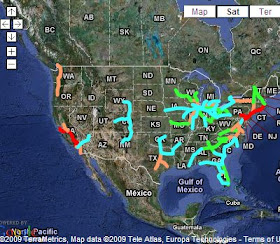
The Real Future of High-Speed Rail in the US
We've seen the official plan for high-speed rail in the US. Now The Infrastructurist has a very handy map on what we can actually expect to see built in the near (and not-so-near) future.
Says the site:
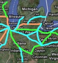
The pink lines include the Southeast High Speed Rail Corridor, which will run between Washington, DC and Charlotte, NC; New York HSR (which appears to be roughly coterminous with the officially sanctioned Empire Corridor); portions of the Chicago Hub network connecting Chicago to Detroit, St. Louis, and Milwaukee; the Cascades Corridor, which will run between Vancouver, Seattle, and Portland; a Tampa-Orlando line, the first stage in the Florida HSR plan; and the Texas T-Bone, which could end up providing the transportational spine of the Texas Triangle megaregion (and which has a more sensible orientation than the government's official plan for high-speed rail, in that it connects Houston, the state's largest city).
One thing to note is that red and pink lines together are represented in 20 states. That means 20 governors and 40 senators have incentive to push for some of that funding. Add green lines and you're talking about a majority of states (and senators) that would be invested in high-speed rail development. Since political support will be needed to make good on these plans, that's significant, and could also lead to cascading momentum for the entire high-speed rail plan; if, for instance, progress begins to be made on the Southeast Corridor between DC and Charlotte, you can imagine an envious Atlanta wanting to get into the game, and an extension of the line to the Peach State would become all the more likely. And by the way, that's why I think the Infrastructurist's characterization of the blue lines in their map as "very unlikely to be built in the next few decades" may be a bit of an overstatement. I'm not sure how we could know what the political support for these plans might be in, say, 20 years, but it seems very possible that as progress gets made on some of these main lines, support for some of the secondary lines here will increase considerably. Another big spike in the price of oil, which would make both driving and flying more expensive, also might help to kick-start some of those plans.
You can zoom in on the map and click on rail lines, which link to more detailed information on each of the high-speed rail plans (which is the source for most of the links above). The infrastructurist also has a chart that compares some of the biggest current high-speed rail plans in the world. The most ambitious, in length, speed, and population served, is the line between Shanghai and Beijing. California is next, followed by plans for Argentina, Saudi Arabia, France-Italy, the Netherlands, and Israel.
Via Matt Yglesias.
Says the site:
The colors indicate the seriousness of planning for the corridors. Red lines represent projects that are partially funded or providing high-speed operation today; pink lines are under intensive state planning and likely to be among the first to receive stimulus funds; green lines are far off but not inconceivable; and blue lines are very unlikely to be built in the next few decades.The only existing "high-speed" rail line is the Northeast Corridor, aka the Acela, that runs between Boston and Washington, DC, and the modest speeds of that line barely qualify it for high-speed status. The first truly high-speed rail in the US is likely to be the line between San Francisco and LA. It will have speeds up to 220 mph, and a $10 billion bond was approved by voters last year to begin construction; other than the Northeast Corridor, it's the only red line on this map.
The pink lines include the Southeast High Speed Rail Corridor, which will run between Washington, DC and Charlotte, NC; New York HSR (which appears to be roughly coterminous with the officially sanctioned Empire Corridor); portions of the Chicago Hub network connecting Chicago to Detroit, St. Louis, and Milwaukee; the Cascades Corridor, which will run between Vancouver, Seattle, and Portland; a Tampa-Orlando line, the first stage in the Florida HSR plan; and the Texas T-Bone, which could end up providing the transportational spine of the Texas Triangle megaregion (and which has a more sensible orientation than the government's official plan for high-speed rail, in that it connects Houston, the state's largest city).
One thing to note is that red and pink lines together are represented in 20 states. That means 20 governors and 40 senators have incentive to push for some of that funding. Add green lines and you're talking about a majority of states (and senators) that would be invested in high-speed rail development. Since political support will be needed to make good on these plans, that's significant, and could also lead to cascading momentum for the entire high-speed rail plan; if, for instance, progress begins to be made on the Southeast Corridor between DC and Charlotte, you can imagine an envious Atlanta wanting to get into the game, and an extension of the line to the Peach State would become all the more likely. And by the way, that's why I think the Infrastructurist's characterization of the blue lines in their map as "very unlikely to be built in the next few decades" may be a bit of an overstatement. I'm not sure how we could know what the political support for these plans might be in, say, 20 years, but it seems very possible that as progress gets made on some of these main lines, support for some of the secondary lines here will increase considerably. Another big spike in the price of oil, which would make both driving and flying more expensive, also might help to kick-start some of those plans.
You can zoom in on the map and click on rail lines, which link to more detailed information on each of the high-speed rail plans (which is the source for most of the links above). The infrastructurist also has a chart that compares some of the biggest current high-speed rail plans in the world. The most ambitious, in length, speed, and population served, is the line between Shanghai and Beijing. California is next, followed by plans for Argentina, Saudi Arabia, France-Italy, the Netherlands, and Israel.
Via Matt Yglesias.
More Homers Will Be Hit at New Yankee Stadium
The New York Yankees organization is, by its nature, arrogant and duplicitous. So it should come as no surprise that their claims that the new Yankee Stadium has the same dimensions as the old Yankee Stadium turn out to be false. So says Greg Rybarczyk, of the Hit Tracker website, as documented at Was Watching:
The old Yankee Stadium outfield wall is in red; the new one is in blue. Says Rybarczyk:
Looks like good news for lefty sluggers and bad news for the Yankees pitching staff.
The old Yankee Stadium outfield wall is in red; the new one is in blue. Says Rybarczyk:
I created this by using actual prints from the new stadium, and by using high resolution satellite photos for the old stadium. You may have heard that the dimensions at the new park are the same as the old park, but that is not strictly true. In certain spots the distances are the same or similar, but there are significant differences in the fence line. As you can see in the diagram, most of right field is shorter in the new park, by as much as 9 feet, but more typically by 4-5 feet (the blue dotted lines in the corners are scale markings that are 4 feet apart.) In center field, the new park is actually a bit deeper, and in left field, the parks are very similar. From some analysis I’ve done on home runs, these differences would tend to increase home runs overall, and particularly in middle-to-lower power hitters.Note that right field is closer to home plate to begin with, and already had the most homers hit to that part of the field in the old stadium; so moving that wall in closer will surely cause a greater marginal increase on homers hit there than the decrease in homers caused by the left-center wall being moved farther out, where many a fly ball will continue to go to die. And indeed, according to the New York Times, the new Yankee Stadium has seen the most homers per game in the majors so far this season (in an admittedly small sample size of four games).
The fence distances are not the only difference: in a few places, the fence is shorter (particularly the right field corner). A typical conversion factor for fence height to distance is that lowering a fence by 1 foot is roughly equal to moving it 0.84 feet closer to home plate. So, with the right field fence being a couple feet shorter in the new park, this is like moving it in a foot and a half or so.
Looks like good news for lefty sluggers and bad news for the Yankees pitching staff.
Immigrants Moving to the Suburbs
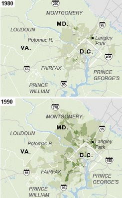
In another entry in its series on immigrants in the US, the New York Times has an article that's nominally about the shift of immigrant populations out of ethnic urban neighborhoods and into the suburbs, but actually seems like a weird stitching together of one article about social problems in immigrant communities with another about immigrants moving to the suburbs. Anyway, they have these maps of the DC area.
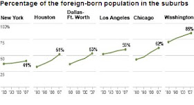
And this is from a chart on where immigrants are living.
The article is a little strange. The bulk of it is an anecdotal account of a Maryland teenager who has had verious teenager-in-a-bad-social-environment type problems. But then the article keeps insisting that immigrant kids are actually doing fairly well overall, compared to native-born kids as well as prior immigrant groups. And then it occasionally makes a tenuous connection between one or the other of these themes and the fact that a lot of immigrants in the suburbs these days:
In so far as the article has a point, it seems to be that, though most immigrants are following the old American pattern of slowly climbing the social ladder, a multi-generational task, there is a minority that isn't.
And this is from a chart on where immigrants are living.
The article is a little strange. The bulk of it is an anecdotal account of a Maryland teenager who has had verious teenager-in-a-bad-social-environment type problems. But then the article keeps insisting that immigrant kids are actually doing fairly well overall, compared to native-born kids as well as prior immigrant groups. And then it occasionally makes a tenuous connection between one or the other of these themes and the fact that a lot of immigrants in the suburbs these days:
Nationwide, about half of immigrants live in the suburbs, including more than 40 percent of the immigrant poor, according to Audrey Singer and Jill H. Wilson of the Brookings Institution. Many live in places that did little to promote immigrant mobility even in good times; now, vanishing jobs and strained safety nets increase the risk of downward assimilation.And a few comments are just odd:
Now nearly two-thirds Latino and foreign-born, it has the aesthetics of suburban sprawl and the aura of Central America. Laundromats double as money-transfer stores. Jobless men drink and sleep in the sun. There is no city government, few community leaders, and little community.The aesthetics of suburban sprawl but the "aura" of Central America? What is the difference between aesthetics and aura, exactly? And is a lack of city government and community a typical characteristic of Central American life?
In so far as the article has a point, it seems to be that, though most immigrants are following the old American pattern of slowly climbing the social ladder, a multi-generational task, there is a minority that isn't.
On average, children of immigrants today are progressing well, with levels of earnings and education similar to peers whose parents are native born. Concerns about downward mobility mostly focus on the children of the least-educated immigrants, particularly poor Mexicans and Central Americans who account for more than a third of today’s second generation.Semi-relatedly, Matt Yglesias suggests a possible future for racail categorization in the US:
Some scholars predict that they will follow poor Italians, who rose more slowly than other groups but rose nonetheless. Others worry that they may repeat the experience of poor African-Americans, with a significant minority mired in long-term poverty and social disorder.
I read Ta-Nehisi Coates casually refer to Yeah Yeah Yeahs frontwoman Karen O as a “white girl.” In reality she is, as they say, “Half Korean, 100% Rock Star”. Nevertheless, I think there’s a clear sense in which it strikes people as more intuitive to refer to a half-white, half-Korean indie rock star born in Korea and raised by both parents in New Jersey as “white” than it is to refer to a half-white, half-Kenyan President born in Hawaii and raised by his white mom and grandparents as “white.”It's possible to imagine a future where "blackness" is tied to certain cultural touchstones, like music and fashion, but also to class, and where Hispanic and Asian immigrants identify more closely with "whiteness" or "blackness" depending on their socioeconomic status. And maybe this is already sort of happening in some cases. That would be problematic and bad for a lot of reasons; but, from a dispassionate perspective, also a sort of interesting evolution of the meaning of race in American society. (Of course, the ideal future would be one in which racial dichotomization is left behind altogether.)
All of which is to say that there’s a decent chance that we’re evolving in a direction where the salient divide isn’t between “white” and “non-white” but between “black” and “non-black.”
Monday, April 20, 2009
Heavy Metal Map of Europe
Internets, I know you've been on tenterhooks wanting to know just what the distribution of heavy metal bands in Europe actually is. Well, concern yoursevles no more, because I, for some reason, have taken upwards of 20 minutes out of my day to make this map.
It's based on the metal band listings at metalmap.org, which a commenter pointed to in the previous thread. Scandinavia, as you can see, is more than well-represented. I am unsurprised by this, but also unsure why I am unsurprised. Here, in no rational order, are the number of heavy metal bands listed at that site for the coutries of Europe:
Iceland - 19
Ireland - 26
UK - 64
Norway - 311
Sweden - 517
Finland - 99
Estonia - 103
Latvia - 18
Lithuania - 46
Poland - 265
Russia - 82
Belarus - 46
Ukraine - 28
Moldova - 3
Romania - 176
Bulgaria - 36
Greece - 23
Macedonia - 1
Albania - 4
Serbia - 32
Montenegro - 0
Bosnia - 16
Croatia - 28
Slovenia - 21
Hungary - 74
Slovakia - 79
Czech Republic - 240
Austria - 99
Switzerland - 111
Germany - 298
Italy - 279
Denmark - 40
Netherlands - 258
Belgium - 149
Luxembourg - 11
France - 195
Spain - 157
Portugal - 86
Malta - 3
The site further breaks down metal bands into black metal, black/death, crust, crust/grind, death, death/black metal, death/doom, death/grind, doom metal, experimental, gore/grind, grindcore, grind/noise, hc/grind, industrial, jazz/grind, melodic black metal, melodic death metal, noise, noise/grind, sympho black metal, sympho doom metal, and thrash/death subcategories.
If, like me, you obviously have too much time on your hands, you can spend a couple minutes reading through the names of the bands. It's an odd sort of meditation, like walking through a Hieronymus Bosch painting.
If you're into that sort of thing.
Sunday, April 19, 2009
Heavy Metal Map of the World
Via Map of the Week, the Middlebury College radio station, of all places, made a heavy metal cartogram.
Country size corresponds to number of band listings in the Encyclopaedia Metallum. It's a little hard to tell which European countries are which, but there at least seems to be something of a skew towards the Teutonic.
Snow
NASA's Earth Observatory has a map animation of global snow cover from 1999-2009.
It's surprising how much of the world's land area spends a big chunk of the year under a layer of frozen water. Guess we really are still in an ice age.
Saturday, April 18, 2009
The White House Plan for High-Speed Rail
The Obama White House continues to give prominent support for high-speed rail. Here's their new high-speed rail map.
It's, um, not so different from the old one: You'll note, however, that that sissy green shade on the old map has been replaced by a dynamic crimson; and, too, there are wavy ghost-lines to give a sense of integration to the plan. Change we can believe in!
But I kid. There's nothing wrong with sticking to the plan for high-speed rail that the government has nominally had since the nineties. The only problem is that it hasn't been funded. But thanks to a personal intervention by Obama, $8 billion got worked into the stimulus bill earlier this year; and his budget includes another $1 billion per annum to develop the system. Here's some of what Obama had to say about the plan on Thursday:
Also: Houston is in Texas! Richard Florida may believe in some mythical urban mega-region on the western Gulf Coast that stretches from Pensacola to Brownsville. But I am here to tell you: Houston (not to mention Corpus Christi and Brownsville-McAllen) is far more integrated - economically, geographically, politically - with Austin and Dallas than it is with New Orleans. My car recently broke down in the town of Brenham, TX and I had occasion to get into a conversation with the local tow truck driver about patterns of megaregional integration in that part of the state (as one does with tow truck drivers). Specifically, he noted that the town had been growing in recent decades, and the reason was that people were finding they could commute from there to both Houston and Austin. I assure you there is no similarly oriented town between Houston and New Orleans. All of which is to say that - pace The Grateful Dead - Houston is not too close to New Orleans; it is close to the I-35 corridor megaregion of San Antonio-Austin-Dallas. The high-speed rail plan should reflect that reality.
UPDATE: Just saw that Cartophilia covered this as well. He's also got details and a map for the rail plan centered on Ohio. The high population densities, pre-existing infrastructure, and need for economic investment really make the Pittsbugh-Cleveland-Cincinnat-Detroit-Chicago area the best place to develop high-speed rail after the Northeast Corridor.
It's, um, not so different from the old one: You'll note, however, that that sissy green shade on the old map has been replaced by a dynamic crimson; and, too, there are wavy ghost-lines to give a sense of integration to the plan. Change we can believe in!
But I kid. There's nothing wrong with sticking to the plan for high-speed rail that the government has nominally had since the nineties. The only problem is that it hasn't been funded. But thanks to a personal intervention by Obama, $8 billion got worked into the stimulus bill earlier this year; and his budget includes another $1 billion per annum to develop the system. Here's some of what Obama had to say about the plan on Thursday:
What we're talking about is a vision for high-speed rail in America. Imagine boarding a train in the center of a city. No racing to an airport and across a terminal, no delays, no sitting on the tarmac, no lost luggage, no taking off your shoes. (Laughter.) Imagine whisking through towns at speeds over 100 miles an hour, walking only a few steps to public transportation, and ending up just blocks from your destination. Imagine what a great project that would be to rebuild America.I just have a couple of quibbles with the plan. One: connect Pittsburgh and Cleveland! They're only 130 miles apart by freeway, a distance that could conceivably make for a reasonable commute by high-speed rail. And it's a part of the country that could definitely use the short-term economic stimulus of building the line as well as the long-term benefit of increasing economic integration. Furthermore, such a line would connect the Midwest's Chicago Hub Network with the Northeast Corridor, and then we'd have something actually approaching a continental HSR system.
Now, all of you know this is not some fanciful, pie-in-the-sky vision of the future. It is now. It is happening right now. It's been happening for decades. The problem is it's been happening elsewhere, not here.
In France, high-speed rail has pulled regions from isolation, ignited growth, remade quiet towns into thriving tourist destinations. In Spain, a high-speed line between Madrid and Seville is so successful that more people travel between those cities by rail than by car and airplane combined. China, where service began just two years ago, may have more miles of high-speed rail service than any other country just five years from now. And Japan, the nation that unveiled the first high-speed rail system, is already at work building the next: a line that will connect Tokyo with Osaka at speeds of over 300 miles per hour. So it's being done; it's just not being done here.
There's no reason why we can't do this. This is America. There's no reason why the future of travel should lie somewhere else beyond our borders. Building a new system of high-speed rail in America will be faster, cheaper and easier than building more freeways or adding to an already overburdened aviation system –- and everybody stands to benefit.
Also: Houston is in Texas! Richard Florida may believe in some mythical urban mega-region on the western Gulf Coast that stretches from Pensacola to Brownsville. But I am here to tell you: Houston (not to mention Corpus Christi and Brownsville-McAllen) is far more integrated - economically, geographically, politically - with Austin and Dallas than it is with New Orleans. My car recently broke down in the town of Brenham, TX and I had occasion to get into a conversation with the local tow truck driver about patterns of megaregional integration in that part of the state (as one does with tow truck drivers). Specifically, he noted that the town had been growing in recent decades, and the reason was that people were finding they could commute from there to both Houston and Austin. I assure you there is no similarly oriented town between Houston and New Orleans. All of which is to say that - pace The Grateful Dead - Houston is not too close to New Orleans; it is close to the I-35 corridor megaregion of San Antonio-Austin-Dallas. The high-speed rail plan should reflect that reality.
UPDATE: Just saw that Cartophilia covered this as well. He's also got details and a map for the rail plan centered on Ohio. The high population densities, pre-existing infrastructure, and need for economic investment really make the Pittsbugh-Cleveland-Cincinnat-Detroit-Chicago area the best place to develop high-speed rail after the Northeast Corridor.
Friday, April 17, 2009
This is, Now, the Third Unemployment Map of the United States That I'm Posting Here
This map showed unemployment at the county level. And this map showed the unemployment rate over time at the state level. Now, in a sort of Hegelian synthesis of recession cartography, Slate has an interactive and animated map of county-level unemployment rates evolving over time since before the economy went skydiving with a parachute of ornamental cutlery.
Blues are good. Reds are bad. Circle sizes show number of jobs gained or lost.
What's great about this one is that the animation really lets you see how the recession spread - first out of Michigan and the industrial Midwest (which was sort of never out of recession to begin with), then to the bubble-towns of Florida and Southern California, before invading manufacturing areas in the South and other areas on the coasts, and finally pretty much everywhere else in the country that doesn't have an energy-based economy. (I wonder how much of the relative strength of the economies in places like Louisiana, Texas, and Alaska has to do with the huge spike in oil prices during 2008.) And as employment attrition marches grimly across the land, an azure sea of hearty growth becomes, over time, stained a bloody red. The map really explodes with big red vircles in January of this year.
You can also mouse over counties to see their numbers, though the feature is a bit wonky; it seems really determined to make me see that Suffolk County, NY has lost 19,642 jobs since February 2008, but won't let me know what's gone on in New York City, about the job market of which I have more than a passing interest at the moment. Still, a very good map with a ton of information.
Thursday, April 16, 2009
Income Inequality in Europe
By popular demand (well... one guy asked about it), here is a map of income inequality in Europe.
Just like the map of the US below, this uses the Gini index as a measure of inequality (based on this table). The general pattern seems to be an equitable core comprised of Scandinavia, Germany, France, and Central Europe, with modestly greater inequality towards the Anglophone, Mediterranean, and Slavic peripheries. Turkey (which is mostly in Asia, after all) has the highest Gini score - 43.6. Every other country is less inequitous than every single US state. In fact, the twenty countries with the lowest Ginis in the world are all on this map (except Malta, but only because it's too small to show up).
By the way, the colors in the map above are the same as in the US map from the previous post, but the scale is obviously different. Just for the sake of having an apples-to-apples visualization, this is what it would look like if the same scale were used as on the US map:
Wednesday, April 15, 2009
Is the US Becoming a Third World Country?
The simplest way to say whether a country is rich or poor is to add up its cumulative wealth, which is usually stated in terms of GDP. Sometimes this number is divided by the number of people in a country to say what the average wealth is: GDP per capita. And for a lot of purposes, including the overall economic strength of a country in an international context, that's a useful definition of wealth. But it's not a sufficient criterion for determining whether a society is wealthy. For instance, it's theoretically possible that a country could have a larger per capita GDP than any other country on the planet, but also for all that wealth to be controlled by a single autocratic leader to whom everyone else is enslaved. In the crudest economic terms, that society could be considered wealthy, even though all but one person would be utterly impoverished. So to determine whether a society is truly wealthy, some account needs to be taken of the distribution of wealth.
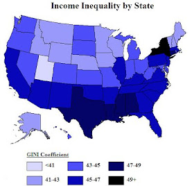
Here's a map I made of income inequality in the US.
This map is based on numbers from the US census (pdf). It uses the Gini index to measure income inequality. Gini
And then there is the United States, sandwiched between Cote d'Ivoire and Uruguay at .450. Not counting Hong Kong (.523), the US is a complete loner among developed countries. In fact, as you can see from the map above, there is no overlap between any single US state and any other developed country; no state is within the normal range of income distribution in the rest of the developed world. Here's a list of the states with their Gini index numbers, and the country where income distribution is most comparable in parentheses:
Alabama - .472 (Nepal)
Alaska - .417 (Cambodia)
Arizona - .454 (Jamaica)
Arkansas - .460 (Ecuador)
California - .466 (Rwanda)
Colorado - .450 (Uruguay)
Connecticut - .480 (Venezuela)
Delaware - .434 (Guyana)
District of Columbia - .537 (Honduras)
Florida - .467 (Rwanda)
Georgia - .461 (Mexico)
Hawaii - .438 (Nigeria)
Idaho - .421 (Thailand)
Illinois - .462 (Malaysia)
Indiana - .432 (Guyana)
Iowa - .424 (Burundi)
Kansas - .441 (Kenya)
Kentucky - .460 (Ecuador)
Louisiana - .475 (Madagascar)
Maine - .428 (Singapore)
Maryland - .433 (Guyana)
Massachusetts - .461 (Mexico)
Michigan - .444 (Philippines)
Minnesota - .430 (Iran)
Mississippi - .471 (Nepal)
Missouri - .449 (Cote d'Ivoire)
Montana - .426 (Singapore)
Nebraska - .430 (Iran)
Nevada - .434 (Turkey)
New Hampshire - .417 (Cambodia)
New Jersey - .458 (Uganda)
New Mexico - .457 (Uganda)
New York - .495 (Costa Rica)
North Carolina - .458 (Uganda)
North Dakota - .434 (Guyana)
Ohio - .449 (Cote d'Ivoire)
Oklahoma - .460 (Ecuador)
Oregon - .444 (Kenya)
Pennsylvania - .455 (Jamaica)
Rhode Island - .442 (Philippines)
South Carolina - .462 (Mexico)
South Dakota - .439 (Nigeria)
Tennessee - .468 (Rwanda)
Texas - .474 (Mozambique)
Utah - .410 (Russia)
Vermont - .420 (Thailand)
Virginia - .456 (Uganda)
Washington - .443 (Kenya)
West Virginia - .447 (Cameroon)
Wisconsin - .424 (Burundi)
Wyoming - .413 (Senegal)
Obviously, the US is far wealthier than any of the countries to which states are being compared on this list; but it's striking to see the US fit a pattern which, outside of the US, is exclusively a phenomenon of the underdeveloped world.
But does that mean that the US is on the road to Third World-dom? Well, not necessarily - and not yet, at least. But it should give some context to comparisons of wealth between societies. For instance, the GDP per capita in the US is one of the highest in the world. But more of that wealth is concentrated in the hands of relatively few people, meaning fewer people (relative to that high per capita GDP) are well-off.
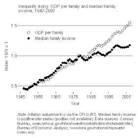
Matt Yglesias posted this chart the other day:
So even though a lot of wealth has been created since the 1970s, the typical family isn't much better off. And as Yglesias points out: "Another country with a lower GDP but less inequality could still be a country in which most people are richer than most Americans, and I believe there’s pretty compelling evidence that that’s now the case in a number of European countries."
I would add this: to the extent that wealth matters, it's because wealth increases the well-being of individuals. But there's undeniably a law of diminishing returns: a billionaire is not going to be a thousand times happier than a millionaire just because he has a thousand times as much money. In fact, I would argue that beyond some modest threshold - maybe below an income of $100,000/year - having more money simply doesn't affect one's well-being in any significant way. People certainly desire more wealth, mainly as a positional good - a billionaire has a higher status than a millionaire. But jockeying for positional goods is a zero-sum game; the billionaire's gain is the millionaire's loss, and so overall well-being is not increased by creating more wealth if that wealth just ends up getting shuttled up the income ladder into those stratospheric heights. In other words, if a country becomes wealthier because rich people are getting richer while everyone else treads water, that country is no better off than it was before. And if that's the case for a given country while more wealth is being created in other countries where it isn't being concentrated solely in the hands of the very rich, then that country's well-being, relative to other countries, decreases. That's what's been going on in the US for the last few decades. It's a sign of decline.
But not an irreversible one; the US doesn't have to become a third world country, where the majority of the population struggles to take care of basic needs while a minority controls a huge proportion of the nation's wealth. And an economic crisis, in large part brought about by wealthy elites mishandling their economic power, might be just the thing to start turning the trend around.
Here's a map I made of income inequality in the US.
This map is based on numbers from the US census (pdf). It uses the Gini index to measure income inequality. Gini
indicates how much the income distribution diļ¬ers from a proportionate distribution (one where everyone would have the same income; for example, 20 percent of the population would hold 20 percent of the income, 40 percent of the population would hold 40 percent of the income, etc.). The Gini index varies from 0 to 1, where 0 indicates perfect equality (a proportional distribution of income), and 1 indicates perfect inequality (where one person has all the income and no one else has any).So the higher the number, the more wealth inequality there is. For most advanced industrial economies, the Gini number is pretty low. According the the CIA World Factbook (table compiled here), the lowest Gini score in the world is Sweden's, at .23, followed by Denmark and Slovenia at .24. The next 20 countries are all in either Western Europe or the former Communist bloc of Eastern Europe. The EU as a whole is at .307. Russia has the highest number in Europe (.41); Portugal is the highest in Western Europe (.38). Japan is at .381; Australia is .352; Canada is .321.
And then there is the United States, sandwiched between Cote d'Ivoire and Uruguay at .450. Not counting Hong Kong (.523), the US is a complete loner among developed countries. In fact, as you can see from the map above, there is no overlap between any single US state and any other developed country; no state is within the normal range of income distribution in the rest of the developed world. Here's a list of the states with their Gini index numbers, and the country where income distribution is most comparable in parentheses:
Alabama - .472 (Nepal)
Alaska - .417 (Cambodia)
Arizona - .454 (Jamaica)
Arkansas - .460 (Ecuador)
California - .466 (Rwanda)
Colorado - .450 (Uruguay)
Connecticut - .480 (Venezuela)
Delaware - .434 (Guyana)
District of Columbia - .537 (Honduras)
Florida - .467 (Rwanda)
Georgia - .461 (Mexico)
Hawaii - .438 (Nigeria)
Idaho - .421 (Thailand)
Illinois - .462 (Malaysia)
Indiana - .432 (Guyana)
Iowa - .424 (Burundi)
Kansas - .441 (Kenya)
Kentucky - .460 (Ecuador)
Louisiana - .475 (Madagascar)
Maine - .428 (Singapore)
Maryland - .433 (Guyana)
Massachusetts - .461 (Mexico)
Michigan - .444 (Philippines)
Minnesota - .430 (Iran)
Mississippi - .471 (Nepal)
Missouri - .449 (Cote d'Ivoire)
Montana - .426 (Singapore)
Nebraska - .430 (Iran)
Nevada - .434 (Turkey)
New Hampshire - .417 (Cambodia)
New Jersey - .458 (Uganda)
New Mexico - .457 (Uganda)
New York - .495 (Costa Rica)
North Carolina - .458 (Uganda)
North Dakota - .434 (Guyana)
Ohio - .449 (Cote d'Ivoire)
Oklahoma - .460 (Ecuador)
Oregon - .444 (Kenya)
Pennsylvania - .455 (Jamaica)
Rhode Island - .442 (Philippines)
South Carolina - .462 (Mexico)
South Dakota - .439 (Nigeria)
Tennessee - .468 (Rwanda)
Texas - .474 (Mozambique)
Utah - .410 (Russia)
Vermont - .420 (Thailand)
Virginia - .456 (Uganda)
Washington - .443 (Kenya)
West Virginia - .447 (Cameroon)
Wisconsin - .424 (Burundi)
Wyoming - .413 (Senegal)
Obviously, the US is far wealthier than any of the countries to which states are being compared on this list; but it's striking to see the US fit a pattern which, outside of the US, is exclusively a phenomenon of the underdeveloped world.
But does that mean that the US is on the road to Third World-dom? Well, not necessarily - and not yet, at least. But it should give some context to comparisons of wealth between societies. For instance, the GDP per capita in the US is one of the highest in the world. But more of that wealth is concentrated in the hands of relatively few people, meaning fewer people (relative to that high per capita GDP) are well-off.
Matt Yglesias posted this chart the other day:
So even though a lot of wealth has been created since the 1970s, the typical family isn't much better off. And as Yglesias points out: "Another country with a lower GDP but less inequality could still be a country in which most people are richer than most Americans, and I believe there’s pretty compelling evidence that that’s now the case in a number of European countries."
I would add this: to the extent that wealth matters, it's because wealth increases the well-being of individuals. But there's undeniably a law of diminishing returns: a billionaire is not going to be a thousand times happier than a millionaire just because he has a thousand times as much money. In fact, I would argue that beyond some modest threshold - maybe below an income of $100,000/year - having more money simply doesn't affect one's well-being in any significant way. People certainly desire more wealth, mainly as a positional good - a billionaire has a higher status than a millionaire. But jockeying for positional goods is a zero-sum game; the billionaire's gain is the millionaire's loss, and so overall well-being is not increased by creating more wealth if that wealth just ends up getting shuttled up the income ladder into those stratospheric heights. In other words, if a country becomes wealthier because rich people are getting richer while everyone else treads water, that country is no better off than it was before. And if that's the case for a given country while more wealth is being created in other countries where it isn't being concentrated solely in the hands of the very rich, then that country's well-being, relative to other countries, decreases. That's what's been going on in the US for the last few decades. It's a sign of decline.
But not an irreversible one; the US doesn't have to become a third world country, where the majority of the population struggles to take care of basic needs while a minority controls a huge proportion of the nation's wealth. And an economic crisis, in large part brought about by wealthy elites mishandling their economic power, might be just the thing to start turning the trend around.
Tuesday, April 14, 2009
Bus Stops
More good stuff from Good. This is from a pseudo-map depicting cuts in the budgets of transit systems around the US since the economy started to do its frog-in-a-blender routine.
Good has this tendency to publish these graphics that are really impressive looking, and are awesome from a design perspective, but on closer inspection actually contain less information that it seems like they do. This, for instance, looks like it's trying to tell us about the relative scale of cutbacks at transit systems around the country, and maybe even the division of those cuts between job losses, service cuts, and fare hikes. Turns out, though, the only comparative data represented here is the relative size of the 15 largest transit systems where any sort of cuts have been made (though that's still sort of interesting). It doesn't tell us anything about the size of the cuts in either absolute or relative terms. Looks cool, though.
Says Good:
Transportation for America, by the way, has its own map of transit cuts around the US. According to them, "every $1 billion invested in public transit operations generates 60,000 jobs." That would mean $100 billion would save 6 million jobs - well ahead of the pace Obama tried to set by saving 3.5 million jobs with $800 billion. Some sort of law of diminishing returns undoubtedly applies, so it probably wouldn't be possible to save 6 million jobs in mass transit. Still, it has to be one of the more efficient uses of government money available.
Good has this tendency to publish these graphics that are really impressive looking, and are awesome from a design perspective, but on closer inspection actually contain less information that it seems like they do. This, for instance, looks like it's trying to tell us about the relative scale of cutbacks at transit systems around the country, and maybe even the division of those cuts between job losses, service cuts, and fare hikes. Turns out, though, the only comparative data represented here is the relative size of the 15 largest transit systems where any sort of cuts have been made (though that's still sort of interesting). It doesn't tell us anything about the size of the cuts in either absolute or relative terms. Looks cool, though.
Says Good:
Last year, Americans took more than 10 billion rides on public transportation, the highest level in more than 50 years. But despite the increases, public transit systems are being forced to cut back service, risking losing many of the riders they gained due to high gas prices and a bad economy. In New York, for example, the Metropolitan Transit Authority is moving forward with plans to drastically raise fares and totally eliminate some subway and bus lines.This is annoying - literally, in that it will make it less convenient and more expensive for people to get around; but also because the middle of a recession is the worst possible time to make such cuts. Firing people who work in these transit systems obviously raises unemployment, which makes the recession worse; cutting service harms people who - perhaps unable to afford to drive a car - are newly dependent on transit; and raising fares hurts people just at the moment when every penny counts the most for them. To a point, it's unavoidable; state and local revenues go way down during a recession, so they end up making cuts in lots of areas, including transportation. On the other hand, I vaguely recall a big to-do not long ago about the federal government spending a not inconsiderable amount of cash to try and stimulate the economy. Seems they could have found the funds in there somewhere to at least bridge the lost revenue gap and keep cities from having to cut services; and it seems like the sums that would be required to keep the buses running in Atlanta, say, would have been pretty paltry on the scale of a $700,000,000,000 bill. But local mass transit (unlike alternative energy and high-speed rail) ended up getting left out of the stimulus for the most part. Guess people who ride subways and buses weren't considered "shovel-ready."
Transportation for America, by the way, has its own map of transit cuts around the US. According to them, "every $1 billion invested in public transit operations generates 60,000 jobs." That would mean $100 billion would save 6 million jobs - well ahead of the pace Obama tried to set by saving 3.5 million jobs with $800 billion. Some sort of law of diminishing returns undoubtedly applies, so it probably wouldn't be possible to save 6 million jobs in mass transit. Still, it has to be one of the more efficient uses of government money available.
The Road to Canterbury
If, like me, you like literature and English is your primary language, you probably have this occasional nagging sense that you ought to read Canterbury Tales. But - again, if you're like me - you probably haven't. Well good news! There's no need. You can just go and check out NPR's interactive map of the journey about which Chaucer's work was written.
The map is connected to a series of stories NPR is doing on modern England, and the sorts of changes that have happened there since Chaucer's time. From NPR:
Chaucer's stories, published in the late 14th century, follow a collection of travelers from London to visit the tomb of Thomas Becket at Canterbury Cathedral. The Canterbury Tales offers readers a "concise portrait of an entire nation, high and low, old and young, male and female, lay and clerical, learned and ignorant, rogue and righteous, land and sea, town and country," wrote Oxford scholar Nevill Coghill.Yep. Definitely ought to read that some time...
Monday, April 13, 2009
Australia is the Canary in the Global Waming Coal Mine
The future is here, and it is Australian. This map shows the expected spread in the range of dengue fever on the continent - almost all the way to Sydney.
According to this LA Times article, Australia is experiencing some of the first pronounced effects of global warming:
Australia, however, likes to burn coal. Its people enjoy the electricity provided by burning coal, and they like the economic growth that comes from such a cheap energy source. So, they are the world's highest per-capita producers of greenhouse gases, which means they are contributing disproportionately to the withering and charring of their own country. That is, you'll note, ironic.
Australia. Apocalypse. I think we all know where this is headed.
According to this LA Times article, Australia is experiencing some of the first pronounced effects of global warming:
They call Australia the Lucky Country, with good reason. Generations of hardy castoffs tamed the world's driest inhabited continent, created a robust economy and cultivated an image of irresistibly resilient people who can't be held down. Australia exports itself as a place of captivating landscapes, brilliant sunshine, glittering beaches and an enviable lifestyle.Among those cautionary experiences: a heat wave that killed 200 people in February, followed by fires that killed another 173, as well as - and this astonished me - "a quarter of Victoria state's koalas, kangaroos, birds and other wildlife." Meanwhile, the drought in Victoria has desiccated the country's breadbasket; rainfall has been less than half of average for more than a decade. The article characterizes the agricultural sector as "collaps[ing]," along with the country's self-sufficiency in food production. And even as the once-fertile south literally dries up and blows away, the tropical wet season in the north is becoming longer and more severe, with flooding and cyclones becoming more frequent. Higher water temperatures are bleaching the coral of the Great Barrier Reef, with one report saying the reef will become "functionally extinct" by 2050. That's barely 40 years from now. Inland wildlife, meanwhile, is being chased up the slopes of Australia's smallish mountains by advancing heat.
Look again. Climate scientists say Australia -- beset by prolonged drought and deadly bush fires in the south, monsoon flooding and mosquito-borne fevers in the north, widespread wildlife decline, economic collapse in agriculture and killer heat waves -- epitomizes the "accelerated climate crisis" that global warming models have forecast.
With few skeptics among them, Australians appear to be coming to an awakening: Adapt to a rapidly shifting climate, and soon. Scientists here warn that the experience of this island continent is an early cautionary tale for the rest of the world.
Australia, however, likes to burn coal. Its people enjoy the electricity provided by burning coal, and they like the economic growth that comes from such a cheap energy source. So, they are the world's highest per-capita producers of greenhouse gases, which means they are contributing disproportionately to the withering and charring of their own country. That is, you'll note, ironic.
Australia. Apocalypse. I think we all know where this is headed.