A beautiful animation of the entire 2008 Atlantic hurricane season:
It was produced by NOAA's National Hurricane Center and can be downloaded here.
Here's a map of all the tropical storms and hurricanes from that busy year. This year, by constrast, has been rather quiet.
Showing posts with label north america. Show all posts
Showing posts with label north america. Show all posts
Monday, November 2, 2009
Tuesday, May 19, 2009
The New and Improved Geography of Personality - Now Includes Canada!
A little while ago, I looked at a study on the geography of personality by Peter J. Rentfrow, Samuel D. Gosling and Jeff Potter. That work looked at the geographic distribution among the 50 states of the prevalence of the "big five" personality traits: extroversion, agreeableness, neuroticism, conscientiousnness, and openness. Well, Richard Florida has maps that present similar data; except that these ignore state boundaries, which gives a clearer and more fine-grained sense of the actual distribution of those traits; and better yet, these maps include Canada. So here are the maps of the geography of personality for the US and Canada. (Note: Florida cites, as the source for these maps, Jason Rentfrow and Kevin Stolarick, and the data represented in these maps seem to show some slightly different patterns than the other paper, which I'll refer to as the Rentfrow et al. paper, even though both of these, technically, are Rentfrow et al. papers (do you think Peter and Jason are related?).)

According to Rentfrow, et al., extroversion is generally associated with "sociability, energy, and health," and extroverted people tend to socialize more, but also tend to be more indiscriminate in their associations; they don't necessarily have more close friends. The big hubs for extroversion seem to be centered around Chicago, Atlanta, and Florida, with Bos-Ny-Wash and California being the least extroverted regions. Canada is more uniform, though Ontarians seem to be a bit more extroverted than Albertans.

Agreeableness "reflects warmth, compassion, cooperativeness, and friendliness." Rentfrow et al. found that high levels of agreeableness in states correlated with social involvement and religiosity. It was also positively correlated with spending time with friends and having guests over, but negatively with going to bars and joining clubs. Again, Atlanta seems to be a major hub of agreeableness, and it is generally prevalent throughout the South; and again Bos-Ny-Wash and Southern California score low. Greater Toronto and Alberta score slightly lower as well, and Vancouver scores slightly higher.

Neuroticism is characterized by "anxiety, stress, impulsivity, and emotional instability and is related to antisocial behavior, poor coping, and poor health." Unsurprisingly, the Rentfrow et al. study found that highly neurotic states had lower rates of exercise, higher rates of disease, and a shorter life expectancy. In these states, people are less likely to join clubs and spend time with friends. Again, the Northeast represents one of the ends of the spectrum for the distribution of this trait; but in this case it's focused very particularly around the New York City area. There's a secondary neurotic hub around Ohio; the South and West are generally un-neurotic, as is Canada - esepecially Vancouver.

Conscientiousness at the individual level "reflects dutifulness, responsibility, and self-discipline [and] it is positively associated with religiosity" and health-promoting behavior. The South has high levels of conscientiousness; the Northeast, not so much. Southern Ontario and the big cities of California also seem to have lower levels of conscientiousness.

Openness "reflects curiosity, intellect, and creativity at the individual level." Rentfrow et al. found that highly open states had high levels of liberal values, and a disproportionate number of people in the "artistic and investigative professions". People in these areas are more tolerant of homosexuality, more likely to support legalization of marijuana, and more likely to be pro-choice. However, more open states tend to have lower rates of social involvement. and are considerably less religious. "Open" people are concentrated around New York City and the cities of the West Coast from Vancouver to San Diego. The South, Midwest, and southern Ontario are less open.
Taking these maps as a whole, what's most remarkable to me is the extent to which the story of the geography of personality in North America is a story about the difference between New York City and Atlanta. Just look at those maps: in the case of every one of the big five personality traits, both of those cities represent one end of the spectrum of the distribution of that trait; and in every case, they represent opposite ends of that spectrum. In other words, both areas are outliers for every trait, and both areas are outliers in opposite directions for every trait. Other parts of North America, like Canada and the interior West, are either generally near the middle of the spectrum for most traits; or, like the Midwest, they share patterns with the Atlanta-centered South or the NYC-centered Northeast depending on the trait. But in every single case, Atlanta and New York City are diametrically opposed to each other. It's fascinating.
Tuesday, April 28, 2009
Swine Flu: The Inevitable Google Map
It was only a matter of time before this showed up.

A Google map of the spread of the global health scare du jour. Pink markers are suspected cases; purple markers are confirmed or probable; deaths have no dot in the middle of the marker; yellow markers are negative cases. Click on markers for copious details on individual cases.
That someone would make such a map may have been inevitable, but nonetheless: note how cool it is. The map format, combined with (theoretically) near-time updates on reported cases and free 'n easy public access make this an ideal medium for monitoring the spread of an epidemic like swine flu.
Monday, April 6, 2009
The Baseball Map of America
The long darkness known as the baseball off-season is finally over. In cartographic celebration of this sporting Eostre, here is the map of the countries of baseball in North America:

Thirty teams, thirty countries, one evil empire.

Thirty teams, thirty countries, one evil empire.
Thursday, March 5, 2009
Mass Transit Systems of North America
From the obscenely wonderful Radical Cartography, a map of mass transit systems throughout North America.

(Note: I've shifted a couple of the 'cities' around slightly for formatting purposes.) The map depicts fixed mass transit systems - subways, light rail, and the like - in cities across North America, all depicted at the same scale. Radical Cartography says: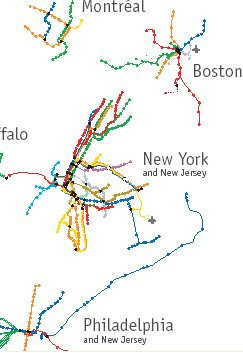 Seattle. Detroit you can sort of understand: that city's been bleeding population for decades, perhaps leaving it without sufficient density and tax base to support a modern mass transit system; and of course they're the home of GM, which has not historically been very amenable to the whole notion of people not being chained to the yoke of car culture. But Seattle? A city that's been pretty much booming for the last few decades? Where there's supposedly a high level of environmental consciousness? That is actually rather densely built and walkable, and has massive problems with traffic congestion? Seattle, I think you have some explaining to do.
You can compare this map to a list of heavy rail mass transit systems in North America, mostly based on information from this list (which unlike the map doesn't include light rail, note):
1. New York City-Subway (7,825,500)
2. Mexico City-Metro (3,879,500)*
3. Toronto-TTC (1,256,700)*
4. Washington, DC-Metrorail (1,019,900)
5. Montreal-Metro (791,500)**
6. Chicago-L (680,400)
7. Boston-MBTA or T (502,500)
8. San Francisco-BART (392,900)
9. Atlanta-MARTA (294,400)
10. Philadelphia-SEPTA (eww...) (289,000)
11. Vancouver-SkyTrain (271,000)***
12. New York City-PATH (257,400)
13. Los Angeles-Metro Rail (153,000)
14. Miami-Metrorail (65,500)
15. Baltimore-Metro Subway (57,600)
16. Philadelphia-PATCO (36,900)
17. San Juan-Tren Urbano (36,500)
* estimate based on this
**based on this
***based on this
Well, making that list was certainly an exercise in procrastinating from work I should be doing. Hope you enjoyed it!
(Note: I've shifted a couple of the 'cities' around slightly for formatting purposes.) The map depicts fixed mass transit systems - subways, light rail, and the like - in cities across North America, all depicted at the same scale. Radical Cartography says:
At a glance, many metros seem to be comparable in scale, but what separates New York from Baltimore is density: station-to-station distance, line overlap, and linkages.You can also really pick out the slackers in this sort of direct comparison - I'm looking at you, Detroit and
Most systems are organized as a hub with spokes; the two notable exceptions are New York and Mexico City, both of which are more like nets.
 Seattle. Detroit you can sort of understand: that city's been bleeding population for decades, perhaps leaving it without sufficient density and tax base to support a modern mass transit system; and of course they're the home of GM, which has not historically been very amenable to the whole notion of people not being chained to the yoke of car culture. But Seattle? A city that's been pretty much booming for the last few decades? Where there's supposedly a high level of environmental consciousness? That is actually rather densely built and walkable, and has massive problems with traffic congestion? Seattle, I think you have some explaining to do.
You can compare this map to a list of heavy rail mass transit systems in North America, mostly based on information from this list (which unlike the map doesn't include light rail, note):
1. New York City-Subway (7,825,500)
2. Mexico City-Metro (3,879,500)*
3. Toronto-TTC (1,256,700)*
4. Washington, DC-Metrorail (1,019,900)
5. Montreal-Metro (791,500)**
6. Chicago-L (680,400)
7. Boston-MBTA or T (502,500)
8. San Francisco-BART (392,900)
9. Atlanta-MARTA (294,400)
10. Philadelphia-SEPTA (eww...) (289,000)
11. Vancouver-SkyTrain (271,000)***
12. New York City-PATH (257,400)
13. Los Angeles-Metro Rail (153,000)
14. Miami-Metrorail (65,500)
15. Baltimore-Metro Subway (57,600)
16. Philadelphia-PATCO (36,900)
17. San Juan-Tren Urbano (36,500)
* estimate based on this
**based on this
***based on this
Well, making that list was certainly an exercise in procrastinating from work I should be doing. Hope you enjoyed it!
Tuesday, March 3, 2009
The Food Nations of North America
From Renewing America's Food Traditions, a coalition of organizations dedicated to promoting the diverse foods and food traditions of North America, comes this map of the "food nations" of the continent:

According to RAFT, this map identifies what it calls "totem foods" which are emblematic not only of a regional cuisine, but of an entire culture:
It's not hard to intuit that there's something to this depiction of cultural geography. Indeed, this geographical partition is similar in many of its particulars to others made in the areas of cultural and political geography, including some I've discussed here. Chile Pepper Nation corresponds pretty closely to the areas of the US Southwest that used to be part of Mexico (and the part of northwestern Mexico that still is), and that is heavily influenced by Mexican and certain Native American cultures. Clambake Nation is the Yankee portion of the Bos-NY-Wash mega-region, plus the coastal areas of the Atlantic that correspond to the Eastern portion of Robert David's Upper Coasts region, while the western portion of Upper Coasts, the region anchored by the Cascasdia mega-region goes here by the name of Salmon Nation. Corn Bread and BBQ Nation is otherwise known as the Greater South, less Gator Nation, which is just another way of describing the Gulf Coast Mega-region. And Moose Nation - well, that's just Canada minus the parts that have people.
As the RAFT folks write in the introduction to their book on America's food traditions, more than 400 years after the first white people started mucking about on the continent:
But I digress. The RAFT map is interesting and their goals noble. They go into far greater detail in their book, which you can download as a pdf file free of charge at this site. In those pages they detail the ten most endangered traditional foods: Chapalote corn, Chiltepin pepper, Eulachon Smelt, Gulf Coast sheep, Java chicken (which is, yes, actually from Asia originally, but never mind), Marshall strawberry, Native American sunflowers, Pineywoods cattle, the Seminole pumpkin, and White Abalone. (They also list the top ten success stories - traditional foods that have made a comeback - including American alligator, Louisiana Creole cream cheese, and Iriquois white corn.)
The book also has a comprehensive index of endangered traditional foods; especially given the price tag, it's really an essential reference for anyone in North America who cares about food, culture, and the preservation of traditional knowledge.

According to RAFT, this map identifies what it calls "totem foods" which are emblematic not only of a regional cuisine, but of an entire culture:
These totem foods are more than just important commodities--community feasts, household rituals, song, stories and the nutritional well-being of residents have revolved around these foods for centuries.It's fair to say, in other words, that this map is not just a map of North American food commodities, but a full-blown cultural map of the continent.
It's not hard to intuit that there's something to this depiction of cultural geography. Indeed, this geographical partition is similar in many of its particulars to others made in the areas of cultural and political geography, including some I've discussed here. Chile Pepper Nation corresponds pretty closely to the areas of the US Southwest that used to be part of Mexico (and the part of northwestern Mexico that still is), and that is heavily influenced by Mexican and certain Native American cultures. Clambake Nation is the Yankee portion of the Bos-NY-Wash mega-region, plus the coastal areas of the Atlantic that correspond to the Eastern portion of Robert David's Upper Coasts region, while the western portion of Upper Coasts, the region anchored by the Cascasdia mega-region goes here by the name of Salmon Nation. Corn Bread and BBQ Nation is otherwise known as the Greater South, less Gator Nation, which is just another way of describing the Gulf Coast Mega-region. And Moose Nation - well, that's just Canada minus the parts that have people.
As the RAFT folks write in the introduction to their book on America's food traditions, more than 400 years after the first white people started mucking about on the continent:
two-thirds of the distinctive seeds and breeds which then fed America have vanished. One in fifteen wild, edible plant and animal species on this continent has diminished to the degree that it is now considered at risk. These declines in diversity bring losses in traditional ecological and culinary knowledge as well. Consequently, we have suffered declines in the food rituals which otherwise link communities to place and cultural heritage.It's not gone unnoticed that there has been some degree of homogenization in ways we eat. One big reason for this has been industrialized agriculture and cheap transportation costs: just look at the stickers on your produce to see what kind of epic vegetable diaspora your daily diet represents. Normally I'd lament the cultural homogenization, but I've just been reading some Jim Kunstler, whose dystopian rants can't help but give one the sense that, while a return to localism in the food supply is likely just around the corner, it will only be because we are going to have far greater problems to worry about: namely, the end of cheap transportation and general economic collapse. (The pinch of salt with which one is inclined to take Kunstler would be a good bit larger if not for the fact that his predictions of doom have been spot on for the past year or so.)
But I digress. The RAFT map is interesting and their goals noble. They go into far greater detail in their book, which you can download as a pdf file free of charge at this site. In those pages they detail the ten most endangered traditional foods: Chapalote corn, Chiltepin pepper, Eulachon Smelt, Gulf Coast sheep, Java chicken (which is, yes, actually from Asia originally, but never mind), Marshall strawberry, Native American sunflowers, Pineywoods cattle, the Seminole pumpkin, and White Abalone. (They also list the top ten success stories - traditional foods that have made a comeback - including American alligator, Louisiana Creole cream cheese, and Iriquois white corn.)
The book also has a comprehensive index of endangered traditional foods; especially given the price tag, it's really an essential reference for anyone in North America who cares about food, culture, and the preservation of traditional knowledge.
Subscribe to:
Posts (Atom)

