Thursday, July 15, 2010

First Half of 2010 is the Warmest on Record

June 2010 was the hottest June on record, 1.22°F above average. So was the period of April-June, 1.26°F above average. And January through June - the entire first half of 2010 - were also the hottest on record, 1.22°F above average. A trifecta!

jan-june 2010 world temperature map

Pop quiz: what do these facts, and the giant oil spill and ecosystem carnage in the Gulf of Mexico, and the environmental damage and civil unrest in the Niger Delta, among many other sordid, disturbing facts about life on Earth in the early 21st Century, have in common?

George Will, among others, would say: nothing. Nothing at all. Because he does not believe that the world is warming due to our burning of fossil fuels; indeed, he does not believe we are in a period of global warming at all, as he argued in an editorial last year. He stated there that
according to the U.N. World Meteorological Organization, there has been no recorded global warming for more than a decade, or one-third of the span since the global cooling scare.
This assertions was factually incorrect - the WMO said no such thing - as were pretty much all of Will's assertions in the editorial. But what would make Will not only believe this assertion, but decide to broadcast it to the world from his extremely authoritative position as an editorialist for the Washington Post? Perhaps it was his interpretation of the fact that the ten warmest years on record, according to NOAA, have been, in order, 2005, 1998, 2003, 2002, 2006, 2009, 2007, 2004, 2001, and 2008. Or perhaps it's just his reading of this chart:


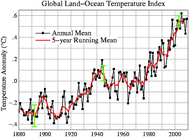
These data points pretty strongly suggest that the world is in a period of warming, and the record for 2010 is clearly continuing the trend. But to correctly understand the data that are being represented here, you have to meet at least two sriteria: 1) Have the statistical acumen and general intelligence of at least a second-grader; and 2) Not be a disingenuous toady for the fossil fuel industry. On at least one of these points, Will has obviously failed.

Monday, July 12, 2010

The Coming Heat Wave Wave

The weather where I live - a large East Coast metropolis somewhere between Bridgeport, CT and Trenton, NJ - was notably warm last week, as it was for much of the East Coast. At Dot Earth, Andrew Revkin links to a study that predicts many more such heat waves in the future.

hot seasons us global warming map

On the study:
"Using a large suite of climate model experiments, we see a clear emergence of much more intense, hot conditions in the U.S. within the next three decades," said Noah Diffenbaugh, an assistant professor of environmental Earth system science at Stanford and the lead author of the study.

Writing in the journal Geophysical Research Letters (GRL), Diffenbaugh concluded that hot temperature extremes could become frequent events in the U.S. by 2039, posing serious risks to agriculture and human health.

"In the next 30 years, we could see an increase in heat waves like the one now occurring in the eastern United States or the kind that swept across Europe in 2003 that caused tens of thousands of fatalities," said Diffenbaugh, a center fellow at Stanford's Woods Institute for the Environment. "Those kinds of severe heat events also put enormous stress on major crops like corn, soybean, cotton and wine grapes, causing a significant reduction in yields"...

In the study, Diffenbaugh and Ashfaq used two dozen climate models to project what could happen in the U.S. if increased carbon dioxide emissions raised the Earth's temperature by 1.8 degrees Fahrenheit (1 degree Celsius) between 2010 and 2039 – a likely scenario, according to the International Panel on Climate Change.

In that scenario, the mean global temperature in 30 years would be about 3.6 degrees F (2 degrees C) hotter than in the preindustrial era of the 1850s. Many climate scientists and policymakers have targeted a 2-degree C temperature increase as the maximum threshold beyond which the planet is likely to experience serious environmental damage. For example, in the 2009 Copenhagen Climate Accord, the United States and more than 100 other countries agreed to consider action to reduce greenhouse gas emissions "so as to hold the increase in global temperature below 2 degrees Celsius."

But that target may be too high to avoid dangerous climate change, Diffenbaugh said, noting that millions of Americans could see a sharp rise in the number of extreme temperature events before 2039, when the 2-degree threshold is expected to be reached.

"Our results suggest that limiting global warming to 2 degrees Celsius above preindustrial conditions may not be sufficient to avoid serious increases in severely hot conditions," Diffenbaugh said.
The study predicts that "an intense heat wave – equal to the longest on record from 1951 to 1999 – is likely to occur as many as five times between 2020 and 2029 over areas of the western and central United States." In other words, imagine you are 60 years old or so, and think of the absolute most extreme heat wave you've experienced in your entire life.

Twenty years from now, such heat waves will be occurring once every year or two.

And needless to say, there is zero evidence that we are prepared to seriously address the problem of global warming sufficiently enough to actually achieve the 2-degree goal. This is because we are a short-sighted, greedy, and not-quite-intelligent-enough species, and the world we bequeath to future generations will be severely damaged as a result. Very likely we will go down in history as a generation of obnoxious assholes who were too enthralled with our SUVs and plastic tchotchkes to make even the most minimally adequate moral calculations about our actions.

And if you think things might change once the effects of global warming actually start showing up in earnest... well, I have my doubts. Here is Revkin quoting social scientist Robert Brulle:
I’m up in New Hampshire, and the signs of climate change are everywhere, should you choose to see them. The strawberry season has already passed (it usually comes in late July), and you can now get fresh blueberries (3 weeks ahead of normal). The lake I am staying at has lost a lot of water clarity due to an excessive amount of tannic acid. The lake had its earliest ice out this year in memory, and so the leaves had had a longer time to decompose, thus releasing more tannic acid to the water. The water looks more like what you see in the Pine Barrens than in New Hampshire. These changes are all just taken in stride. Climate change remains something abstract and far away, both in time and space. In short, these changes are being normalized.
Cloudier lakes in New Hampshire today, an inundated Bangladesh tomorrow, and everything changing at the rate of one very slowly boiling frog. This is just a very difficult sort of calamity for our species to respond to.

Thursday, July 8, 2010

The Company You Keep

A provocative series of maps from Esquire's politics blog depicts the countries of the world according to a couple of controversial policies:

gays military capital punishment world map

The countries that ban gays in the military, according to Esquire, are Cuba, China, Egypt, Greece, Iran, Jamaica, Mexico, Nigeria, North Korea, Pakistan, Saudi Arabia, Singapore, Somalia, South Korea, Sudan, Syria, Turkey, United Arab Emirates, Uganda, United States, Venezuela, and Yemen

The countries that execute people are Afghanistan, Antigua and Barbuda, Bahamas, Bahrain, Bangladesh, Barbados, Belarus, Belize, Botswana, Burundi, Cameroon, Chad, China, Comoros, Congo, Cuba, Dominica, Egypt, Equatorial Guinea, Eritrea, Ethiopia, Gabon, Ghana, Guatemala, Guinea, Guyana, India, Indonesia, Iran, Iraq, Israel, Jamaica, Japan, Jordan, Kuwait, Laos, Lebanon, Lesotho, Libya, Malawi, Malaysia, Mongolia, Nigeria, North Korea, Oman, Pakistan, Palestinian Authority, Qatar, Saudi Arabia, Sierra Leone, Singapore, Somalia, South Korea, St. Kitts and Nevis, St. Lucia, St. Vincent and the Grenadines, Sudan, Swaziland, Syria, Taiwan, Tajikistan, Tanzania, Thailand, Trinidad and Tobago, Uganda, United Arab Emirates, United States, Vietnam, Yemen, Zambia, and Zimbabwe

And the countries that do both:

countries ban gays in the military and execute people

That is some pretty rarefied company for the United States: Cuba, China, Egypt, Iran, Jamaica, Nigeria, North Korea, Pakistan, Saudi Arabia, Singapore, Somalia, Sudan, Syria, United Arab Emirates, Uganda, and Yemen. The US's only company in the Western hemisphere are Cuba and Jamaica. Other than that it's just a handful of countries in Africa, a handful of countries in the Muslim Middle East, and a few in East Asia. No European countries on the list. The only other developed country is Singapore.

But all this is likely to change as the gears of the military bureaucracy seem to be slowly but inexorably grinding towards repeal of Don't Ask-Don't Tell. In which case the US will join only one other country in the executes-people-but-allows-gays-in-the-military pile: Israel.

What I find most interesting here, though, is the matter of American exceptionalism. To the extent that this term refers to the tendency of the US to embrace more authoritarian-conservative policies, it turns out the US isn't all that exceptional - except within the Western World (i.e., for these purposes, Europe + Latin America + Anglophone settler countries). It joins with a geographically coherent coterie of nations in clusters across parts of Africa, the Middle East, and much of South and East Asia.

But these areas couldn't be more unlike eachother - politically, culturally, linguistically, historically, religiously, geographically... They just tend to be alike in embracing more authoritarian policies. This consistent authoritarianism just seems to be independent of any other variable. Odd. (Of course, you could also take the view that the anti-authoritarianism of Europe and Latin America and perhaps part of Africa is exceptional, and what needs explaining.)

Tuesday, July 6, 2010

The Universe

Listen, I know it may be tough to keep up with my blistering blogging pace of late, but just bear with me... Here I give you a map of everything:

planck telescope universe map

The image is from a BBC News article about mapping done by the European Space Agency's Planck Telescope:
This is the extraordinary place where we all live - the Universe.

The picture is the first full-sky image from Europe's Planck telescope which was sent into space last year to survey the "oldest light" in the cosmos.

It took the 600m-euro observatory just over six months to assemble the map.

It shows what is visible beyond the Earth to instruments that are sensitive to light at very long wavelengths - much longer than what we can sense with our eyes.

Researchers say it is a remarkable dataset that will help them understand better how the Universe came to look the way it does now.

"It's a spectacular picture; it's a thing of beauty," Dr Jan Tauber, the European Space Agency's (Esa) Planck project scientist, told BBC News.

Dominating the foreground are large segments of our Milky Way Galaxy.

The bright horizontal line running the full length of the image is the galaxy's main disc - the plane in which the Sun and the Earth also reside.
One book I'm currently reading is Edward Casey's Getting Back into Place, which discusses the nature of place from a philosophical perspective. One of the book's themes is that our lived experience 1) always occurs in discrete places (as opposed to abstract space, for instance) and 2) our understanding of, or feel for, place is inherently a function of embodied experience. That is, it is only by virtue of being embodied beings that we understand places in the way we do. (To give one example, the verticality of certain buildings - think of the soaring cathedrals of Europe - evoke the natural verticality of the human form, and so we experience such buildings as inherently dignified, aspirational, and literally uplifting.) (Yes, I know that is a little broad and might sound vague or just weird. There's just no way to really do much more than gesture broadly like this. But check out the book if you're intrigued by this kind of stuff.)

And of course, one of the places we all share, and a place we are always in, is the universe. But what's odd about this place (well, among other things) - or in particular, what's odd about our experience of this place, is that it seems to totally baffle our intuitions as embodied beings. The scale is just so vast, it's literally incomprehensible. I mean, I can sort of imagine myself circumnavigating the globe. In fact, I have flown clear to the other side of the world. Which seemed like a very far way to go, but it was nonetheless a scale to which I could (barely) relate my own body: I can sort of imagine the world divided up into chunks on the scale of like a landscape that I might behold from a ridge, say, and thereby imagine the whole as constituted of so many chunks. Does that make sense?

Okay. But the universe is just so obviously beyond that scale. We can't imagine what a light-year is - we can't relate it to the scale of our sensory experiences in the way I just tried to do with the Earth as a whole (which was already pushing it). And it's 4 light-years to the nearest star. And the numbers! Are there 100 billion stars in the universe? 50 quadrillion? It really doesn't matter, because again, the numbers are so far beyond anything we can imagine in terms of our embodied experience that they are just meaningless. We hear numbers like this and we just think: really big number. We don't comprehend them in the way we can comprehend "3" or "8" or "100" or even "10,000."

Anyways, what's great about the map above (and the accompanying BBC video might help you to "read" it) is that it represents this greatest possible whole, the universe itself, in a way that makes it sort of comprehensible. Of course, the scale of the universe reamins beyond the ken of our intuitions as embodied beings. But this representation at least helps us to imagine the whole - to take it in, in a sense, like we would a landscape. And this must be to the good: this place is our home, after all. We ought to get to know it as well as we can.

Wednesday, June 16, 2010

Net Migration in the US

An interesting interactive migration map from Forbes shows net migration for 2008 for every county in the US:

us migration map

You can see migration to a given county from any other county in the country. E.g., 66 people moved from Dane County, WI (Madison) in 2008, and 34 moved in the opposite direction. Or: 149 people moved from Harris County, TX (Houston) to Queens, NY, but 449 made the opposite trip. Also, this being Forbes, matters economic are considered integral, so per capita income for migrants is also shown. This is pretty interesting, actually, as it is suggestive of the sort of moving involved: the average income for folks making the leap between high-tech hubs San Mateo, CA and Travis County, TX (Austin) was $74,500. For those moving from Cameron County, TX on the Mexican border to Clark County, NV (Las Vegas) it was just $12,900.

Friday, June 4, 2010

Has BP Ruined the Entire Atlantic Basin?

This video paints a dismaying picture:


Via Mother Jones, which says:
The National Center for Atmospheric Research (NCAR) just released this horrifying animation of how ocean currents may carry all the oil in the Gulf of Mexico. According to their computer modeling of currents and the oil, the spill "might soon extend along thousands of miles of the Atlantic coast and open ocean as early as this summer."

"I've had a lot of people ask me, 'Will the oil reach Florida?'" says NCAR scientist Synte Peacock in a statement accompanying the animation, which he worked on. "Actually, our best knowledge says the scope of this environmental disaster is likely to reach far beyond Florida, with impacts that have yet to be understood."

The models show oil hitting Florida's Atlantic coast within a few weeks, then moving north as far as about Cape Hatteras, N.C., before heading east.
One question I haven't seen answered is: at what level of dispersion is the oil no longer harmful? I assume that if a hundred million gallons were distributed evenly throughout the world's oceans, it wouldn't even be noticeable, and would biodegrade in no time. But somewhere between that, and the actual conditions we have - giant plumes and enormous sheens concentrated in the northern Gulf of Mexico - is the threshhold beyond which dispersion takes care of the problem. I don't know what that threshhold is - whether, for instance, the quantities shown swirling about in the mid-Atlantic in this animation would still be dangerous to ecosystems. At the least, though, this looks bad for pretty much the entire coast of Florida.

Thursday, May 13, 2010

Mapping the Invisible in the Jungles of Belize

Jungle. Ancient civilization. Lasers. Cool:

Photobucket

Says the NY Times:
A small aircraft flying back and forth above the ancient Maya city of Caracol, in Belize, used a laser to penetrate the dense forest canopy.

Viewed in three dimensions, the data revealed new ruins, causeways and agricultural terraces of the sprawling city. A detail [of a detail] of Caracol's city center is shown here.
Interesting stuff, but a little disheartening in a sense. The age of physical human discovery is truly over; nowadays all we get is laser-guided dispatches from the global panopticon.

Monday, May 10, 2010

Hanging of the Parliament

So they went ahead and had those elections in the UK, as you may have heard. The result was a major victory for primary colors, as this Wikipedia map shows. (Blue = Conservatives; Red = Labour; Yellow = LD; assorted = regional and minor parties):

uk 2010 election map

The political parties, however, didn't do so hot. Oddly, though electoral politics is supposedly a zero-sum game, all three major parties managed to lose. The Tories fell short of the majority they were hoping for; Labour lost a ton of seats and had their worst showing in decades; and the Lib Dems, despite anticipation of major gains and predictions that they might crack 100 seats, actually lost a handful of seats. The Tories now have 305 seats, to Labour's 258, and the Lib Dems' 57, with the rest distribute amongst various regional parties and a Green. With ~323 needed to form a majority, the parliament is, as they say, hung.

For comparison, this is what the map looked like after the last election, in ought-five:

Tuesday, May 4, 2010

Whither the Spill?

Thither, according to an oceanologist from the University of South Florida College of Marine Science Ocean Circulation Group, which has modeled the forecasted trajectory of the spill:


The narrator is expecting the slick to get caught up in the loop current, which feeds into the Gulf Stream, which runs up the East Coast of the US. Says he:
It's not looking good for the whole Gulf and for the East Coast, really... All these arrows are pushing it toward the loop current and once that happens, well, all bets are off... I hope that the people on the east coast are getting prepared for this, and Florida 'cause it looks like it's gonna come your way. It looks like it's not just a Gulf Coast deal.
At the end he gives two pieces of advice: to say our prayers, and to keep the pressure on BP to "spend every dime they have" on the clean-up. I humbly encourage my readers to put more energy into the latter.

Tuesday, April 27, 2010

Spill, Baby, Spill

Proving that you don't have to have centralized government control of your economy to wreak environmental havoc, that oil rig that blew up last week off the coast of Louisiana is causing problems:


So says Eric Berger:
Officials from Louisiana to Florida remain concerned about oil leaking from a Transocean rig that exploded last week in the Gulf of Mexico, killing 11.

As crews attempt to stop the flow of an estimated 42,000 gallons a day escaping from a pipe about 5,000 feet below the surface, the oil slick has been slowly expanding across the Gulf.

Satellite images have helped officials track the slick as it swirls around the Gulf. Here's the best, most recent image captured by NASA's Aqua satellite.
That's a thousand barrels of oil a day, leaking up from the bottom of the Gulf where the rig's pipe snapped off (those are technical terms). And it looks increasingly likely that the only thing that will work to stem the leakage is to drill a relief well, but that'll take months. (Part of the problem is that the well is 5,000 feet down, which complicates any potential engineering solution, as you can imagine - but those are the sorts of problems you run into when you're scrounging under the earth's proverbial sofa for the every last drop of fossil fuel resources you can find.) The slick is already 80 miles by 36 miles across and likely to reach land within days. This thing could get very ugly for the Gulf Coast.

UPDATE
: Now it's 100 x 45 miles.


From the Times-Picayune.

Tuesday, April 20, 2010

UK Election Calculator

The BBC has an election seat calculator for the upcoming UK elections:

uk election calculator

I will say this: UK electoral democracy appears to be pretty messed up. Like, US-caliber mess up. I say this because as you can see, I've set the calculator so that the 3 majorest parties all get just about the same percentage of the vote (a third each, if you want to check my math). Yet look at the seat distribution that results from that popular vote outcome:


See? Messed up. Everyone gets the same number of votes but the Tories and Lib Dems combined don't have as many seats as Labour. W, if I may say, TF? I assume this is a function of the Lib Dem vote being highly concentrated in ethnic areas? And the conservative vote being somewhat concentrated in rural areas? But I'm sort of projecting from the American political scene, so that may be way off base.

At any rate, the BBC's "poll of polls" currecntly shows the Conservatives with a slight lead: 33% to 29% for each of the other two parties. That would result in 285 votes fo Labour to 244 for the conservatives, and a whopping 92 seats for team yellow. Democracy!!!And since this would result in a hung parliament, I assume the High Court would intervene and choose the victor in a 5-4 ruling according to their own political predilections. What, isn't that how everyone does it?

Monday, April 19, 2010

So Long, And Thanks for All the Fish

The Aral Sea is just... about...


Gone. Another image of the sea from March 2010:


From the Huffington Post:
The drying up of the Aral Sea is one of the planet's most shocking disasters, U.N. Secretary-General Ban Ki-moon said Sunday, as he urged Central Asian leaders to step up efforts to solve the problem.

Once the world's fourth-largest lake, the sea has shrunk by 90 percent since the rivers that feed it were largely diverted in a Soviet project to boost cotton production in the arid region.

The shrunken sea has ruined the once-robust fishing economy and left fishing trawlers stranded in sandy wastelands, leaning over as if they dropped from the air. The sea's evaporation has left layers of highly salted sand, which winds can carry as far away as Scandinavia and Japan, and which plague local people with health troubles.
The story of the Aral Sea is the sort of thing you want to point to when people argue that technology and human ingenuity will save us from our own self-inflicted crises. The Shrinkage started with the Soviet Union's plan to divert the Amu Darya and Syr Darya to grow a bunch of cotton in the middle of the desert. Hilariously, the Soviets knew the Sea would vanish as a result of this plan - but they did it anyway:
''It was part of the five-year plans, approved by the council of ministers and the Politburo,'' said Aleksandr Asarin, an expert at the Russian State Hydroproject Institute who angered his bosses by predicting, in 1964, that the sea was headed for catastrophe. ''Nobody on a lower level would dare to say a word contradicting those plans,'' he said, ''even if it was the fate of the Aral Sea.''
Apparently Kazakhstan is working to revive what is now the North Aral Sea with some success. There's less hope for the southern sliver of the sea that remains. The water, already so salty as to have been rendered lifeless, continue to recede from the stranded fishing villages and rusting husks of Soviet-era fishing boats that used to subsist on the sea's bounty.

Thursday, April 8, 2010

Cities at Night

Via The Map Room, NASA's Earth Observatory posts some nice images of cities at night. E.g.:

el paso/juarez at night

From le text:
Border cities like Ciudad Juaréz, Mexico, and El Paso, Texas, illustrate different city patterns side-by-side, suggesting cultural influences on the development and growth of cities and infrastructure. Ciudad Juaréz supports at least 1,300,000 people. On the U.S. side of the Rio Grande, El Paso is marked by the brightly-lit Interstate Highway I-10 that cuts across the city. Although the area of El Paso, with an estimated population of slightly more than 600,000 is roughly on the order of the area of built-up Ciudad Juaréz, the density of settlement evidenced by the distribution of lights is much less.
Taken April 7, 2003.

Sunday, April 4, 2010

Taxi Taxi

No, not the decently high quality yet reasonably priced used clothing store on Westheimer Road in Houston, TX. Why would you think I'm talking about that? I'm referring to this map animation from the New York Times:

manhattan texi map

It's a heat map showing frequency of cab pick-ups at every single block of Manhattan for every single hour of the entire week. Animatable. Zoomable. Rolloverable for the specific number for any single block and a corresponding graph for the entire week. Really just a gratuitous display of data triumphalism from the Times who, one senses, are just sort of showing off at this point. This map, for instance, doesn't really tell you anything you don't already know - people take cabs in Midtown during the day, in the Village at night. But if you're of a certain bent you might find the sheer detail and comprehensiveness of the presentation here sort of jarring.

It does seem like we're approaching a point, rather rapidly, where almost any information about spatial conditions, processes, or events can be instantly translatable into cartographic form. I am looking forward to the day when I can zoom in close enough on Google Earth to see a real time image of myself sitting at the computer using Google Earth. The image will narrow in on the computer screen... closer, closer, until-

Monday, March 29, 2010

Mapping Global Happiness

Yet another entrant in the genre of happiness cartography, this time courtesy of Gallup:

gallup global happiness map

The survey of 155 countries describes respondents as "thriving," "struggling," or "suffering" according to the Cantril Self-Anchoring Striving Scale. The scale is very straightforward - it simply asks people to locate themselves on a scale of 0 to 10, where 0 is the worst possible life for themselves and 10 is the best. The three categories break out as follows:
Thriving -- wellbeing that is strong, consistent, and progressing. These respondents have positive views of their present life situation (7+) and have positive views of the next five years (8+). They report significantly fewer health problems, fewer sick days, less worry, stress, sadness, anger, and more happiness, enjoyment, interest, and respect.

Struggling -- wellbeing that is moderate or inconsistent. These respondents have moderate views of their present life situation OR moderate OR negative views of their future. They are either struggling in the present, or expect to struggle in the future. They report more daily stress and worry about money than the "thriving" respondents, and more than double the amount of sick days. They are more likely to smoke, and are less likely to eat healthy.

Suffering
-- wellbeing that is at high risk. These respondents have poor ratings of their current life situation (4 and below) AND negative views of the next five years (4 and below). They are more likely to report lacking the basics of food and shelter, more likely to have physical pain, a lot of stress, worry, sadness, and anger. They have less access to health insurance and care, and more than double the disease burden, in comparison to "thriving" respondents.
The patterns are familiar from other similar surveys: overall the Americas tend to be happiest (a median of 42% of respondents are thriving), followed by Europe (29%), Asia (17%), and Africa (8%).

The five most satisfied countries in the world are - say it with me now - the Scandinavian countries of Denmark (82% thriving), Finland (75%), Norway (69%), and Sweden (68%), plus the Netherlands (68%). The highest in the Western Hemisphere is Costa Rica (63%), followed by Canada (62%), Panama (62%), Brazil (58%), and the United States (57%). Asia is led by New Zealand (63%), Israel (62%), and Australia (62%). The least satisfied are mostly in Africa - Togo (1%), Burundi (2%), and Comoros (2%) are the least satisfied countries in the world. Meanwhile, the big Asian countries are surprisingly low on the scale: Japan comes in at just 19% thriving, India at 10%, and China at 9%.

Tuesday, March 9, 2010

Fast Food Nation

Stephen Von Worley, burger cartographer extraordinaire, has created a map that presents fast food dominance across US territory in delectably manichean terms:

hamburger map of the us

Not wrongly, Von Worley frames the Empire of the Gilded Parabola as evil and (more wrongly) the other fast food outlets as a scrappy alliance of insurgents. Says he:
In this and the following graphic, each individual restaurant location has equal power. The entity that controls each point casts the most aggregate burger force upon it, as calculated by the inverse-square law – kind of like a chart outlining the gravitational wells of galactic star clusters, but in an alternate, fast food universe.

By far, the largest pocket of resistance is Sonic Drive-In’s south-central stronghold: more than 900 restaurants packed into the state of Texas alone. Sheer density is the key to victory!

The rebels already have the numbers – over 24,000 locations in total – but they’ve divided and conquered themselves by strict adherence to the peacetime principles of brand identity and corporate structure. This is war, and for the sake of self-preservation, all must be sacrificed! Kings and Queens: get used to hanging with the common folk. Tone down the sarcasm, Jack. And everyone, please, stop yanking Wendy’s pigtails! Y’all need to work in harmony to succeed with the winning strategy: an Alliance!
I.e., black space is McDonalds land. The only other contiguous territory of any real scale belongs to Sonic, across much of Texas and subsidiary areas. But Jack in the Box shows some strength in the Southwest, Burger King's got a far-flung string of outposts from the Southeast to the Northwest, and even Hardee's puts up a fight in the Carolinas. Dairy Queen, which I had always thought of as sort of the village pub of small Texas towns, actually looks to be even stronger in precisely the areas of the Upper Midwest which are most prone to actual blizzards.

Go to Von Worley's post to see another map that shows that as a combined force, the upstarts swamp the McHegemon.

Via Andrew Sullivan.

Saturday, February 27, 2010

Pacific Tsunami

There was an 8.8 magnitude earthquake in Chile this morning. That is one of the ten strongest quakes in history, and a hundred times stronger than the 7.0 that leveled Port-au-Prince last month. It struck a relatively unpopulated area, though, and also a far more developed country, so the damage and number of deaths won't be nearly as high as in Haiti. It was expected to produce a tsunami, however, and NOAA's West Coast and Alaska Tsunami Warning Center has a map showing the predicted energy of the tsunami as it crosses the Pacific:

Photobucket

They also have a map showing predicted arrival times of the tsunami. From the time of the earthquake it was expected to take 7-8 hours to reach Central America, 15 hours to reach Hawaii, and ~22 hours to reach Japan. They've issued a tsunami warning for the entire Pacific basin, though the tsunami isn't expected to be catastrophic.

The wave is expected to be about eight feet high when it reaches Hilo.

Thursday, February 25, 2010

Olympic Medals Map

The NY Times has an interactive map of Olympic medals won by country:

vancouver winter olympics medals map

This represents medals won in the Vancouver Olympics thus far. You'll notice that the United States has a larger circle than Canada. This is because the United States has won more medals than Canada. I draw attention to this fact because the Canadians were all bragging about how they were going to win the most medals. Clearly they are going to fail to do so. Their hubris rankles; hubris belongs to Americans and Russians. In Canadians it is just... unbecoming. Also, as a United Statesian, it's fun to root for my country on the rare occasions when we are the underdog, like in the winter Olympics and the World Cup.

The map has medal winners going back to the first Winter Olympics in 1924. You can see that it was basically a meeting of Europeans, with a few odd North Americans thrown in, until the last few cycles. Now the North Americans are a much bigger presence, as are the Asians and even the bleepin' Australians, who need to knock it off with the excelling at sports all the time. Are there even any ski resorts in Australia?

Meanwhile, The Vancouver [de]Tour Guide 2010 team sends along their effort to google map some stuff of interest around Vancouver. They describe it as "a mixture of google bombing, counter-cartography and psychogeography that uses Google Maps to contest the online/offline representations of Vancouver during the Olympics." I link to them here mainly because I enjoy the words "counter-cartography" and "psychogeography."