Showing posts with label transportation. Show all posts

Sunday, April 4, 2010

Taxi Taxi

No, not the decently high quality yet reasonably priced used clothing store on Westheimer Road in Houston, TX. Why would you think I'm talking about that? I'm referring to this map animation from the New York Times:

manhattan texi map

It's a heat map showing frequency of cab pick-ups at every single block of Manhattan for every single hour of the entire week. Animatable. Zoomable. Rolloverable for the specific number for any single block and a corresponding graph for the entire week. Really just a gratuitous display of data triumphalism from the Times who, one senses, are just sort of showing off at this point. This map, for instance, doesn't really tell you anything you don't already know - people take cabs in Midtown during the day, in the Village at night. But if you're of a certain bent you might find the sheer detail and comprehensiveness of the presentation here sort of jarring.

It does seem like we're approaching a point, rather rapidly, where almost any information about spatial conditions, processes, or events can be instantly translatable into cartographic form. I am looking forward to the day when I can zoom in close enough on Google Earth to see a real time image of myself sitting at the computer using Google Earth. The image will narrow in on the computer screen... closer, closer, until-

Monday, December 21, 2009

Interstate/Underground

The blog at Good has a map of the US interstate highway system on the model of the London tube map:

US interstate system as tube map

A detail:

interstate map detail

Nice map, but I don't think Kent is the most important city between San Antonio and Las Cruces.

The author of this map cited a couple other interstate maps as inspiration, including this one by Chris Yates:

interstate system simplified

More inspiration here and here.

Thursday, August 6, 2009

America 2050's Rail Plans

I have yet to see a forward-thinking and possibly pie-in-the-sky rail plan for the United States that I didn't feel like posting here, and this plan from America 2050 is no exception. They have a passenger rail plan map which includes megaregions, which points up the usefulness of rail in integrating the country's magalopoli:

America 2050 passenger rail plan

They also have a plan for a freight network:

America 2050 freight rail plan

You can read their policy brief here (pdf), though it's pretty much your standard pro-rail boilerplate. Which is to say: I heartily endorse it!

Thursday, June 11, 2009

An Alternative High-Speed Rail Plan

the transport politic has an alternative proposal for a high-speed rail network for the US:


By contrast, here's the official high-speed rail plan as proposed by the White House in April:


Among the differences: the ttp plan includes a route for the Colorado Front Range which the gummint plan lacks; it also integrates the major components of HSR in the eastern half of the country, from the Northeast Corridor to Texas; and integrates the Arizona 'Sun Corridor' into the California network. Whence the differences? Well, these are among ttp's criteria:
the transport politic’s proposal was informed by an analysis of potential travel between metro regions of populations greater than 100,000 and between 50 and 500 miles apart... The vast majority of train travel would occur on trains running at 150 mph or above on routes of 500 miles or less. Roads and airports along these corridors would be significantly decongested as more people choose to take the train instead of a car for short to medium distances (50-200 miles) and the train instead of the airplane for long distance (300-500 miles) travel...

There is no transcontinental high-speed railroad proposed here because high-speed rail simply doesn’t attract particularly high ridership above the 500 mile travel distance; the best way to get from the East Coast to the West Coast will – and should, barring some unforeseen technological advance – remain via airplane...

In order to calculate the cost effectiveness of each route on the high-speed system, the transport politic used a relatively simple methodology based on travel between city pairs 50 to 500 miles apart. The calculations assume the following: that a big city to big city route attracts more passengers than a small city to small city route; that a big city to small city route attracts more passengers than a small city to small city route; that as distances increase, ridership decreases, though not proportionately. I recognize that these assumptions may be incorrect in many cases, but they provide a reasonable start for further research on this subject.
They also get into the nitty-gritty of how such a plan ought to be administered:
the transport politic’s suggestion is that the most appropriate way to get the ball rolling is to separate train operations – Amtrak – from track possession and maintenance by setting up a national infrastructure owner – let’s call it NatTrack. This agency would take hold of the Amtrak-owned Northeast Corridor and begin acquiring and assembling land for future high-speed rail corridors. Through eminent domain, it would also take possession of a large number of the nation’s freight lines, most of which are currently under-maintained and poorly managed, and begin converting them to standard-speed rail operations. NatTrack would manage route creation, not only in buying land and constructing track, but in prioritizing corridors to build new lines, deciding which to implement, and when.
Here's their proposal for order of implementation:


By the way, as a Texas-based blog, The Map Scroll heartily endorses the plan to include Houston in the Texas HSR plan along with San Antonio, Austin, and Dallas-Fort Worth, which the official plan stupidly fails to do. Intermodality shows a plan specifically for Texas:

texas map,map,texas

There are lots more details for the transport politic's plan, including scoring for every route based on a function of distance and expected demand. It's really a comprehensive analysis and well worth checking out.

Monday, June 1, 2009

Carbon Footprints, Transit Ridership and More

Via Good, the Housing and Transportation Affordability Index has some excellent maps for several dozen US metros that pertain to housing, transportation, and energy issues. This one shows CO2 emissions from auto use per capita in the New York City area:

nyc co2

The numbers go way, way down as you move towards the urban center. Of course, most people in New York City don't even own cars. But maybe a bit more surprisingly, the pattern is almost as striking in cities where sprawl is rampant. Here's Atlanta, for instance:

Photobucket

The gray lines are freeways and the black lines are Marta rail lines. It looks like per capita CO2 use is highest both along the Marta lines and near freeways; in the case of the latter, that's presumably because the sprawl is somewhat more dense near freeways. But, of course, the general rule is that the closer you are to the city center, the smaller your carbon footprint.

There are many, many more maps here on a number of variables pertaining to housing and transportation. To pick one at random, here's transit ridership as a percentage of workers in the Bay Area:

transit ridership bay area

There's much more like this - average rents, gasoline expenses, travel time to work, etc.; it's a ton of information that's both fascinating and useful. And all in map form. If you're like me, in other words, this site has the potential to waste a tremendous amount of your time.

Monday, May 25, 2009

If You Like It Then You Shouldn't Put a Ring Road On It

Via Strange Maps, Thumb has this poster which overlays ring roads from around the world:

ring roads,cities

According to Thumb, "This poster is designed as a sort of calling card for Rice School of Architecture, located in Houston. We collected ring roads from 27 international cities and layered them all at the same scale. As it turned out, Houston has the largest system of those we surveyed. (Beijing was second)"

Strange Maps says that it's not entirely clear what is being referred to here as Houston's ring road. But it seems clear that the shape in the poster is that of the area contained by Highway 6 on the south and west sides of town and FM 1960 on the north side. The east side of this loop is a bit undefined, but it looks like it could be formed by Highway 146, which runs up the west side of Galveston Bay. Or maybe the east side of the "ring" is just open, represented by a notional north-south line that forms the right side of the poster.

Now, I can attest from personal experience: follow the route of this ring road and you will see nothing but the worst sorts of urban sprawl; it's truly a netherworld of placelessness, an interminable conurbation of strip malls and glass boxes which inspire the human spirit with nothing but alienation and loathing. I am sure that such is the case with most of the other US ring roads represented here.


As for the rest of the cities here, I can't say much; I've only been to a few of them, and never did I make a point of touring their ring roads. Is the spawning of endless sprawl by ring roads an international phenomenon? Maybe the very concept of the ring road is anti-urban: its function is to connect peripheral areas of the metropolis to each other, rather than to the central city. In the case of smaller rings, like Vienna's or Amsterdam's, the ring might be contained within an area that is basically urban; but for the larger rings, it seems inevitable that they'd promote auto-centric lower-density development - a.k.a. sprawl.

As noted above, Beijing has the second largest ring. I'd be especially interested in knowing what the character of development there is like. One thing that I'm curious about is the extent to which China is emulating the American style of urban development. China is, after all, adding cars to its roads at a furious rate. On the other hand, it seems to be adding to its mass transit infrastructure at an equally furious rate. And the other Chinese ring roads on this poster - Guangzhou and Tianjin - aren't obscenely huge. So, my legion of Chinese readers: what's the deal with urban growth there? Is it proceeding with a sensible consideration of the needs of a healthy urban environment? Or is it sprawling in the same sort of wasteful, inane, and crude patterns as the US has been for the last 60 years?

Tuesday, April 21, 2009

The Real Future of High-Speed Rail in the US

We've seen the official plan for high-speed rail in the US. Now The Infrastructurist has a very handy map on what we can actually expect to see built in the near (and not-so-near) future.


Says the site:
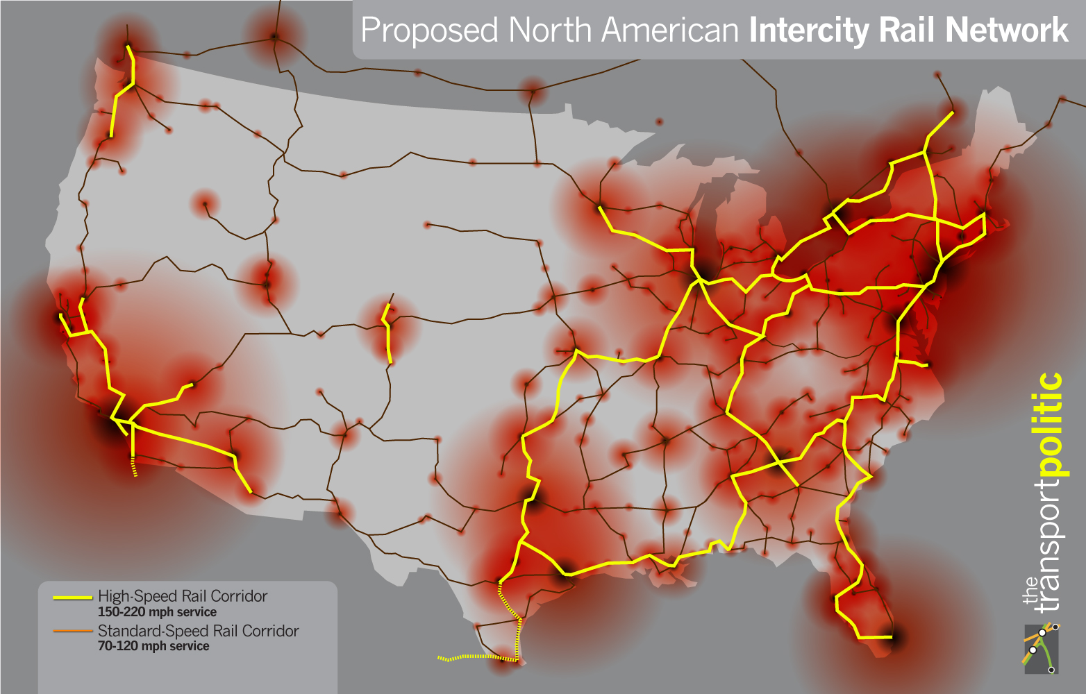
The colors indicate the seriousness of planning for the corridors. Red lines represent projects that are partially funded or providing high-speed operation today; pink lines are under intensive state planning and likely to be among the first to receive stimulus funds; green lines are far off but not inconceivable; and blue lines are very unlikely to be built in the next few decades.
The only existing "high-speed" rail line is the Northeast Corridor, aka the Acela, that runs between Boston and Washington, DC, and the modest speeds of that line barely qualify it for high-speed status. The first truly high-speed rail in the US is likely to be the line between San Francisco and LA. It will have speeds up to 220 mph, and a $10 billion bond was approved by voters last year to begin construction; other than the Northeast Corridor, it's the only red line on this map.

The pink lines include the Southeast High Speed Rail Corridor, which will run between Washington, DC and Charlotte, NC; New York HSR (which appears to be roughly coterminous with the officially sanctioned Empire Corridor); portions of the 
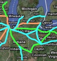
Chicago Hub network connecting Chicago to Detroit, St. Louis, and Milwaukee; the Cascades Corridor, which will run between Vancouver, Seattle, and Portland; a Tampa-Orlando line, the first stage in the Florida HSR plan; and the Texas T-Bone, which could end up providing the transportational spine of the Texas Triangle megaregion (and which has a more sensible orientation than the government's official plan for high-speed rail, in that it connects Houston, the state's largest city).

One thing to note is that red and pink lines together are represented in 20 states. That means 20 governors and 40 senators have incentive to push for some of that funding. Add green lines and you're talking about a majority of states (and senators) that would be invested in high-speed rail development. Since political support will be needed to make good on these plans, that's significant, and could also lead to cascading momentum for the entire high-speed rail plan; if, for instance, progress begins to be made on the Southeast Corridor between DC and Charlotte, you can imagine an envious Atlanta wanting to get into the game, and an extension of the line to the Peach State would become all the more likely. And by the way, that's why I think the Infrastructurist's characterization of the blue lines in their map as "very unlikely to be built in the next few decades" may be a bit of an overstatement. I'm not sure how we could know what the political support for these plans might be in, say, 20 years, but it seems very possible that as progress gets made on some of these main lines, support for some of the secondary lines here will increase considerably. Another big spike in the price of oil, which would make both driving and flying more expensive, also might help to kick-start some of those plans.

You can zoom in on the map and click on rail lines, which link to more detailed information on each of the high-speed rail plans (which is the source for most of the links above). The infrastructurist also has a chart that compares some of the biggest current high-speed rail plans in the world. The most ambitious, in length, speed, and population served, is the line between Shanghai and Beijing. California is next, followed by plans for Argentina, Saudi Arabia, France-Italy, the Netherlands, and Israel.

Via Matt Yglesias.

Saturday, April 18, 2009

The White House Plan for High-Speed Rail

The Obama White House continues to give prominent support for high-speed rail. Here's their new high-speed rail map.


It's, um, not so different from the old one: You'll note, however, that that sissy green shade on the old map has been replaced by a dynamic crimson; and, too, there are wavy ghost-lines to give a sense of integration to the plan. Change we can believe in!

But I kid. There's nothing wrong with sticking to the plan for high-speed rail that the government has nominally had since the nineties. The only problem is that it hasn't been funded. But thanks to a personal intervention by Obama, $8 billion got worked into the stimulus bill earlier this year; and his budget includes another $1 billion per annum to develop the system. Here's some of what Obama had to say about the plan on Thursday:
What we're talking about is a vision for high-speed rail in America. Imagine boarding a train in the center of a city. No racing to an airport and across a terminal, no delays, no sitting on the tarmac, no lost luggage, no taking off your shoes. (Laughter.) Imagine whisking through towns at speeds over 100 miles an hour, walking only a few steps to public transportation, and ending up just blocks from your destination. Imagine what a great project that would be to rebuild America.

Now, all of you know this is not some fanciful, pie-in-the-sky vision of the future. It is now. It is happening right now. It's been happening for decades. The problem is it's been happening elsewhere, not here.

In France, high-speed rail has pulled regions from isolation, ignited growth, remade quiet towns into thriving tourist destinations. In Spain, a high-speed line between Madrid and Seville is so successful that more people travel between those cities by rail than by car and airplane combined. China, where service began just two years ago, may have more miles of high-speed rail service than any other country just five years from now. And Japan, the nation that unveiled the first high-speed rail system, is already at work building the next: a line that will connect Tokyo with Osaka at speeds of over 300 miles per hour. So it's being done; it's just not being done here.

There's no reason why we can't do this. This is America. There's no reason why the future of travel should lie somewhere else beyond our borders. Building a new system of high-speed rail in America will be faster, cheaper and easier than building more freeways or adding to an already overburdened aviation system –- and everybody stands to benefit.
I just have a couple of quibbles with the plan. One: connect Pittsburgh and Cleveland! They're only 130 miles apart by freeway, a distance that could conceivably make for a reasonable commute by high-speed rail. And it's a part of the country that could definitely use the short-term economic stimulus of building the line as well as the long-term benefit of increasing economic integration. Furthermore, such a line would connect the Midwest's Chicago Hub Network with the Northeast Corridor, and then we'd have something actually approaching a continental HSR system.

Also: Houston is in Texas! Richard Florida may believe in some mythical urban mega-region on the western Gulf Coast that stretches from Pensacola to Brownsville. But I am here to tell you: Houston (not to mention Corpus Christi and Brownsville-McAllen) is far more integrated - economically, geographically, politically - with Austin and Dallas than it is with New Orleans. My car recently broke down in the town of Brenham, TX and I had occasion to get into a conversation with the local tow truck driver about patterns of megaregional integration in that part of the state (as one does with tow truck drivers). Specifically, he noted that the town had been growing in recent decades, and the reason was that people were finding they could commute from there to both Houston and Austin. I assure you there is no similarly oriented town between Houston and New Orleans. All of which is to say that - pace The Grateful Dead - Houston is not too close to New Orleans; it is close to the I-35 corridor megaregion of San Antonio-Austin-Dallas. The high-speed rail plan should reflect that reality.

UPDATE: Just saw that Cartophilia covered this as well. He's also got details and a map for the rail plan centered on Ohio. The high population densities, pre-existing infrastructure, and need for economic investment really make the Pittsbugh-Cleveland-Cincinnat-Detroit-Chicago area the best place to develop high-speed rail after the Northeast Corridor.

Tuesday, April 14, 2009

Bus Stops

More good stuff from Good. This is from a pseudo-map depicting cuts in the budgets of transit systems around the US since the economy started to do its frog-in-a-blender routine.


Good has this tendency to publish these graphics that are really impressive looking, and are awesome from a design perspective, but on closer inspection actually contain less information that it seems like they do. This, for instance, looks like it's trying to tell us about the relative scale of cutbacks at transit systems around the country, and maybe even the division of those cuts between job losses, service cuts, and fare hikes. Turns out, though, the only comparative data represented here is the relative size of the 15 largest transit systems where any sort of cuts have been made (though that's still sort of interesting). It doesn't tell us anything about the size of the cuts in either absolute or relative terms. Looks cool, though.

Says Good:
Last year, Americans took more than 10 billion rides on public transportation, the highest level in more than 50 years. But despite the increases, public transit systems are being forced to cut back service, risking losing many of the riders they gained due to high gas prices and a bad economy. In New York, for example, the Metropolitan Transit Authority is moving forward with plans to drastically raise fares and totally eliminate some subway and bus lines.
This is annoying - literally, in that it will make it less convenient and more expensive for people to get around; but also because the middle of a recession is the worst possible time to make such cuts. Firing people who work in these transit systems obviously raises unemployment, which makes the recession worse; cutting service harms people who - perhaps unable to afford to drive a car - are newly dependent on transit; and raising fares hurts people just at the moment when every penny counts the most for them. To a point, it's unavoidable; state and local revenues go way down during a recession, so they end up making cuts in lots of areas, including transportation. On the other hand, I vaguely recall a big to-do not long ago about the federal government spending a not inconsiderable amount of cash to try and stimulate the economy. Seems they could have found the funds in there somewhere to at least bridge the lost revenue gap and keep cities from having to cut services; and it seems like the sums that would be required to keep the buses running in Atlanta, say, would have been pretty paltry on the scale of a $700,000,000,000 bill. But local mass transit (unlike alternative energy and high-speed rail) ended up getting left out of the stimulus for the most part. Guess people who ride subways and buses weren't considered "shovel-ready."

Transportation for America, by the way, has its own map of transit cuts around the US. According to them, "every $1 billion invested in public transit operations generates 60,000 jobs." That would mean $100 billion would save 6 million jobs - well ahead of the pace Obama tried to set by saving 3.5 million jobs with $800 billion. Some sort of law of diminishing returns undoubtedly applies, so it probably wouldn't be possible to save 6 million jobs in mass transit. Still, it has to be one of the more efficient uses of government money available.

Thursday, February 19, 2009

Walkability of US Cities

The very nice site Walk Score not only lists the 40 largest US cities by walkability, it provides heat maps of all of them so you can see where the most walkable neighborhoods are. Here, for instance, is Seattle:


And this is what the walk scores mean:

* 90–100 = Walkers' Paradise: Most errands can be accomplished on foot and many people get by without owning a car.
* 70–89 = Very Walkable: It's possible to get by without owning a car.
* 50–69 = Somewhat Walkable: Some stores and amenities are within walking distance, but many everyday trips still require a bike, public transportation, or car.
* 25–49 = Car-Dependent: Only a few destinations are within easy walking range. For most errands, driving or public transportation is a must.
* 0–24 = Car-Dependent (Driving Only): Virtually no neighborhood destinations within walking range. You can walk from your house to your car!
Seattle, by the way, is the 6th most walkable city in the US. Top honors go to San Francisco, followed, not unpredictably, by New York, Boston, Chicago and Philadelphia; Washington, DC is seventh and Portland is 10th. More surprising, maybe, is that Long Beach and Los Angeles come in at 8th and 9th respectively, despite the latter's epitomization of car-centric development. And the least walkable city in America? Jacksonville, Florida. (By the way, I have a pet theory that Jacksonville doesn't actually exist.)

The methodology does have one flaw, though. The rankings are based on an average within a city's borders, which introduces an element of arbitrariness. For instance, San Francisco actually has a pretty tiny land area; the urban conurbation extends well beyond its political borders, and almost all of the measured area is part of the urban core. Whereas El Paso, for instance - though it wouldn't be ranked high by any measure - is given an even worse ranking due to the fact that much of the area within its city limits is actually comprised of an uninhabited mountain range, driving down its walkability average. (UPDATE: Oops - turns out I was wrong about this. From Walk Score's methodology page: "We weight the Walk Score of each point by population density so that the walkability rankings reflect where people live and so that neighborhoods/cities do not have lower Walk Scores because of parks, bodies of water, etc." However, using city limits still does introduce some level of arbitrariness, since city limits of older and denser cities, like San Francisco and Boston, tend to be smaller, encompassing only the urban core; whereas a lot of younger Sun Beltish cities, like Houston or, indeed, El Paso, have incorporated suburbs. And that drives the walkability average up for the older, denser cities (which are the most walkable anyway, by and large) and drives it down for the (already less walkable) newer, sprawlier cities. So there you go.)

Still, the maps are great; I think it might be the single best measure of the success of urban communities, simply because it measures the extent to which cities are built for people, rather than for cars - and people are, you know, sort of the raison d'etre of urban environments. Now if only they had maps for cities in other countries - the comparisons would be fascinating.

Wednesday, February 18, 2009

Freeway Dreams: Failed Efforts to Destroy Urban America

It's well known that in the middle of the 20th Century, the US went on an absolute binge of freeway construction. It's been good for commerce and the construction industry, but the unintended consequences for cities have been severe: the destruction of vibrant urban communities to make way for freeways; the inexorable spread of suburban placelessness; traffic jams; pollution. Particularly pernicious were the frequent instances of low-income or minority neighborhoods being leveled to make way for these high-speed commuter roads out to the suburbs. If you have urbanist tendencies, you probably see the freeway system as the greatest crime committed against urban design in the last century. Seen from this perspective, it's easy to look back at the 1950s and '60s as a time when the freeway builders, and their urban planning patrons such as Robert Moses, had unchecked power to will the demolition of whole neighborhoods.

But there were actually all sorts of concerted efforts to stop the bulldozers in those days; and what's more, these freeway revolts even succeeded on occasion, as discussed at Greater Greater Washington. See, for instance, this plan to thoroughly cross-hatch San Francisco with freeways. In the face of public pressure, which began as early as 1955, more than 80% of these roads never got built:


In fact, San Francisco continues to tear down what freeways it does have within its city limits; its the only major city to lose freeway miles since 1990.

There was a major plan to build an inner ring in Boston, too:


Public opposition put the kibosh on that one in the early seventies. (The only portion of the plan that was completed - the Central Artery - became a notorious eyesore, and was itself demolished in the nineties and re-built underground in a project known as the Big Dig, which project was itself an enormous debacle for all sorts of reasons. So you see that the original freeway plan set off a sort of catalytic chain of fiascos.)

Other places weren't so fortunate; in Houston, among many other cities, an inner ring was built around the central business district, coincidentally enough running right through some of the city's most historic black neighborhoods. Funny how that always seemed to happen with these freeway plans. Though even some minority neighborhoods mounted successful efforts to fight off the highwaymen, even in Houston itself, where the Harrisburg Freeway, which would have bisected the city's mostly Hispanic East End was scuttled. And the campaign in Washington, DC that spawned this announcement was also a success:


Jane Jacobs led the fight against freeways in New York, though her great urbanist screed, The Death and Life of Great American Cities,wasn't published until 1961, and the tide didn't turn against Robert Moses & co.'s freeway plans for NYC until they had mostly been enacted. Only the finishing touches on the city's freeway sytem - the dashed lines in the map below, plus the Lower Manhattan Freeway that would have obliterated most of SoHo and the Lower East Side - were halted.


Despite Moses' success in re-building the city as a place for cars rather than people, New York is still the most thoroughgoingly urban city in North America, with the largest and arguably most successful public transit system. That is either a testament to New York's resilience in the face of efforts to re-shape it, or an indictment of the rest of America's cities for failing to provide successful urban environments for their people.

UPDATE
: A commenter links to a map of Portland's thwarted freeways. The city, which had commissioned none other than Robert Moses to design its highway plan, was definitely at the vanguard of the freeway revolt movement. The author of that post makes a good point:
We’re lucky to have escaped the fate of many other cities — but I hope we are not getting ready, with the Columbia River Crossing project and all the stimulus spending in our near future, to make some of the same mistakes that we avoided forty years ago.

Tuesday, February 17, 2009

Growth of the NYC Subway

It's New York City day here at The Map Scroll! Here's a link to an animated map that shows the growth of the NYC subway over time, from Appealing Industries (via Spacing Toronto).


Unfortunately there's no time legend, which would have seemed like a no-brainer to include. Still a very interesting animation, though. And if you want to see about eleventy billion more maps from throughout the history of the NYC subway, go here.

And as a bonus, here's another one from Spacing Toronto of Toronto's own (admittedly less exciting) subway map.

Saturday, February 14, 2009

Supertrains!

Good news for fans of high-speed rail. According to Transportation for America, the final economic stimulus bill approved by the US Congress includes $8.4 billion for mass transit, $1.3 billion for Amtrak, and a whopping (and unexpected) $8 billion for the nation's woefully under-developed high-speed rail system. Those are funds that weren't present in either the original House or Senate bills, so it's a big improvement, and something of a surprise. What's more, President Obama himself evidently weighed in to get those funds included, so it looks like it's going to be a priority for his administration.

Now, hopefully, the US will make some progress in developing its ten designated high-speed rail corridors:


Of these ten corridors, only the northeast corridor (aka, the 'Acela') is already up and running. (In California, voters last year approved a $10 billion dollar bond to develop their high-speed rail service, so that combined with some federal funds ought to make the California corridor particularly ripe for progress.)

By contrast, here's Europe's HSR system:

The colored sections indicate service of 200-350 km/hr. (By dreary contrast, the average speed of the Acela is 140 km/hr.) And Japan, of course, has long been a pioneer in high-speed rail.

Meanwhile, look what China is doing:


In 2007, they opened 6,000 km of high-speed rail all at once, instantly making it the most extensive system in the world - larger, even, than all of Europe's networks combined. Seen in this light, the US system is decades behind international standards. But hopefully the US just took a big step towards catching up.

Thursday, January 15, 2009

High-Speed Rail and the Economic Stimulus

Well, the US House's economic stimulus plan is out. I was hoping for a big investment in mass transit and rail to finally get the US moving towards something resembling a modern, balanced transportation infrastructure. So what does the plan offer?

· $30 billion for highway construction;

· $10 billion for transit and rail to reduce traffic congestion and gas consumption.

Not great. And only $1.1 billion of that transit/rail money is for new projects. Of course, we don't know yet where in particular those funds are going, but it's clearly not sufficient to move towards a comprehensive plan like this one:


This is the plan of Andy Kunz, an urban designer and director of New Urbanism.org. The map shows planned routes for high-speed rail, and it really is like a win-win-win-win-win proposition. Consider that such a plan would:

- reduce our reliance on foreign oil
- help curb global warming
- provide tons of jobs, especially in places like the industrial midwest, Florida, and California, which have been hurt so badly hurt by the housing crisis and recession
- promote the development of an industry in the US where the country has fallen far behind the EU and Asian economic powers
- help prepare us for the era of peak oil.

There are, though, a couple of things I would change about this plan. First, I don't know that a Denver-Salt Lake City-San Francisco route makes a lot of sense. Those are some vast distances with really low population densities; I would substitute a regional line for the Colorado piedmont running from, say, Fort Collins down to Pueblo, and maybe even extending it down to El Paso. I would keep the southern route but I'd run it from San Antonio through El Paso. And I'd connect Houston to Austin.

Unfortunately, you get the sense that the US has sort of reached this point of inertia where we just can't make these sort of major investments to reshape our country anymore. It seems that our institutions have just become too ossified, our economic interests have become too established and enmeshed with the political power structure, and the public has become at once complacent and despairing - not liking the way things are, but also not caring enough to change them, or not feeling like they could change. In other words, it feels like we've entered a period of national decline in which these sorts of plans are untenable.

This could all change, of course. The malaise of the last couple of decades may prove to be a cyclical phenomenon. Maybe things will change again. Maybe the US will become a global leader at something other than financial trickery once more. But if it's going to happen, this $1 trillion economic stimulus - a once-in-a-generation opportunity to re-orient our priorities - would be an excellent place to start. And so far, the indications that we are going to do so are mixed, at best.

UPDATE: By the way, if you're wondering what a rising power investing in the future looks like:

In an amazing move towards converting their entire country towards sustainability, China is underway rebuilding its entire transportation system from the ground up. They now realize that cars and oil have no future. China is building an amazing 5,000 miles of brand new high speed trains comparable to the French TGV (200+ mph), all of which will be open for business in just 2 short years! In addition, China is building 36 brand new, full size metro systems - each to cover an entire city. The new Shanghai metro system will be the largest in the world when complete - larger than London's extensive system. China's massive, fast track green transportation construction project is unprecedented in the history of the world, and will completely transform China towards sustainability by drastically reducing their need for oil and cars.