Here's more on wealth since 1500, from Visualizing Economics:
You can pretty clearly see that the story of the global economy from like 1750 to 1950 was really all about a redistribution of wealth from India and China to Western Europe and the US. Other regions of the world just didn't change that much one way or the other.
But it's also interesting how many trends have reversed themselves since ca. 1950. The dominance of the US and Western Europe has receded somewhat. Japan has about doubled its historical share of global wealth. China and India have halted their long slides (though they still have a long way to go to recoup their historical norms).
We'll check in in another 500 years and see how things are coming along.
UPDATE: I am told that - this being The Map Scroll rather than The Chart Scroll - good form demands that this post include a map. So, here is a moderately relevant map animation showing the changing map of Europe from 1519 CE to the present.
Saturday, January 31, 2009
Friday, January 30, 2009
Social Trust in Europe
Mark Easton has another interesting map this week. This one shows levels of trust and belonging among 15-24 year olds across 22 European countries.
It's from a study called the National Accounts of Well-Being. According to Easton, the study
As you can see, young people in Great Britain and Bulgaria are the least trustworthy. The most trusting appear to be in Hungary and Norway. Strangely, there don't seem to be any sort of patterns to the geographical distribution of trust whatsoever. Scandinavia - so often a uniform block of strong social health indicators - ranges from the very trusting Norwegians to the fairly suspicious Finns. The old Warsaw Pact countries include one the trustingest (Hungary) and one of the least trusting (Bulgaria). Catholic or Protestant countries? Ethnically homogeneous or plural society? There seem to be no strong correlations.
However, the study also rates overall well-being, which combines ratings of social well-being like the one depicted above with ratings of individual well-being, such as "positive feelings," "vitality," "self-esteem," a sense of meaning and purpose, etc. And here some clearer patterns begin to emerge. And here, irritatingly, Scandinavia's dominance of positive social indicators once more asserts itself: Norway, Sweden, Finland and Denmark, plus the might-as-well-be-Scandinavian Netherlands, all score near the top; but so do the Alpine countries of Switzerland and Austria. (I tell you, mountains are good for the soul!) And - also true to form - the old Eastern Bloc countries bring up the social health rear, with Ukraine putting in a particularly weak showing.
One final note: the study also rates "optimism." And who comes in dead last in that category? France. Shocking, I know.
They've got a bunch of interesting maps like this over there - go check it out.
It's from a study called the National Accounts of Well-Being. According to Easton, the study
tries to measure trust and belonging by comparing answers to questions such as these:
• Generally speaking, would you say that most people can be trusted, or that you can't be too careful in dealing with people?
• Do you think that most people would try to take advantage of you if they got the chance, or would they try to be fair?
• Would you say that most of the time people try to be helpful or that they are mostly looking out for themselves?
As you can see, young people in Great Britain and Bulgaria are the least trustworthy. The most trusting appear to be in Hungary and Norway. Strangely, there don't seem to be any sort of patterns to the geographical distribution of trust whatsoever. Scandinavia - so often a uniform block of strong social health indicators - ranges from the very trusting Norwegians to the fairly suspicious Finns. The old Warsaw Pact countries include one the trustingest (Hungary) and one of the least trusting (Bulgaria). Catholic or Protestant countries? Ethnically homogeneous or plural society? There seem to be no strong correlations.
However, the study also rates overall well-being, which combines ratings of social well-being like the one depicted above with ratings of individual well-being, such as "positive feelings," "vitality," "self-esteem," a sense of meaning and purpose, etc. And here some clearer patterns begin to emerge. And here, irritatingly, Scandinavia's dominance of positive social indicators once more asserts itself: Norway, Sweden, Finland and Denmark, plus the might-as-well-be-Scandinavian Netherlands, all score near the top; but so do the Alpine countries of Switzerland and Austria. (I tell you, mountains are good for the soul!) And - also true to form - the old Eastern Bloc countries bring up the social health rear, with Ukraine putting in a particularly weak showing.
One final note: the study also rates "optimism." And who comes in dead last in that category? France. Shocking, I know.
They've got a bunch of interesting maps like this over there - go check it out.
Wealth
Global Wealth in 1500:
Global Wealth in 2002:
These are from the UK's Daily Mail. They're cartograms - and we loves the cartograms! - showing the relative wealth of nations in 1500 and in 2002; the larger the nation, the more wealth it had.
One thing I find interesting is that wealth at both times in history was tripodal. In 1500, the 3 big axes were Western Europe, India, and China; in 2002 it's the US, Western Europe, and East Asia. That might be a coincidence, or it might be the case that there's some reason that that's a more naturally stable way for wealth to tend to become distributed across the globe. Maybe the geography of the world is such that there tend to be dominant powers that exert enough power to dominate roughly 1/3 of the planet, beyond which further concentration of wealth sets off negative feedbacks, like the way growth in predator populations eventually starts to induce a negative feedback when they start eating all the prey and running out of food. But I lean toward coincidence.
Also: West Africa wasn't really doing too poorly for itself in 1500. Nigeria (or whatever turn-of-the-16th Century conglomeration of tribes and city-states and kingdoms constituted the area corresponding to modern Nigeria (you see how much I know about African history)), for instance, was about on par with the middle-range European nation-state of the time.
Plus: you might expect wealth to serve as a decent proxy for military power. But, while Mexico is clearly not the equal of Spain in 1500, the disparity is hardly so severe as to account for the fact that, just a few years later, Cortes would march into the Aztec capital with like a couple of drinking buddies and a mule and conquer the whole freakin civilization. So clearly other factors were involved. (And indeed, here are three suggestions.)
And finally: has Russia ever made good on its enormous resource potential?
Thursday, January 29, 2009
Конфликт
"Conflict," a cool old Soviet short film about borders.
Found at the evidently defunct Central Asian Borders blog.
Oil!
More cartograms! This one shows oil reserves - the bigger the country the more of the black goo they have underground.
And this one shows energy consumption - not just oil, but you can bet this map tracks pretty well with regular old oil consumption, too.
When it comes to oil, it's pretty obvious that it's the Saudi's world; we all just live in it. And if you throw in the other 11 members of OPEC - Algeria, Angola, Ecuador, Iran, Iraq, Kuwait, Libya, Nigeria, Qatar, United Arab Emirates, and Venezuela - you're talking about an enormous proportion of the world's reserves of oil. It raises (but does not beg) the question: is energy independence - getting off our addiction to foreign (especially OPEC) oil - a reasonable goal?
I can think of two ways to answer this: first, US oil production has been declining for 35 years, and no matter what the drillbabydrillers say, no amount of extra drilling, in Alaska or thte continental shelf or anywhere else, is going to reverse that long-term trend. Meanwhile, the population of the US continues to grow, there are still hundreds of millions of cars on the roads, and oil continues to literally be the lubricant that allows the economy to run (or, at least, to do whatever it's doing these days). Of course, the dependence is every bit as great for Europe (outside the exporting nations of Norway and Russia) and the big economies of Asia. Conservation can help, marginally, but short of a drastic and long-term reorganization of the world's energy infrastructure, the status quo will remain, and the Saudis, et al. will continue to have their fist around the IV that is the economic lifeline of the world.
There's another possibility, though, if the Export Land Model is correct. The ELM (put together by geologist Jeffrey Brown and others (see The Oil Drum for more)) argues that as a country reaches peak production, the combination of rising domestic oil consumption and declining production can cause net oil exports to, essentially, fall off a cliff, and even major exporters will reach zero net exports in just a few years. So the question is, are the major exporters anywhere near peak oil production? Because if so, that export spigot may be far closer to shutting off than most people realize. And so we might be far closer to "energy independence" than it seems, in the sense that we'd no longer be using much in the way of foreign oil - though energy independence, in such a scenario, would be a far grimmer outcome than any of us would want.
The Great Arctic Game
The competition over the Arctic even extends to mapping itself. This New York Times video discusses the race between nations to map their continental shelves so as to be able to claim the fossil fuels therein.
Wednesday, January 28, 2009
The Best Election Map of 2008
2008 was a real boon for political maps, like the ones I talked about here. Some of those suddenly vogueish cartograms were particularly bitchin, like these from dreaminonempty:
This one just shows the outcome of the 2008 election: the redder the county, the stronger it went for McCain; the bluer the county, the stronger it went for Obama. And of course, it's a cartogram, so every county's size is shown here in proportion to its population, rather than its land area. (That's why the map looks so pinched in the interior west, where populations are very small, and swollen on the coasts, where lots of people live.) Here's another:
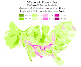
This one shows the change from 2004 to 2008: the greener the county, the more it moved toward the Democrats; the purpler the county, the more it moved toward the Republicans. You can clearly see here how nearly the whole country went more Democratic, except for a thin skein of counties corresponding, roughly, to the Upland South. And here's one that takes a longer view:
Even though the Democrat did much better in 2008 than in 1988, there's actually a pretty big chunk of the country where the Republicans have grown much stronger over the past 20 years - there's a lot of deep purple in rural areas of Appalachia, the South, and the Great Plains. But what the cartogram makes clear is just how small, in population terms, those areas are. And while Republicans are doing better in those rural areas, Democrats are doing much better in urban counties throughout the country - even in the big cities of conservative southern states, like Atlanta, Dallas, and Houston.
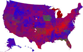
So that's a lot of information you can get out of these cartograms that you don't get out of those stodgy old blue-red maps. Still, the geographic distortion on these is really severe - it's to the point that you can't really tell which places are being represented ny which blobs of color. But so check this out, from Axis Maps. It's the best map I've seen of the 2008 election (click on it for a bigger image).
What they've done is very clever: they've used a regular spatial representation of the US, but indicated population density by simply shading more densely populated areas brighter. They use population density, rather than size, so as not to overstate the importance of very large counties, like San Bernardino in California, or whatever county Las Vegas is in. But the effect is still that areas are shaded brighter in proportion to their relative voting strength. It gives a good sense not just of the relative strength of Obama and McCain, but of where their strengths are based.
And one final variation:
This shows the same info as the map above, but rather than a simple red/blue color dighotomy, it uses intermediate shades to indicate strength of victory. I would say that this would be ideal - it shows strength of victory and population size without geographic distortion - except that I have trouble reading the shades of purple. It's just hard for me to tell intuitively how the shades relate to each other (I'm clearly no tetrachromat). Regardless, kudos to Axis Maps for putting these together.
Tuesday, January 27, 2009
Arctic Sea Ice
Speaking of Arctic sea ice, The Cryosphere Today has a nice map of sea ice extent, which they update daily. Today it looks like this:
It's a little less than a million sq. km. below average, about where it's been the last few winters.
Global Warming Melts the Arctic; Nations Lick Their Chops at Potential Oil Bonanza
Via Andrew Sullivan, this map animation from the Economist depicts the shrinking of the Arctic ice, and the brewing competition between the Arctic nations over the region's resources.
The six countries involved - Russia, Canada, the US, Norway, Iceland, and Denmark - are, apparently without irony, determined to lay claim to the oil and natural gas that is becoming increasingly accessible as a warming climate continues to erode the Arctic sea ice.
One of the horrors of addiction is that, as the addictive substance becomes less and less satisfying, and its negative effects mount over time, it becomes even more necessary to consume more of the substance to provide escape from the greater and greater suffering the substance is causing.
Mapping Cuts in Mass Transit
Via Matt Yglesias, Transportation for America has put together an interactive map showing the cities around the country where the recession has caused cutbacks in service that aren't addressed in the stimulus bill as it's currently constituted. This is stuff that could easily be funded, would stimulate the economy right now, and would disproportionately benefit the economically hardest-hit. In short, there's no reason these things shouldn't be covered by the stimulus.
Monday, January 26, 2009
Place of the Week: Kalmykia
For the first installment of what may or may not become a regular weekly feature of this blog focusing on some odd or surprising corner of the world, I present to you: The Republic of Kalmykia.
Status: Semi-autonomous constituent republic of the Russian Federation
Area: 76,150 sq. km.
Population: 292,410
Languages: Kalmyk, Russian
Religions: Buddhism, Christianity
Autocratic Leader's Eccentric Foible: an exorbitant interest in chess
Kalmykia came to my attention when, looking at a map of world religions one day, I noticed a seemingly misplaced smudge of color in a remote corner of Europe signifying the predominance of Buddhism. Turns out it's quite true: Buddhism is the religion of the Kalmyks, who are a branch of the Oirats, a nomadic shepherding people from the Mongolian steppe. The Kalmyks broke off from the Oirats in the 17th Century, migrating to a fertile grasslands region on the northwest coast of the Caspian Sea.
Though there has been some historical tension between the various Oirat peoples and the Mongols, they share many characteristics, including a similar appearance, language, and culture, as well as an adherence to Tibetan Buddhism. As with most ethnic groups that lived in the Soviet Union, the Kalmyks had to put up with state efforts to quash religious practice. Things have mellowed a bit since the fall of the Soviet Union, though, at least on the religious persecution front; in 2005 the Burkhan Bakshin Altan Sume opened as the largest Buddhist temple in Europe.
The republic is led by Kirsan Ilyumzhinov. According to the BBC:
Ilyumzhinov has been president of FIDE, the International Chess Organization, since 1995. His intention to build an enormous "Chess City" in Kalmykia has engendered protests among the local population, who are among the poorest people in Europe.
According to the BBC, Reporters Without Borders has described the Kalmyk authorities as "among the most repressive towards the media in the entire Russian Federation".
Status: Semi-autonomous constituent republic of the Russian Federation
Area: 76,150 sq. km.
Population: 292,410
Languages: Kalmyk, Russian
Religions: Buddhism, Christianity
Autocratic Leader's Eccentric Foible: an exorbitant interest in chess
Kalmykia came to my attention when, looking at a map of world religions one day, I noticed a seemingly misplaced smudge of color in a remote corner of Europe signifying the predominance of Buddhism. Turns out it's quite true: Buddhism is the religion of the Kalmyks, who are a branch of the Oirats, a nomadic shepherding people from the Mongolian steppe. The Kalmyks broke off from the Oirats in the 17th Century, migrating to a fertile grasslands region on the northwest coast of the Caspian Sea.
Though there has been some historical tension between the various Oirat peoples and the Mongols, they share many characteristics, including a similar appearance, language, and culture, as well as an adherence to Tibetan Buddhism. As with most ethnic groups that lived in the Soviet Union, the Kalmyks had to put up with state efforts to quash religious practice. Things have mellowed a bit since the fall of the Soviet Union, though, at least on the religious persecution front; in 2005 the Burkhan Bakshin Altan Sume opened as the largest Buddhist temple in Europe.
The republic is led by Kirsan Ilyumzhinov. According to the BBC:
A Buddhist millionaire businessman, Kirsan Ilyumzhinov acquired his wealth in the economic free-for-all which followed the collapse of the USSR.
At the age of just over 30, he was elected president in 1993 after promising voters $100 each and a mobile phone for every shepherd. He also pledged to introduce what he called an "economic dictatorship" in the republic.
Soon after his election, Mr Ilyumzhinov introduced presidential rule, concentrating power in his own hands.
He called early elections in 1995 and was re-elected unopposed - this time for a seven-year term. He won re-election in 2002
Ilyumzhinov has been president of FIDE, the International Chess Organization, since 1995. His intention to build an enormous "Chess City" in Kalmykia has engendered protests among the local population, who are among the poorest people in Europe.
According to the BBC, Reporters Without Borders has described the Kalmyk authorities as "among the most repressive towards the media in the entire Russian Federation".
Tibetan Wheel of Life
And one more from the LOC. This one stretches the definition of 'map' a bit, but it's so beautiful, and just so freakin cool:
It's a 20th Century painting of the Tibetan Wheel of Life. From the Library's description:
Is this a map? I'm going to say it is. I'm going to say it's a sort of metaphysical map - a representation of metaphysical relations, rather than physical space. And its purpose is the same as that of a physical map: to render, through symbolic representation, a picture of the enmeshing environment within which we find ourselves from a broader perspective than any we could attain through direct sensual perception alone.
It's a 20th Century painting of the Tibetan Wheel of Life. From the Library's description:
In the Tibetan Buddhist world view, the six realms of existence (Gods, demigods, humans, animals, hungry ghosts, and hell-beings) are all held in the grasp of the Lord of Death. In the center of the wheel are the three root poisons of desire, hatred, and ignorance symbolized by the cock, snake, and pig, and on the outer rim are the twelve links of dependent origination by which all causes and effects are determined. The ultimate goal, shown by the monks in the left inner circle and the Buddha in the upper right, is to follow a path that frees one from these cycles.
Is this a map? I'm going to say it is. I'm going to say it's a sort of metaphysical map - a representation of metaphysical relations, rather than physical space. And its purpose is the same as that of a physical map: to render, through symbolic representation, a picture of the enmeshing environment within which we find ourselves from a broader perspective than any we could attain through direct sensual perception alone.
Buddhist Geography
Here's another one from the Library of Congress. This is a 19th Century Burmese Buddhist depiction of the universe.
Interestingly, it shows the world as being constituted by the same sort of concentric ring-shaped continents and oceans as the Jain world map. But see those fish and turtles and other creatures around the terrestrial rings? Those represent a cosmic ocean, an element not present in the Jain depiction (though the Jains had some very particular opinions about the structure of the cosmos, to be sure).
It makes sense that there'd be some commonality between the geographies of the two religions, as many of the ideas of Buddhism derive from the same Indian metaphysical milieu. For instance, Buddhists also believed Mount Meru to be the center of the world, and as the axis at which the four major continents met. (By the way: yes, I am equivocating like crazy when I talk about "Buddhists" believing this or that; there are a bunch of major branches of the religion, some of which have been around for thousands of years, so it's not possible to speak of any one definitive Buddhist view of the world. But mostly I'm talking about early Buddhism, when it was still based primarily in India.)
But so anyway, here, from Wikipedia, is a description of the Buddhist view of Manusyaloka, "the world of humans and human-like beings who live on the surface of the earth":
As in the Jain worldview, Jambudvipa is to the south of Mount Meru (or Sumeru) and is the home of regular old folks like us (or like Indians, at any rate). It's tough to tell from the map above which, if any, of the outer continents depicted are meant to be Jambudvipa. Here are the descriptions of the four continents, at any rate; draw your own conclusions about the map above.
Bear in mind, though, that for all its specificity, this geography and cosmology is not meant as a literal description of the world as it appears to humans; rather, it was likey meant as a description of the way it appears to the "divine eye" through which a Buddha might perceive it. Or perhaps it was simply an allegorical description of the nature of the universe. Regardless, the Buddhist and Jain cosmologies are striking for the incredible scale on which their portrait of the universe is painted - and believe me, there are worlds upon worlds in those cosmologies beyond what I've briefly sketched here. The universe is much vaster and more incomprehensible in these accounts than it is in anything the West ever produced.
Until the 20th Century. See, that's the thing: with their fantastical descriptions and supererogatory scales of time and space, they've actually come much closer to the findings of modern science than anything in the Western tradition. That's not to say that they nailed it in every respect - they didn't foresee the organization of matter in the universe in the form of galaxies and galaxy clusters, for instance. But on this one profoundly significant fact, the ancient Indian cosmologies and modern astronomy agree: a human life is, by the temporal and spatial measure of the universe, a very, very small thing.
Interestingly, it shows the world as being constituted by the same sort of concentric ring-shaped continents and oceans as the Jain world map. But see those fish and turtles and other creatures around the terrestrial rings? Those represent a cosmic ocean, an element not present in the Jain depiction (though the Jains had some very particular opinions about the structure of the cosmos, to be sure).
It makes sense that there'd be some commonality between the geographies of the two religions, as many of the ideas of Buddhism derive from the same Indian metaphysical milieu. For instance, Buddhists also believed Mount Meru to be the center of the world, and as the axis at which the four major continents met. (By the way: yes, I am equivocating like crazy when I talk about "Buddhists" believing this or that; there are a bunch of major branches of the religion, some of which have been around for thousands of years, so it's not possible to speak of any one definitive Buddhist view of the world. But mostly I'm talking about early Buddhism, when it was still based primarily in India.)
But so anyway, here, from Wikipedia, is a description of the Buddhist view of Manusyaloka, "the world of humans and human-like beings who live on the surface of the earth":
The mountain-rings that engird Sumeru are surrounded by a vast ocean, which fills most of the world. The ocean is in turn surrounded by a circular mountain wall called Cakravāḍa (Pāli: Cakkavāḷa) which marks the horizontal limit of the world. In this ocean there are four continents which are, relatively speaking, small islands in it. Because of the immenseness of the ocean, they cannot be reached from each other by ordinary sailing vessels, although in the past, when the cakravartin kings ruled, communication between the continents was possible by means of the treasure called the cakraratna (Pāli cakkaratana), which a cakravartin and his retinue could use to fly through the air between the continents.
As in the Jain worldview, Jambudvipa is to the south of Mount Meru (or Sumeru) and is the home of regular old folks like us (or like Indians, at any rate). It's tough to tell from the map above which, if any, of the outer continents depicted are meant to be Jambudvipa. Here are the descriptions of the four continents, at any rate; draw your own conclusions about the map above.
o Jambudvīpa or Jambudīpa is located in the south and is the dwelling of ordinary human beings. It is said to be shaped "like a cart", or rather a blunt-nosed triangle with the point facing south. (This description probably echoes the shape of the coastline of southern India.) It is 10,000 yojanas in extent (Vibhajyavāda tradition) or has a perimeter of 6,000 yojanas (Sarvāstivāda tradition) to which can be added the southern coast of only 3 1⁄2 yojanas' length. The continent takes its name from a giant Jambu tree (Syzygium cumini), 100 yojanas tall, which grows in the middle of the continent. Every continent has one of these giant trees. All Buddhas appear in Jambudvīpa. The people here are five to six feet tall and their length of life varies between 80,000 and 10 years.
o Pūrvavideha or Pubbavideha is located in the east, and is shaped like a semicircle with the flat side pointing westward (i.e., towards Sumeru). It is 7,000 yojanas in extent (Vibhajyavāda tradition) or has a perimeter of 6,350 yojanas of which the flat side is 2,000 yojanas long (Sarvāstivāda tradition). Its tree is the acacia. The people here are about 12 feet (3.7 m) tall and they live for 250 years.
o Aparagodānīya or Aparagoyāna is located in the west, and is shaped like a circle with a circumference of about 7,500 yojanas (Sarvāstivāda tradition). The tree of this continent is a giant Kadamba tree. The human inhabitants of this continent do not live in houses but sleep on the ground. They are about 24 feet (7.3 m) tall and they live for 500 years.
o Uttarakuru is located in the north, and is shaped like a square. It has a perimter of 8,000 yojanas, being 2,000 yojanas on each side. This continent's tree is called a kalpavṛkṣa (Pāli: kapparukkha) or kalpa-tree, because it lasts for the entire kalpa. The inhabitants of Uttarakuru are said to be extraordinarily wealthy. They do not need to labor for a living, as their food grows by itself, and they have no private property. They have cities built in the air. They are about 48 feet (15 m) tall and live for 1,000 years, and they are under the protection of Vaiśravaṇa.
Bear in mind, though, that for all its specificity, this geography and cosmology is not meant as a literal description of the world as it appears to humans; rather, it was likey meant as a description of the way it appears to the "divine eye" through which a Buddha might perceive it. Or perhaps it was simply an allegorical description of the nature of the universe. Regardless, the Buddhist and Jain cosmologies are striking for the incredible scale on which their portrait of the universe is painted - and believe me, there are worlds upon worlds in those cosmologies beyond what I've briefly sketched here. The universe is much vaster and more incomprehensible in these accounts than it is in anything the West ever produced.
Until the 20th Century. See, that's the thing: with their fantastical descriptions and supererogatory scales of time and space, they've actually come much closer to the findings of modern science than anything in the Western tradition. That's not to say that they nailed it in every respect - they didn't foresee the organization of matter in the universe in the form of galaxies and galaxy clusters, for instance. But on this one profoundly significant fact, the ancient Indian cosmologies and modern astronomy agree: a human life is, by the temporal and spatial measure of the universe, a very, very small thing.
Sunday, January 25, 2009
Jain Geography
Here's something completely different:
It's a Jaina portrayal of the world, from an exhibit at the Library of Congress. According to the exhibit's website
Indeed, that Jain cosmology and geography they speak of is a trip. Sez Wikipedia, the early Jains divided the universe into three parts: the heavens or realms of the gods (Urdhva Loka), the realms of the humans (Madhya Loka), and the realms of the hellish beings (Adho Loka). So the image above is a depiction of Madhya Loka, the realms of the humans.
Madhya Loka consists of at least eight continent-islands, arranged concentrically, each of which is surrounded by an ocean (typically with some sort of succulent name, like "Sugar Ocean" or "Ocean of Milk"); you can see those continent-rings clearly on this map (though why only two?). Humans live on Jambudvipa, the island at the center of the world; and at the center of Jambudvipa is Mount Meru, the highest point and center of the world. (According to trusty ol' Wikipedia, the quasi-mythical Mount Meru corresponds to the real world's Nagard Sarovar, in the middle of the Pamir Mountains.) At the summit of Mount Meru is Brahmapuri, the great city of Brahma, the god of creation.
From carbon dioxide emissions to eastern cosmology without so much as a segue. You see? You see why maps are so fun?
It's a Jaina portrayal of the world, from an exhibit at the Library of Congress. According to the exhibit's website
Jainism has its own version of geography and cosmology. This chart from the nineteenth century shows the world of human habitation as a central continent with mountain ranges and rivers, surrounded by a series of concentric oceans (with swimmers and fish) and ring-shaped continents.
Indeed, that Jain cosmology and geography they speak of is a trip. Sez Wikipedia, the early Jains divided the universe into three parts: the heavens or realms of the gods (Urdhva Loka), the realms of the humans (Madhya Loka), and the realms of the hellish beings (Adho Loka). So the image above is a depiction of Madhya Loka, the realms of the humans.
Madhya Loka consists of at least eight continent-islands, arranged concentrically, each of which is surrounded by an ocean (typically with some sort of succulent name, like "Sugar Ocean" or "Ocean of Milk"); you can see those continent-rings clearly on this map (though why only two?). Humans live on Jambudvipa, the island at the center of the world; and at the center of Jambudvipa is Mount Meru, the highest point and center of the world. (According to trusty ol' Wikipedia, the quasi-mythical Mount Meru corresponds to the real world's Nagard Sarovar, in the middle of the Pamir Mountains.) At the summit of Mount Meru is Brahmapuri, the great city of Brahma, the god of creation.
From carbon dioxide emissions to eastern cosmology without so much as a segue. You see? You see why maps are so fun?
Saturday, January 24, 2009
CO2
An incredible map animation of carbon dioxide emissions in the United States:
The Purdue U. researchers who put this together are also working to recapitulate the effort on a global scale with something they call the Hestia Project. Should be even more fascinating.
Meanwhile, in other CO2-related news, Western forests are dying at an increasing rate:
The West is a brittle environment to begin with. And this sort of thing has the potential to catalyze some nasty feedback loops:
Frightening. And we're still waiting for the first wisp of evidence that humanity is remotely capable of dealing with this issue...
UPDATE: Paul Rosenberg has more on the Western forests.
The Purdue U. researchers who put this together are also working to recapitulate the effort on a global scale with something they call the Hestia Project. Should be even more fascinating.
Meanwhile, in other CO2-related news, Western forests are dying at an increasing rate:
Jan 23rd, 2009 | GRANTS PASS, Ore. -- Trees in old growth forests across the West are dying at a small, but increasing rate that scientists conclude is probably caused by longer and hotter summers from a changing climate.
While not noticeable to someone walking through the forests, the death rate is doubling every 17 to 29 years, according to a 52-year study published in the Friday edition of the journal Science. The trend was apparent in trees of all ages, species, and locations.
"If current trends continue, forests will become sparser over time," said lead author Phillip J. van Mantgem of the U.S. Geological Survey's Western Ecological Research Center.
The West is a brittle environment to begin with. And this sort of thing has the potential to catalyze some nasty feedback loops:
These thinner and weaker forests will become more vulnerable to wildfires and may soak up less carbon dioxide, in turn speeding up global warming, they said...
Warmer temperatures may be encouraging pine beetles and other organisms that attack trees, the researchers said. That, along with the stress of prolonged droughts, may be accelerating death rates.
Frightening. And we're still waiting for the first wisp of evidence that humanity is remotely capable of dealing with this issue...
UPDATE: Paul Rosenberg has more on the Western forests.
Friday, January 23, 2009
The 2008 Election and Southern Whites
Two maps:
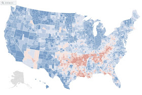
This one shows how Obama and Clinton did in the primaries. The redder the county, the better Clinton did; the bluer the county, the better Obama did. (Ignore Michigan and Florida; they didn't have real primaries.) You can see Clinton had an obvious region of strength from her home state of NY, down the spine of the Appalachians and through the Ozark states. This region is also known as the Upland South, or Appalachia.
And this one shows the voting shifts from 2004 to 2008. Bluer areas shifted towards the Democrats; redder areas shifted towrds the Republicans.
Notice anything about these two maps? There sure seems to be a strong correlation between the red areas in both of them, huh? In other words, it sure looks like Obama was unpopular in Appalachia. Indeed, that was a common theme in political commentary, during the primaries and right through the aftermath of the general election.
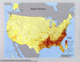
This analysis was wrong, though. It's true Obama underperformed in Appalachia. But another way to characterize Appalachia is as the area of the South which has few blacks. Now consider this map:
It shows the percentage of blacks in every county. And as you can see, they're concentrated in much of the south - much of the south outside Appalachia, that is. Of course, Obama did really well among blacks, boosting both the Democratic percentage of their vote and raising turnout among that demographic. So he actually did comparatively well in parts of the south with large black populations. In the remainder of the south - not so much.
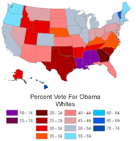
But what the conventional wisdom sometimes missed was that Obama did just as poorly among southern whites in areas with lots of blacks, if not more so. A final map, from dreaminonempty, to drive the point home:
Obama's worst states among whites were Louisiana, Mississippi, Alabama, and Georgia (all of which, along with South Carolina, went for Goldwater in 1964, incidentally: the only states besides Goldwater's home state of Arizona to do so). He did slightly better in those states overall, though, thanks to his huge margins among blacks. So Obama didn't have an "Appalachia problem," as some have alleged. He had a southern whites problem. (Though the better way to say it, probably, is that Southern whites had an Obama problem.)
Of course, not every region in the south was so hostile. He actually won Virginia and North Carolina, for instance. These are all areas where the New South has taken hold - areas which are more urbane, cosmopolitan, wealthier and more educated. He didn't win whites in these states, but he did do better among them than he did in the more rural and economically stagnant areas of the south.
It's fair to say that race has something to do with this pattern. But obviously, despite this obstacle (which was limited mostly just to the South), Obama won anyway. And this is progress. What will be interesting to see is what the results will be in 2012. Obama may or may not win, but here's a bet: those areas of the south will not diverge from the rest of the country as much as they did in 2008. They're among the most conservative parts of the US, of course, and I don't expect that to change. But I don't think they'll be quite so divergent. I think four years of an African American president will have an effect in these areas; I think whites will get used to the idea. And in so doing, the country may actually be able to make even more racial progress than was made in electing the first black president in the first place.
Thursday, January 22, 2009
Patchwork Nation
Here is another attempt at slicing and dicing the US in order to paint a telling portrait of the political geography of the nation. This is by Dante Chinni at the Christian Science Monitor:
Rather than grouping more or less contiguous regions together, as Robert David does, Chinni defines 11 types of American community, and assigns each county to one of these types. They are:
1) Boom Towns (brown): these are economically thriving and growing communities, home to 38.5 million people.
2) College and Careers (green): college towns, the 13 million residents of which tend to be younger and more secular than the nation as a whole.
3) Emptying Nests (green-blue): these areas are older, whiter, and more evangelical Christian than the country as a whole; the 22 million people of these counties are concentrated in the Midwest and parts of the South.
4) Evangelical Epicenters (beige): concentrated in small towns and outer suburbs, especially in the South, and to a lesser extent in the West (largely thanks to the large Mormon population). Lots of young families boost the population of 27 million.
5) Immigration Nation (light blue): concentrated in the Southwest, these counties have large Hispanic populations (the average is 36%, but in many of these counties its much higher). 12 million people.
6) Industrial Metropolis (black): only 24 counties, but 38 million people, who tend to be young and diverse.
7) Military Bastions (purple): 5 million people live in these counties, the economies of which are oriented around the military. They tend to have high numbers of veterans and evangelicals.
8) Minority Central (orange): the majority of the 22 million people in these counties are actually white, but a disproportionately large number are African American (in the South and a few counties in the Midwest) or Native American (in a few pockets in the West). Tend to be poorer than the country as a whole
9) Monied 'Burbs (sort of flesh-colored): the most populous constituent of Patchwork Nation, with 84 million people and a median income above $55,000. They are clustered, obviously, around big cities.
10) Service Worker Centers (sort of ochre, I guess; some of these colors are tough): midsize and smaller towns with McDonalds-based economies. A bit older than average, and growing more Hispanic. 12 million people.
11) Tractor Country (geez, I don't know... fuchsia? Just look for Nebraska - it's that color): a ton of counties, but only 6 million people. White; mostly midwestern; rural.
This is an interesting effort. I might quibble on a few points. First, there are counties in Immigration Nation and Minority Central which are actually predominantly white, and where the culture and politics are dominated by the white populations; so I don't much see the purpose in assigning them to those categories. Also, how can Travis County, TX (Austin) not be a College and Careers county? And: "Minority Central"? We can't do better than that?
Also, I wonder if divorcing the notion of "political regions" from actual geographical contiguity isn't getting a bit too cute. I mean, why not break it down even further, to the level of towns or neighborhoods? (Of course, you have to stop somewhere, else you might end up with a map with 300,000,000 colored districts, each the size of one individual, a kind of Borgesian reductio ad absurdum of fine-grain analysis.) All in all, though, a useful map, I think, especially in conjunction with others that stick with the contiguity standard.
Here, by the way, is how the vote broke down by community type:
Wednesday, January 21, 2009
The 10 Political Regions of America
We've all seen the maps of red states and blue states that show areas of strength for the Republican and Democratic parties, respectively. But of course, state borders weren't drawn to delineate areas of common political beliefs: Chicago has more in common with New York City or LA than it does with the rural towns of southern Illinois, for instance. So states are not the most helpful unit for analyzing voters and the ways they vote.
Here's Robert David's attempt at providing a better description of the political geography of the US:
David divides the US into 10 regions, within each of which the demographics are broadly similar and the culture is generally consistent. These are:
1) The Northeast Corridor: the big cities of the east coast, from NYC to DC. Densely populated and diverse, the area is strongly Democratic.
2) Upper Coasts: includes the uber-liberal regions of New England and the West Coast, from San Francisco north. Though mostly white, these areas are among the most Democratic in the country.
3) Chippewa: the northern Great Lakes region, from upstate New York to Minnesota, and with an arm down into Iowa. The area leans Democratic, despite seriously low levels of melanin.
4) Mega-Chicago: Chicago broadly construed, let's say. Includes most of the majorly urban reas of the midwest. Usually somewhat Democrat-leaning, it outperformed for adopted son Obama.
5) Cumberland: a mix of Appalachia and midwestern farm-and-factory country, it's one of the older and whiter regions of the US. It's a fairly strong region for Republicans.
6) South Coast: stretching from the mid-Atlantic to central Florida, the region has a relatively high black population, as well as a number of 'New South' boomtowns. It's the only region to switch sides from 2004 to 2008, supporting Bush and then Obama.
7) Southern Inland: most of the interior South, from Missouri to Florida. It's one of the Republicans' strongest regions.
8) Comanche: this aggregation of areas in the Great Plains and along the Gulf Coast was McCain's best.
9) El Norte: an immigrant-heavy region with a heavily Hispanic population. Includes most of the population of the Southwest, plus Hawaii and south Florida. Obama won it by 18%, a big improvement on Kerry's 3% margin.
10) Frontier: tumbleweeds, etc. Includes, interestingly, a slice of northern New England. Leans Republican, though Democrats are getting more competitive in some of these areas (after dominating them back in the mid-twentieth century).
Here's how the vote broke down in the 2008 election:
Northeast Corridor: 65% Obama, D margin of 30 points, up from 21 points in 2004.
Upper Coasts: 65% Obama, D margin of 30 points, up from 22 points.
Mega-Chicago: 61% Obama, D margin of 22 points, up from 9 points.
El Norte: 59% Obama, D margin of 18 points, up from 3 points.
Chippewa: 55% Obama, D margin of 10 points, up from 3 points.
South Coast: 52% Obama, D margin of 4 points, reversal from a loss by 6 points.
Frontier: 53% McCain, R margin of 6 points, down from 18 points.
Cumberland: 55% McCain, R margin of 10 points, down from 20 points.
Southern Inland: 56% McCain, R margin of 12 points, down from 16 points.
Comanche: 60% McCain, R margin of 20 points, down from 27 points.
It's an interesting map, and a highly debatable one. To make just one observation: based on the election results of the past year, it seems that Appalachia or the Upland South - the region running through the hilly parts of Pennsylvania down through Geargia, then west through Arkansas and Oklahoma - ought to be regarded as a distinct and coherent political region. It was Clinton's strongest region against Obama, and then constituted most of the only area of the country where McCain outperformed Bush's 2004 vote percentages. Still, it's an interesting way of looking at the country, and thinking about the cultural foundations of voting behavior.
The Inauguration from Space
Via Marc Ambinder, this is the Mall in Washington during President Obama's inauguration.
All the brownish clumps up and down the Mall are crowds of people arrayed in front of the giant TV screens. (Something rather postmodern about 1.5 million people showing up in person to watch the inauguration, only to end up watching video of the event, which video largely focused on the event-as-spectacle - the newsworthy fact that all these people had shown up to watch the event "in person.")
Follow this link to see a huge, detailed version of this image.
Monday, January 19, 2009
Women in Government
In commemoration of the historical event that will be unfolding tomorrow in Washington, DC, it seems like a good time to take a look at some political maps. To start things off, here is a map showing the percentage of female representatives in state legislatures in the US:
There are some interesting patterns here. The West and New England jump out as having the highest rates of elected women. Of course, Wyoming was the first state to grant women the right to vote, followed by the other early-adopting states of Utah, Idaho, and Colorado, so the West has a long tradition of being at the forefront of women's participation in democratic government. Meanwhile, as a result of the 2008 elections, the New Hampshire State Senate is the first statewide legislative body in the US to have a female majority - 13 of its 24 members are women. At the other end of the spectrum, the South has generally low numbers of women in state legislators, and South Carolina has the lowest of all - the only state where fewer than 10% of representatives are women.
Globally, only 17% of parliamentary members are women - an improvement on the 10% registered in 1995, but obviously still far short of the 51% of the world's population who are women. Countries with the greatest equality in representative government include Sweden (46% women) and Spain (41%). Turkey, by contrast, has only one female representative, and Romania has none at all.
Here'a a world map showing women in government as a proportion of elected officials:
There aren't any countries where women form a majority of a governing body; in only 22 countries do they constitute even a quarter of all representatives. And, as in the case of so many social indicators, Scandinavia leads the way (though in this case, interestingly, so does southern Africa).
Yet More on Megaregions: Asia, This Time
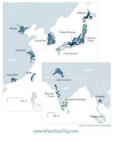
Here's more from the Florida, et al. paper (PDF) on megaregions. This shows the megaregions of Asia. They are:
1) Tokyo, with 55 million people and $2.5 trillion in economic output: the world's largest megaregion.
2) Osaka-Nagoya, to the south of Greater Tokyo on Japan's largest island of Honshu. It has 36 million people, and contributes another $1.4 trillion to the global economy.
3) Fuku-Kyushu straddles the three mjor Japanese islands of Honshu, Shikoku, and Kyushu, and is home to another 18.5 million people.
4) Sapporo, the last of Japan's four megaregions - and it's smallest - is Sapporo, which covers much of the northern island of Hokkaido. (Note that the authors of the paper observe that the boundaries between Japan's four regions are themselves beginning to blur, and that they may be in the process of becoming an integrated "super-megaregion.")
5) Seoul-Busan covers most of the nation of South Korea; it's population is 46 million.
6) Singapore, the city-state at the southern tip of the Malay Peninsula, is home to 6 million, a third of whom actually live across the border in Malaysia.
7) The megaregion around Bangkok has a population of 19 million, and an economic output of $100 billion.
8) The Hong-Zhen megaregion in Southeast China incorporates Hong Kong and the rapidly growing industrial cities of Guangdong province. It has a population of about 45 million.
9) Shanghai anchors a megaregion of 66 million people, though being entirely contained within an emerging economy, it produces only $130 billion in economic output (as of 2007).
10) Beijing anchors China's third megaregion, which is home to 43 million people. (The authors note that per capita economic output is fully 360% higher in these three megaregions thn it is in the rest of China.)
11) Delhi-Lahore is home to a whopping 121 million people: the largest megaregion by population in the world. (The authors also mention that Bangalore-Madras, with 72 million people, and Mumbai-Poona, with 62 million, are likely to become megaregions in the near future, though as yet they don't meet the criterion of having an economic output of at least $100 billion. Interestingly, the near-megaregions of India actually have a lower per cepita GDP than other areas in the country, in contrast to China's disproportionately wealthy megaregions.)
There are three further megaregions beyond those in North America, Europe and Asia. Mexico City, with a population of 45 million and an output of $290 billion, is the largest of these; Rio de Janeiro-Sau Paulo is home to 43 million; and the Middle Eastern conurbation formed by Tel Aviv, Israel, Amman, Jordan, and Beirut, Lebanon has a population of 31 million.
Together, the 40 megaregions of the world count for less than 18% of global population; yet they produce fully 2/3 of the world's economic activity. The authors make the compelling case that these megaregions - rather than cities or nations - provide the best level of economic and social analysis, and that this is the level at which economic development meaningfully occurs. In other words, the rise of the developing economies is not so much a story of the rise of China, India, Brazil, etc.; it's the story of the rise of Hong-Zhen, Delhi-Lahore, and Rio-Paulo. And it's the future of those megaregions which will define the future of the world.
UPDATE: And let's not forget Taipei: 21.8 million souls , all the way up and down the western side of the island of Taiwan.
Sunday, January 18, 2009
Ocean: An Illustrated Atlas
The New York Times discusses a new National Geographic publication, Ocean: An Illustrated Atlas. It's geared to general readers, and has got lots of maps, including the one above - a map of chlorophyll amounts in the world's oceans. (It's interesting how much ocean life tends to concentrate near the poles and the mouths of major rivers.)
Plus it's got lots of NatGeo-grade photography of guys like these:
Sea squirts. Cute, no?
Saturday, January 17, 2009
State Mottos: They're Bonkers
Via Cartophilia, here's the US with all of the states' mottos by artist Emily Wick:
It's a clever piece of work. But what strikes me most about it is how very strange most state mottos are. I mean, many of them are cryptic at best - at worst they sound like drunken mumblings, or deranged ejaculations. Consider Kansas' "To the stars through difficulties." It begins with an almost misplaced strength of ambition, and then sort of peters out into vaguery. And then there's Michigan's cheerfully literal "If you seek a pleasant peninsula, look about you." Why yes, Michigan - I've had it with subpar peninsulas; this is just what I was after! Meanwhile, you feel like whoever wrote North Dakota's "Liberty and Union Now and Forever One and Inseparable" went on about one clause too long.
Other favorites:
-New Mexico's "It grows as it goes" and Washington's cryptic "By and by" sound like they could have been penned by Gertrude Stein.
-North Carolina's ontologically befuddling "To be rather than to seem."
-Arkansas' "The People Rule!" And South Dakota's not-to-be-outdone response: "Under God, the People Rule!"
-Virginia's "Thus Always to Tyrants." A bit defeatist for a state motto, no?
-California's "Eureka!" sounds, frankly, a bit unhinged.
-Maryland really needs to account for its "Manly Deeds, Womanly Words." What exactly are they getting at, anyway?
-And last but not least, Maine's "I Direct." I have absolutely no idea what is meant here, but I prefer to believe it's an expression of Maine's insecurity. Having been born as a mere spin-off of Massachusetts - the "Joanie Loves Chachi" (no relation, by the way) to MA's "Happy Days." Maybe this "I Direct" is a sort of over-compensatory jab at the rest of the states, born of Napoleonic-type grievance.
Or maybe everyone from Maine is just insane.
Friday, January 16, 2009
More on Megaregions: Europe
The megaregions of Europe, from The Rise of the Mega Region (PDF), a paper by Richard Florida, Tim Gulden, and Charlotta Mellander.
Accoring to the authors:
Europe’s largest mega-region is the enormous economic composite spanning Amsterdam-Rotterdam, Ruhr-Cologne, Brussels-Antwerp, and Lille. Housing 59.2 million people and producing nearly $1.5 trillion in economic output, this megaregion’s production exceeds Canada’s and as well as China’s or Italy’s. Next in size is the British mega-region stretching from London through Leeds, Manchester, Liverpool and into Birmingham. This mega-region is home to 50 million people and responsible for $1.2 trillion in economic output. The Italian mega-region stretching from Milan through Rome to Turin is a leading center for fashion and industrial design. 48 million people produce some $1 trillion in output, making it the 3rd largest economic conglomerate in Europe and the 7th largest in the world. In Germany, the mega-region encompassing Stuttgart, Frankfurt, and Mannheim is home to 23 million people. To the west is Greater Paris, a mega-region of 14.7 million people accountable for $380 billion in LRP. The bi-national Euro-Sunbelt mega-region (rank 11), which stretches from Barcelona into Marseille and then Lyon, claims some 25 million people who produce $610 billion in LRP. Vienna-pest ($180 billion in LRP), Prague ($150 billion LRP), Lisbon ($110 LRP), Scotland’s Glas-burgh ($110 LRP), Madrid ($100 billion LRP) and Berlin ($100 billion LRP) round out the list of Europe’s mega-regions.
They make the interesting observation that though the European megaregions are comparable in size to those in North America, they are anchored by urban cores that actually tend to be smaller (with the exceptions of Paris and London). So the megaregional designation seems especially pertinent to the conurbations of Europe.
Can I just say, though, that compared to "Cascadia" and the "Texas Triangle," some of these megaregions' names are a bit lacking? I mean, "Am-Brus-Twerp" sounds like some exotic sort of polyp. How's about we change that to "Teutonia," or "The Land of the Very Tall Industrialists" or something? The strikingly uninspired "Lon-Leed-Chester" could be changed to "Teatown." "Rome-Milan-Turin" would sound much better if it were called "Berlusconi's Funland" (or alternately, "Italy"). And while we're at it, why don't we just go ahead and change Berlin's name to "Jelly Doughnut."
Social Cohesion in the UK
Here's another map on the social health of England:
Mark Easton gives a description of the map:
As with the anomie map, I'd be interested to see a version of this for the US. In both the UK and the US, my educated guess - and it's not more than that - is that you'd see better reported relations between races in areas that either have very low minority populations, or a very high degree of diversity. In the former sorts of places, minority groups aren't sufficiently prominent to pose a threat to the local majority group. In the latter sorts of places, there may be no majority group (as is the case where I live), and so members of diverse groups are pretty much forced to live and work together (and are liable to find that the world does not come crashing down upon doing so). In between, however, are communities where a majority of the population has historically been empowered (whites, in England), but where a significant minority population seems to represent a threat to their erstwhile hegemonic control.
Of course, tons of other factors, especially historical and economic ones, contribute to the nature of race relations. (I'm sure you'd find different attitudes on race in Vermont compared with southern Appalachia, even though both regions are almost entirely white.) But it would be very interesting to compare this cohesion map with a map of ethnic population by county in the UK. (I've been looking - I can't find one, but I'll post if I do.)
Mark Easton gives a description of the map:
The map colours range between bright green (where 100% of the population think that "people from different backgrounds get on well") to bright red (where 40% or fewer believe the same). Broadly, green means good race relations while brown/red suggests tension.
As with the anomie map, I'd be interested to see a version of this for the US. In both the UK and the US, my educated guess - and it's not more than that - is that you'd see better reported relations between races in areas that either have very low minority populations, or a very high degree of diversity. In the former sorts of places, minority groups aren't sufficiently prominent to pose a threat to the local majority group. In the latter sorts of places, there may be no majority group (as is the case where I live), and so members of diverse groups are pretty much forced to live and work together (and are liable to find that the world does not come crashing down upon doing so). In between, however, are communities where a majority of the population has historically been empowered (whites, in England), but where a significant minority population seems to represent a threat to their erstwhile hegemonic control.
Of course, tons of other factors, especially historical and economic ones, contribute to the nature of race relations. (I'm sure you'd find different attitudes on race in Vermont compared with southern Appalachia, even though both regions are almost entirely white.) But it would be very interesting to compare this cohesion map with a map of ethnic population by county in the UK. (I've been looking - I can't find one, but I'll post if I do.)
Thursday, January 15, 2009
Megaregions: The Emerging Map of Urban America
Here's a map that's pertinent to the earlier post on high-speed rail. The America 2050 organization is some kind of non-profit/think tank that deals in planning for future growth in the US, and they've put together this map of what the US will look like in 2050, entitled "The Emerging Megaregions." Essentially, they foresee the swelling megalopolises in several different areas of the country merging with each other to form giant conurbations. They define them thus:
As metropolitan regions continued to expand throughout the second half of the 20th century their boundaries began to blur, creating a new scale of geography now known as the megaregion. Interlocking economic systems, shared natural resources and ecosystems, and common transportation systems link these population centers together...
Most of the nation's rapid population growth, and an even larger share of its economic expansion, is expected to occur in 10 or more emerging megaregions: large networks of metropolitan regions, each megaregion covering thousands of square miles and located in every part of the country.
The 11 megaregions as defined by America 2050 are:
1. Northeast. Also known as Bosnywash, after three of the main nodes along its spine, or the Northeast Corridor, this is the most fully developed megaregion. It already had 50,000,000 residents in 2000, and contributed a fifth of the national GDP.
2. Great Lakes. Less cohesive than the Northeast, perhaps, but absolutely sprawling in size, the Great Lakes megaregion encompasses the whole area from Milwaukee to Buffalo, and from St. Louis to Detroit (and possibly Toronto, though that's vague). It actually has a larger population than the Northeast - 53,000,000 in 2000, and expected to gain another 9,000,000 by 2025, though it will be doing so in the face of the continuing erosion of the region's mainstay manufacturing sector.
3. Piedmont Atlantic. Stretches from Birmingham, AL through Atlanta to North Carolina's Reseach Triangle. It's one of the boomingest regions in the country, and will grow by 38% - to 20,000,000 - by 2025.
4. Florida. Basically the whole state, less the panhandle. I wish I could report that Florida is expected to evolve into a dystopian hellscape, populated by McCarthian (as in Cormac) gangs of countryside-terrorizing cannibals, even as the seas rush up to sweep away whatever pathetic fragments of civiliztion might have been spared from total collapse. However, America 2050 seems to think Florida will in fact be a bustling, diverse, and growing region of more thn 20,000,000 souls, anchored by the international city of Miami. We'll see who's right...
5. Gulf Coast. The coastal region of the Gulf of Mexico, from the Florida panhandle all the way to Brownsville, including New Orlans and Houston. Will have a population of 16,000,000 by 2025, constituting 4% of the nation's growth and economic output. (Frankly, though, I'm not sure if I quite buy this as a megaregion. It includes vast areas of sparsely populated land, in the bayous of Louisiana and the cattle country of south Texas. Plus, note that Houston is also counted as part of the Texas Triangle (q. v. #6 below), which seems like cheating.)
6. Texas Triangle. The eponymous geometrical figure is formed by Houston, Dallas-Fort Worth, and San Antonio, with Austin in there as well. A2050 says that "by 2050 about 35 million people, or 70 percent of the population of Texas, will live in the four metropolitan areas that comprise the Texas Triangle" - the consequent of 45%+ population growth. Pretty amazing. The San Antonio-Austin-DFW spine is already sort of congealing into a Bosnywash-type melded conurbation. Meanwhile, Houston has one of the world's busiest ports, directly connecting the region with international markets.
7. Front Range. The string of cities along I-25, from Cheyenne, WY to Albuquerque, NM, anchored by Denver. It's the smallest of the megaregions - it will have just under 7,000,000 people by 2025 - but is growing as quickly as anywhere in the country.
8. Arizona Sun Corridor. Phoenix and Tucson and points in between. It's growing at a phenomenal rate - 62% - and will have over 7,000,000 people in 2025. The ASC, Front Range, and Cascadia could have an interesting debate over Best Scenery.
9. Southern California. LA. Hollywood. The Valley. San Diego. Cities of hundreds of thousands of people you've never even heard of (Oxnard?!). Southern California: 28,000,000 people by 2025, asshole drivers every one.
10. Northern California. This includes the Bay Area, of course, as well as Sacramento, Tahoe/Reno, and much of the Central Valley of California. It'll be home to 17,000,000 by 2025. (I've also heard S. Calif and N. Calif referred to as the single megaregion of "San-San": San Diego to San Francisco, though it's really more like Tijuana to Santa Rosa.)
11. Cascadia. The Pacific Northwest Coast, from Vancouver, BC to Eugene, Oregon, including Seattle and Portland. Known for its musical heyday 15 years ago, its disastrously albinic population, and Bill Gates. A.k.a. "Ecopolis." Will have more than 10,000,000 caffeine-addled residents in 2025.
Whew. That was quite the tour. Now let me just say, in terms of sustainable development and urban growth, that the emergence of these megaregions needn't be a disaster - but that there's a better way and a worse way for growth to occur. You can well imagine these areas serving as the regional foci for a national high-speed rail system, as described in the post below. They would be well-suited for such a rail plan: imagine commuters shuttling from Portland to Seattle, or Raleigh to Atlanta, every day on 200-mph Supertrains. That would be great for quality of life, great for economic growth, and great for the environment. On the other hand, simply filling in the spaces between cities with mile after endless mile of sprawling, identityless suburbia will be terrible for quality of life (imagine the traffic and the pollution), and might well mean - literally - the collapse of the global environment. It's strange to say that these are the stakes of something as seemingly arcane as megaregional urban planning, but there you are. This is the world we live in.
High-Speed Rail and the Economic Stimulus
Well, the US House's economic stimulus plan is out. I was hoping for a big investment in mass transit and rail to finally get the US moving towards something resembling a modern, balanced transportation infrastructure. So what does the plan offer?
· $30 billion for highway construction;
· $10 billion for transit and rail to reduce traffic congestion and gas consumption.
Not great. And only $1.1 billion of that transit/rail money is for new projects. Of course, we don't know yet where in particular those funds are going, but it's clearly not sufficient to move towards a comprehensive plan like this one:
This is the plan of Andy Kunz, an urban designer and director of New Urbanism.org. The map shows planned routes for high-speed rail, and it really is like a win-win-win-win-win proposition. Consider that such a plan would:
- reduce our reliance on foreign oil
- help curb global warming
- provide tons of jobs, especially in places like the industrial midwest, Florida, and California, which have been hurt so badly hurt by the housing crisis and recession
- promote the development of an industry in the US where the country has fallen far behind the EU and Asian economic powers
- help prepare us for the era of peak oil.
There are, though, a couple of things I would change about this plan. First, I don't know that a Denver-Salt Lake City-San Francisco route makes a lot of sense. Those are some vast distances with really low population densities; I would substitute a regional line for the Colorado piedmont running from, say, Fort Collins down to Pueblo, and maybe even extending it down to El Paso. I would keep the southern route but I'd run it from San Antonio through El Paso. And I'd connect Houston to Austin.
Unfortunately, you get the sense that the US has sort of reached this point of inertia where we just can't make these sort of major investments to reshape our country anymore. It seems that our institutions have just become too ossified, our economic interests have become too established and enmeshed with the political power structure, and the public has become at once complacent and despairing - not liking the way things are, but also not caring enough to change them, or not feeling like they could change. In other words, it feels like we've entered a period of national decline in which these sorts of plans are untenable.
This could all change, of course. The malaise of the last couple of decades may prove to be a cyclical phenomenon. Maybe things will change again. Maybe the US will become a global leader at something other than financial trickery once more. But if it's going to happen, this $1 trillion economic stimulus - a once-in-a-generation opportunity to re-orient our priorities - would be an excellent place to start. And so far, the indications that we are going to do so are mixed, at best.
UPDATE: By the way, if you're wondering what a rising power investing in the future looks like:
In an amazing move towards converting their entire country towards sustainability, China is underway rebuilding its entire transportation system from the ground up. They now realize that cars and oil have no future. China is building an amazing 5,000 miles of brand new high speed trains comparable to the French TGV (200+ mph), all of which will be open for business in just 2 short years! In addition, China is building 36 brand new, full size metro systems - each to cover an entire city. The new Shanghai metro system will be the largest in the world when complete - larger than London's extensive system. China's massive, fast track green transportation construction project is unprecedented in the history of the world, and will completely transform China towards sustainability by drastically reducing their need for oil and cars.
Wednesday, January 14, 2009
Human Footprint: Africa
Here's another human footprint map. This one's of Africa:
The level of detail on this National Geographic map is really astonishing. It's actually quite beautiful, but it elicits - in me, at least - a certain degree of despair.
Tuesday, January 13, 2009
What Bush Hath Wrought
The Atlantic has published a graphic illustrating some of the changes that have taken place in the US over the course of the Bush regime - everything from population to per capita hours of video games played to the street price of cocaine. Granted, correlation is not causation, and it's hardly as if Bush is solely responsible for everything that's gone on in the US in the last 8 years. But one thing that does jump out from these graphics is that the US is a considerably more militarized society than it was before Bush took office.
Draw your own conclusions.
(Here's the link to the full map.)
Mapping Our Oil Addiction
The Rocky Mountain Institute has produced an oil map webtool that lets you see how oil imports to the US have evolved since 1973.
You can also track the amounts spent on oil imports over time, and the dollar amounts of oil being imported from individual countries.
One thing this tool makes abundantly clear is how different the last few years' run-up in oil prices was. Prices spiked during the first and second oil crises - ca. 1973 and 1979, respectively. But in both cases, the price surge was a direct result of a decrease in supply. The last few years, however, saw prices spike higher than they'd ever been, even though supply remained roughly constant. How could this be?
Some blame speculation in the oil markets. But if this was the case, supplier countries ought to have responded to the surging prices by increasing exports - something they failed to do until prices got really astronomical last summer.
I think a more likely explanation is that the past few years have seen global demand butting up against the geological limitations on global supply. This is more commonly known as the phenomenon of peak oil. Supply limitations are the only way to countenance flat exports in the face of soaring prices.
Of course, prices collapsed last year after two things happened: OPEC finally increased production a smidge, and (more importantly) the global economy took a long walk on a short pier, causing demand to crash. So the pressure on global oil supplies has eased - for now. We'll have to see what happens when the economic picture gets rosier again. If oil prices again quickly begin to spike, we'll have a good indication that the era of peak oil has arrived.