Showing posts with label europe. Show all posts

Sunday, August 8, 2010

Russia's Portentous Summer

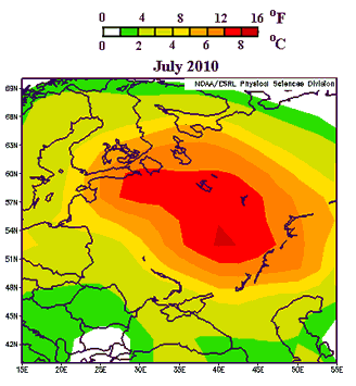
Jeff Masters says, "one of the most remarkable weather events of my lifetime is unfolding this summer in Russia" where the current heat wave is pretty much entirely off the historical charts. For comparison, the 2003 heat wave across Western Europe killed more than 40,000 people - and the present heat wave in Russia is far more extreme than that:


Says Masters:
The past 25 days in a row have exceeded 30°C (86°F) in Moscow, and there is no relief in sight--the latest forecast for Moscow calls for high temperatures near 100°F (37.8°C) for the majority of the coming week. As I reported in yesterday's post, the number of deaths in Moscow in July 2010 was about 5,000 more than in July 2009, suggesting that the heat wave has been responsible for thousands of deaths in Moscow alone. I would expect that by the time the Great Russian Heat Wave of 2010 is over, the number of premature deaths caused by the heat wave will approach or exceed the 40,000 who died in the 2003 European Heat Wave. As seen in Figure 2, the Russian heat wave of this year is more intense and affects a wider region than the great 2003 heat wave, though the population affected by the two heat waves is probably similar.
Another commentator writes:
To put this in rough perspective -- and note this is not absolutely precise, it's purely ballpark to give you some feel for what the Russian people are enduring -- if this heat wave was hitting North America, it would be near 100°F in Fairbanks, Alaska. Most of Canada would be baking at 100° or higher, the northeast, from Maine to the Great Lakes region would be hitting upwards of 105° everyday, even the nightly low in the massive urban heat islands of New York and Chicago would be over 90°! The midwest grain belt and parts of the Pacific Northwest would not see a drop of rain for two months and pushing as high as 110° in places. The desert southwest, even some of the higher elevations of Nevada, Arizona, New Mexico, and West Texas, would be as uninhabitable as Death Valley or the Sahara.

It would mean nation-wide massive power brownouts, unprecedented crop failures, water rationing like you have never seen, record wildfires raging in dozens of states, thousands of deaths [Correction: Dr. Jeff Masters at WeatherUnderground informs me it would probably more like tens of thousands of deaths] and life threatening heat related illness, roads and highways clogged with broken-down, over-heated cars, and emergency services stretched beyond the breaking point across the US and Canada. The conditions could be so severe in places, especially if the wave persisted for a couple of years, that it could produce mass migration, i.e., refugees, the likes of which haven't been seen since the Great Depression.
Tens of thousands of deaths from the sort of weather event that will become more common as global warming continues apace. The usual caveat applies about the fallacy of attributing individual weather events to long-term climate trends, but needless to say, a warming planet will experience more severe heat waves. As Masters notes:
Looking back at the past decade, which was the hottest decade in the historical record, Seventy-five countries set extreme hottest temperature records (33% of all countries.) For comparison, fifteen countries set extreme coldest temperature records over the past ten years (6% of all countries).
Weather events like these heat waves have proven their capacity to have death tolls in the five figures. But perhaps the most ominous portent of the Russian heat wave has been the government's move to ban grain exports - a response to the decimation of wheat crops due to the wildfires and drought that have attended the heat wave. Natural calamity leading to resource nationalism, causing food prices to spike across the globe: this story will be written again in the decades to come.

Monday, November 16, 2009

Parag Khanna's Crystal Ball is a Globe

Fantastic. Just came across this at the atlas(t) blog. It's the mappiest TED talk ever:


It's Parag Khanna, who has the very important-sounding title of Director of the Global Governance Initiative and Senior Research Fellow in the American Strategy Program at the New America Foundation, talking about political geography. He uses lots of maps to illustrate the most salient changes that are going on in the global order today. One focus is on the expanding profile of China, which is touched with perhaps just a tinge of Sinophobia - Khanna suggests that Siberia may be a remote region of China, rather than Russia, before too long, and raises the specter of a sort of fifth column of ethnic Chinese working their way up the ladders of economic power in various foreign countries throughout East Asia.

Khanna also discusses Iraq - he's keen to let Kurdistan go indie, claiming that Iraq would still be the second largest oil producer in the world (though I think he might be forgetting about Russia, and the US as well, for that matter). He also suggests the Palestinians' problems could be solved by infrastructure development. I'm going to give him the benefit of the doubt on that one, and assume that he would make a more nuanced argument if time permitted.

Looking eastward, he sees the development of the energy resources in Central Asia and the Caucasus as leading towards a new, decidedly more carbon-oriented, Silk Road for the 21st Century. Most intriguing is his discussion of the future of Europe. He sees it as growing (which the EU has been, of course, for decades); in particular, he sees further regions of Eastern Europe, North Africa, and the Middle East moving increasingly into the orbit of what he variously calls the European "zone of peace" or the "Euro-Turkish superpower."

Khanna also raises the prospect of several new countries coming into the world in the next few years. All very interesting stuff.

Wednesday, July 22, 2009

The Coming European Crack-Up?

Coming Anarchy imagines a future Europe where the continent's various semi-latent separatist movements have achieved their goals:

secessionist europe map

The cartographer lists two conditions as necessary for a successful devolutionary/secessionist movement:
First, the state must be well off economically and able to hold it’s own, i.e. it must have more to gain than lose. Hence, states like Baden-Württemberg and Bavaria are the two richest in Germany, essentially subsidizing the rest would have more motivation than the poor underdeveloped east German states which feed off the rest. The second condition is that the region must have a well developed and unique identity which comes in the form of a strong dialect or different language, history of independence or autonomy and other characteristics that go into defining a culture. Thus, Bavaria (which is actually what most people think about when they think of Germany) is both rich and has a long cultural past and different identity. It has its own dialect, a history of independence and a host of other unique traits including traditional song, dance, clothes etc that other regions lack.
I was recently reading an article about World War II. Specifically, I was reading an article about the horrific paroxysms of ghoulish violence that constituted World War II, something about which it's good, if unpleasant, to be reminded from time to time. That violence is epitomized by the Holocaust, of course, but there was far more to it than that: fire-bombings, mass starvation, death marches through the countryside, castration, rape, torture... For all intents and purposes, Armageddon came to Europe in the 1940s.

That was less than 70 years ago; it's still within living memory. But since that time Western Europe has become the most stable, peaceful, and prosperous region in the world. The European Union is developing into a real trans-national sovereignty, something I don't believed has ever happened in a non-colonialist context in the history of the world. But all of this stability and prosperity has been so world-historically anomalous; if, in 70 years, we've gone from the Warsaw Ghetto to dickering over farm subsidies in Brussels, would an inverse movement - away from peace, away from cultural and economic integration - be just as possible?

The map above actually represents a benign vision of the future; European stability is a precondition for the success of the separatist movements this map highlights. But it makes me wonder if the stability and current shape of Europe is something we take too much for granted. There's one sure bet, at any rate: if you try to predict the future simply by extrapolating current trends, you're bound to be wrong.

By the way: Brittany has a separatist movement??

(Via The Map Room via Andrew Sullivan.)

Monday, June 8, 2009

Socialists Lose Elections in Europe; Greens, Racists, Pirates Triumphant

Europe had some elections, and the left-of-center parties didn't do so hot. Here's a map from Financial Times:


Click on the map and scroll over countries for details. Losses were mostly absorbed by the center-left, but gains were made not just by the center-right but by parties of the far right and left. Turnout was low, about 43%; it's fallen in every Euro-election since 1979. Says the BBC:
Several governments battling the economic downturn are facing a heavy defeat, says the BBC's Oana Lungescu in Brussels.

However, governing parties in France and Germany appear to have done relatively well despite the crisis.

Angela Merkel described the increase in the vote of her Christian Democrats over the Social Democrats as "sensational" and said it boded well for her chances in the nation's general election in September.

In results so far:

* French President Nicolas Sarkozy's UMP trounced socialist opponents, while greens from the Europe-Ecologie party also made gains
* In Italy, Prime Minister Silvio Berlusconi's centre-right People of Freedom party won most votes - 35% - although that was well below his prediction. The anti-immigrant Northern League made strong gains
* In the UK, the governing Labour Party suffered a serious defeat, gaining its lowest share of the vote for a century
* Spain's conservative Popular Party beat the ruling Socialists, but the four percentage point margin was lower than they had expected
* Poland's governing centre-right Civic Platform gained ground at the expense of the Eurosceptic Law and Justice Party
* Portugal's conservative Social Democrats secured about 31% of the vote. The ruling Socialists fell a massive 18 percentage points from the last European election, to about 26%
* Austria's far right increased its vote on the last European election but was well down on its percentage in last year's national polls
* Greece's Socialist party, PASOK, bucked the European trend by securing the largest vote percentage, ahead of the ruling conservatives

Voters have been choosing representatives mainly from their own national parties, many of which then join EU-wide groupings with similarly-minded parties from other countries.
Also:
Sweden's Pirate Party, which wants to legalise internet file sharing, won 7% of the national vote and one of the country's 18 seats in the European Parliament.
The composition of the new parliament will be like yea:


And for those who need a primer on what these party labels mean (and bear in mind that these groups are represented at the European parliament level, and generally correspond to other parties with similar ideologies at the national level):

European People's Party (EPP)
: Major center-right party of Europe
Socialists: Major center-left party of Europe; aligned with the Parti Socialiste in France and the Social Democrats in Germany
Liberals (ALDE): Alliance of Liberals and Democrats for Europe; centrists
Green Party: left-wing party oriented around environmental and social justice issues, among others
Left (EUL-NGL): European United Left-Nordic Green Left; represents far-left and Communist national parties
UEN: Union for Europe of the Nations, a group of far-right nationalists (presumably working together at the Euro-level in a spirit of distrustful self-interest)
Ind/Dem: The Independence/Democracy Group, generally right-wing Euroskeptics, mostly from Northern Europe

UPDATE: And the Netherlands is now orange on the ft.com map, as ALDE takes the lead there. Seems appropriate.

Wednesday, June 3, 2009

More on the Happy Planet Index

As promised, here's more on the Happy Planet Index. This is from their map of Europe (note that it uses a different scale than the world map for the sake of intra-regional comparison):


Note that the European HPI is calculated differently than the world HPI: the Euro version uses carbon footprint as the denominator in the index, whereas the global HPI uses overal ecological footprint (details here). (And can I make a modest suggestion to the folks at the New Economics Foundation? If you have two indexes - one for Europe and another for the world - that don't use the same variables, perhaps you shouldn't use the same name for those two indexes.) As is just about always the case, the Scandinavians lead the way, followed by Italy, Spain, and a few others. (Presumably they aren't leaders in a global sense, though; Europe, though thriftier than the US, still consumes a lot by global standards.)

Now back to the global HPI. As I mentioned in the previous post, I like the concept behind this index. As with the Human Development Index, it seeks to take a broader measure of well-being than can be obtained by simply looking at cumulative economic activity. In particular, it assigns a value to ecosystems and the life of the planet which, being that which sustains us, is of some importance. Another way to put this is that the HPI is an economic indicator which incorporates certain external costs - the costs of economic activity which are not paid by those directly involved in a given transaction. Economists - especially those legions that have come out of the University of Chicago - for some reason tend to be incredibly myopic about such things. I don't know why; I guess they find mathematical models more elegant than the real world, with all its knotty complications, but those models don't do so well at taking into account the big picture - the social and environmental consequences of economic activity.

So I appreciate the effort here. But at first glance some of the results seemed counter-intuitive, e.g., the "happiest planet" countries being located in Central America. As a commenter said in the previous post, "The real question is Mexico. American companies move to Mexico to avoid our environmental laws, most Mexicans are quite poor, and while the government isn't necessarily mistreating them, drug cartels evidently are, but Mexico is ecologically efficient?" My concerns were along similar lines - it seems that these countries are subject to considerable ecological exploitation. But actually, the HPI accounts for this in their measure of ecological footprint:
The ecological footprint measures how much land area is required to sustain a given population at present levels of consumption, technological development and resource efficiency, and is expressed in global-average hectares (gha). The largest component elements of Footprint are the land used to grow food, trees and biofuels, areas of ocean used for fishing, and ­ most importantly ­ the land required to support the plant life needed to absorb and sequester CO2 emissions from fossil fuels.

Footprint takes account of the fact that in a global economy people consume resources and ecological services from all over the world. Therefore, a Chiquita plantation in Costa Rica will not count towards Costa Rica’s Footprint, but rather towards the Footprint of those countries where the bananas are consumed. For this reason, a country’s Footprint can be significantly larger than its actual biocapacity. The Footprint of a country is thus best understood as a measure of its consumption, and its worldwide environmental impact.
That seems sensible. And it helps to explain the situation for countries like Mexico, where the ecological costs of a lot of industrial and agricultural activity are borne by the US and Canada (as far as the HPI is concerned, at least!), Mexico's NAFTA buddies which are the destination for the lion's share of Mexican goods. But this means that the maps of HPI aren't reflective of the ecological health or sustainability of practices in a country; they're more like a measure of countries' responsibility for ecological costs (which in the real world may often be borne in countries with some of the highest HPI scores).

And for all that, most of the low-consuming countries of Africa still score very low on the HPI:


Not only do they not consume much, their consumption contributes disproportionately little to their life expectancy and well-being.

Monday, May 18, 2009

"The Mappies"? National Geographic Hands Out Awards

The Map Room links to The National Geographic Map Awards, which are given out to cartographers who produce maps that stand out for technical proficiency and aesthetica quality. Here's a look at the 2008 winners.

Daniel Huffman, of the University of Wisconsin, won for this map of the tallest buildings in Europe between 1895 and 2007.


The size of the clock faces and the numbers on them indicate the number of buildings which were among the 30 tallest in Europe during the given time period. The colered rims indicate the time period and building type of the ranked buildings (e.g., red buildings were religious structures; blues were offices). You can see why it won - a ton of information simply portrayed, and a very broad implied narrative about the social and economic history of Europe over the last century and more. For instance, look at how at the beginning of the period - from "12 o'clock" to "6 o'clock" or even later, the tallest buildings are mostly religious and widespread; there's rarely more than one in any given city. By the time we get to the last few decades, the tallest buildings are almost all office buildings, and they're heavily concentrated in just a handful of cities: Paris, Frankfurt, London, and (though you need to click on the map to see it) Moscow and Istanbul.

Second place went to another UWer, Ben Coakley, for a map of small airline flights in Canada.


There's a certain elegant flourish to those flight paths, no?

Gregg Verutes, of San Diego State, got third place for his flash map of the slums of Accra, Ghana.


This image shows slum density. Verutes' map actually ran a bit slow for me, but then, my computer is rigged out of tin cans and AA batteries, so you might have better luck.

And as a bonus, here's a winner from 2007 - a zoomable map of armed forces sizes by Zachary Johnson, yet another U-Wisconsin mapmaker.


This is not to be confused with a cartogram of general military spending, which looks way different.

Wednesday, April 29, 2009

The Most Photographed Places in the World

A team of Cornell researchers has developed a method for mapping out the locations of about 35 million images from Flickr. The resultant visualizations, as described in their paper (pdf), look like this image, which shows the locations where Flickr photos were taken, and includes representative images of the most photographed landmarks in the 20 most photographed cities in Europe.


The goal of their work is to "investigate the interplay between structure and content — using text tags and image features for content analysis and geospatial information for structural analysis." In other words, all photographs are of places; it therefore makes sense to organize them spatially, i.e., with maps. Furthermore, this information can be combined with the subjects of photographs to, as the researchers put it, create
a fascinating picture of what the world is paying attention to. In the case of global photo collections, it means that we can discover, through collective behavior, what people consider to be the most significant landmarks both in the world and within specific cities; which cities are most photographed; which cities have the highest and lowest proportions of attention drawing landmarks; which views of these landmarks are the most characteristic; and how people move through cities and regions as they visit different locations within them. These resulting views of the data add to an emerging theme in which planetary-scale datasets provide insight into different kinds of human activity — in this case those based on images; on locales, landmarks, and focal points scattered throughout the world; and on the ways in which people are drawn to them.
The researchers analyze photos taken at the levels of both metropolitan areas and individual landmarks. They can determine, for instance, that the seven most photographed landmarks in the world are

1. The Eiffel Tower
2. Trafalgar Square
3. Tate Modern Art Museum
4. Big Ben
5. Notre Dame Cathedral
6. The London Eye
7. The Empire State Building

They can also rank landmarks within cities; the three most photographed places in Boston, for instance, are Fenway Park, Trinity Church, and Faneuil Hall.

The ten most photographed cities, meanwhile, are

1. New York
2. London
3. San Francisco
4. Paris
5. Los Angeles
6. Chicago
7. Washington
8. Seattle
9. Rome
10. Amsterdam

Another interesting product of their work is that, using time stamps on photos, they're able to approximate the routes traveled by Flickr photographers.
Geotagged and timestamped photos on Flickr create something like the output of a rudimentary GPS tracking device: every time a photo is taken, we have an observation of where a particular person is at a particular moment of time. By aggregating this data together over many people, we can reconstruct the typical pathways that people take as they move around a geospatial region. For example, Figure 1 shows such diagrams for Manhattan and the San Francisco Bay area. To produce these figures, we plotted the geolocated coordinates of sequences of images taken by the same user, sorted by time, for which consecutive photos were no more than 30 minutes apart. We also discarded outliers caused by inaccurate timestamps or geolocations. In the figure we have superimposed the resulting diagrams on city maps for ease of visualization.
The top image shows pathways through Manhattan; the densest movement appears to be through Midtown and the Times Square area, with a secondary area of popularity in Lower Manhattan and across the Brooklyn Bridge. The bottom image shows pathways in the San Francisco Bay area; downtown appears to be popular, as well as the trendy neighborhoods of Nob Hill, Russian Hill, North Beach, and the touristy Fisherman's Wharf. Golden Gate Bridge and what looks to be the University of California at Berkeley are secondary nodes of interest.

This is all very reminiscent of what the folks at Columbia were trying to do in describing the geography of buzz; it depends on the same principle that we can learn something about what places are important by analyzing what places people are paying attention to, and we can do that by looking at what places people are taking pictures of. It's a clever idea, and an example, I think, of how the digitization of information is allowing us to have an exceptionally more fine-grained understanding of not just the world itself, but also of how we look at the world. But it also recalls something from Don DeLillo's novel White Noisein which a bridge somewhere in the Midwest is famous for being the most photographed bridge in the world. In other words, it's famous just because it's famous; and the experience of perceiving the object - famous for being perceived - becomes a weirdly important moment for the perceiver in that it authenticates the perceiver's sense of belonging in society and in history (what Umberto Eco might call a hyperreal moment). And I think it's true that people find it important, for whatever reason, to document their perception of highly-perceived objects like the Eiffel Tower - your photo of the Eiffel Tower is the "proof" that you've been to Paris; it's a token of a certain sort of experience, not because the Eiffel Tower is itself important, or particularly interesting to you, but because it is an iconic representation which many people can relate to precisely because it is a famous image with which people are familiar; it is, in short, famous for being famous. (Look at the images of landmarks on postcards at any sidewalk vendor in the world for other examples of images which have this same function of authenticating one's experience of a place.) But if this is the case, then I don't think the authors of this paper are justified in claiming that what they've documented is "what people are paying attention to," because taking a photograph of something is not necessarily a significant act of "paying attention to" something. Rather, it is often the more trivial act of doing something like documenting your perception of the most often perceived bridge in the world; it is a documentation of your having seen something which is famous for being seen. So at the end of the day, these researchers' exercise has a certain circular quality: it is documenting what places people are paying attention to based on what places people believe are being paid attention to. It's sort of interesting to have such documentation; but it doesn't amount to a documentation of what places are "most important," or even of what places people are paying most attention to. If people are genuinely focused on some object, after all, in most cases they probably wouldn't even think to photograph it.

Monday, April 27, 2009

Europe's Role in Afghanistan

The Center for American Progress has an interactive map of the role of European nations in Afghanistan.


According to CAP, here were the outcomes of a recent NATO summit:
Troop contributions:
* 5,000 troops total.
* 3,000 troops for Afghan elections (to be deployed temporarily through the August 20 Afghan election).
* 1,400 to 2,000 troops to train Afghan security forces.
* 300 paramilitary police trainers.

Specific country commitments:

* Spain: 600 soldiers.
* Germany: 600 soldiers.
* Poland: 600 soldiers.
* United Kingdom: 900 soldiers.
* Albania: 140.
* Italy: 200 military trainers, 100 paramilitary police trainers.
* Bulgaria, Estonia, Greece, Portugal, Turkey, Slovakia, and Belgium: military trainers.

European monetary commitments:

* $100 million to finance training the Afghan National Army.
* $500 million in civilian assistance/humanitarian aid.

Despite strategic consensus, it is unclear how effective these additional troop and monetary pledges will be. What is clear is that the European appetite for sending purely combat troops has diminished. The United States has discussed sending approximately 30,000 additional troops to Afghanistan this year (including 900 civilians and 4,000 trainers and advisors to the Afghan army) compared to Europe’s 5,000. With regard to funding, U.S. military expenses are currently about $2 billion a month and increasing by about 60 percent this year. Europe’s commitment of an additional $600 million pales in comparison.
Now do they know what it is they're trying to accomplish with all those troops and dollars?

Monday, April 20, 2009

Heavy Metal Map of Europe

Internets, I know you've been on tenterhooks wanting to know just what the distribution of heavy metal bands in Europe actually is. Well, concern yoursevles no more, because I, for some reason, have taken upwards of 20 minutes out of my day to make this map.


It's based on the metal band listings at metalmap.org, which a commenter pointed to in the previous thread. Scandinavia, as you can see, is more than well-represented. I am unsurprised by this, but also unsure why I am unsurprised. Here, in no rational order, are the number of heavy metal bands listed at that site for the coutries of Europe:

Iceland - 19
Ireland - 26
UK - 64
Norway - 311
Sweden - 517
Finland - 99
Estonia - 103
Latvia - 18
Lithuania - 46
Poland - 265
Russia - 82
Belarus - 46
Ukraine - 28
Moldova - 3
Romania - 176
Bulgaria - 36
Greece - 23
Macedonia - 1
Albania - 4
Serbia - 32
Montenegro - 0
Bosnia - 16
Croatia - 28
Slovenia - 21
Hungary - 74
Slovakia - 79
Czech Republic - 240
Austria - 99
Switzerland - 111
Germany - 298
Italy - 279
Denmark - 40
Netherlands - 258
Belgium - 149
Luxembourg - 11
France - 195
Spain - 157
Portugal - 86
Malta - 3

The site further breaks down metal bands into black metal, black/death, crust, crust/grind, death, death/black metal, death/doom, death/grind, doom metal, experimental, gore/grind, grindcore, grind/noise, hc/grind, industrial, jazz/grind, melodic black metal, melodic death metal, noise, noise/grind, sympho black metal, sympho doom metal, and thrash/death subcategories.

If, like me, you obviously have too much time on your hands, you can spend a couple minutes reading through the names of the bands. It's an odd sort of meditation, like walking through a Hieronymus Bosch painting.


If you're into that sort of thing.

Thursday, April 16, 2009

Income Inequality in Europe

By popular demand (well... one guy asked about it), here is a map of income inequality in Europe.


Just like the map of the US below, this uses the Gini index as a measure of inequality (based on this table). The general pattern seems to be an equitable core comprised of Scandinavia, Germany, France, and Central Europe, with modestly greater inequality towards the Anglophone, Mediterranean, and Slavic peripheries. Turkey (which is mostly in Asia, after all) has the highest Gini score - 43.6. Every other country is less inequitous than every single US state. In fact, the twenty countries with the lowest Ginis in the world are all on this map (except Malta, but only because it's too small to show up).

By the way, the colors in the map above are the same as in the US map from the previous post, but the scale is obviously different. Just for the sake of having an apples-to-apples visualization, this is what it would look like if the same scale were used as on the US map:

Wednesday, April 8, 2009

Genetic Map of Northern Europe

From The New York Times, another genetic map shows that there are, in fact, genetic differences between the nationalities of Northern Europe, according to a study of Australian individuals of Northern European descent.


Says the Times: "The graphic records two sets of correlations (labelled PC1 and PC2) in the genetic data derived from the various populations." Can I say what that means, exactly? I cannot. But the key takeaway here is that the proximity of any two points on the chart correlate to genetic similarity between individuals. And as you can see from the color-coding, individuals from the same country clearly cluster genetically. There is, though, a fair bit of overlap, except when it comes to the ever-anomalous Finns, who appear to have wandered off the genetic reservation altogether. Indeed, the Finns appear to be suffering the peculiar existential condition of not even being all that genetically similar to themselves. (CEU refers to the general European population, by the way.)

The researchers have drawn some interesting conclusions from their study.
The Australian team says that natural selection has probably helped differentiate the various populations in their survey. Another factor may be that the Irish have inherited more genes from the first settlers of Europe, hunters and gatherers who were followed by people who practiced agriculture, while the Finns may have some ancestors who came from East Asia.
It would be interesting to discover that the Irish have evolved to inhabit a uniquely Irish niche in the ecology of Northern Europe, and the Swedes another distinct niche, etc. That would seem to be to me the consequence of what these researchers say, and I find it surprising; I always figured whatever genetic differences existed between populations were just due to genetic drift. But of course, whatever differences we're talking about aren't very large, anyway. It's not like we're talking about different species or anything.

On the other hand, if you cock your head and look at a Finn in just the right light...

Sunday, April 5, 2009

Mapping the Conficker Worm

Via PCMag's Security Watch blog, the Conficker Working Group has infection maps of the Conficker worm, which is some sort of centipedal beast that feasts on the souls of computers or something.


The map is based on infection rates as of April 1st. This caveat is given:
While the maps appear very detailed, the mapping process itself is somewhat inaccurate. Each area of color is a spot that must be placed and then a range of color applied based off the density of data in that spot. So, the greater the scale of the map there is an increased bleed effect of the applied dots and distribution. Areas can appear far more infected than they are in actuality. So we present the maps as something to see within those limitations and built-in levels of inaccuracy.
Still, some patterns are evident. As the Security Watch blog post notes, the infection rate seems to be much denser in Italy than in France.


The blog also gives rates of infection for some countries; the winner is Vietnam, with a rate above 13%, followed by Brazil and the Phillipines at 11%. The US is at 4.7%, and Italy has the highest infection rate in Europe at 3.6%. (It's not clear to me, though, whether these numbers represent the percent of all infected systems that reside in a given country, or the percent of systems in the given country that are infected.)

Saturday, February 21, 2009

A Phantasmagoria of Economic Data

This title exaggerates. I just wanted to be the first person in the history of the English language to write that phrase. Still, the dismal scientists who put together this interactive web tool from the OECD have found a way to present an awful lot of information about the economies of OECD nations. Here's an image from their map of Europe:


It's mostly interesting in that you can compare intranational regions internationally, if you see what I'm saying. Like, in the image above, you can compare per capita GDP in Bretagne not just to GDP in other regions of France, but to Yorkshire, Calabria, and Istanbul as well. Its graphics for Europe are especially interesting, since there's such a broad range of development among European nations - broader than you might think - and also the sub-national territories are mostly small, so the data is pretty fine-grained. You can also roll over all those various regions, bundeslander, and voivodeships to get a raft of demographic and economic data, and you can do so for the other OECD regions as well: Canada/US/Mexico, Japan/S. Korea, and Australia/New Zealand. Also: scatter plots - and that's all I'm going to say about that.

The OECD, in case you were wondering, is a group of 30 nations that are characterizzed by a high level of economic and human development, and a general commitment to democratic principles. If you were wondering further how it is that countries like Mexico and Turkey finagled their way into the group while Argentina, Chile and Brazil were left out - well, I'm sorry. I can't help you. I can't explain it. But I can report that, according to Wikipedia, in 2007 "the OECD Ministerial Council decided to open accession discussions with Chile, Estonia, Israel, the Russian Federation and Slovenia." One or two of those countries strike me as having less than a hearty commitment to democratic principles, but what do I know.

Saturday, February 14, 2009

Supertrains!

Good news for fans of high-speed rail. According to Transportation for America, the final economic stimulus bill approved by the US Congress includes $8.4 billion for mass transit, $1.3 billion for Amtrak, and a whopping (and unexpected) $8 billion for the nation's woefully under-developed high-speed rail system. Those are funds that weren't present in either the original House or Senate bills, so it's a big improvement, and something of a surprise. What's more, President Obama himself evidently weighed in to get those funds included, so it looks like it's going to be a priority for his administration.

Now, hopefully, the US will make some progress in developing its ten designated high-speed rail corridors:


Of these ten corridors, only the northeast corridor (aka, the 'Acela') is already up and running. (In California, voters last year approved a $10 billion dollar bond to develop their high-speed rail service, so that combined with some federal funds ought to make the California corridor particularly ripe for progress.)

By contrast, here's Europe's HSR system:

The colored sections indicate service of 200-350 km/hr. (By dreary contrast, the average speed of the Acela is 140 km/hr.) And Japan, of course, has long been a pioneer in high-speed rail.

Meanwhile, look what China is doing:


In 2007, they opened 6,000 km of high-speed rail all at once, instantly making it the most extensive system in the world - larger, even, than all of Europe's networks combined. Seen in this light, the US system is decades behind international standards. But hopefully the US just took a big step towards catching up.

Thursday, February 5, 2009

The Genetic Map of Europe

Speaking of genetic variation in Europe, this map by Manfred Kayser and others is fascinating.


It's a bit hard to read at first. (You can click on it to see a bigger version.) The basic idea is to show the genetic relationships between 23 distinct populations across Europe, which are physically located as indicated on the right. So the more populations overlap, or the closer they are to each other, the more genetically similar they are.

The genetic map is also configured to roughly correspond to the physical relationships between the populations. One thing you can see is that they are more spread out along the top-bottom axis than along the left-right axis. That means there's greater genetic variation between north and south than there is between east and west.

The fascinating thing is how the history of Europe can be read in these patterns. From the New York Times write-up of the paper:
Europe has been colonized three times in the distant past, always from the south. Some 45,000 years ago the first modern humans entered Europe from the south. The glaciers returned around 20,000 years ago and the second colonization occurred about 17,000 years ago by people returning from southern refuges. The third invasion was that of farmers bringing the new agricultural technology from the Near East around 10,000 years ago.

The pattern of genetic differences among present day Europeans probably reflects the impact of these three ancient migrations, Dr. Kayser said.

It makes sense that latitudinal genetic variation would be greater than longitudinal variation. People accustomed to a certain climate - especially farmers - would be more likely to spread quickly along east-west lines, since places that have similar latitudes tend to have similar climates; people who are adapted to live at a given location are more likely to be comfortable 500 miles due east or west of that location than 500 miles due north or south. So it would take longer for populations to spread north or south, which would allow more time for genetic changes to emerge.

There are the Alps, too, of course. They run generally east-west, and serve to partially block the Italian peninsula from the rest of Europe. This relative isolation is probably why the Italian populations are among the most genetically peripheral in Europe.

And then there are the Finns. They don't even genetically overlap with other groups in the study, according the metric the authors are using - in fact, they're not even close; they're way off by themselves in the upper right-hand corner. According to the NYT, the genetic barrier between the Finns and the rest of Europe "arose because the Finnish population was at one time very small and then expanded, bearing the atypical genetics of its few founders."

Wednesday, February 4, 2009

The Lactose Tolerance Map of Europe

More European genetics! This was published in Nature. Don't worry about the top map. The middle one shows genetic diversity in the milk-producing genes of European cattle. The bottom one shows the geographic distribution of lactose tolerance in Europe. Darker shades of orange indicate greater diversity.

So why is this so interesting? Because the high level of genetic diversity in north-central European cattle is an indication that that's where cattle have been around the longest: that's the area where their genes have had the most time to diversify, like an old tree whose branches have had a lot of time to spread out. And see that dashed black line in the bottom map? That indicates the area where the fossil record shows that people have been herding cattle the longest. So the genetic record and the archaeological record really strongly agree: cattle have been around for a long time in north-central Europe and southern Scandinavia.

Now look at the bottom map - the one that shows lactose tolerance in the human population. Of course, all humans digest milk as babies. But it's only thanks to some relatively new genes that many of us are able to digest milk as adults. These are the genes that make us lactose tolerant. And where are those genes concentrated? In almost the exact same area as the oldest European cattle! In other words, Europeans have evolved to be able to drink milk in just those areas where that adaptation has been most advantageous.

Those original cattle herders - the Funnel Beaker culture - established themselves aroundd 5,000 to 6,000 years ago. So, as with skin color, we're not talking about a real long time in which these evolutionary changes have occurred. Nonetheless, the population today in The Netherlands and Sweden is more than 99% lactose tolerant.

Europe isn't even the only place lactose tolerance evolved. It's happened even more recently in Africa, among three distinct populations in Kenya and Tanzania, as well as Sudan, and as recently as 2,700 years ago. (No word on lactose tolerance in India, but given that they eat a lot of dairy and have had domesticated cows the longest, there's probably some interesting genetic history there as well.)

The Blue Eyes Map of Europe

And here is a map of the distribution of fair eyes in Europe.


It's a very - though not entirely - similar distribution to that of blonde hair. The concentration of these really sort of strange traits around the Baltic makes you realize that northern Europeans, and especially Swedes and Finns, are kind of a race of mutants. Not that there's anything wrong with that. But it makes you wonder why these adaptations never showed up on a large scale in northern Asia and northern North America. Those areas were certainly populated long enough for such traits to take root.

Tuesday, February 3, 2009

The Blonde Hair Map

Apropos the last post, here is a map of the distribution of blonde hair across Europe, via Strange Maps.


Any guesses as to where the "blonde gene" first cropped up?

By the way, I don't want to sully the Vikings' good name by implying that they may have been engaged in any lascivious behavior during their various rampages across Europe, but it's interesting to compare the blonde map with this map of Viking invasions.

Friday, January 30, 2009

Social Trust in Europe

Mark Easton has another interesting map this week. This one shows levels of trust and belonging among 15-24 year olds across 22 European countries.


It's from a study called the National Accounts of Well-Being. According to Easton, the study

tries to measure trust and belonging by comparing answers to questions such as these:
• Generally speaking, would you say that most people can be trusted, or that you can't be too careful in dealing with people?
• Do you think that most people would try to take advantage of you if they got the chance, or would they try to be fair?
• Would you say that most of the time people try to be helpful or that they are mostly looking out for themselves?


As you can see, young people in Great Britain and Bulgaria are the least trustworthy. The most trusting appear to be in Hungary and Norway. Strangely, there don't seem to be any sort of patterns to the geographical distribution of trust whatsoever. Scandinavia - so often a uniform block of strong social health indicators - ranges from the very trusting Norwegians to the fairly suspicious Finns. The old Warsaw Pact countries include one the trustingest (Hungary) and one of the least trusting (Bulgaria). Catholic or Protestant countries? Ethnically homogeneous or plural society? There seem to be no strong correlations.

However, the study also rates overall well-being, which combines ratings of social well-being like the one depicted above with ratings of individual well-being, such as "positive feelings," "vitality," "self-esteem," a sense of meaning and purpose, etc. And here some clearer patterns begin to emerge. And here, irritatingly, Scandinavia's dominance of positive social indicators once more asserts itself: Norway, Sweden, Finland and Denmark, plus the might-as-well-be-Scandinavian Netherlands, all score near the top; but so do the Alpine countries of Switzerland and Austria. (I tell you, mountains are good for the soul!) And - also true to form - the old Eastern Bloc countries bring up the social health rear, with Ukraine putting in a particularly weak showing.

One final note: the study also rates "optimism." And who comes in dead last in that category? France. Shocking, I know.

They've got a bunch of interesting maps like this over there - go check it out.

Friday, January 16, 2009

More on Megaregions: Europe


The megaregions of Europe, from The Rise of the Mega Region (PDF), a paper by Richard Florida, Tim Gulden, and Charlotta Mellander.

Accoring to the authors:

Europe’s largest mega-region is the enormous economic composite spanning Amsterdam-Rotterdam, Ruhr-Cologne, Brussels-Antwerp, and Lille. Housing 59.2 million people and producing nearly $1.5 trillion in economic output, this megaregion’s production exceeds Canada’s and as well as China’s or Italy’s. Next in size is the British mega-region stretching from London through Leeds, Manchester, Liverpool and into Birmingham. This mega-region is home to 50 million people and responsible for $1.2 trillion in economic output. The Italian mega-region stretching from Milan through Rome to Turin is a leading center for fashion and industrial design. 48 million people produce some $1 trillion in output, making it the 3rd largest economic conglomerate in Europe and the 7th largest in the world. In Germany, the mega-region encompassing Stuttgart, Frankfurt, and Mannheim is home to 23 million people. To the west is Greater Paris, a mega-region of 14.7 million people accountable for $380 billion in LRP. The bi-national Euro-Sunbelt mega-region (rank 11), which stretches from Barcelona into Marseille and then Lyon, claims some 25 million people who produce $610 billion in LRP. Vienna-pest ($180 billion in LRP), Prague ($150 billion LRP), Lisbon ($110 LRP), Scotland’s Glas-burgh ($110 LRP), Madrid ($100 billion LRP) and Berlin ($100 billion LRP) round out the list of Europe’s mega-regions.


They make the interesting observation that though the European megaregions are comparable in size to those in North America, they are anchored by urban cores that actually tend to be smaller (with the exceptions of Paris and London). So the megaregional designation seems especially pertinent to the conurbations of Europe.

Can I just say, though, that compared to "Cascadia" and the "Texas Triangle," some of these megaregions' names are a bit lacking? I mean, "Am-Brus-Twerp" sounds like some exotic sort of polyp. How's about we change that to "Teutonia," or "The Land of the Very Tall Industrialists" or something? The strikingly uninspired "Lon-Leed-Chester" could be changed to "Teatown." "Rome-Milan-Turin" would sound much better if it were called "Berlusconi's Funland" (or alternately, "Italy"). And while we're at it, why don't we just go ahead and change Berlin's name to "Jelly Doughnut."