Showing posts with label society. Show all posts

Tuesday, February 16, 2010

The United States of Facebook

PeteSearch finds some patterns in the ways Facebook users are connected to each other:


The colored clumps represent areas within which users' friends tend to be found. That is, someone within Greater Texas, for instance, will tend to have more friends within that region than outside of it. Lines connect cities which tend to have more friend connections.

Says Pete: "Some of these clusters are intuitive, like the old south, but there's some surprises too, like Missouri, Louisiana and Arkansas having closer ties to Texas than Georgia." On Stayathomia:
Stretching from New York to Minnesota, this belt's defining feature is how near most people are to their friends, implying they don't move far. In most cases outside the largest cities, the most common connections are with immediately neighboring cities, and even New York only has one really long-range link in its top 10. Apart from Los Angeles, all of its strong ties are comparatively local.

In contrast to further south, God tends to be low down the top 10 fan pages if she shows up at all, with a lot more sports and beer-related pages instead.
On Dixie:
Dixie towns tend to have links mostly to other nearby cities rather than spanning the country. Atlanta is definitely the hub of the network, showing up in the top 5 list of almost every town in the region. Southern Florida is an exception to the cluster, with a lot of connections to the East Coast, presumably sun-seeking refugees.

God is almost always in the top spot on the fan pages, and for some reason Ashley shows up as a popular name here, but almost nowhere else in the country.
On Mormonia: "It's worth separating from the rest of the West because of how interwoven the communities are, and how relatively unlikely they are to have friends outside the region." The Nomadic West has much longer lines of connection than other regions, which is not terribly surprising. Socalistan is not simply Californiastan (or California for that matter) because the center of gravity clearly bends LA-wards. And Pete observes that Pacifica is "the most boring of the clusters."

All this, Pete notes, is "qualitative, not quantitative," so data caveat emptor and all that. Still, an interesting representation.

Via Andrew Sullivan.

Thursday, August 20, 2009

The Unhealthy Behaviour Axis

A new map from Gallup and AHIP (and a continuation of their study of well-being across the states, covered here before), measures states by healthy behaviour:

healthy behaviour us map

Says Gallup:
The midyear results from the AHIP State and Congressional District Resource for Well-Being, a product of the Gallup-Healthways Well-Being Index, find the nation as a whole dropping substantively on the Healthy Behavior Sub-Index, from 63.7 in 2008 to 62.6 in the first half of 2009. The Healthy Behavior Sub-Index is one of six sub-indexes that make up the Gallup-Healthways Well-Being Index, and asks Americans four questions: do you smoke; did you eat healthy all day yesterday; in the last seven days, on how many days did you exercise for 30 minutes or more; and in the last seven days, on how many days did you have five or more servings of fruits and vegetables. The Healthy Behavior Sub-Index scores for the nation and for each state are calculated based on a scale from 0 to 100, where 100 would be a perfect score.

Healthy Behavior scores in most states are trending down in the first half of 2009 compared with 2008, though many have not decreased by a statistically significant degree. Mississippi, whose score ranks among the bottom 10, is the only state to record a statistically significant increase in its healthy behavior score thus far in 2009.
The healthiest states, in order, are Vermont, Hawaii, Montana, California, New Mexico, New Hanpshire, Maine, Delaware, Idaho, Wyoming, and Oregon. The least healthy is Kentucky, followed by Arkansas, West Virginia, Indiana, Ohio, Alabama, Tennessee, Oklahoma, Mississippi, Illinois, and Louisiana.

This is sort of a weird map. On the one hand, there is a very clear nexus of unhealthy states - all of the 'higher range' states are contiguous, in fact, with 'mid-range' states mostly forming a periphery around that core. But the weird thing is that the group of unhelthy states, despite its contiguity, transcends just about every other cultural and geographical distinction youcould try to make: North/South; warm-weather/cold-weather; urban/rural; manufacturing/service/agricultural economy; liberal/conservative; Obama/McCain; large/small minority population... If you break down these states by any intuitive metric, they seem to form no pattern at all, yet they create as tight a spatial clustering as you'll find on any map of the states. Is it a coincidence, or is there some hidden variable here that would explain the pattern?

The map does vaguely remind me of the personality type maps from Richard Florida. In particular, there are a few personality traits which seem to notably predominate both in the South and in the Midwest, in roughly the same areas as the "unhealthy behaviour" states in the map above: people in those regions tends to be extroverted, conscientious, and not very open to experience. Do those traits correlate with smoking, eating junk food, and not exercising? Don't see any reason why they should, but who knows.

Via M. Yglesias.

Wednesday, August 19, 2009

Incarceration Nation II

It occurs to me, regarding incarceration rates, that it would make sense to simply show per capita incarceration rates by state. So here you go - a map that is adapted, again, from Pew's One in 100: Behind Bars in America 2008 (pdf):

incarceration rate by state

More so than in the map of prison funding, some clear geographical tendencies emerge here. One way to characterize the deepest blue states here would be as all the Gulf Coast states plus South Carolina, Oklahoma, Delaware and Arizona. Another way would be: the Deep South plus a few outlying states. Yet another would be: the states Goldwater won in the 1964 US presidential election, plus Texas, Oklahoma, Delaware and Florida. And another still would be: 10 of the 21 states (+ DC) with the lowest proportion of non-Hispanic whites.

I think all of these characterizations, actually, tell us something about why these states, in particular, have the highest incarceration rates: I mean, is anyone surprised that the Deep South has most of the highest incarceration rates in the country? But I think the last characterization is especially interesting. Look at this map based on data from censusscope.org:

non-hispanic white population by state

Someone who actually knows a thing or two about statistics would be able to run some sort of regression analysis to check this hypothesis, but it looks to me like there's a pretty strong correlation between a state's incarceration rate and its non-white population, but that that correlation is somewhat mitigated by certain regional variables (if the state is in the Interior West, it will have a relatively high number of prisoners; if it's in the Northeast or Far West, a relatively low number). And actually, it might be more correct to say that the correlation holds for states with the smallest white majorities, since for three of the four states which actually have majority-minority populations (Hawaii, New Mexico, and California, but not Texas), the incarceration rates are not notably high.

And really, all of this is totally unsurprising, if you accept this premise: that most of what happens in American politics is inflected by race, and in particular, by the white majority's fears about non-whites. Given this premise, you would expect crime and punishment policies to tend towards the more punitive in places where a large minority population would seem to pose a threat to the white majority, since in those places the (white) majority will be more likely to support policies driven by emotional gratification (i.e., 'lock up the bastards!'). In such places, since non-whites tend to be poorer and have less social capital, the 'bastards' will tend to be equated with non-whites. (And indeed, the incarceration rate for non-whites is much, much higher than it is for whites (one of the strongest bits of evidence that we are still a long ways from a "post-racial" era).) But in places like northern New England, the Upper Midwest, and the northern Plains, non-whites constitute a minuscule portion of the population, so there's less racial anxiety among the white majority. And, since almost everyone in places like North Dakota and Vermont is white, it ends up being mostly white people that are sent to prison; it makes it a little harder to work up the old "lock up the bastards!" dander when the bastards in question (or in the mind's eye, at least) don't have a different (which is to say, dismissable and otherizable) racial identity from one's own.

This could also explain why three of the four states with the highest non-white populations - the aforementioned Hawaii, California, and New Mexico - aren't in the top quintile of highest incarceration rate states. In those states, whites are in the minority, so you'd expect them to be much less able to translate their collective interests into actual policy.

I don't mean to suggest that high incarceration rates are just a function of white racial anxiety. Like I said, there are regional patterns too - I don't think the high rates in the Interior West have especially much to do with race. And I guess it's possible that crime rates might be somehow related to the number of prisoners in a given state. But really: it's the United States we're talking about here. That pretty much means that race is a factor.

Thursday, August 13, 2009

Incarceration Nation

At Criminal Justice, Matt Kelley posts a chart from the Pew Center's report "One in 100: Behind Bars in America 2008" (pdf) showing state spending on prisons as a percentage of their overall budgets. Here's the data mappified:

spending on prisons by state map

(No, Michigan, I don't know why PEW doesn't love you.) Kelley has the original chart, which also shows percentage point changes (which only went down for eight states) from 1987-2007. Says Kelley: "These numbers are hideous. Oregon spends more than 10% of its general fund on corrections. Vermont, Michigan, Oregon, Connecticut and Delaware spend more on corrections than on higher education."

The Pew report also includes this chart, which shows just what an outlier the US is among western nations in terms of prison populations:

incarceration rates international comparison chart

Let's hear it for American exceptionalism!

Wednesday, June 10, 2009

Maps Can Save the World

Or make it a bit better, at least. The Economist has an article this week about using mapping tools for political advocacy. Here, for instance, is a map of Los Angeles that shows that areas with more parks (darker green) have lower rates of childhood obesity (smaller circles):


Says The Economist:
mapping technology has matured into a tool for social justice. Whether it is to promote health, safety, fair politics or a cleaner environment, foundations, non-profit groups and individuals around the world are finding that maps can help them make their case far more intuitively and effectively than speeches, policy papers or press releases.

“Today you are allowed to visualise data in ways you couldn’t even understand just a few years ago,” says Jeff Vining of Gartner, a consulting firm. Along with web-based resources, coalescence around more advanced tools has also helped, such as the emergence of ESRI, based in Redlands, California, as the market leader in mapping software. And the rise of open-source projects such as MapServer, PostGIS and GRASS GIS have made sophisticated mapping available to non-profit groups with limited resources.
I think what you've got here is another case where the proliferation of technology and information has a democratizing effect in that it allows people the means to form a clearer view of the world, and by extension a better understanding of how to redress injustices, improve their lives, or just become aware of opportunities which previously would have been obscure to them. New technologies don't always have such propitious effects, but this is one case where they do. Also note that maps are great.

Via gvlt.

Tuesday, June 9, 2009

The Sun Never Sets on Facebook

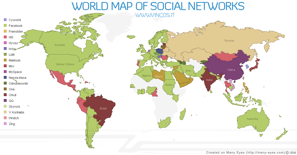
Via Andrew Sullivan, Vincos Blog has a world map of social networking sites:


With areas of dominance in North America, Latin America, Western Europe, Africa, and Southeast Asia, Facebook is the clear imperial hegemon in the world of social networking (and all that is despite its having one of the dumbest names in the business). But, according to Vincos, it is not actually the largest social networking site in the world; that superlative belongs to QQ, which dominates China with "300 million active accounts."

Good ol' Friendster, meanwhile, has been pushed back - a bit oddly - to a final redoubt in the Philippines. Hi5, which I had never heard of, has probably the weirdest distribution of strength: it's tops in Mexico and Central America, Ecuador and Peru, Portugal, Cameroon, Romania, Thailand, and Mongolia - and nowhere else. I defy you to find the family resemblance that ties that group of countries together.

There are several country or language-specific networks that are king in just one nation: Hyves in the Netherlands, CyWorld in South Korea, iWiW in Hungary, and Mixi in Japan, among others. A few networks are popular across a cultural region, like Maktoob in the Middle East, V Kontakte in the core areas of the former Soviet Union, and Odnoklassniki in the more peripheral areas of same. MySpace, meanwhile, has fallen from its perch everywhere but Guam.

Saturday, April 25, 2009

Meth Map of the US

This map of methamphetamine use by state is based on data from PBS, who ran a Frontline episode on the meth epidemic a while back.


They actually have their own map of this data (which is from 2003, by the way), but it doesn't capture enough of the variation at the top of the scale between a state like Kansas, which had 54 meth users per 100,000 residents admitted for treatment, and Oregon, which has 212.

Meth's West Coast origins are obvious from this map and, at least as of a few years ago, the drug had yet to make serious inroads on the East Coast. PBS's chart has a substantial capsule on each state. For Oregon, for instance, they say:
Methamphetamine is currently one of the most widely abused drugs in Oregon, where there are more individuals seeking treatment for a meth addiction per capita than in any other state in the nation. In 2004, 8,561 residents sought treatment for meth addiction, or about 19.0 percent of all persons seeking substance abuse treatment -- more than the number of people seeking treatment for cocaine and marijuana abuse combined. Although this number has decreased from a high of 9,463 individuals in 2002, it has increased from 2000 when 7,665 did. Although Mexican traffickers provide most of the meth in circulation in Oregon, the state is also home to a large number of local clandestine labs. In 2004, DEA, state and local officials seized 472 labs. Similarly, "crystal" meth, the purer, more addictive form of the drug, is becoming increasingly available throughout the state and is the exclusive variety now available in Central Oregon. This type of meth is often taken intravenously and is thought to be the cause of a recent rise in syphilis cases, and state health officials fear it might cause a boom in cases of HIV.
Meth causes bad problems:
In 2005 it was reported that 58 percent of law enforcement officials in 500 counties surveyed by the National Association of Counties cite methamphetamine as their biggest drug problem. Half in the sample said that up to 20 percent of their inmates were incarcerated because of meth-related crimes, and some segments representing small counties and areas in the upper Midwest reported as many as 75 to 100 percent of their incarcerations as meth-related.

While that survey drew on a disproportionate number of counties in the West where meth is most widely available, the National Drug Intelligence Center (NDIC) in February 2005, published results from a larger, random sample of 3,400 drug enforcement agencies nationwide. In the NDIC survey, for the first time since they have been taking such surveys, a plurality (40 percent) considered meth their leading drug threat. Cocaine came in second at 36 percent, and marijuana at 12 percent.
Needless to say, we're taking our usual hyperventilating "ban it!" approach to dealing with the problem rather than focusing on prevention and treatment. That's not to say prevention and treatment would rub out the problem; but we all know what sorts of raging successes are likely to derive from the War-On-Drugs approach. At the very least, color me skeptical that sending a whole new class of addicted individuals to prison is likely to do much to solve the social problems for which the drug is responsible.

Saturday, April 11, 2009

How To Be a Hunter-Gatherer

Or a gatherer, at least. Fallen Fruit is an LA-based organization that is making maps of publicly available fruit and nuts, like this one of a neighborhood in Santa Fe, New Mexico:


Their goals are idealistic, communitarian, and downright Michael Pollan-y:
"Public Fruit" is the concept behind the Fallen Fruit, an activist art project which started as a mapping of all the public fruit in our neighborhood. We ask all of you to contribute your maps so they expand to cover the United States and then the world. We encourage everyone to harvest, plant and sample public fruit, which is what we call all fruit on or overhanging public spaces such as sidewalks, streets or parking lots.

We believe fruit is a resource that should be commonly shared, like shells from the beach or mushrooms from the forest. Fallen Fruit has moved from mapping to planning fruit parks in under-utilized areas. Our goal is to get people thinking about the life and vitality of our neighborhoods and to consider how we can change the dynamic of our cities and common values.
As for their (rather hypothetical) goal to eventually map publicly available food throughout the world, I will say this: for people in much of the developing world, there'd really be no need - they're likely already growing a lot of their own food, and a lot of them who are just at a subsistence level might not take too keenly to the idea of making their fruit available to anyone who walks by. Only in a place like the US, where the practice of cultivating our own food sources is largely a lost art and there's already a superabundance of food, does the ideal of publicly pluckable food make much sense. (That's as opposed to organized systems of food sharing in communities, which can succeed both practically and morally.) Indeed, the global food distribution system on which the US relies is inherently such a delicate operation, dependent on a broadly functioning global economy and cheap and abundant fossil fuels for production and transportation, that a day may yet come when we'd see the local food production of our own neighbnorhoods as more than the idle hobby of aging hippies and idealistic liberals.

Saturday, April 4, 2009

Mapping the Future of Gay Marriage

Yesterday, same-sex marriage in Iowa was rendered legal by that state's Supreme Court (two days after it was made legal in Sweden). The United States seems inexorably headed towards marriage rights for gay couples - but how long will it take to get there across the board? Nate Silver has an answer. Based entirely on his hard work at fivethirtyeight.com, here is the future of gay marriage in the US:


The years indicated are those by which a gay marriage ban would be defeated by voters in a given state, according to a regression model designed by Silver. (Again, all the math and hard work is Silver's; I just made the map.)

How did Silver come up with these results? Here's the explanation:
I looked at the 30 instances in which a state has attempted to pass a constitutional ban on gay marriage by voter initiative. The list includes Arizona twice, which voted on different versions of such an amendment in 2006 and 2008, and excludes Hawaii, which voted to permit the legislature to ban gay marriage but did not actually alter the state's constitution. I then built a regression model that looked at a series of political and demographic variables in each of these states and attempted to predict the percentage of the vote that the marriage ban would receive.

It turns out that you can build a very effective model by including just three variables:

1. The year in which the amendment was voted upon;
2. The percentage of adults in 2008 Gallup tracking surveys who said that religion was an important part of their daily lives;
3. The percentage of white evangelicals in the state.

These variables collectively account for about three-quarters of the variance in the performance of marriage bans in different states. The model predicts, for example, that a marriage ban in California in 2008 would have passed with 52.1 percent of the vote, almost exactly the fraction actually received by Proposition 8.
The more religious a state is, and the more white evangelicals it has, the higher the percentage of voters who would be likely to support a gay marriage ban. However, according to Silver marriage bans "are losing ground at a rate of slightly less than 2 points per year. So, for example, we'd project that a state in which a marriage ban passed with 60 percent of the vote last year would only have 58 percent of its voters approve the ban this year." So it's possible to extrapolate, given the current religious demographics of a state and the trend of decreasing support for bans, when a gay marriage ban would fail.

There are 11 states where a marriage ban would already be expected to fail: all of New England and New York, plus several states in the West (all of which are among the least religious states in the country). California wouldn't be likely to reject a ban until next year. (Side note: despite California's status as a sort of poster boy for social liberalism, most of the Northeast tends to be more liberal on these kinds of social indicators.)

Over the next couple of years, majority opposition to gay marriage bans will spread quickly through the Northeastern and Western states, then through the Midwest - claiming a majority of all states by 2013 - and finally through the South, with Mississippi bringing up the rear in 2024.

Of course, history rarely moves in a straight line, and there's a big element of speculation in simply extrapolating from current trends. As Silver notes, a backlash against gay marriage might mount, delaying or reversing the trends that have been evident over the past few years; or by a sudden gestalt shift gay marriage might find broad acceptance. What seems much more likely than the precise dates given here, though, is the chronology of the geographical spread of acceptance. Same-sex marriages are already legal in the New England states of Massachusetts and Connecticut, with the Vermont legislature recently voting overwhelmingly to allow it (though the Governor may veto the bill [UPDATE: the legislature overrode the veto, so Vermont is the fourth state to make gay marriage legal, and the first to do so legislatively rather than judicially]). And even among states where gay marriage bans have passed, some of the most narrow margins were in Western states like Oregon, Colorado, Arizona and, of course, California. Meanwhile, it is certain that the South will be the last region in the country to become amenable to gay marriage.

As for Iowa? According to Silver, an amendment to the state constitution to ban same-sex marriage in that state would require passage in two consecutive sessions of the state legislature, and then would have to be ratified by the voters. So it couldn't come up for a vote at the ballot box until at least 2012. According to Silver's regression model, such a ban might pass in Iowa until 2013 - but who knows; maybe 3 years of being neighbors with happily married gay couples without having their social fabric torn asunder will cause Iowans' tolerance clock to speed up just a bit.

5/19/09 UPDATE: This map was never intended as a prediction of when gay marriage would actually become legal. But it is interesting that, as of a month and a half later, gay marriage is now legal in 4 states (MA, CT, VT, ME), will soon be legal in a 5th (NH; just waiting for a technicality in the bill to be worked out), and is making progress in a 6th state (NY) which, according to Nate S., would vote against a hypothetical gay marriage ban as of this year. In other words, gay marriage may actually be legal in at least half of these 11 states by the time the year is out, and will definitely be legal in at least 5 - plus Iowa, of course. Again, the point was never that these would be the dates by which gay marriage would actually be legal - but it almost seems to be turning out that way, to some extent.

Wednesday, April 1, 2009

The Atheist Map of the UK

The Guardian has an interactive map of religious belief - or the lack thereof - in the UK.


The map is based on a survey by the think tank Theos which polled respondents on their beliefs about human origins. The map indicates the percentage of the population who agree with the proposition that 'evolution removes the need for God.' The map gives stats for each region of the country; the pie chart on the left is for the Eatern region - the most atheistic region of the country, where fully 4 out of 9 people say that evolution obviates a religious explanation for the existence of life.

Here are the regions of the country ranked by lack of religiosity:
1. Eastern - where 44% agree that 'evolution removes the need for God'
2. Southwest - 40%
2. Southeast - 40%
4. Northeast - 39%
5. Yorks and Humber - 38%
5. East Midlands - 38%
7. Northwest - 36%
7. West Midlands - 36%
9. Scotland - 34%
10. Wales - 32%
11. London - 31%
12. Northern Ireland - 28%

London's low ranking is a bit of a shocker. Could it be the large immigrant population there importing beliefs from more devout corners of the globe?

It's interesting to compare this map to the map of atheism in the US. The most obvious thing to note is that the US is way more religious than the UK. The two maps aren't 100% comparable. In fact, neither map directly depicts self-reported atheists as such: the US map shows "non-religious" population, and this UK map shows those who choose belief in evolution over belief in God, when given the choice. But those are both pretty good proxies for atheism/agnosticism. And a comparison shows that the most religious regions of the UK barely approach the least religious regions of the US: only the states of Vermont (34%) and New Hampshire (29%) have more non-believers than the most religious region of the UK, Northern Ireland (28%).

But none of that is too surprising. What I find more interesting is a possible correlation between the UK and the US. The most religious regions of the UK are Scotland and Northern Ireland. Those happen to be the source regions for the Scots-Irish who populated the the American South as early as the early 18th Century and contributed much to the development of the culture of that region, which is now the most religious in the US. Of course, the South is far more religious than Northern Ireland or Scotland is today; but could the relative strength of religion in these areas within the context of their broader societies be causally related? Is it a function of that centuries-old cultural kinship? It seems possible.

Saturday, March 28, 2009

The Uneven Geography of Incarceration

The Atlantic maps a phenomenon of displacement in New Orleans that's wholly unrelated to the aftermath of Katrina.


The map shows the residences of people who entered prison in 2007, and the cost of housing prisoners over their entire sentence by block. Says the Atlantic:
Nationwide, an estimated two-thirds of the people who leave prison are rearrested within three years. A disproportionate number of them come from a few urban neighborhoods in big cities. Many states spend more than $1 million a year to incarcerate the residents of single blocks or small neighborhoods.

One such “million-dollar neighborhood” is shown above—a half-square-mile portion of Central City, an impoverished district southwest of the French Quarter. In 2007, 55 people from this neighborhood entered prison; the cost of their incarceration will likely reach about $2 million.
The Columbia Spatial Information Design Lab has a similar graphic for Brooklyn:


Given the heavy concentrations of prisoners in these neighborhoods, it seems that a relatively small amount of investment targeted at these places might be able to break the vicious cycle of crime, incarceration and community disruption. And indeed, says the Atlantic, that's just what some people are arguing:
Some New Orleans officials and community groups are now using prison-admission maps like these to explore new investments—block by block—in the social infrastructure of these damaged neighborhoods. Plenty of money is already being spent on these neighborhoods, in the form of policing and prison costs; the hope is that by spending more money in them, in a highly targeted fashion, the release-and-return-to-prison cycle can eventually be broken.
Taking a preventive rather than reactive approach to problems is not exactly a classic American virtue. Here's to hoping it works.

Thursday, March 12, 2009

The Geography of Personality

A fascinating study (pdf link) by Peter J. Rentfrow, Samuel D. Gosling, and Jeff Potter looks at the geographical variation of "the big five" personality traits: Extraversion, Agreeableness, Conscientiousness, Neuroticism, and Openness. From the abstract:
Volumes of research show that people in different geographic regions differ psychologically. Most of that work converges on the conclusion that there are geographic differences in personality and values, but little attention has been paid to developing an integrative account of how those differences emerge, persist, and become expressed at the geographic level... We present a theoretical account of the mechanisms through which geographic variation in psychological characteristics emerge and persist within regions... Results provided preliminary support for the model, revealing clear patterns of regional variation across the U.S. and strong relationships between state-level personality and geographic indicators of crime, social capital, religiosity, political values, employment, and health.
So by looking at the distribution of personality traits, we may be able to discover something about broad social factors like health, crime, and economic development. The authors place their work in the context of the long history in anthropology of describing personality differences among nations, but their work is focused on regions within the United States. The paper includes five maps of their results, clsasifying states by quintile, and I can't resist posting all five of them. The first shows extraversion:


Extraversion is generally associated, as the authors say, with "sociability, energy, and health." And the study found that states with higher levels of extraversion tended to be the states with higher levels of social involvement, such as participating in clubs and hanging out at bars. (They note, though, that it didn't correlate with the amount of time spent with friends; thus, "individuals appear to spend more time socializing in states where E is high than they do in low-E states, but their socializing is apparently somewhat indiscriminate and is not restricted to close friends.") You can clearly see the most extraverted states are in the Upper Midwest and northern Plains and parts of the South - and, a bit to my surprise, in the mid-Atlantic region. (And does anyone have a good explanation for Maine?) Another interesting note: state-level extraversion is positively correlated with robbery and murder rates.


Agreeableness "reflects warmth, compassion, cooperativeness, and friendliness." The authors found that high levels of agreeableness in states correlated with social involvement and religiosity. It was also positively correlated with spending time with friends and having guests over, but negatively with going to bars and joining clubs. Highly agreeable states also had fewer deaths from cancer and heart disease. Among the researchers' unpredicted findings was that these states also have a disproportionate number of artists and entertainers (which is a bit surprising just looking at the map).


Conscientiousness at the individual level "reflects dutifulness, responsibility, and self-discipline [and] it is positively associated with religiosity" and health-promoting behavior. The study found that conscientiousness had a positive correlation with religiosity at the state level and a slight correlation with the amount of exercise people did. Conscientiousness was also negatively correlated with going to bars and, for some reason, with frequency of having guests over. You can see that high-conscientiousness states tend to cluster in the Plains, the Southwest, and parts of the Southeast; the northeast is very unconscientious, evidently.


Neuroticism is characterized by "anxiety, stress, impulsivity, and emotional instability and is related to antisocial behavior, poor coping, and poor health." Unsurprisingly, the study found that highly neurotic states had lower rates of exercise, higher rates of disease, and a shorter life expectancy. In these states, people are less likely to join clubs and spend time with friends. The geographic clustering of neuroticism is strong: it's prevalent in the Northeast and much of Appalachia, and, for some reason, in the states of the lower Mississippi Valley. The West is decidedly less neurotic than the East, you may be unsurprised to hear.


Openness "reflects curiosity, intellect, and creativity at the individual level." The researchers predicted that highly open states would have high levels of liberal values, and a disproportionate number of people in the "artistic and investigative professions," and that is indeed what they found. People in these states are more tolerant of homosexuality, more likely to support legalization of marijuana, and more likely to be pro-choice. However, more open states tend to have lower rates of social involvement. and are considerably less religious. These states cluster on the West Coast and in the Bos-ny-wash megaregion, with a more scattered distribution elsewhere.

But why do these regional differences exist in the first place? The paper proposes a number of possible reasons, including selective migration (e.g., an open personality type moves from their dull Kentucky town to a "creative capital" like New York City or the Bay Area); social influence (a certain personality trait becomes more predominant in a given region simply be re-inforcing itself through repeated exposure to individuals, creating a self-perpetuating cycle of reinforcement); and environmental influence (people in cold, dreary climates like the Pacific Northwest or New England might be more prone to depression, or less aggressive).

It's fascinating stuff, and there's lots more in the (rather long) paper. The topic could be the subject of just about endless study and debate. And a natural next step would be to extend this study across countries - wouldn't maps like this of Europe or Asia be fascinating?

Wednesday, March 11, 2009

Immigration to the US

Sigh. If the New York times keeps publishing these fantastic interactive maps, I'm going to have to keep posting them.


This one depicts immigrant communities in the US in typical Timesian detail: with the biggest contributor to and population of the immigrant commnities in every single county in the country, and for every decade going back to 1880.

There are also maps showing the distribution of immigrant groups across the country, like this one showing population born in Mexico by county.


The Times map lets you mouse over the bubbles to see county and immigrant populations for every dacade.

The Well-Being of America


First, apologies right off the bat for these maps having the ugliest color scheme in the history of the world. (The color spectrum is right there in nature, people - you just have to use it.) The maps come from a poll done by Gallup for AHIP (America's Health Insurance Plans, which could perhaps explain the colors (insurance analysts not being known, generally, for their refined sense of design)).

The maps show well-being by state and congressional district based on interviews with 350,000 people during 2008. Says Gallup:
The Well-Being Index score for the nation and for each state is an average of six sub-indexes, which individually examine life evaluation, healthy behaviors, work environment, physical health, emotional health, and access to basic necessities. The questions in each sub-index are asked nightly of 1,000 national adults, aged 18 and older.
So the ratings of well-being are inferred rather than derived from self-reporting. That's good.

The Western states tend to rate the highest, along with a couple eastern states with more post-industrial economies. The being is most well in Utah, followed by Hawaii, Wyoming, Colorado, and Minnesota. The unhappiest states tend to be the poorer ones, and the ones with more manufacturing-based economies; no surprises there. The least well state in the union is West Virginia, with Kentucky, Mississippi, Ohio, and Arkansas rounding out the bottom five.

As for the wellest congressional district? Honors go to California's 14th, which runs along the Pacific coast between San Francisco and San Jose and contains part of Silicon Valley. And the least well district is Kentucky's 5th, in the eastern part of the state, deep in the heart of darkest Appalachia.

Monday, March 9, 2009

The Atheist Map of America

A new survey shows that the US is growing less religious; USA Today maps it.


It's an interactive map that lets you plot the percentages of the states' populations that are Catholic, other Christian, other religions, or belong to no religion for both 1990 and 2008. This image shows the non-religious populations as of 2008.

They're a much larger percentage of the population than they were even one generation ago: 15%, compared to 8% in 1990. That makes them a larger bloc than every other group except Catholics and Baptists. In 1990, fewer than 10% of the population was non-religious in 36 states, not counting Alaska and Hawaii (the least important states, according to this and many other maps); by 2008, that was the case in just 6 states. Oregon was the least religious state in 1990, with 18% claiming no religion; there are now a dozen states above 20%. These numbers are pretty remarkable.

The geographic distribution of non-religion is pretty unsurprising. States in New England and the West are the least religious; states in the South and the Plains are the most religious. The least religious state in the country is now Vermont, where a full 34% of people claim no religion, up from 13% in 1990. At the other end of the spectrum, just 5% of Mississippians claim no religion. Overall, the percentage of the population that calls itself Christian has shrunk by 11%

Tuesday, February 17, 2009

Killer Circles Invade New York City

The Digital Atlas of New York City, put together by William A. Bowen of California State University, Northridge, has a bunch of interesting maps of the Big Whatsit. This, for instance, is from the map showing the distribution of the black population in NYC:


(By the way, does that pattern look familiar?) The atlas also has maps showing income, education, and ancestry - you can see which parts of the city Dutch or Dominicans have settled in, for instance. The only drawback is that it's a bit dated. It's a problem for demographic maps for the US in 2009: the decennial census is a year away, so everything's based on data that's 9 years old.

Ah, and just now I notice that Bowen has similar atlases of Seattle, DC, Boston, Chicago, Honolulu, LA, San Francisco, San Diego, and Sacramento, as well. And also a bunch of other maps. So there you go.

Sunday, February 15, 2009

The Geography of Economic Tumult

The Atlantic has put up a series of interactive maps that let you track the relative economic power and influence of US cities over time.


The maps accompany an article by urbanist and pop sociologist Richard Florida. He makes a bunch of interesting predictions about the effects the economic meltdown will have on the geography of the United States. He thinks, for instance, that New York is positioned to come out okay - better than a lot of places, at least - thanks to its economic and cultural diversity. (Despite being the epicenter of the financial collapse, only 8% of New York's jobs are in finance; compare that to 18% in Des Moines, Iowa.) Indeed, he writes:
While the crisis may have begun in New York, it will likely find its fullest bloom in the interior of the country—in older, manufacturing regions whose heydays are long past and in newer, shallow-rooted Sun Belt communities whose recent booms have been fueled in part by real-estate speculation, overdevelopment, and fictitious housing wealth. These typically less affluent places are likely to become less wealthy still in the coming years, and will continue to struggle long after the mega-regional hubs and creative cities have put the crisis behind them.
The Rust Belt - the cities built on manufacturing in the 19th and 20th centuries, from Buffalo to St. Louis - is especialy likely to take it on the chin, and perhaps to never fully recover. More surprising is that the Sun Belt might get hit pretty hard as well. The vast arc of fast-growing states in the south and west will have some winners, like Charlotte and Austin, which have been adding jobs in the "creative class" sector. But the growth of other cities, like Las Vegas and Phoenix, has been mostly driven by construction and real estate - essentially, their growth has been based on their growth, which is not the most sustainable model in a recession.

Florida also makes prescriptions for the future, arguing that the suburban model of urban growth is past its prime and ill-suited to the developing creative economy; that homeownership should not be a goal of public policy; and that we should be cultivating growth in the burgeoning megaregions and the creative centers within them. Ultimately, he foresees this:
What will this geography look like? It will likely be sparser in the Midwest and also, ultimately, in those parts of the Southeast that are dependent on manufacturing. Its suburbs will be thinner and its houses, perhaps, smaller. Some of its southwestern cities will grow less quickly. Its great mega-regions will rise farther upward and extend farther outward. It will feature a lower rate of homeownership, and a more mobile population of renters. In short, it will be a more concentrated geography, one that allows more people to mix more freely and interact more efficiently in a discrete number of dense, innovative mega-regions and creative cities. Serendipitously, it will be a landscape suited to a world in which petroleum is no longer cheap by any measure. But most of all, it will be a landscape that can accommodate and accelerate invention, innovation, and creation—the activities in which the U.S. still holds a big competitive advantage.
Sounds good to me.

Thursday, February 12, 2009

Visualizing Segregation


That Mondrianesque image on the right there is, believe it or not, a sort of "map." It comes from some folks at Dartmouth who were interested in studying patterns of segregation in cities - not Jim Crow-era forced segregation, but the de facto kind that exists today in most American cities, where the phenomena of "black" neighborhoods and "white" neighborhoods are common. This map is going to need a bit of explaining, but bear with me, because I think it's really interesting.

The map is of a simulated city of "reds" and "blues." As the site describes it:
This segregation applet simulates the movement of people between houses within a "city." The city is divided into 10 x 10 "tracts" which are in turn divided into a grid of smaller squares. Each small square in the city represents a house that can be vacant (white) or occupied by a red or blue or, in three-color mode, a green square.
So the whole grid represents a city made up of people of two races. By pressing the start button on the applet you can set time in motion and let people move around, just as they do in real cities.

However, they're not moving around randomly. See those little boxes on the left that say "minimum # of like neighbors" and "maximum # of unlike neighbors"? Those determine where a given "family" will move to. In the image above there are no preferences, so any family will move anywhere. When you set time in motion, there will just be random movement of blues and reds around the grid. But suppose we change the settings to this:

Now we've set it so that a red family will only move to a neighborhood where it has a minimum of 4 red neighbors and a maximum of 6 blue neighbors; likewise, a blue family will only move to a neighborhood that has a minimum of 4 blue neighbors and a maximum of 6 red neighbors. And what's the result? After about 2,000 "moves," we get a city that looks something like this:

Now almost everyone in the city lives in a neighborhood that is completely homogeneous. This is sort of remarkable: remember, it's not the individual preference of anyone in this city to live in an all-red or all-blue neighborhood; everyone just wants to live in an area where at least half of the neighbors are the same race as themselves. But the end result is that nearly everyone ends up living in an almost totally segregated neighborhood.

Here's another scenario. In this case, the preferences are set quite liberally: every red only wants to have at least 2 red neighbors and no more than 6 blue neighbors, and every blue wants at least 2 blue neighbors and no more than 6 red neighbors. In this case, you can imagine, we have a city with low levels of racism and racial resentment and fear, but people just want to feel like they have at least a couple of neighbors who come from a similar culture or background as themselves. And here's what happens:

Shocking, right? Even though we've posited a city with very little racial animus, and just a seemingly reasonable desire of most people to feel like they share a similar identity or culture or background with just a couple of their neighbors, we still end up with a city where most people live in a generally homogeneous neighborhood. It's a fascinating result. There's a bit more mixing than in the scenario above, but still not as much as you might expect; maybe this comes closest to resembling an actual typical American city.

On one hand, this is sort of reassuring. It means that, even though many cities are still quite segregated, even in the 21st century, that doesn't mean different races are irreconcilably hostile towards each other; people just have a reasonable desire to be around at least a few people similar to themselves. On the other hand, if the end result of this desire is such a significant degree of segregation, then the odds that people would become more comfortable with other races through familiarity with them would seem not to improve over time.

By the way, the site also provides specific stats - those "segregation indices" on the left - for the more quantificationally adept (though that ain't me). You can also play around with different scenarios by changing the relative population sizes of the reds and blues, adding a third race ("greens"), or even instituting 1950s-style policies of restricting races from a particular area. For a certain sort of brain, it can be a bit addictive.

Friday, January 30, 2009

Social Trust in Europe

Mark Easton has another interesting map this week. This one shows levels of trust and belonging among 15-24 year olds across 22 European countries.


It's from a study called the National Accounts of Well-Being. According to Easton, the study

tries to measure trust and belonging by comparing answers to questions such as these:
• Generally speaking, would you say that most people can be trusted, or that you can't be too careful in dealing with people?
• Do you think that most people would try to take advantage of you if they got the chance, or would they try to be fair?
• Would you say that most of the time people try to be helpful or that they are mostly looking out for themselves?


As you can see, young people in Great Britain and Bulgaria are the least trustworthy. The most trusting appear to be in Hungary and Norway. Strangely, there don't seem to be any sort of patterns to the geographical distribution of trust whatsoever. Scandinavia - so often a uniform block of strong social health indicators - ranges from the very trusting Norwegians to the fairly suspicious Finns. The old Warsaw Pact countries include one the trustingest (Hungary) and one of the least trusting (Bulgaria). Catholic or Protestant countries? Ethnically homogeneous or plural society? There seem to be no strong correlations.

However, the study also rates overall well-being, which combines ratings of social well-being like the one depicted above with ratings of individual well-being, such as "positive feelings," "vitality," "self-esteem," a sense of meaning and purpose, etc. And here some clearer patterns begin to emerge. And here, irritatingly, Scandinavia's dominance of positive social indicators once more asserts itself: Norway, Sweden, Finland and Denmark, plus the might-as-well-be-Scandinavian Netherlands, all score near the top; but so do the Alpine countries of Switzerland and Austria. (I tell you, mountains are good for the soul!) And - also true to form - the old Eastern Bloc countries bring up the social health rear, with Ukraine putting in a particularly weak showing.

One final note: the study also rates "optimism." And who comes in dead last in that category? France. Shocking, I know.

They've got a bunch of interesting maps like this over there - go check it out.

Monday, January 19, 2009

Women in Government

In commemoration of the historical event that will be unfolding tomorrow in Washington, DC, it seems like a good time to take a look at some political maps. To start things off, here is a map showing the percentage of female representatives in state legislatures in the US:


There are some interesting patterns here. The West and New England jump out as having the highest rates of elected women. Of course, Wyoming was the first state to grant women the right to vote, followed by the other early-adopting states of Utah, Idaho, and Colorado, so the West has a long tradition of being at the forefront of women's participation in democratic government. Meanwhile, as a result of the 2008 elections, the New Hampshire State Senate is the first statewide legislative body in the US to have a female majority - 13 of its 24 members are women. At the other end of the spectrum, the South has generally low numbers of women in state legislators, and South Carolina has the lowest of all - the only state where fewer than 10% of representatives are women.

Globally, only 17% of parliamentary members are women - an improvement on the 10% registered in 1995, but obviously still far short of the 51% of the world's population who are women. Countries with the greatest equality in representative government include Sweden (46% women) and Spain (41%). Turkey, by contrast, has only one female representative, and Romania has none at all.

Here'a a world map showing women in government as a proportion of elected officials:


There aren't any countries where women form a majority of a governing body; in only 22 countries do they constitute even a quarter of all representatives. And, as in the case of so many social indicators, Scandinavia leads the way (though in this case, interestingly, so does southern Africa).