Friday, October 30, 2009

The Commitment to Development Index

The Center for Global Development has a tool that ranks rich countries' commitment to the developing world.

commitment to development index 2009

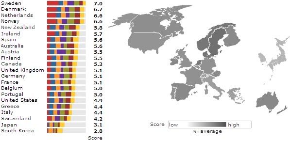
This Commitment to Development Index, says the CGD, "rates 22 rich countries on how much they help poor countries build prosperity, good government, and security. Each rich country gets scores in seven policy areas, which are averaged for an overall score." You can click on countries to get details on their rating in each of seven categories. As per usual, Scandinavia seems to be trying to make the rest of us look bad. For top-ranked Sweden, the rating is:

sweden cdi rating

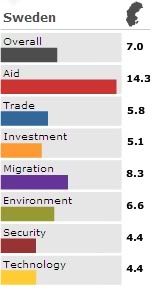
They give a lot through government programs, but little through private donations. By contrast, here's my own personal nation's rating:

us cdi rating

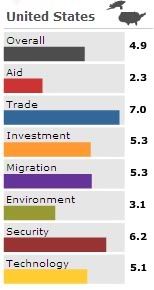
We contribute all of 0.15% of our GDP to development, compared to 0.92% for Sweden. But our rate of private charitable giving ranks us 4th. I was surprised to see we actually have relatively low agricultural subsidies, which I think is more a reflection of the standard practice of high subsidization rates across the developed world, rather than a mark of particular openness in that sector of the US economy.

And what's up with the Asians? Japan and South Korea need to get on the ball.

Via the ever-linkable Matt Yglesias.

Monday, October 12, 2009

Yikes

Let's check in on the old unemployment picture, shall we?

us unemployment county map

Oh dear. Not good at all.

Via Mike Lux, the map is from the Bureau of Labor Statistics. (It can be found here (pdf). Says Lux:
If full employment is defined as four percent, then only nine counties east of the Mississippi River that fit that definition. Two counties west of the Rocky Mountains qualify; one in eastern Washington State and the other covers the North Slope of Alaska.

The bright spots of full employment can be found in the agricultural counties of the Great Plains. Montana, Wyoming, North and South Dakota, Nebraska and Kansas seem immune to the wave of persistent joblessness, at least for now.
And this is just average annual employment. Things are worse now, with unemployment having climbed to 9.8%. Nor does it count those who are underemployed or who have dropped out of the labor force altogether; if it did, the national number would stand at nearly 20%, according to Lux.

Curiously, not having a McDonalds nearby seems to correlate with low unemployment. Clearly McDonaldses cause people to lose jobs!

Monday, October 5, 2009

Where the Uninsured Are

NPR has a map of the uninsured by congressional district and by state.

without health insurance by congressional district map

On the face of it, it looks like the usual, albeit paradoxical, story: areas that vote more Democratic, and which support a broader social safety net, have less need of one, since fewer people are uninsured in those areas; whereas Republican-leaning areas, where support is presumably greater for the status quo (the maintaining of which seems to be the Republican approach to health care), tend to have more uninsured. Unfortunately, this map doesn't do a good job of letting you see urban congressional districts, so the appearance of the map could be rather unrepresentative of the country as a whole, and especially of Democratic-leaning areas (many of which are in cities).

However, you can also see uninsured numbers by state, which reveals that of the 26 states (counting DC as a state for wishful thinking purposes) where the uninsured are less than 15%, 21 were won by Obama in 2008. And of the 13 states where the uninsured are more than 20%, 10 were won by McCain. (McCain won 7 of the 12 15-20% states.) That's a rather striking correlation, no?

Meanwhile, Nate Silver uses math n' stuff to create a map that projects support for the public option for every congressional district:

nate silver's public option support map

Based on a few polls in certain states and districts, Nate created a regression analysis to project what support across every district in the US would likely be, based on a few variables, including poverty rate and Obama's vote share in the district. He found that:
-- The public option is estimated to have plurality support in 291 of the 435 Congressional Districts nationwide, or almost exactly two-thirds.
-- The public option is estimated to have plurality support in 235 of 257 Democratic-held districts.
-- The public option is estimated to have plurality support in 34 of 52 Blue Dog - held districts, and has overall popularity of 51 percent in these districts versus 39 percent opposed.
By implication, the public option was favored in 56 of the 178 Republican-held districts. Nate breaks out the projected support numbers for every district in his post.

Thanks to Matt Osborne for that one.