Tuesday, December 22, 2009

States of Happiness

Ladies and gentleman, your latest state-by-state quantification of human feeling:

united states happiness map

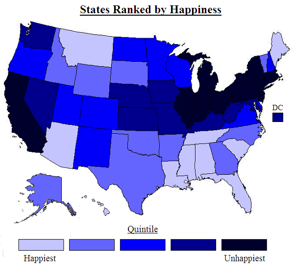
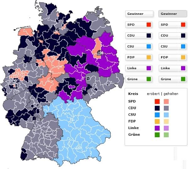
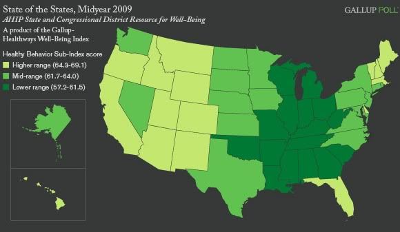
This map is based on a new study that finds correlations between subjectively reported happiness and certain objective factors like air quality, cost of living, and climate:
The new research published in the elite journal Science on 17th December 2009 is by Professor Andrew Oswald of the UK’s University of Warwick and Stephen Wu of Hamilton College in the US. It provides the first external validation of people’s self-reported levels of happiness. “We would like to think this is a breakthrough. It provides an justification for the use of subjective well-being surveys in the design of government policies, and will be of value to future economic and clinical researchers across a variety of fields in science and social science” said Professor Oswald.

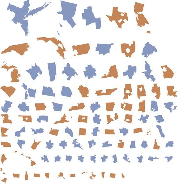
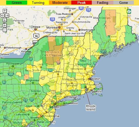
The researchers examined a 2005- 2008 Behavioral Risk Factor Surveillance System random sample of 1.3 million United States citizens in which life-satisfaction in each U.S. state was measured. This provided a league table of happiness by US State reproduced below. The researchers decided to use the data to try to resolve one of the most significant issues facing economists and clinical scientists carrying out research into human well-being.
That issue: whether subjective reports of well-being (like those portrayed here) can be trusted. Seems that they can.

The study used subjective reports of well-being, but then checked those reports against a number of other variables for each state, including "precipitation; temperature; wind speed; sunshine; coastal land; inland water; public land; National Parks; hazardous waste sites; environmental ‘greenness’; commuting time; violent crime; air quality; student-teacher ratio; local taxes; local spending on education and highways; [and] cost of living." It turned out that the objective factors which would be expected to correlate with subjective happiness - nice climate, affordability, short commutes and all that - actually do correlate to the reported happiness of those 1.3 million surveyees. According to Professor Andrew Oswald, the lead author of the study:
“The state-by-state pattern is of interest in itself. But it also matters scientifically. We wanted to study whether people's feelings of satisfaction with their own lives are reliable, that is, whether they match up to reality -- of sunshine hours, congestion, air quality, etc -- in their own state. And they do match. When human beings give you an answer on a numerical scale about how satisfied they are with their lives, you should pay attention.

People’s happiness answers are true, you might say. This suggests that life-satisfaction survey data might be tremendously useful for governments to use in the design of economic and social policies,” said Oswald.
The happiest state is Louisiana (!), followed by Hawaii, Florida, Tennessee, and Arizona. The South does well in general, and the Northeast and Rust Belt not so much, which is interesting: happiness levels seem to be in strikingly inverse proportion to levels of economic and social development. The unhappiest state, it thrills me to report, is New York, followed by Connecticut and New Jersey - a trifecta for the tri-state!

The rest of the unhappiest quintile of states form a Bleak Belt from southern New England to the Great Lakes, with California thrown in for good measure. California can't blame it on the climate, of course, so their other factors must have been really brutal. On the other hand, Montana and Maine managed to sneak into the top tier despite their godforsaken climes.

Via the NY Times.

Monday, December 21, 2009

Interstate/Underground

The blog at Good has a map of the US interstate highway system on the model of the London tube map:

US interstate system as tube map

A detail:

interstate map detail

Nice map, but I don't think Kent is the most important city between San Antonio and Las Cruces.

The author of this map cited a couple other interstate maps as inspiration, including this one by Chris Yates:

interstate system simplified

More inspiration here and here.

Wednesday, December 16, 2009

Deconstructing Metros

Neil Freeman's rather postmodern fake is the new real site has a graphic of the "fifty largest metro areas (in blue), disaggregated from their states (in orange). Each has been scaled and sorted according to population. The metro areas are US-Census defined CBSAs and MSAs":

metro state map disaggregation

This actually took me a while to figure out, but what seems to be going on is that metro areas and states minus their top-50 metro area populations are scaled to population and ranked in that order. Actually pretty interesting: it shows how much of the US population lives in those 50 cities vs. the rest of the country.

And by the way, I still don't believe Jacksonville actually exists, let alone that it's one of the 50 largest urban areas in the US. Have you ever met anyone from there? Have you ever, like, heard of someone taking a trip to Jacksonville? Didn't think so. And yet we're supposed to believe it's home to 1.3 million people? Please.

Via urban cartography.

Tuesday, December 15, 2009

Yet More on the Fate of the Planet

Via The Map Room and mapperz, here's another nice visualization of the calamity coming down the pike.


The image on the left anticipates increasing greenhouse gas emissions over the course of the century, which leads to a rise of just over 4C; the one on the right shows what'll happen if emissions gradually decrease - a rise of only 2C.

But obviously the warming, in either scenario, won't be uniform. The images really show how much more dramatic warming is forecast to be over land than over the ocean. Bear that in mind when you hear forecasts of like 4C warming by the end of this century: that's a global average, but it'll be considerably higher over land, which of course is where humans and cute baby elephants and things tend to live.

Meanwhile, talks in Copenhagen are hitting various sorts of predictable roadblocks:
China and the United States were at an impasse on Monday at the United Nations climate change conference here over how compliance with any treaty could be monitored and verified.

China, which last month for the first time publicly announced a target for reducing the rate of growth of its greenhouse gas emissions, is refusing to accept any kind of international monitoring of its emissions levels, according to negotiators and observers here. The United States is insisting that without stringent verification of China’s actions, it cannot support any deal.
If there's reason for optimism about the world's ability to do anything useful to slow our eminently foreseeable slide into global environmental devastation, it is this: if the US and China can just work out a framework for tackling the problem in a meaningful way, then Europe and Japan would surely follow; and just like that the countries producing a substantial majority of emissions will be on board. The rest of the world would not stand in the way (though OPEC would surely throw a fit).

If there's reason to be pessimistic about same, however, it's that the US and China would both have to agree to do something to meaningfully thwart global warming. For China, that would mean altering the model of industrialization that has brought them unprecedented and almost miraculous wealth in the last couple of decades, not to mention a growing role as a global power. For the US, it would mean overcoming the ossification of decline, including the extensive corruption of the political process and Versaillization of the political media, that appears to have compromised our ability to achieve any significant reforms on any front. In other words...

Sigh.

UPDATE: But here is some good news:
Negotiators have all but completed a sweeping deal that would compensate countries for preserving forests and in some cases other natural landscapes like peat soils, swamps and fields that play a crucial role in curbing climate change.

Environmental groups have long advocated such a compensation program because forests are efficient absorbers of carbon dioxide, the primary heat-trapping gas linked to global warming. Rain forest destruction, which releases the carbon dioxide stored in trees, is estimated to account for 20 percent of greenhouse gas emissions globally.

The agreement for the program, once signed, may turn out to be the most significant achievement to come out of the Copenhagen climate talks, providing a system through which countries can be paid for conserving disappearing natural assets based on their contribution to reducing emissions.
So it's good to hear some concrete good will come out of this meeting. And of course preserving ecosystems carries all sorts of environmental benefits along with it, beyond the increased absorption of greenhouse gases. But on the other hand:
A final agreement on the program may not be announced until the end of the week, when President Obama and other world leaders arrive — in part because there has been so little progress on other issues at the climate summit, sponsored by the United Nations.
Baby steps... Who knows. we may yet manage to cobble together a decent approach to global warming by the end of the century or so.

Tuesday, December 8, 2009

Global Warming is Gonna Be Bad for the Midwest

While bureaucrats from around the world are in Copenhagen haggling over an arcane agreement that may have profound effects on the state of the entire planet a century from now, you can enjoy this interactive map, which projects temperature rise across the the lower 48 states by the 2080s:

21st century global warming map of the us

It's based on a "medium" projection of greenhouse gas emissions. It shows at least a 4F temperature rise relative to a 1961-1990 baseline pretty much everywhere and 6-8F in much of the Interior West and Midwest (a.k.a. where our food comes from). In fact the seven states that are expected to heat up the most are all in the Midwest or thereabouts: Nebraska and Iowa (9.4F according to the moderate scenario), South Dakota (9.3), Missouri (9.2), Illinois (9.1), Kansas (9.1), and North Dakota (9.0).

The maps are based on a report (pdf) from The Nature Conservancy:
To help average Americans, policy makers and other local stakeholders better understand how climate change will directly impact their states, The Nature Conservancy has analyzed the latest and most comprehensive scientific data available to calculate specific temperature projections for each of the 50 US states over the next 100 years.

The Nature Conservancy also worked with the University of Washington and the University of Southern Mississippi to develop a new on-line tool that combines the latest scientific data and climate models with geographic information systems (GIS), statistical analysis and web-based mapping services. This tool, Climate Wizard (www.climatewizard.org), represents the first time ever that the full range of climate history and future projections for specific landscapes and time frames have been brought together in a user-friendly format that is available to a mass audience.
It also predicts rainfall:

us global warming precipitation prediction map

Bad news for California and Texas. Oh well, at least they're not the two most populous states in the country or anything.

Via Huffington Post.

Tuesday, November 24, 2009

Nine Chinas

Patrick Chovanec, an associate professor of business-type stuff at Tsinghua University in Beijing, has a map of what he calls the Nine Nations of China up at The Atlantic:

nine nations of china map

Chovanec, inspired by Joel Garreau's Nine Nations of North America, sees China as "a mosaic of several distinct regions, each with its own resources, dynamics, and historical character," and notes that "taken individually, these 'nations' would account for eight of the 20 most populous countries in the world." The nine regions are:

The Frontier (colored salmonish on the map): Population a mere 86 million. It's China's outback, or more pertinently, its Empty Quarter. Lots of wild landscapes, ethnic minorities, and exploitable resources - a milieu Americans might find faintly familiar!

The Refuge (contemplative purple): Pop. 110 million. An agricultural breadbasket consisting of the provinces of Sichuan and Chongqing, it's remote but close to self-sufficient; sheltered by high mountains, the be-pandaed region sounds like a Chinese pastoral idyll, albeit one that's now lurching somewhat gawkily into industrialization and increasing integration with the rest of China and the world.

Shangri-La (ethereal light blue): Pop. 132 million. Purported home of the legendary paradise on earth, Shangri-La is, naturally, beset by environmental degradation, drug cultivation (an historic producer of opium and, more recently, the far deadlier tobacco), and poverty: it's the poorest of the nine regions. It's also comprised of about 30% non-Han minorities.

The Yellow Land
(a very yellowy yellow): Pop. 359 million. A massively fertile land watered by the Yellow River, this region has more people than the United States. It has also served as the center of Chinese political power since roughly forever; it's the real belly of the whatnot.

The Crossroads (sullen dark blue): Pop. 226 million. So named because of its geographical centrality, and because it has historically stood between regions that compete for its resources; the region's never risen to a position of dominance within China, despite its placement on the Yangtze and main transportation corridors of the country.

The Back Door (debauched orange): Pop. 112 million. Once known as Yueh, this region in the south of China was a sort of Wild South for northern elites: a place of exile, full of jungles, gambling, smuggling, shadowy secret societies, and monkey-eating. Anchored by Hong Kong, it's boomed on the back of massive exports of late; presumably becoming less awesome.

The Straits (green like money): Pop. a paltry 59 million. Formed by Fujian on the mainland and the ever-ambiguous Taiwan, the region has been primarily a sea-faring one for centuries; its colonies throughout southeast Asia still remain tied together in many ways. The Asian tiger-dom of Taiwan has driven this to become the wealthiest of China's regions, though its political future is anyone's guess.

The Metropolis (tawdry pink): Pop. 147 million. The area around Shanghai and the mouth of the Yangtze has been the one region to seize preeminence from the Yellow Land at various points in Chinese history. After a period of neglect during the years of High Communism in China, Shanghai has led the country towards what seems to be its ever more urbane, cosmopolitan, and capitalistic future.

The Rust Belt (industrial alienation gray): Pop. 109 million. This is Manchuria, the locus of a certain prickliness between Russia and Japan a century ago. Japan held the region from 1931 until World War II; it went quickly to the Communists, and it became a stronghold of the socialist state. The reform era, though, hasn't been kind to the region; parts are almost as bad off as Michigan, if you can believe it. Pastimes include grain alcohol, decline.

Chovanec's got much more in his capsule descriptions, not to mention his blog.

Sunday, November 22, 2009

The Decline and Fall of Assorted Empires

A visualization of four European empires over the course of the 19th and 20th Centuries:


The bubbles respresent "the evolution of the top 4 maritime empires of the XIX and XX centuries by [areal] extent"; hence Britain's loss of Canada looks like a more significant bursting of the imperial bubble than its loss of India, even though India is obviously a far more important place than Canada.

Via Andrew Sullivan and 3quarksdaily.

Thursday, November 19, 2009

Support for US Health Care Reform in Three Dimensions

A nice map repetition from a New York Times op-ed shows support for health care reform along axes of income and age:

health care reform support map

The accompanying opinion piece is by Nate Silver, Andrew Gelman, and Daniel Lee. Say the authors:
Using a statistical method called multilevel regression and post-stratification, we ... mapped opinion on health care, breaking down voters by age, family income and state. We’re used to thinking about red states and blue states, but the geographic variation is dwarfed by the demographic patterns: younger, lower-income Americans strongly support increased government spending on health care, while elderly and well-off Americans are much less supportive of the idea. But in general, senators seems to be less interested in what their constituents, old and young, rich and poor, might think about health care, and more interested in how they feel about President Obama.

This may actually be good news for the Democrats. Although the Annenberg surveys had shown health care subsidies to be quite popular — they had 67 percent support nationally in 2000 and 73 percent support in 2004 — that was back when they were a mere abstraction, and before voters might have been considering how to pay for them. Nowadays, President Obama enjoys higher approval ratings — in the low to mid-50s, according to most polls — than do the Democrats’ health care reform plans, which are mired in the mid-40s in most surveys. Conditions being what they are, Democrats would rather have a referendum on the president than one on the health care bill itself.
Support for Obama seems to be driving attitudes about health care reform to some extent, and not the other way around. Of course, a lot of what this has to do with is trust. As Machiavelli said, reform is hard: vested interests who benefit from the status quo will oppose it at every turn, and they tend to be well-organized, while support for reform tends to be diffuse and shallow. Whether you're going to support a large intervention in a system that, for all its shortcomings, is our system - the one most of us have grown accustomed to - will depend in large part on whether you trust the folks who are doing the reforming. And of course, if you're already a beneficiary of guaranteed government-provided health care, like everyone in the US over the age of 65, you really don't have much incentive to support reform; unless, that is, you aren't entirely self-interested, and actually care about, for instance, the ability of young people to acquire health care when they're in their 20s and don't have access to the kind of job stability that's necessary to acquire employer-based health insurance; or who can't get health care in the free market because of a pre-existing condition like asthma; or are just too poor to afford quality health care.

But of course the maps show a geographical dimension too. Support tends to be lower in Republicaan-leaning regions like the Plains and the Utah-Idaho-Wyoming triad of conservative Western states; it tends to be higher in the Northeast and Great Lakes states. (By the way, when and why did Wisconsin become more liberal than Minnesota?) What will be interesting to me is to see how support shifts once a bill is actually passed. My guess is that support will increase across the board, once there are a bunch of headlines about Obama signing "historic leegislation" and all that. On the other hand, I wouldn't put it past Congress to end up with such a watered-down bill, with so many sops to the health insurance and health care industries, that it just pisses everyone off.

Tuesday, November 17, 2009

El Niño Heats Up

El Niño is growing stronger:

El Niño map

This image, from the NASA/JPL Ocean Surface Topography Team, is based on measurements taken from a US/French satellite over ten days around November 1.

Says NASA:
El Niño is experiencing a late-fall resurgence. Recent sea-level height data from the NASA/French Space Agency Ocean Surface Topography Mission/Jason-2 oceanography satellite show that a large-scale, sustained weakening of trade winds in the western and central equatorial Pacific during October has triggered a strong, eastward-moving wave of warm water, known as a Kelvin wave. In the central and eastern equatorial Pacific, this warm wave appears as the large area of higher-than-normal sea surface heights (warmer-than-normal sea surface temperatures) between 170 degrees east and 100 degrees west longitude. A series of similar, weaker events that began in June 2009 initially triggered and has sustained the present El Niño condition.

This image... shows a red and white area in the central and eastern equatorial Pacific that is about 10 to 18 centimeters (4 to 7 inches) above normal. These regions contrast with the western equatorial Pacific, where lower-than-normal sea levels (blue and purple areas) are between 8 to 15 centimeters (3 and 6 inches) below normal. Along the equator, the red and white colors depict areas where sea surface temperatures are more than one to two degrees Celsius above normal (two to four degrees Fahrenheit).

"In the American west, where we are struggling under serious drought conditions, this late-fall charge by El Niño is a pleasant surprise, upping the odds for much-needed rain and an above-normal winter snowpack," said JPL oceanographer Bill Patzert.
Swell. More here, including a map animation.

Californiaishness

This slightly odd map ranks states according to how similar they are to California, on a 1-30 scale:

map of states similar to california

Leading the way is California - it gets a full 30, which means it's very similar to California, indeed. The next most California-like state is Rhode Island, in a bit of an upset, along with Arizona and then the other two states that border California. Coming in an impressive 5th place is Michigan, followed by Florida. New Jersey, Wisconsin, and Illinois round out the top ten most Californiaish states.

Most unlike California honors go to Wyoming.

Via Yglesias.

Monday, November 16, 2009

Parag Khanna's Crystal Ball is a Globe

Fantastic. Just came across this at the atlas(t) blog. It's the mappiest TED talk ever:


It's Parag Khanna, who has the very important-sounding title of Director of the Global Governance Initiative and Senior Research Fellow in the American Strategy Program at the New America Foundation, talking about political geography. He uses lots of maps to illustrate the most salient changes that are going on in the global order today. One focus is on the expanding profile of China, which is touched with perhaps just a tinge of Sinophobia - Khanna suggests that Siberia may be a remote region of China, rather than Russia, before too long, and raises the specter of a sort of fifth column of ethnic Chinese working their way up the ladders of economic power in various foreign countries throughout East Asia.

Khanna also discusses Iraq - he's keen to let Kurdistan go indie, claiming that Iraq would still be the second largest oil producer in the world (though I think he might be forgetting about Russia, and the US as well, for that matter). He also suggests the Palestinians' problems could be solved by infrastructure development. I'm going to give him the benefit of the doubt on that one, and assume that he would make a more nuanced argument if time permitted.

Looking eastward, he sees the development of the energy resources in Central Asia and the Caucasus as leading towards a new, decidedly more carbon-oriented, Silk Road for the 21st Century. Most intriguing is his discussion of the future of Europe. He sees it as growing (which the EU has been, of course, for decades); in particular, he sees further regions of Eastern Europe, North Africa, and the Middle East moving increasingly into the orbit of what he variously calls the European "zone of peace" or the "Euro-Turkish superpower."

Khanna also raises the prospect of several new countries coming into the world in the next few years. All very interesting stuff.

Friday, November 13, 2009

The Spread of Swine Flu: Blame it on Louisiana

Nate Silver has a map based on data from Google Flu Trends that shows the timeline of the spread of swine flu around the US:

spread of swine flu us map

Google Flu Trends works by applying the Google Panopticon to searches that correlate with CDC data on actual flu cases, and has the benefit of being immediately responsive to trends in outbreaks of influenza (CDC data tends to lag by a week or two).

Says Silver:
This map is fascinating on a number of levels. Although the initial outbreak of H1N1 back in April was centered on Texas, California, New York, Illinois and South Carolina, the place where the flu first hit critical mass several months later was in Louisiana. It then slowly radiated its way outward to most of the neighboring states -- Maine finally hit the 5,000-point threshold just last week. There also appear to be other points from which the flu spread -- a less prominent 'epicenter', for instance, centered in Minnesota and the Dakotas. And somehow, there came to be quite a lot of flu at various points in both Alaska and Hawaii -- Hawaii's peak actually came way back in June and July, well before the one in the Deep South.
Here's something I don't begin to understand: everyone kept saying there'd be a second wave of swine flu in the fall, because the slu likes colder temperatures. Sure enough that second wave came to pass - but it looks like it actually erupted in one of the warmest regions of the country at the height of summer. That makes the opposite of sense to me.

Anyhoo, here's some good news, according to Nate: "the flu is pretty much on the decline in all states except Northern New England." Though if you're looking for a reason to feel glum, you should be informed that more people have died in the US from swine flu than died in the attacks of September 11, and most of them were fairly young.

Meanwhile, I see that Google is going global (or at least semi-global) with their flu map:

google flu map of the world

Bad times for cold places.

Monday, November 9, 2009

Because I Haven't Gotten Extremely Depressed About Global Warming in the Last Couple of Weeks...

The British government recently came out with a new interactive map, posted by The Guardian here, that shows the likely impacts of global warming, assuming our species continues our sit-on-our-asses-till-we're-all-fried approach to this looming catastrophe:

uk met global warming map

Says The Guardian:
The map was launched to coincide with the London Science Museum's new Prove it climate change exhibition by David Miliband, foreign secretary and his brother Ed Miliband, energy and climate change secretary. It comes in advance of key political talks on climate change in December in Copenhagen, where British officials will push for a new global deal to curb emissions.

The Miliband brothers said a new deal needed to be strong enough to limit global temperature rise to 2C, although many involved in the negotiations privately believe this to be impossible. A joint press release from the government and the Met Office released to promote the map says the government is aiming for an agreement that limits climate change "as far as possible to 2C".
The map presumes a global average rise of 4 degrees Celsius, a disastrous scenario which is nonetheless where we are very probably headed (as the UK Met Office says itself). That is, again, assuming that we don't take significant action to thwart such a catastrophe.

I personally consider such action highly unlikely for a number of reasons, which is really too bad, because this forecast is a terrible one. It calls for temperatures to be 6-7C warmer across most of the continental US, for instance. That's about 10-13 degrees Fahrenheit; that's like the difference between spring and summer. The "hottest days of the year could become as much as 10-12C (18-22F) warmer [!] over eastern North America," says the map; it's even worse for the Arctic, where a rise of 15C is so off-the-charts huge that's it's just impossible to predict what sort of effects it will have; beyond the prospect of a positive feedback from Arctic methane release, it's really not much fun to think about it anymore.

I will just stand up on my little digital soapbox here and make the point, not for the first time, that this dystopic future is the price we're paying for our cheeseburgers and our SUVs. It is really a profoundly, spectacularly, stupidly high price to pay for a lifestyle that, frankly, is not all that great to begin with. But no doubt this lesson will sink in... oh, right about the time that Bangladesh does.

Via The Map Room.

Friday, November 6, 2009

Bloomberg Wins, More or Less

The New York Times has an interactive block-by-block map of Tuesday's vote for mayor in New York City:

new york city mayoral election map

Plutocrat Michael Bloomberg beat out bureaucrat William Thompson to win a third term as mayor. He is a popular mayor, but he rammed a repeal of term limits through the city council and spent roughly nine gajillion dollars of his personal fortune on his re-election, which may have turned off some New Yorkers, and the election ended up much closer than most anyone expected - he won only 51-46. (The Times says, "[t]he results in the mayor’s race are likely to be personally bruising to Mr. Bloomberg, a man of no small ego who told the public last fall that his financial acumen made him uniquely qualified to pull the city out of a deep economic funk.") I would also like to believe that voters were squeamish about continuing to name the city's wealthiest resident as its civil leader, the sort of practice that makes it really hard to stifle the chortles when you start talking about "American democracy."

At any rate, says the Times:
Mayor Michael R. Bloomberg won re-election Tuesday, but voters were less enthusiastic about him than the last time he ran in 2005. The mayor did well in high-income white areas of Manhattan and Queens, and also in election districts dominated by immigrants, like Flushing and Brighton Beach. But his vote fell sharply in black neighborhoods, especially southeast Queens, where the black middle class has been hard-hit by foreclosure.
Those big blue splotches mostly correspond to the majority African-American neighborhoods in Queens, Brooklyn, and El Bronx. Bloomberg got like 90% in the swankier districts of the Upper East Side, and Thompson did about as well in his best districts in places like Bed-Stuy and Brownsville. Bloomberg did well among Jews and white Catholics; it seems like the Hispanic vote leaned toward Thompson, though it's a bit hard for me to tell from this map.

UPDATE: Commenter Gaurav links to a New York Magazine post that compares the NYC election map to the city's white population, based on a map from the Digital Atlas of New York City (which I posted about before). Here's the distribution of the city's white population:

new york city white population map

That's a tasty correlation! And Andrew B links to this map from the Digital Atlas showing Hispanic population. Definitely looks like they went for Thompson pretty strongly.

Monday, November 2, 2009

A Season of Storms

A beautiful animation of the entire 2008 Atlantic hurricane season:


It was produced by NOAA's National Hurricane Center and can be downloaded here.

Here's a map of all the tropical storms and hurricanes from that busy year. This year, by constrast, has been rather quiet.

Sunday, November 1, 2009

Maoists in India

The New York Times has an article about the escalating fight against Maoist rebels in India. It includes this map:

maoists in india map

Says the Times:
India’s Maoist rebels are now present in 20 states and have evolved into a potent and lethal insurgency. In the last four years, the Maoists have killed more than 900 Indian security officers, a figure almost as high as the more than 1,100 members of the coalition forces killed in Afghanistan during the same period.

If the Maoists were once dismissed as a ragtag band of outdated ideologues, Indian leaders are now preparing to deploy nearly 70,000 paramilitary officers for a prolonged counterinsurgency campaign to hunt down the guerrillas in some of the country’s most rugged, isolated terrain.
The rebels claim to represent many of India's impoerished people, especially among its indigenous tribal groups. Despite their violent tactics, they have some support among intellectuals in India, including the writer Arundhati Roy. They're not to be confused with the above-ground Communist Party, which is a force in Indian politics.

Friday, October 30, 2009

The Commitment to Development Index

The Center for Global Development has a tool that ranks rich countries' commitment to the developing world.

commitment to development index 2009

This Commitment to Development Index, says the CGD, "rates 22 rich countries on how much they help poor countries build prosperity, good government, and security. Each rich country gets scores in seven policy areas, which are averaged for an overall score." You can click on countries to get details on their rating in each of seven categories. As per usual, Scandinavia seems to be trying to make the rest of us look bad. For top-ranked Sweden, the rating is:

sweden cdi rating

They give a lot through government programs, but little through private donations. By contrast, here's my own personal nation's rating:

us cdi rating

We contribute all of 0.15% of our GDP to development, compared to 0.92% for Sweden. But our rate of private charitable giving ranks us 4th. I was surprised to see we actually have relatively low agricultural subsidies, which I think is more a reflection of the standard practice of high subsidization rates across the developed world, rather than a mark of particular openness in that sector of the US economy.

And what's up with the Asians? Japan and South Korea need to get on the ball.

Via the ever-linkable Matt Yglesias.

Monday, October 12, 2009

Yikes

Let's check in on the old unemployment picture, shall we?

us unemployment county map

Oh dear. Not good at all.

Via Mike Lux, the map is from the Bureau of Labor Statistics. (It can be found here (pdf). Says Lux:
If full employment is defined as four percent, then only nine counties east of the Mississippi River that fit that definition. Two counties west of the Rocky Mountains qualify; one in eastern Washington State and the other covers the North Slope of Alaska.

The bright spots of full employment can be found in the agricultural counties of the Great Plains. Montana, Wyoming, North and South Dakota, Nebraska and Kansas seem immune to the wave of persistent joblessness, at least for now.
And this is just average annual employment. Things are worse now, with unemployment having climbed to 9.8%. Nor does it count those who are underemployed or who have dropped out of the labor force altogether; if it did, the national number would stand at nearly 20%, according to Lux.

Curiously, not having a McDonalds nearby seems to correlate with low unemployment. Clearly McDonaldses cause people to lose jobs!

Monday, October 5, 2009

Where the Uninsured Are

NPR has a map of the uninsured by congressional district and by state.

without health insurance by congressional district map

On the face of it, it looks like the usual, albeit paradoxical, story: areas that vote more Democratic, and which support a broader social safety net, have less need of one, since fewer people are uninsured in those areas; whereas Republican-leaning areas, where support is presumably greater for the status quo (the maintaining of which seems to be the Republican approach to health care), tend to have more uninsured. Unfortunately, this map doesn't do a good job of letting you see urban congressional districts, so the appearance of the map could be rather unrepresentative of the country as a whole, and especially of Democratic-leaning areas (many of which are in cities).

However, you can also see uninsured numbers by state, which reveals that of the 26 states (counting DC as a state for wishful thinking purposes) where the uninsured are less than 15%, 21 were won by Obama in 2008. And of the 13 states where the uninsured are more than 20%, 10 were won by McCain. (McCain won 7 of the 12 15-20% states.) That's a rather striking correlation, no?

Meanwhile, Nate Silver uses math n' stuff to create a map that projects support for the public option for every congressional district:

nate silver's public option support map

Based on a few polls in certain states and districts, Nate created a regression analysis to project what support across every district in the US would likely be, based on a few variables, including poverty rate and Obama's vote share in the district. He found that:
-- The public option is estimated to have plurality support in 291 of the 435 Congressional Districts nationwide, or almost exactly two-thirds.
-- The public option is estimated to have plurality support in 235 of 257 Democratic-held districts.
-- The public option is estimated to have plurality support in 34 of 52 Blue Dog - held districts, and has overall popularity of 51 percent in these districts versus 39 percent opposed.
By implication, the public option was favored in 56 of the 178 Republican-held districts. Nate breaks out the projected support numbers for every district in his post.

Thanks to Matt Osborne for that one.

Tuesday, September 29, 2009

Deutschland Wahlergebnisse

Germany had an election; Der Spiegel has a map (under the Wahlkriese tab):

germany election map

(According to Babel Fish, 'erobert' means 'conquered' (evocative!) and 'gehalten' means 'held,' so you can see where parties made gains, especially the CDU and Linke.)

The link comes from the San Francisco Examiner, which says:
The results are in on Sunday’s elections in Germany, and the big news is that it is a big win for the center-right. In the vote for proportional representation (Zweitstimme), Chancellor Angela Merkel’s Christian Democrats (the Christian Democratic Union and the Bavarian Christian Social Union, CDU/CSU) got 33.8% of the vote and the free-market Free Democrats (FDP), Merkel’s preferred coalition partner, got 14.6%, for a total of 48.4%. The Social Democrrats (SDP) got only 23.0%, their lowest share in history, while the Greens (Grüne) got 10.7% and the Left (Linke, more or less the former Communists) got 11.9%. The SDP has been willing to enter into a coalition with the Greens, as it did in 1998-2005, and with the CDU/CSU, as it has in the so-called Grand Coalition since the 2005 election, but not with the Left.

Both of the two largest parties got smaller percentages than in the last election, in September 2005, but the drop for the CDU/CSU was minimal, while the SDP share dropped from 34.2% to 23.0%--one out of its three voters went elsewhere. The percentages for the three minor parties all rose, with the FDP getting the largest percentage in the 60-year history of the Federal Republic. My sense is that voters in Germany, as in Britain, are engaging here in tactical voting.
If my brain is functioning properly (not certain!) that means right/center-right parties got 48.4% of the vote, and left/center-left parties got 45.6%.

You can click on the Interaktive Grafik to see where each parties had strengths. The Christian Democrats did best in northwestern Germany, but showed strength in the southwest and parts of the east as well. The CSU, which appears to stand in relation to the CDU in Bavaria as the DFL party stands in relation to the Democrats in Minnesota, did well on their home turf. The Free Democrats did best in the south and in Schleswig-Holstein in the north. The opposition Social Democrats, who sort of tanked a little, had their best showing in the west, especially in Hessen, Nordrhein-Westfalen, and Niedersachsen. Linke, a left-wing party, did best in East Germany but poorly pretty much everywhere else. The Green Party, kind of oddly, did best in many of the same regions as the Free Democrats; those areas appear to be amenable to third parties, for whatever reason. They also did wellish in and around Berlin.

Michael Barone, the author of the Examiner article, notes: "What strikes me as uncanny is that the CDU/CSU tends to win in the historically Catholic parts of Germany (the south, much of the Rhineland) while the SDP and, in 2009, the Left tends to win in the historically Protestant parts of Germany." He's got some other observations about the vote (and also a few dubious conclusions about what this says about Europeans' desires for smaller government).

Meanwhile, Matt Yglesias notes that the Pirate Party got a decent 2% of the vote in their first election. Not bad!

Friday, September 25, 2009

"Where the Buffalo Roamed"

I can't improve on the blog post title from Stephen Von Worley, who maps the US by distance to the nearest McDonalds:

nearest mcdonalds us map

We here at the Map Scroll would also like to endorse the ironic detachment of Von Worley's post - such a mood being really the only way to cope with the bombardment of consumerist waste the US landscape has endured over the course of the last 60-odd years - which begins thus:
This summer, cruising down the I-5 through California’s Central Valley to the Los Angeles Basin, I unwittingly stumbled upon a most exasperating development: the country strip mall. First, let me state that I don’t hate. I’ve got nothing against Petco, Starbucks, OfficeMax, et al. When overcome by the desire for a cubic yard of kitty litter, a carafe of pre-Columbian frappasmoochino, or fifty gross of pink highlighter pens, I’m there in a jiffy!

But, Mr. Real Estate Tycoon, did you have to plop your shopping center smack dab in the middle of what was previously nowhere? Okay, the land was cheap. And yes, you did traffic studies and proved that the interstate and distant suburbs would drench whatever you built in a raging torrent of eager consumerism. But your retail monstrosity drains the wildness from the countryside for twenty miles in every direction! Sure, you can’t see it from everywhere - but once you know it’s there, you feel it. In the rural drawl of a neighboring rancher, that flat-out sucks!

Which begs the question: just how far away can you get from our world of generic convenience? And how would you figure that out?
He got data on the locations of all 13,000 McDonald'ses in the lower 48, applied some "technical know-how," as the kids call it, and made this map. As you can see, there's really no escaping the Gilded Parabolas in the eastern half of the country. There are, though, a few pockets in the West where the hegemony of the arches needn't weigh quite so heavily on the spirit:
For maximum McSparseness, we look westward, towards the deepest, darkest holes in our map: the barren deserts of central Nevada, the arid hills of southeastern Oregon, the rugged wilderness of Idaho’s Salmon River Mountains, and the conspicuous well of blackness on the high plains of northwestern South Dakota. There, in a patch of rolling grassland, loosely hemmed in by Bismarck, Dickinson, Pierre, and the greater Rapid City-Spearfish-Sturgis metropolitan area, we find our answer.

Between the tiny Dakotan hamlets of Meadow and Glad Valley lies the McFarthest Spot: 107 miles distant from the nearest McDonald’s, as the crow flies, and 145 miles by car!
I'm totally moving to Spearfish.

Via Felix Salmon.

Thursday, September 24, 2009

Things Change

Yankee Magazine crowd-sources autumn:

northeast us foliage map

Reports are made by people (qualification: have color vision!) around the northeastern US, who write in and say stuff like
Hi folks, Things around here are really starting to look diferent around here [sic]. We had those last few nights that got alittle [sic] cooler and it seemed like the swamp maples took the hint. Like popcorn when it starts to pop [sic]. The colors realy [sic] started to show, see ya for now [sic]
which you can read by clicking on the map. You can also register to do it yourself. It all strikes me as somehow breathtakingly wholesome.

I also like the existential connotations of the map legend.

Via Andrew Sullivan

Saturday, September 19, 2009

Who's Your Polluter?

The New York Times has another one of their ridiculously information-rich maps which shows all of the 200,000+ facilities around the US that have pollution discharge permits, viewable by state:


The orange dots are facilities that have been cited for violations, and you can mouse-over them to see who they are and how many times they've been cited.

All this information is thanks to the 1972 Clean Water Act. It makes you think: thank heavens for that progressive Nixon administration! If not for them, there'd be no Clean Water Act and no EPA. And given the paralysis of the political system these days, as the wealthy classes become ever more shameless about claiming their ever-larger slices of an ever-shrinking pie, even as a sense of social responsibility towards the society which allowed them to garner that wealth continues to erode, it seems very unlikely that political initiatives like that would be able to pass now.

An accompanying article starts off this way:
Jennifer Hall-Massey knows not to drink the tap water in her home near Charleston, W.Va. In fact, her entire family tries to avoid any contact with the water.

Her youngest son has scabs on his arms, legs and chest where the bathwater — polluted with lead, nickel and other heavy metals — caused painful rashes. Many of his brother’s teeth were capped to replace enamel that was eaten away.

Neighbors apply special lotions after showering because their skin burns. Tests show that their tap water contains arsenic, barium, lead, manganese and other chemicals at concentrations federal regulators say could contribute to cancer and damage the kidneys and nervous system.

“How can we get digital cable and Internet in our homes, but not clean water?” said Mrs. Hall-Massey, a senior accountant at one of the state’s largest banks.
Imagine if we didn't have the Clean Water Act.

Saturday, September 5, 2009

How Americans Carpe Their Diems

This is not reallya map. Or maybe you could say it's a kind of time-map. But whatever, I'm posting it anyways:

how americans spend their days

From the NY Times, it shows how Americans spend their days. It's based on the American Time Use Survey, which asked thousands of people to record how they spent every minute of the day. It, if interacted with, breaks down into demographic sub-categories for potentially many minutes of data-representational fun. The Times observes some things:

  • The average American spends 2/3 of their day sleeping, eating, working, and watching TV
  • Unemployed people spend more than two hours a day doing laundry and yard work
  • People who aren't in the labor force watch four hours of TV a day
  • Hispanics are as likely as whites to be eating at noon, but whites are much more likely than Hispanics to be eating at 6:30
I also notice that at 8:50pm, 39% of Americans are watching TV; at no time are more than 33% working. And at no time are more than 7% of people socializing. That seems low!

H/t to CC.

Tuesday, August 25, 2009

Speaking of the Devil...

Dante's Divine Comedy is one of those classics I've been meaning to read for years and just haven't gotten around to. Likening the mild stickiness of the London tube to the allegorical cosmology of Inferno, the first part of The Divine Comedy, led me to look up the infamous nine circles that comprise that cosmology, and as it turns out, the London Underground is far worse than the first circle of hell! So is London, for that matter.

botticelli's map of dante's inferno
Botticelli's map of Dante's Inferno.

Here are descriptions of the nine circles, based on this tour of Dante's hell (with an assist from Wikipedia).

First Circle
. Aka Limbo. The realm of non-sinners who don't get their Heaven ticket punched on account of being non-Christians. Includes green meadows and a nice castle - a sort of eternal retirement home for many of history's greatest poets and philosophers including Avicenna, Horace, Ovid, Aristotle, Socrates, Plato, Virgil and Homer. Sounds way, way cooler than Heaven itself.

Second Circle. Realm of the lustful - the "carnal sinners who subordinate reason to desire." Violent storms whip sinners' souls here to and fro. Some famous romantics ended up here, including Cleopatra, Dido, Achilles, and Helen.

Third Circle
. A punishment for gluttons. Snowballs actually have a pretty decent chance here, as its inhabitants are forced to lie in a slushy mix of snow, hail, and freezing rain. Guarded by a three-headed dog.

Fourth Cirlce. Destination for the avaricious (though certain Christians might not realize their souls are headed here). Medievals saw this sin as "most offensive to the spirit of love." Actually, for Dante both the free-spenders and the tight-fisted would end up here, where they could annoy each other for all eternity.

Fifth Circle
. A swampy place, and the realm of the angry, who take two forms: the wrathful (who express their anger), and the sullen (who repress it); the former spend eternity picking fights with each other, and the latter grumble and gurgle in a muddy bog. Beyond the fifth circle, the really heavy-duty hells begin, as the punished sins become more serious.

Sixth Circle. This hell reserved for heretics, who Dante defines as those who deny the immortality of the soul. They included epicureans, who saw the soul as mortal and enjoyed the boozin' and the feastin'. This circle also would seem to be more fun than Heaven, if not for the flaming tombs...

Seventh Circle. Getting into some serious damnation now... the seventh circle is for violent sinners - murderers, suiciders, blasphemers, userers, and sodomites. Those who commit violence against others are punished in a river of blood; those who do violence against themselves (suicides and "squanderers") are condemned to a horrid forest; a third region - a barren desert, torched by "flakes of fire" - is for those who commite violence against God.

Eighth Circle. Land of the fraudsters, including thieves, falsifiers, and specialists in fraudulent rhetoric, including "divisive individuals who sow scandal and discord." Presumably where Glenn Beck will find himself after the sad day he passes on. Punishments include being licked by flame and getting turned into a lizard.

Ninth Circle
. The helliest hell of all and the realm of the worst of the worst: traitors. Like the third circle, it's a cold place, as the sinners in the ninth circle are entombed in ice at least up to their necks. Certain folks here like to gnaw on each other's heads. Satan is at the very center of this circle, waist-deep in ice, perpetually weeping, and munching on traitors (Brutus and Cassius in particular - one for each of his mouths).

Here's another map of Dante's hell - not quite as artful as Botticelli's version, but sort of mappier.

Monday, August 24, 2009

London's Underground: The First Circle of Hell?

The Underground is hot, according to this heat map of heat:

london underground heat map

Says Times Online:
It is easy to feel sorry for commuters on the London Underground at this time of year, crammed into stuffy carriages with the temperature rising. But some passengers, it appears, are more deserving of pity than others.

A map compiled by Transport for London (TfL) has revealed the hottest spots on the Tube network, notorious for its lack of air-conditioning.

The map, which covers most of the Underground lines in zones one and two, was compiled by TfL officials to identify areas most in need of cooling, but it will be a handy aid for travellers anxious to avoid the worst spots.
The hottest parts of the Central Line were above 30C (that's 86 in 'Merican numbers) on the hottest day of 2008. Notes the Times: "In previous tests, temperatures in some carriages during the summer have exceeded 35C [95F], which would make the network officially unfit for transporting cattle." Upon reading this line, the hooved population of Texas collectively burst into derisive laughter, rolling gaily among the prickly pears and bullnettles for some hours. (They're big readers of Times Online, oddly.)

My point: that's not all that hot, especially for the hottest day of the year. How did the Brits ever manage to stick around India long enough to comprehensively exploit the place?

Fun With Epidemiology!

This game lets you respond to outbreaks of disease!

the great flu game

Deliver face masks, develop vaccines, and watch verite videos of indeterminately Teutonic scientists and panicky masses as you try to slow the spread of mean-looking red dots across a Risk-like map of the world. Note with equanimity the catastrophic consequences of your misallocations of resources as millions die, and consider the fundamental absurdity of a universe in which such picayune decision-making can lead to such widescale suffering and death. Fun for all ages!

Thursday, August 20, 2009

The Unhealthy Behaviour Axis

A new map from Gallup and AHIP (and a continuation of their study of well-being across the states, covered here before), measures states by healthy behaviour:

healthy behaviour us map

Says Gallup:
The midyear results from the AHIP State and Congressional District Resource for Well-Being, a product of the Gallup-Healthways Well-Being Index, find the nation as a whole dropping substantively on the Healthy Behavior Sub-Index, from 63.7 in 2008 to 62.6 in the first half of 2009. The Healthy Behavior Sub-Index is one of six sub-indexes that make up the Gallup-Healthways Well-Being Index, and asks Americans four questions: do you smoke; did you eat healthy all day yesterday; in the last seven days, on how many days did you exercise for 30 minutes or more; and in the last seven days, on how many days did you have five or more servings of fruits and vegetables. The Healthy Behavior Sub-Index scores for the nation and for each state are calculated based on a scale from 0 to 100, where 100 would be a perfect score.

Healthy Behavior scores in most states are trending down in the first half of 2009 compared with 2008, though many have not decreased by a statistically significant degree. Mississippi, whose score ranks among the bottom 10, is the only state to record a statistically significant increase in its healthy behavior score thus far in 2009.
The healthiest states, in order, are Vermont, Hawaii, Montana, California, New Mexico, New Hanpshire, Maine, Delaware, Idaho, Wyoming, and Oregon. The least healthy is Kentucky, followed by Arkansas, West Virginia, Indiana, Ohio, Alabama, Tennessee, Oklahoma, Mississippi, Illinois, and Louisiana.

This is sort of a weird map. On the one hand, there is a very clear nexus of unhealthy states - all of the 'higher range' states are contiguous, in fact, with 'mid-range' states mostly forming a periphery around that core. But the weird thing is that the group of unhelthy states, despite its contiguity, transcends just about every other cultural and geographical distinction youcould try to make: North/South; warm-weather/cold-weather; urban/rural; manufacturing/service/agricultural economy; liberal/conservative; Obama/McCain; large/small minority population... If you break down these states by any intuitive metric, they seem to form no pattern at all, yet they create as tight a spatial clustering as you'll find on any map of the states. Is it a coincidence, or is there some hidden variable here that would explain the pattern?

The map does vaguely remind me of the personality type maps from Richard Florida. In particular, there are a few personality traits which seem to notably predominate both in the South and in the Midwest, in roughly the same areas as the "unhealthy behaviour" states in the map above: people in those regions tends to be extroverted, conscientious, and not very open to experience. Do those traits correlate with smoking, eating junk food, and not exercising? Don't see any reason why they should, but who knows.

Via M. Yglesias.

Wednesday, August 19, 2009

Incarceration Nation II

It occurs to me, regarding incarceration rates, that it would make sense to simply show per capita incarceration rates by state. So here you go - a map that is adapted, again, from Pew's One in 100: Behind Bars in America 2008 (pdf):

incarceration rate by state

More so than in the map of prison funding, some clear geographical tendencies emerge here. One way to characterize the deepest blue states here would be as all the Gulf Coast states plus South Carolina, Oklahoma, Delaware and Arizona. Another way would be: the Deep South plus a few outlying states. Yet another would be: the states Goldwater won in the 1964 US presidential election, plus Texas, Oklahoma, Delaware and Florida. And another still would be: 10 of the 21 states (+ DC) with the lowest proportion of non-Hispanic whites.

I think all of these characterizations, actually, tell us something about why these states, in particular, have the highest incarceration rates: I mean, is anyone surprised that the Deep South has most of the highest incarceration rates in the country? But I think the last characterization is especially interesting. Look at this map based on data from censusscope.org:

non-hispanic white population by state

Someone who actually knows a thing or two about statistics would be able to run some sort of regression analysis to check this hypothesis, but it looks to me like there's a pretty strong correlation between a state's incarceration rate and its non-white population, but that that correlation is somewhat mitigated by certain regional variables (if the state is in the Interior West, it will have a relatively high number of prisoners; if it's in the Northeast or Far West, a relatively low number). And actually, it might be more correct to say that the correlation holds for states with the smallest white majorities, since for three of the four states which actually have majority-minority populations (Hawaii, New Mexico, and California, but not Texas), the incarceration rates are not notably high.

And really, all of this is totally unsurprising, if you accept this premise: that most of what happens in American politics is inflected by race, and in particular, by the white majority's fears about non-whites. Given this premise, you would expect crime and punishment policies to tend towards the more punitive in places where a large minority population would seem to pose a threat to the white majority, since in those places the (white) majority will be more likely to support policies driven by emotional gratification (i.e., 'lock up the bastards!'). In such places, since non-whites tend to be poorer and have less social capital, the 'bastards' will tend to be equated with non-whites. (And indeed, the incarceration rate for non-whites is much, much higher than it is for whites (one of the strongest bits of evidence that we are still a long ways from a "post-racial" era).) But in places like northern New England, the Upper Midwest, and the northern Plains, non-whites constitute a minuscule portion of the population, so there's less racial anxiety among the white majority. And, since almost everyone in places like North Dakota and Vermont is white, it ends up being mostly white people that are sent to prison; it makes it a little harder to work up the old "lock up the bastards!" dander when the bastards in question (or in the mind's eye, at least) don't have a different (which is to say, dismissable and otherizable) racial identity from one's own.

This could also explain why three of the four states with the highest non-white populations - the aforementioned Hawaii, California, and New Mexico - aren't in the top quintile of highest incarceration rate states. In those states, whites are in the minority, so you'd expect them to be much less able to translate their collective interests into actual policy.

I don't mean to suggest that high incarceration rates are just a function of white racial anxiety. Like I said, there are regional patterns too - I don't think the high rates in the Interior West have especially much to do with race. And I guess it's possible that crime rates might be somehow related to the number of prisoners in a given state. But really: it's the United States we're talking about here. That pretty much means that race is a factor.

Thursday, August 13, 2009

Incarceration Nation

At Criminal Justice, Matt Kelley posts a chart from the Pew Center's report "One in 100: Behind Bars in America 2008" (pdf) showing state spending on prisons as a percentage of their overall budgets. Here's the data mappified:

spending on prisons by state map

(No, Michigan, I don't know why PEW doesn't love you.) Kelley has the original chart, which also shows percentage point changes (which only went down for eight states) from 1987-2007. Says Kelley: "These numbers are hideous. Oregon spends more than 10% of its general fund on corrections. Vermont, Michigan, Oregon, Connecticut and Delaware spend more on corrections than on higher education."

The Pew report also includes this chart, which shows just what an outlier the US is among western nations in terms of prison populations:

incarceration rates international comparison chart

Let's hear it for American exceptionalism!

Tuesday, August 11, 2009

Whither the Bailout?

ProPublica has an interactive US map of the recipients of bank bailout funds:


On this map, "Each marker represents the headquarters of a financial institution that expects or has already received money from the Treasury Department under the TARP (Troubled Asset Relief Program). The size of each marker represents the amount of bailout money given to each institution." You can click on ProPublica's map to see the identities and amounts received for each institution.

They also have amounts received listed by state (and state-like, albeit less than fully represented despite being taxed, entities). The top ten are:

1. New York - $175 billion
2. Michigan - $80.7 (with most of that going to General Motors)
3. North Carolina - $56.3
4. Virginia - $54.9
5. District of Columbia - $44.9
6. California - $34.4
7. It drops off a bit here with Pennsylvania, at $11.3
8. Ohio - $8.1
9. Minnesota - $7.2
10. Georgia - $6.3

Bailed out institutions run the gamut from such big-city cauldrons of decadence and perfidy as AIG ($70 billion) to wholesome mom-and-pop operations like Festus, MO's Midwest Regional Bancorp (on the hook for a trifling 700 grand).

For more of ProPublica's comprehensive bailout coverage, go here.

Thursday, August 6, 2009

America 2050's Rail Plans

I have yet to see a forward-thinking and possibly pie-in-the-sky rail plan for the United States that I didn't feel like posting here, and this plan from America 2050 is no exception. They have a passenger rail plan map which includes megaregions, which points up the usefulness of rail in integrating the country's magalopoli:

America 2050 passenger rail plan

They also have a plan for a freight network:

America 2050 freight rail plan

You can read their policy brief here (pdf), though it's pretty much your standard pro-rail boilerplate. Which is to say: I heartily endorse it!

Sunday, August 2, 2009

Catastrophe Cartography

Tired of the staid monotony that is life in the 21st Century? Feel like there just aren't enough calamities in the day? Crave the delicious sense that Armageddon is threatening at any moment to bust through the seams of our loosely-stitched planet? Then the Hungarian government has just the thing to turn your placidity upside-down. Their Emergency and Disaster Information Service offers a global map of the latest calamities, catastrophies, and cataclysms to wreak havoc on our weary world:

global disaster map

Icons (and an extensive table) indicate recent seismic, volcanic, epidemiological, autocatastrophic, flooding, "technological disaster," heat wave, drought, storm, and other such events. A partial list of the most recent include:
  • Magnitude 3.9 earthquake in the Aleutian islands
  • Unspecified biological hazard in Wallonia
  • Drought in Liaoning affecting 160,000 people
  • Ubinas Volcano erupting in Peru
  • 19 persons infected in an unspecified outbreak in Mogadishu
  • 23 persons evacuated from a storm surge in Maharashtra
  • Forest fire in Fresno
  • Outbreak at a boys' high school in Christchurch
  • Flash flood in Turkey
And so on. Details are provided for each event, including precise location, date, numbers of fatalities, and a damage rating ("moderate" for a forest fire in Sardinia, "heavy" for a biological hazard in Nepal). They also have regional maps, a pandemic monitoring map, and a site that monitors (purportedly) climate change-related events. I'm not sure why the Hungarians adopted the task of compiling all the world's catastrophes in a single site, but the result is an oddly compelling and vaguely horrifying resource.

Monday, July 27, 2009

Programming Note

Dear Internets,

Busy busy busy. Changes are afoot, as I'm taking on a... well, a sort of government job on the East Coast. That means moving, and that means I'm rather busy these days and probably won't be able to post much for a little while. And, frankly, when I get back to posting, it's gonna be hard to meet my once every goddamn day posting quota, though I'll do my best to keep up a respectable pace. But let me just take this opportunity to thank everyone who's been reading the blog - it's really, really cool that I can express my weird love of looking at the world and human society through maps, and connect with folks out there who seem to dig it as much as I do.

Meanwhile, if you haven't had your daily fill of undulations, check out these pics by Marcin Sacha (via Chris Boddener at The Daily Dish).

Best,
Chachy

Wednesday, July 22, 2009

The Coming European Crack-Up?

Coming Anarchy imagines a future Europe where the continent's various semi-latent separatist movements have achieved their goals:

secessionist europe map

The cartographer lists two conditions as necessary for a successful devolutionary/secessionist movement:
First, the state must be well off economically and able to hold it’s own, i.e. it must have more to gain than lose. Hence, states like Baden-Württemberg and Bavaria are the two richest in Germany, essentially subsidizing the rest would have more motivation than the poor underdeveloped east German states which feed off the rest. The second condition is that the region must have a well developed and unique identity which comes in the form of a strong dialect or different language, history of independence or autonomy and other characteristics that go into defining a culture. Thus, Bavaria (which is actually what most people think about when they think of Germany) is both rich and has a long cultural past and different identity. It has its own dialect, a history of independence and a host of other unique traits including traditional song, dance, clothes etc that other regions lack.
I was recently reading an article about World War II. Specifically, I was reading an article about the horrific paroxysms of ghoulish violence that constituted World War II, something about which it's good, if unpleasant, to be reminded from time to time. That violence is epitomized by the Holocaust, of course, but there was far more to it than that: fire-bombings, mass starvation, death marches through the countryside, castration, rape, torture... For all intents and purposes, Armageddon came to Europe in the 1940s.

That was less than 70 years ago; it's still within living memory. But since that time Western Europe has become the most stable, peaceful, and prosperous region in the world. The European Union is developing into a real trans-national sovereignty, something I don't believed has ever happened in a non-colonialist context in the history of the world. But all of this stability and prosperity has been so world-historically anomalous; if, in 70 years, we've gone from the Warsaw Ghetto to dickering over farm subsidies in Brussels, would an inverse movement - away from peace, away from cultural and economic integration - be just as possible?

The map above actually represents a benign vision of the future; European stability is a precondition for the success of the separatist movements this map highlights. But it makes me wonder if the stability and current shape of Europe is something we take too much for granted. There's one sure bet, at any rate: if you try to predict the future simply by extrapolating current trends, you're bound to be wrong.

By the way: Brittany has a separatist movement??

(Via The Map Room via Andrew Sullivan.)

Tuesday, July 21, 2009

If Aliens are Watching Us...

this is what they are seeing:

if aliens are listening

It is humbling and awe-inspiring to think that we humans are the seat of self-consciousness in the universe - the organs through which the universe imagines itself. Just contemplating that fact can be akin to a spiritual experience.

Contemplating old episodes of Three's Company zipping out past Pollux and Arcturus, on the other hand, is humbling in a really quite different way.

Monday, July 20, 2009

Mapping Peak Oil

David Strahan, the journalist and author of the peak oil tome The Last Oil Shock, has an interactive Oil Depletion Atlas:

david strahan's oil depletion atlas

You can roll over countries to get their peak oil output, their 2007 output, and their historical or (somewhat speculatively) projected year of peak production. For example, the United States peaked in 1970 with production of 11.5 million barrels/day; its 2007 production was 6.88 mb/d. According to Strahan:
There are currently 98 oil producing countries in the world, of which 64 are thought to have passed their geologically imposed production peak, and of those 60 are in terminal production decline. A few countries such as Iran, Libya, and Peru are anomalous in that although they are thought to have passed their production peak, their output is growing at the moment. However they are not expected to regain their previously-established highs. Other post-peak producers may also grow their production temporarily within a long-term downward trend. According to analysis by Energyfiles.com, another 14 countries could peak within the next decade. The numbers given here are a snapshot, and Energyfiles' forecasts are continuously updated in the light of emerging data.
Strahan's map shows that oil production in about 28 countries had yet to peak as of 2007. But a recent post at The Oil Drum inventoried the world's oil producers and found that, of 54 oil producing countries, production was growing in only 14 of them: Saudi Arabia, Canada, Algeria, Equatorial Guinea, China, United Arab Emirates, Brazil, Angola, Kazakhstan, Qatar, Azerbaijan, Sudan, Thailand, and Turkmenistan. Those countries represent less than 40% of global oil production.

Meanwhile, Gail the Actuary (best superhero name ever, by the way) has a post up today at TOD that gives a nice overview of the global oil production situation, complete with nice charts. Her take is that we've already passed the global peak in oil production, and she gives these main reasons:

1) World oil production is down in 2009.
2) The big run-up in oil prices from 2003-2008 was not matched by a rise in oil production.
3) An analysis of scheduled oil development projects, plus decline in older oil fields, points to an overall decline in production over the coming years.
4) OPEC wells are aging and are likely to decline soon. And
5) The Former Soviet Union seems unable to compensate for declining production elsewhere.

It's a very interesting analysis, and well worth the read. I am not personally sold on the notion that world oil production has peaked however (and you should remember that, as the president of the International Energy Agency, I am an expert on the matter). The problem is that there's just a huge amount of uncertainty about oil reserves in OPEC countries and their production capacity, both present and future. This is especially true of Saudi Arabia, the lynchpin of global oil production, which, given their role as chief donor of life-blood for the global economy, has been able to get away with being shockingly opaque about their reserves situation. Nonetheless, they clearly have some production capacity they're not currently using, as they significantly ramped down production when the economy went parasailing with a concrete board last fall. The question is how much extra capacity they have, and how likely is near-term decline in production from aging and gargantuan fields like Ghawar, and I don't think anyone who doesn't have the title of Prince or Chief Geologist for ARAMCO knows the answer to that question.

Still, the most worrisome element in Gail's analysis is that nettlesome #2. Oil prices soared for five straight years, far outside any price range that could be anticipated sans a severe OPEC cutback like those orchestrated in the 1970s. And in those same years production was simply flat, despite surging demand in China and India. I just don't see any way to account for this unless the flat production was due to constraints on global production capacity. And if there have been such constraints over the past half-decade or so, then if we haven't yet reached peak oil, we're certainly not far from it.

Sunday, July 19, 2009

Hot Hot Heat

Another map from that Jeff Masters post confirms something I had strongly suspected: Texas was hot in June!

june 2009 temperature anomalies

But then, so was the Southeast, the Maritime Provinces, the North Pacific, the East Pacific, Western Europe, Eastern Europe, Siberia, China, India, the Middle East, just about all of Africa... in fact, Masters says, it was the second-warmest June in history, just a hair shy of 2005's blistering record. Says Masters:
The period January - June was the fifth warmest such period on record. Global temperature records go back to 1880. The most notable warmer-than-average temperatures were recorded across parts of Africa and most of Eurasia, where temperatures were 3°C (5°F) or more above average. The global ocean Sea Surface Temperature (SST) for June 2009 was the warmest on record, 0.59°C (1.06°F) above the 20th century average. This broke the previous June record set in 2005. The record June SSTs were due in part to the development of El Niño conditions in the Eastern Pacific. If El Niño conditions continue to strengthen during the coming months, we will probably set one or more global warmest-month-on-record marks later this year. The last time Earth experienced a second warmest month on record was in October 2008.
Of course, if you are Rep. Blaine Luetkemeyer (R-MO), you may see this as evidence that we are in a period of global cooling. But also you would be an idiot.

Northwest Passage Becoming Alarmingly Passable

Jeff Masters says: "The fabled Northwest Passage is more than half clear now, and has a good chance of melting free for the third consecutive year--and third time in recorded history." This map shows "ice extent as measured by an AMSR-E microwave satellite sensor on July 15, 2009."

ice-free northwest passage map

The sea ice extent in the Arctic in June was the 4th-lowest ever recorded. (Records only go back to 1979, but it's unlikely any year before that would have challenged the recent records since at least the Medieval Warm Period.) And, Masters notes, "The ice-free seas that nearly surround Greenland now have contributed to temperatures of 2 - 3°C above average over the island over the past ten days. With clear skies and above-average temperatures likely over most of the island for at least the next week, we can expect near-record July melting over portions of the Greenland Ice Sheet this month." Nothing ominous about that!