Via Jeff Masters, an animation of the Japanese tsunami's propagation across the Pacific basin:
The abstract yet brute physicality of the phenomenon makes it all the more horrifying to think about the lives lost to this disaster.
Says Masters, "Today's quake was the strongest in Japanese history, and will likely be the most expensive natural disaster in world history, surpassing the $133+ billion dollar price tag from Hurricane Katrina." He also has a nice map of the force distribution of the tsunami across the Pacific. The irregularities are interesting, as they were for the (obviously far less destructive) tsunami spawned by the Chile earthquake a year ago. I cannot explain them, but I do suspect fractal patterns may be involved.
Saturday, March 12, 2011
Monday, February 28, 2011
The Arab League
An interactive map from The Economist lets you click on member-states of the Arab League for relative scores on democracy, corruption, and press freedom, as well as overall stability:
You know what country looks pretty damn shaky? Iraq. Odd, what with our having bombed them into the age of liberal pluralism just eight years ago... Syria is similarly close to head of the line on the instability index, though most indications are that the government there would have no compuntion about brutally dispatching the opposition at the slightest whiff of unrest. Then again, the same could be (could have been) said for Qaddafi in Libya. And while the Gulf oil states mostly look pretty quiet for now (Bahrain excepted), no one's holding the reins on this tiger.
For what it's worth, here's an interesting take on what the future of the House of Saud may look like.
Thursday, January 6, 2011
The 2010 Census: The Ridiculously Detailed New York Times Map
(Ahem: Based on 2005-2009 American Community Survey data, for the sticklers out there.) A racial profile of the United States, block by block, courtesy of the New York Times:
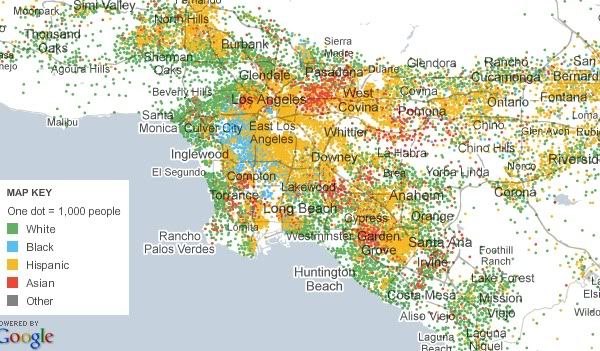
As you can see, this map divides human beings into the five standard types: white, black, Asian, Hispanic, and other. And it characterizes every single city block in the country according to those types. It scales up show whole regions of the country, and scales down so you can check out your own corner of your neighborhood. It is, as the title of this blog post indicates, ridiculously detailed. Which is to say, if you are the sort of person who can spend hours pouring over the patterns of segregation/integration in various US cities (hi!), an enormous time sink.
And, for good measure, they include maps like this, which shows Hispanic population by county, and scales down to individual census tracts:

Tuesday, January 4, 2011
The 2010 Census: Population and Congressional Apportionment
Hey look, I have a blog! Guess I'll post something.
Yep, it's census stuff, from here. Roll over states for their particulars. I think it mostly speaks for itself - the Rust Belt continues to Rusts, the Sun Belt continues to... not rust. One thing I notice about the latter, though, is that there seems to be a bit of consolidation relative to earlier decades. Whereas growth had been widespread across many southern and western states from the 70s through the 90s, it seems a bit more focused in the last ten years, mainly centering on the states associated with megaregions: the Piedmont Atlantic (Georgia and the Carolinas), the Texas Triangle (Texas), and Florida (Florida) in particular. Less urbane states in the broader region, like Tennessee or New Mexico didn't gain as much in the past decade, relatively speaking. Blip? Trend? I speculate half-heartedly, you decide.
Yep, it's census stuff, from here. Roll over states for their particulars. I think it mostly speaks for itself - the Rust Belt continues to Rusts, the Sun Belt continues to... not rust. One thing I notice about the latter, though, is that there seems to be a bit of consolidation relative to earlier decades. Whereas growth had been widespread across many southern and western states from the 70s through the 90s, it seems a bit more focused in the last ten years, mainly centering on the states associated with megaregions: the Piedmont Atlantic (Georgia and the Carolinas), the Texas Triangle (Texas), and Florida (Florida) in particular. Less urbane states in the broader region, like Tennessee or New Mexico didn't gain as much in the past decade, relatively speaking. Blip? Trend? I speculate half-heartedly, you decide.
Tuesday, September 21, 2010
Global Peace Index 2010
Vision of Humanity is out with their 2010 Global Peace Index, a rating of the "state of peace" in 249 nations around the world:
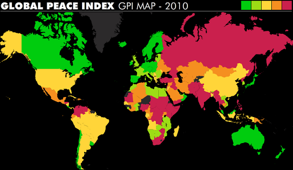
Each of 149 countries are ranked on a five-point scale for 23 indicators, including, e.g., number of homicides; access to weapons; political instability; deaths from conflict (internal); weapons exports; number of displaced people; and number of conflicts fought.
So what is the most peaceful nation in the world? Those honors go to plucky, placid New Zealand for the second year in a row. (Being small, wealthy, and surrounded by ocean would tend to keep the dander down, I'd imagine.) The rest of the top 10:
2. Iceland
3. Japan
4. Austria
5. Norway
6. Ireland
7. Denmark
8. Luxembourg
9. Finland
10. Sweden
All ten of the most peaceful nations in the world are also among the most wealthy; the top three are all island nations. And - do I even need to mention it? - the entirety of Scandinavia is represented here.
The bottom of the scale is a bit more eclectic:
140. Democratic Republic of the Congo
141. Chad
142. Georgia
143. Russia
144. Israel
145. Pakistan
146. Sudan
147. Afghanistan
148. Somalia
149. Iraq
A smattering of countries from the former USSR, Central/South Asia, the Middle East, and Africa. Some very poor countries, others (Russia, Israel) middle-income or higher. Peace comes in just one flavor, it would seem; conflict comes in many.
Some other country rankings I choose to highlight for my own capricious reasons: Germany (16), UK (31), France (32), Botswana (33), Laos (34), Bhutan (36), Vietnam (38), Sierra Leone (53), China (80), US (85), Kazakhstan (95), Iran (104), Mexico (107), South Africa (121), Thailand (124), India (128), North Korea (139). The report notes the top five risers on the list since 2009 (Ethiopia, Mauritania, Hungary, Lebanon, and Haiti), as well as the five biggest fallers (Cyprus, Russia, Philippines, Georgia, and Syria). The complete list is here (pdf), along with regional analyses and discussions of the top and bottom 10. Inexplicably, and a bit annoyingly, the folks at VoH continue to leave the beautiful and glorious Kyrgyz Republic off their rankings, along with a handful of other countries.
You can play with their map, which has a slider showing their rankings back to 2007, and also view maps for each of the component indicators. One trend I notice: a slight but steady movement towards greater peace in Africa. Is this just a blip, or the beginning of a long-term trend? It would certainly be wonderful if it were the latter.
I discussed the 2009 version of the map here.
Tuesday, August 10, 2010
A Map Animation of the Atomic Age
Via Boing Boing and The New Yorker, a map animation that shows every detonation of a nuclear bomb until 1998, by Japanese artist Isao Hashimoto:
Says The New Yorker:
Says The New Yorker:
It is the sort of set of pictures that makes you want to read—to learn more, for example, about how it came to be that France exploded more than a tenth of those bombs (two hundred and ten); China blew up forty-five. Not that anyone was taking cover in Provence: if you don’t watch the icons above and below the map, you might think that Algeria, and not France, was the world’s fourth nuclear-armed power (and that Australia, not Britain, was the third). The Gerboise Bleue explosion, of a seventy-kiloton device, took place in 1960, in the Sahara desert, in the midst of the Algerian war; several others followed. (Later, after Algeria gained its independence, France’s tests moved to French Polynesia; its last one was in 1996.)It's a wonder Nevada's even still habitable - though I guess you could make an argument that it's not, really...
Sunday, August 8, 2010
Russia's Portentous Summer
Jeff Masters says, "one of the most remarkable weather events of my lifetime is unfolding this summer in Russia" where the current heat wave is pretty much entirely off the historical charts. For comparison, the 2003 heat wave across Western Europe killed more than 40,000 people - and the present heat wave in Russia is far more extreme than that:


Says Masters:

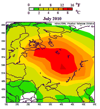
Says Masters:
The past 25 days in a row have exceeded 30°C (86°F) in Moscow, and there is no relief in sight--the latest forecast for Moscow calls for high temperatures near 100°F (37.8°C) for the majority of the coming week. As I reported in yesterday's post, the number of deaths in Moscow in July 2010 was about 5,000 more than in July 2009, suggesting that the heat wave has been responsible for thousands of deaths in Moscow alone. I would expect that by the time the Great Russian Heat Wave of 2010 is over, the number of premature deaths caused by the heat wave will approach or exceed the 40,000 who died in the 2003 European Heat Wave. As seen in Figure 2, the Russian heat wave of this year is more intense and affects a wider region than the great 2003 heat wave, though the population affected by the two heat waves is probably similar.Another commentator writes:
To put this in rough perspective -- and note this is not absolutely precise, it's purely ballpark to give you some feel for what the Russian people are enduring -- if this heat wave was hitting North America, it would be near 100°F in Fairbanks, Alaska. Most of Canada would be baking at 100° or higher, the northeast, from Maine to the Great Lakes region would be hitting upwards of 105° everyday, even the nightly low in the massive urban heat islands of New York and Chicago would be over 90°! The midwest grain belt and parts of the Pacific Northwest would not see a drop of rain for two months and pushing as high as 110° in places. The desert southwest, even some of the higher elevations of Nevada, Arizona, New Mexico, and West Texas, would be as uninhabitable as Death Valley or the Sahara.Tens of thousands of deaths from the sort of weather event that will become more common as global warming continues apace. The usual caveat applies about the fallacy of attributing individual weather events to long-term climate trends, but needless to say, a warming planet will experience more severe heat waves. As Masters notes:
It would mean nation-wide massive power brownouts, unprecedented crop failures, water rationing like you have never seen, record wildfires raging in dozens of states, thousands of deaths [Correction: Dr. Jeff Masters at WeatherUnderground informs me it would probably more like tens of thousands of deaths] and life threatening heat related illness, roads and highways clogged with broken-down, over-heated cars, and emergency services stretched beyond the breaking point across the US and Canada. The conditions could be so severe in places, especially if the wave persisted for a couple of years, that it could produce mass migration, i.e., refugees, the likes of which haven't been seen since the Great Depression.
Looking back at the past decade, which was the hottest decade in the historical record, Seventy-five countries set extreme hottest temperature records (33% of all countries.) For comparison, fifteen countries set extreme coldest temperature records over the past ten years (6% of all countries).Weather events like these heat waves have proven their capacity to have death tolls in the five figures. But perhaps the most ominous portent of the Russian heat wave has been the government's move to ban grain exports - a response to the decimation of wheat crops due to the wildfires and drought that have attended the heat wave. Natural calamity leading to resource nationalism, causing food prices to spike across the globe: this story will be written again in the decades to come.
Wednesday, August 4, 2010
Human Development and the US-Mexico Border
Andrew Sullivan links to a map from the 2009 Human Development Report, which uses HDI, the Human Development Index, as a measure of the general level of development for jurisdictions on both sides of the US-Mexico border:
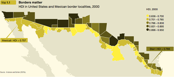
As Steven Taylor notes:
Also: as long-time readers of this blog know, I like nothing better than using HDI for various countries as a frame of reference for apprehending the significance of HDI ratings for various sub-national jurisdictions! And so, here are selected HDI-comparable nations (based on this table (pdf) from the same organization) for each of the five HDI ranges indicated on the map (with countries listed in ascending order of HDI):
.636-.700 - Morocco, Botswana, South Africa, Tajikistan, Vanuatu, Kyrgyzstan, Guatemala, Nicaragua
.701-.765 - Uzbekistan, Honduras, Egypt, Vietnam, Mongolia, Bolivia, Indonesia, Philippines, El Salvador, Algeria, China, Georgia
.766-.830 - Dominican Republic, Jordan, Belize, Tonga, Ukraine, Thailand, Peru, Turkey, Kazakhstan, Brazil, Serbia, Malaysia, Venezuela
.831-.895 - Panama, Bulgaria, Oman, Mexico, Costa Rica, Cuba, Argentina, Lithuania, Chile, Hungary, Malta
.896-.950 - Czech Republic, Portugal, UAE, Singapore, Slovenia, South Korea, Israel, Germany, UK, Italy, Belgium, United States

As Steven Taylor notes:
What is interesting is that the lowest HDI county on the US side (Starr County Texas) is higher than the highest HDI municipality in Mexico (i.e., Mexicali).That's true. It also points up what ought to be an obvious truth about immigration from Mexico and other relatively poor countries to the United States: it is comprised mostly of individuals who are driven by lack of economic opportunity to leave their homeland in order to exchange their labor for money. That many people feel so threatened by this class of people, which is already among the most powerless in society, has always baffled me.
This is, of course, likely not a shock to anyone paying even a modicum of attention to the situation. Still, it continues to underscore that fundamental aspect of this situation: it is the disparity of wealth between the two countries that continues to create the synergy of migration over the border. As I keep saying: any policy that ignores this fact will fail. As such, calls for massive deportations or that assumes it is possible to stop migration over the border is naught more than fantasy. “Seal the border!” is a slogan, not a viable policy.
Also: as long-time readers of this blog know, I like nothing better than using HDI for various countries as a frame of reference for apprehending the significance of HDI ratings for various sub-national jurisdictions! And so, here are selected HDI-comparable nations (based on this table (pdf) from the same organization) for each of the five HDI ranges indicated on the map (with countries listed in ascending order of HDI):
.636-.700 - Morocco, Botswana, South Africa, Tajikistan, Vanuatu, Kyrgyzstan, Guatemala, Nicaragua
.701-.765 - Uzbekistan, Honduras, Egypt, Vietnam, Mongolia, Bolivia, Indonesia, Philippines, El Salvador, Algeria, China, Georgia
.766-.830 - Dominican Republic, Jordan, Belize, Tonga, Ukraine, Thailand, Peru, Turkey, Kazakhstan, Brazil, Serbia, Malaysia, Venezuela
.831-.895 - Panama, Bulgaria, Oman, Mexico, Costa Rica, Cuba, Argentina, Lithuania, Chile, Hungary, Malta
.896-.950 - Czech Republic, Portugal, UAE, Singapore, Slovenia, South Korea, Israel, Germany, UK, Italy, Belgium, United States
Thursday, July 15, 2010
First Half of 2010 is the Warmest on Record
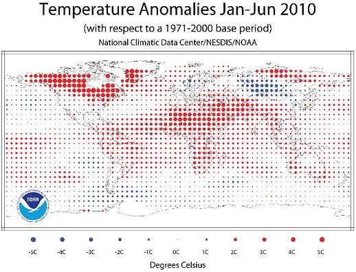
June 2010 was the hottest June on record, 1.22°F above average. So was the period of April-June, 1.26°F above average. And January through June - the entire first half of 2010 - were also the hottest on record, 1.22°F above average. A trifecta!
Pop quiz: what do these facts, and the giant oil spill and ecosystem carnage in the Gulf of Mexico, and the environmental damage and civil unrest in the Niger Delta, among many other sordid, disturbing facts about life on Earth in the early 21st Century, have in common?
George Will, among others, would say: nothing. Nothing at all. Because he does not believe that the world is warming due to our burning of fossil fuels; indeed, he does not believe we are in a period of global warming at all, as he argued in an editorial last year. He stated there that

These data points pretty strongly suggest that the world is in a period of warming, and the record for 2010 is clearly continuing the trend. But to correctly understand the data that are being represented here, you have to meet at least two sriteria: 1) Have the statistical acumen and general intelligence of at least a second-grader; and 2) Not be a disingenuous toady for the fossil fuel industry. On at least one of these points, Will has obviously failed.

Pop quiz: what do these facts, and the giant oil spill and ecosystem carnage in the Gulf of Mexico, and the environmental damage and civil unrest in the Niger Delta, among many other sordid, disturbing facts about life on Earth in the early 21st Century, have in common?
George Will, among others, would say: nothing. Nothing at all. Because he does not believe that the world is warming due to our burning of fossil fuels; indeed, he does not believe we are in a period of global warming at all, as he argued in an editorial last year. He stated there that
according to the U.N. World Meteorological Organization, there has been no recorded global warming for more than a decade, or one-third of the span since the global cooling scare.This assertions was factually incorrect - the WMO said no such thing - as were pretty much all of Will's assertions in the editorial. But what would make Will not only believe this assertion, but decide to broadcast it to the world from his extremely authoritative position as an editorialist for the Washington Post? Perhaps it was his interpretation of the fact that the ten warmest years on record, according to NOAA, have been, in order, 2005, 1998, 2003, 2002, 2006, 2009, 2007, 2004, 2001, and 2008. Or perhaps it's just his reading of this chart:
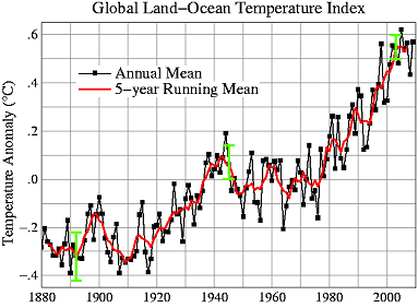
These data points pretty strongly suggest that the world is in a period of warming, and the record for 2010 is clearly continuing the trend. But to correctly understand the data that are being represented here, you have to meet at least two sriteria: 1) Have the statistical acumen and general intelligence of at least a second-grader; and 2) Not be a disingenuous toady for the fossil fuel industry. On at least one of these points, Will has obviously failed.
Monday, July 12, 2010
The Coming Heat Wave Wave
The weather where I live - a large East Coast metropolis somewhere between Bridgeport, CT and Trenton, NJ - was notably warm last week, as it was for much of the East Coast. At Dot Earth, Andrew Revkin links to a study that predicts many more such heat waves in the future.
On the study:
Twenty years from now, such heat waves will be occurring once every year or two.
And needless to say, there is zero evidence that we are prepared to seriously address the problem of global warming sufficiently enough to actually achieve the 2-degree goal. This is because we are a short-sighted, greedy, and not-quite-intelligent-enough species, and the world we bequeath to future generations will be severely damaged as a result. Very likely we will go down in history as a generation of obnoxious assholes who were too enthralled with our SUVs and plastic tchotchkes to make even the most minimally adequate moral calculations about our actions.
And if you think things might change once the effects of global warming actually start showing up in earnest... well, I have my doubts. Here is Revkin quoting social scientist Robert Brulle:
On the study:
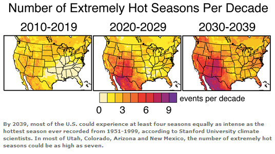
"Using a large suite of climate model experiments, we see a clear emergence of much more intense, hot conditions in the U.S. within the next three decades," said Noah Diffenbaugh, an assistant professor of environmental Earth system science at Stanford and the lead author of the study.The study predicts that "an intense heat wave – equal to the longest on record from 1951 to 1999 – is likely to occur as many as five times between 2020 and 2029 over areas of the western and central United States." In other words, imagine you are 60 years old or so, and think of the absolute most extreme heat wave you've experienced in your entire life.
Writing in the journal Geophysical Research Letters (GRL), Diffenbaugh concluded that hot temperature extremes could become frequent events in the U.S. by 2039, posing serious risks to agriculture and human health.
"In the next 30 years, we could see an increase in heat waves like the one now occurring in the eastern United States or the kind that swept across Europe in 2003 that caused tens of thousands of fatalities," said Diffenbaugh, a center fellow at Stanford's Woods Institute for the Environment. "Those kinds of severe heat events also put enormous stress on major crops like corn, soybean, cotton and wine grapes, causing a significant reduction in yields"...
In the study, Diffenbaugh and Ashfaq used two dozen climate models to project what could happen in the U.S. if increased carbon dioxide emissions raised the Earth's temperature by 1.8 degrees Fahrenheit (1 degree Celsius) between 2010 and 2039 – a likely scenario, according to the International Panel on Climate Change.
In that scenario, the mean global temperature in 30 years would be about 3.6 degrees F (2 degrees C) hotter than in the preindustrial era of the 1850s. Many climate scientists and policymakers have targeted a 2-degree C temperature increase as the maximum threshold beyond which the planet is likely to experience serious environmental damage. For example, in the 2009 Copenhagen Climate Accord, the United States and more than 100 other countries agreed to consider action to reduce greenhouse gas emissions "so as to hold the increase in global temperature below 2 degrees Celsius."
But that target may be too high to avoid dangerous climate change, Diffenbaugh said, noting that millions of Americans could see a sharp rise in the number of extreme temperature events before 2039, when the 2-degree threshold is expected to be reached.
"Our results suggest that limiting global warming to 2 degrees Celsius above preindustrial conditions may not be sufficient to avoid serious increases in severely hot conditions," Diffenbaugh said.
Twenty years from now, such heat waves will be occurring once every year or two.
And needless to say, there is zero evidence that we are prepared to seriously address the problem of global warming sufficiently enough to actually achieve the 2-degree goal. This is because we are a short-sighted, greedy, and not-quite-intelligent-enough species, and the world we bequeath to future generations will be severely damaged as a result. Very likely we will go down in history as a generation of obnoxious assholes who were too enthralled with our SUVs and plastic tchotchkes to make even the most minimally adequate moral calculations about our actions.
And if you think things might change once the effects of global warming actually start showing up in earnest... well, I have my doubts. Here is Revkin quoting social scientist Robert Brulle:
I’m up in New Hampshire, and the signs of climate change are everywhere, should you choose to see them. The strawberry season has already passed (it usually comes in late July), and you can now get fresh blueberries (3 weeks ahead of normal). The lake I am staying at has lost a lot of water clarity due to an excessive amount of tannic acid. The lake had its earliest ice out this year in memory, and so the leaves had had a longer time to decompose, thus releasing more tannic acid to the water. The water looks more like what you see in the Pine Barrens than in New Hampshire. These changes are all just taken in stride. Climate change remains something abstract and far away, both in time and space. In short, these changes are being normalized.Cloudier lakes in New Hampshire today, an inundated Bangladesh tomorrow, and everything changing at the rate of one very slowly boiling frog. This is just a very difficult sort of calamity for our species to respond to.
Thursday, July 8, 2010
The Company You Keep
A provocative series of maps from Esquire's politics blog depicts the countries of the world according to a couple of controversial policies:
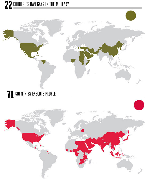
The countries that ban gays in the military, according to Esquire, are Cuba, China, Egypt, Greece, Iran, Jamaica, Mexico, Nigeria, North Korea, Pakistan, Saudi Arabia, Singapore, Somalia, South Korea, Sudan, Syria, Turkey, United Arab Emirates, Uganda, United States, Venezuela, and Yemen
The countries that execute people are Afghanistan, Antigua and Barbuda, Bahamas, Bahrain, Bangladesh, Barbados, Belarus, Belize, Botswana, Burundi, Cameroon, Chad, China, Comoros, Congo, Cuba, Dominica, Egypt, Equatorial Guinea, Eritrea, Ethiopia, Gabon, Ghana, Guatemala, Guinea, Guyana, India, Indonesia, Iran, Iraq, Israel, Jamaica, Japan, Jordan, Kuwait, Laos, Lebanon, Lesotho, Libya, Malawi, Malaysia, Mongolia, Nigeria, North Korea, Oman, Pakistan, Palestinian Authority, Qatar, Saudi Arabia, Sierra Leone, Singapore, Somalia, South Korea, St. Kitts and Nevis, St. Lucia, St. Vincent and the Grenadines, Sudan, Swaziland, Syria, Taiwan, Tajikistan, Tanzania, Thailand, Trinidad and Tobago, Uganda, United Arab Emirates, United States, Vietnam, Yemen, Zambia, and Zimbabwe
And the countries that do both:
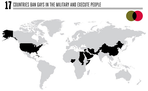
That is some pretty rarefied company for the United States: Cuba, China, Egypt, Iran, Jamaica, Nigeria, North Korea, Pakistan, Saudi Arabia, Singapore, Somalia, Sudan, Syria, United Arab Emirates, Uganda, and Yemen. The US's only company in the Western hemisphere are Cuba and Jamaica. Other than that it's just a handful of countries in Africa, a handful of countries in the Muslim Middle East, and a few in East Asia. No European countries on the list. The only other developed country is Singapore.
But all this is likely to change as the gears of the military bureaucracy seem to be slowly but inexorably grinding towards repeal of Don't Ask-Don't Tell. In which case the US will join only one other country in the executes-people-but-allows-gays-in-the-military pile: Israel.
What I find most interesting here, though, is the matter of American exceptionalism. To the extent that this term refers to the tendency of the US to embrace more authoritarian-conservative policies, it turns out the US isn't all that exceptional - except within the Western World (i.e., for these purposes, Europe + Latin America + Anglophone settler countries). It joins with a geographically coherent coterie of nations in clusters across parts of Africa, the Middle East, and much of South and East Asia.
But these areas couldn't be more unlike eachother - politically, culturally, linguistically, historically, religiously, geographically... They just tend to be alike in embracing more authoritarian policies. This consistent authoritarianism just seems to be independent of any other variable. Odd. (Of course, you could also take the view that the anti-authoritarianism of Europe and Latin America and perhaps part of Africa is exceptional, and what needs explaining.)
The countries that ban gays in the military, according to Esquire, are Cuba, China, Egypt, Greece, Iran, Jamaica, Mexico, Nigeria, North Korea, Pakistan, Saudi Arabia, Singapore, Somalia, South Korea, Sudan, Syria, Turkey, United Arab Emirates, Uganda, United States, Venezuela, and Yemen
The countries that execute people are Afghanistan, Antigua and Barbuda, Bahamas, Bahrain, Bangladesh, Barbados, Belarus, Belize, Botswana, Burundi, Cameroon, Chad, China, Comoros, Congo, Cuba, Dominica, Egypt, Equatorial Guinea, Eritrea, Ethiopia, Gabon, Ghana, Guatemala, Guinea, Guyana, India, Indonesia, Iran, Iraq, Israel, Jamaica, Japan, Jordan, Kuwait, Laos, Lebanon, Lesotho, Libya, Malawi, Malaysia, Mongolia, Nigeria, North Korea, Oman, Pakistan, Palestinian Authority, Qatar, Saudi Arabia, Sierra Leone, Singapore, Somalia, South Korea, St. Kitts and Nevis, St. Lucia, St. Vincent and the Grenadines, Sudan, Swaziland, Syria, Taiwan, Tajikistan, Tanzania, Thailand, Trinidad and Tobago, Uganda, United Arab Emirates, United States, Vietnam, Yemen, Zambia, and Zimbabwe
And the countries that do both:
That is some pretty rarefied company for the United States: Cuba, China, Egypt, Iran, Jamaica, Nigeria, North Korea, Pakistan, Saudi Arabia, Singapore, Somalia, Sudan, Syria, United Arab Emirates, Uganda, and Yemen. The US's only company in the Western hemisphere are Cuba and Jamaica. Other than that it's just a handful of countries in Africa, a handful of countries in the Muslim Middle East, and a few in East Asia. No European countries on the list. The only other developed country is Singapore.
But all this is likely to change as the gears of the military bureaucracy seem to be slowly but inexorably grinding towards repeal of Don't Ask-Don't Tell. In which case the US will join only one other country in the executes-people-but-allows-gays-in-the-military pile: Israel.
What I find most interesting here, though, is the matter of American exceptionalism. To the extent that this term refers to the tendency of the US to embrace more authoritarian-conservative policies, it turns out the US isn't all that exceptional - except within the Western World (i.e., for these purposes, Europe + Latin America + Anglophone settler countries). It joins with a geographically coherent coterie of nations in clusters across parts of Africa, the Middle East, and much of South and East Asia.
But these areas couldn't be more unlike eachother - politically, culturally, linguistically, historically, religiously, geographically... They just tend to be alike in embracing more authoritarian policies. This consistent authoritarianism just seems to be independent of any other variable. Odd. (Of course, you could also take the view that the anti-authoritarianism of Europe and Latin America and perhaps part of Africa is exceptional, and what needs explaining.)
Tuesday, July 6, 2010
The Universe
Listen, I know it may be tough to keep up with my blistering blogging pace of late, but just bear with me... Here I give you a map of everything:
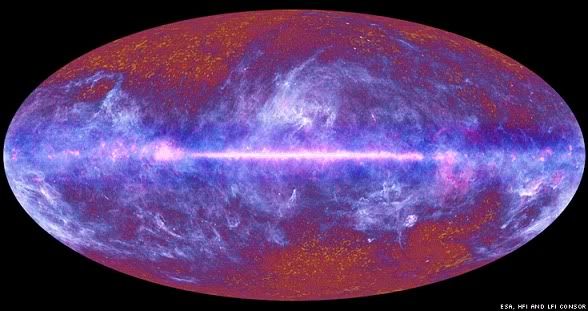
The image is from a BBC News article about mapping done by the European Space Agency's Planck Telescope:
And of course, one of the places we all share, and a place we are always in, is the universe. But what's odd about this place (well, among other things) - or in particular, what's odd about our experience of this place, is that it seems to totally baffle our intuitions as embodied beings. The scale is just so vast, it's literally incomprehensible. I mean, I can sort of imagine myself circumnavigating the globe. In fact, I have flown clear to the other side of the world. Which seemed like a very far way to go, but it was nonetheless a scale to which I could (barely) relate my own body: I can sort of imagine the world divided up into chunks on the scale of like a landscape that I might behold from a ridge, say, and thereby imagine the whole as constituted of so many chunks. Does that make sense?
Okay. But the universe is just so obviously beyond that scale. We can't imagine what a light-year is - we can't relate it to the scale of our sensory experiences in the way I just tried to do with the Earth as a whole (which was already pushing it). And it's 4 light-years to the nearest star. And the numbers! Are there 100 billion stars in the universe? 50 quadrillion? It really doesn't matter, because again, the numbers are so far beyond anything we can imagine in terms of our embodied experience that they are just meaningless. We hear numbers like this and we just think: really big number. We don't comprehend them in the way we can comprehend "3" or "8" or "100" or even "10,000."
Anyways, what's great about the map above (and the accompanying BBC video might help you to "read" it) is that it represents this greatest possible whole, the universe itself, in a way that makes it sort of comprehensible. Of course, the scale of the universe reamins beyond the ken of our intuitions as embodied beings. But this representation at least helps us to imagine the whole - to take it in, in a sense, like we would a landscape. And this must be to the good: this place is our home, after all. We ought to get to know it as well as we can.
The image is from a BBC News article about mapping done by the European Space Agency's Planck Telescope:
This is the extraordinary place where we all live - the Universe.One book I'm currently reading is Edward Casey's Getting Back into Place, which discusses the nature of place from a philosophical perspective. One of the book's themes is that our lived experience 1) always occurs in discrete places (as opposed to abstract space, for instance) and 2) our understanding of, or feel for, place is inherently a function of embodied experience. That is, it is only by virtue of being embodied beings that we understand places in the way we do. (To give one example, the verticality of certain buildings - think of the soaring cathedrals of Europe - evoke the natural verticality of the human form, and so we experience such buildings as inherently dignified, aspirational, and literally uplifting.) (Yes, I know that is a little broad and might sound vague or just weird. There's just no way to really do much more than gesture broadly like this. But check out the book if you're intrigued by this kind of stuff.)
The picture is the first full-sky image from Europe's Planck telescope which was sent into space last year to survey the "oldest light" in the cosmos.
It took the 600m-euro observatory just over six months to assemble the map.
It shows what is visible beyond the Earth to instruments that are sensitive to light at very long wavelengths - much longer than what we can sense with our eyes.
Researchers say it is a remarkable dataset that will help them understand better how the Universe came to look the way it does now.
"It's a spectacular picture; it's a thing of beauty," Dr Jan Tauber, the European Space Agency's (Esa) Planck project scientist, told BBC News.
Dominating the foreground are large segments of our Milky Way Galaxy.
The bright horizontal line running the full length of the image is the galaxy's main disc - the plane in which the Sun and the Earth also reside.
And of course, one of the places we all share, and a place we are always in, is the universe. But what's odd about this place (well, among other things) - or in particular, what's odd about our experience of this place, is that it seems to totally baffle our intuitions as embodied beings. The scale is just so vast, it's literally incomprehensible. I mean, I can sort of imagine myself circumnavigating the globe. In fact, I have flown clear to the other side of the world. Which seemed like a very far way to go, but it was nonetheless a scale to which I could (barely) relate my own body: I can sort of imagine the world divided up into chunks on the scale of like a landscape that I might behold from a ridge, say, and thereby imagine the whole as constituted of so many chunks. Does that make sense?
Okay. But the universe is just so obviously beyond that scale. We can't imagine what a light-year is - we can't relate it to the scale of our sensory experiences in the way I just tried to do with the Earth as a whole (which was already pushing it). And it's 4 light-years to the nearest star. And the numbers! Are there 100 billion stars in the universe? 50 quadrillion? It really doesn't matter, because again, the numbers are so far beyond anything we can imagine in terms of our embodied experience that they are just meaningless. We hear numbers like this and we just think: really big number. We don't comprehend them in the way we can comprehend "3" or "8" or "100" or even "10,000."
Anyways, what's great about the map above (and the accompanying BBC video might help you to "read" it) is that it represents this greatest possible whole, the universe itself, in a way that makes it sort of comprehensible. Of course, the scale of the universe reamins beyond the ken of our intuitions as embodied beings. But this representation at least helps us to imagine the whole - to take it in, in a sense, like we would a landscape. And this must be to the good: this place is our home, after all. We ought to get to know it as well as we can.
Wednesday, June 16, 2010
Net Migration in the US
An interesting interactive migration map from Forbes shows net migration for 2008 for every county in the US:
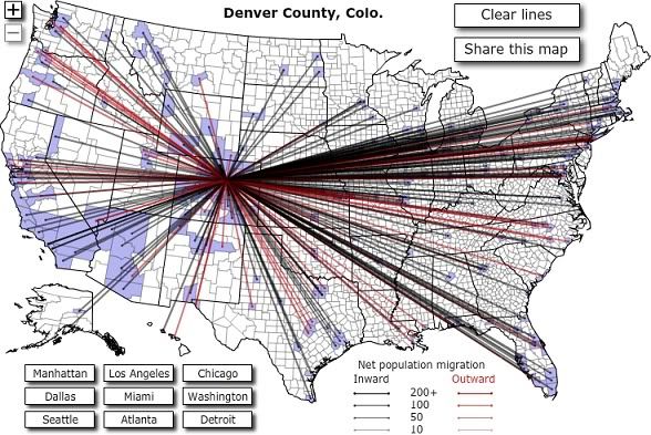
You can see migration to a given county from any other county in the country. E.g., 66 people moved from Dane County, WI (Madison) in 2008, and 34 moved in the opposite direction. Or: 149 people moved from Harris County, TX (Houston) to Queens, NY, but 449 made the opposite trip. Also, this being Forbes, matters economic are considered integral, so per capita income for migrants is also shown. This is pretty interesting, actually, as it is suggestive of the sort of moving involved: the average income for folks making the leap between high-tech hubs San Mateo, CA and Travis County, TX (Austin) was $74,500. For those moving from Cameron County, TX on the Mexican border to Clark County, NV (Las Vegas) it was just $12,900.
You can see migration to a given county from any other county in the country. E.g., 66 people moved from Dane County, WI (Madison) in 2008, and 34 moved in the opposite direction. Or: 149 people moved from Harris County, TX (Houston) to Queens, NY, but 449 made the opposite trip. Also, this being Forbes, matters economic are considered integral, so per capita income for migrants is also shown. This is pretty interesting, actually, as it is suggestive of the sort of moving involved: the average income for folks making the leap between high-tech hubs San Mateo, CA and Travis County, TX (Austin) was $74,500. For those moving from Cameron County, TX on the Mexican border to Clark County, NV (Las Vegas) it was just $12,900.
Friday, June 4, 2010
Has BP Ruined the Entire Atlantic Basin?
This video paints a dismaying picture:
Via Mother Jones, which says:
Via Mother Jones, which says:
The National Center for Atmospheric Research (NCAR) just released this horrifying animation of how ocean currents may carry all the oil in the Gulf of Mexico. According to their computer modeling of currents and the oil, the spill "might soon extend along thousands of miles of the Atlantic coast and open ocean as early as this summer."One question I haven't seen answered is: at what level of dispersion is the oil no longer harmful? I assume that if a hundred million gallons were distributed evenly throughout the world's oceans, it wouldn't even be noticeable, and would biodegrade in no time. But somewhere between that, and the actual conditions we have - giant plumes and enormous sheens concentrated in the northern Gulf of Mexico - is the threshhold beyond which dispersion takes care of the problem. I don't know what that threshhold is - whether, for instance, the quantities shown swirling about in the mid-Atlantic in this animation would still be dangerous to ecosystems. At the least, though, this looks bad for pretty much the entire coast of Florida.
"I've had a lot of people ask me, 'Will the oil reach Florida?'" says NCAR scientist Synte Peacock in a statement accompanying the animation, which he worked on. "Actually, our best knowledge says the scope of this environmental disaster is likely to reach far beyond Florida, with impacts that have yet to be understood."
The models show oil hitting Florida's Atlantic coast within a few weeks, then moving north as far as about Cape Hatteras, N.C., before heading east.
Thursday, May 13, 2010
Mapping the Invisible in the Jungles of Belize
Jungle. Ancient civilization. Lasers. Cool:
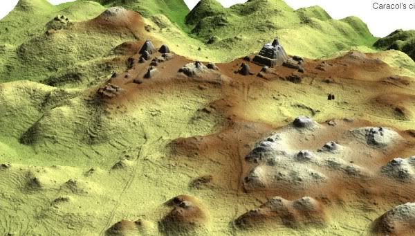
Says the NY Times:
Says the NY Times:
A small aircraft flying back and forth above the ancient Maya city of Caracol, in Belize, used a laser to penetrate the dense forest canopy.Interesting stuff, but a little disheartening in a sense. The age of physical human discovery is truly over; nowadays all we get is laser-guided dispatches from the global panopticon.
Viewed in three dimensions, the data revealed new ruins, causeways and agricultural terraces of the sprawling city. A detail [of a detail] of Caracol's city center is shown here.
Monday, May 10, 2010
Hanging of the Parliament
So they went ahead and had those elections in the UK, as you may have heard. The result was a major victory for primary colors, as this Wikipedia map shows. (Blue = Conservatives; Red = Labour; Yellow = LD; assorted = regional and minor parties):
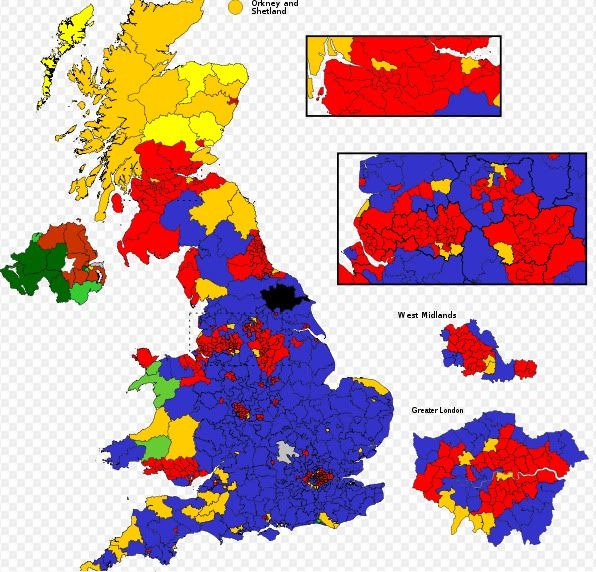
The political parties, however, didn't do so hot. Oddly, though electoral politics is supposedly a zero-sum game, all three major parties managed to lose. The Tories fell short of the majority they were hoping for; Labour lost a ton of seats and had their worst showing in decades; and the Lib Dems, despite anticipation of major gains and predictions that they might crack 100 seats, actually lost a handful of seats. The Tories now have 305 seats, to Labour's 258, and the Lib Dems' 57, with the rest distribute amongst various regional parties and a Green. With ~323 needed to form a majority, the parliament is, as they say, hung.
For comparison, this is what the map looked like after the last election, in ought-five:

Tuesday, May 4, 2010
Whither the Spill?
Thither, according to an oceanologist from the University of South Florida College of Marine Science Ocean Circulation Group, which has modeled the forecasted trajectory of the spill:
The narrator is expecting the slick to get caught up in the loop current, which feeds into the Gulf Stream, which runs up the East Coast of the US. Says he:
The narrator is expecting the slick to get caught up in the loop current, which feeds into the Gulf Stream, which runs up the East Coast of the US. Says he:
It's not looking good for the whole Gulf and for the East Coast, really... All these arrows are pushing it toward the loop current and once that happens, well, all bets are off... I hope that the people on the east coast are getting prepared for this, and Florida 'cause it looks like it's gonna come your way. It looks like it's not just a Gulf Coast deal.At the end he gives two pieces of advice: to say our prayers, and to keep the pressure on BP to "spend every dime they have" on the clean-up. I humbly encourage my readers to put more energy into the latter.
Tuesday, April 27, 2010
Spill, Baby, Spill
Proving that you don't have to have centralized government control of your economy to wreak environmental havoc, that oil rig that blew up last week off the coast of Louisiana is causing problems:

So says Eric Berger: barrels of oil a day, leaking up from the bottom of the Gulf where the rig's pipe snapped off (those are technical terms). And it looks increasingly likely that the only thing that will work to stem the leakage is to drill a relief well, but that'll take months. (Part of the problem is that the well is 5,000 feet down, which complicates any potential engineering solution, as you can imagine - but those are the sorts of problems you run into when you're scrounging under the earth's proverbial sofa for the every last drop of fossil fuel resources you can find.) The slick is already 80 miles by 36 miles across and likely to reach land within days. This thing could get very ugly for the Gulf Coast.
UPDATE: Now it's 100 x 45 miles.

From the Times-Picayune.

So says Eric Berger:
Officials from Louisiana to Florida remain concerned about oil leaking from a Transocean rig that exploded last week in the Gulf of Mexico, killing 11.That's a thousand
As crews attempt to stop the flow of an estimated 42,000 gallons a day escaping from a pipe about 5,000 feet below the surface, the oil slick has been slowly expanding across the Gulf.
Satellite images have helped officials track the slick as it swirls around the Gulf. Here's the best, most recent image captured by NASA's Aqua satellite.
 barrels of oil a day, leaking up from the bottom of the Gulf where the rig's pipe snapped off (those are technical terms). And it looks increasingly likely that the only thing that will work to stem the leakage is to drill a relief well, but that'll take months. (Part of the problem is that the well is 5,000 feet down, which complicates any potential engineering solution, as you can imagine - but those are the sorts of problems you run into when you're scrounging under the earth's proverbial sofa for the every last drop of fossil fuel resources you can find.) The slick is already 80 miles by 36 miles across and likely to reach land within days. This thing could get very ugly for the Gulf Coast.
UPDATE: Now it's 100 x 45 miles.

From the Times-Picayune.
Subscribe to:
Posts (Atom)
