Tuesday, December 22, 2009

States of Happiness

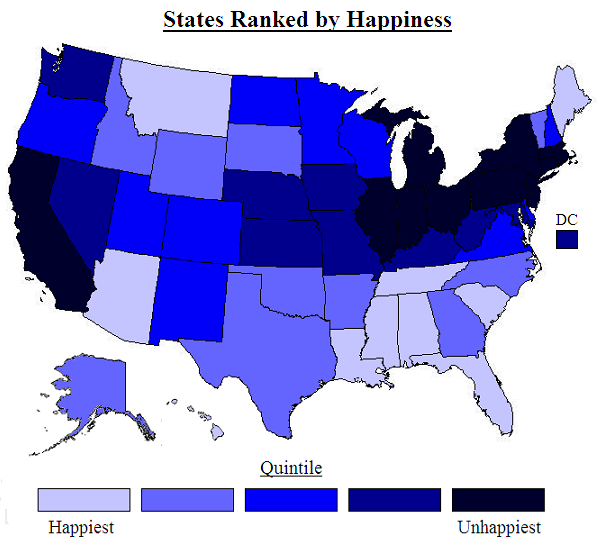
Ladies and gentleman, your latest state-by-state quantification of human feeling:

united states happiness map

This map is based on a new study that finds correlations between subjectively reported happiness and certain objective factors like air quality, cost of living, and climate:
The new research published in the elite journal Science on 17th December 2009 is by Professor Andrew Oswald of the UK’s University of Warwick and Stephen Wu of Hamilton College in the US. It provides the first external validation of people’s self-reported levels of happiness. “We would like to think this is a breakthrough. It provides an justification for the use of subjective well-being surveys in the design of government policies, and will be of value to future economic and clinical researchers across a variety of fields in science and social science” said Professor Oswald.

The researchers examined a 2005- 2008 Behavioral Risk Factor Surveillance System random sample of 1.3 million United States citizens in which life-satisfaction in each U.S. state was measured. This provided a league table of happiness by US State reproduced below. The researchers decided to use the data to try to resolve one of the most significant issues facing economists and clinical scientists carrying out research into human well-being.
That issue: whether subjective reports of well-being (like those portrayed here) can be trusted. Seems that they can.

The study used subjective reports of well-being, but then checked those reports against a number of other variables for each state, including "precipitation; temperature; wind speed; sunshine; coastal land; inland water; public land; National Parks; hazardous waste sites; environmental ‘greenness’; commuting time; violent crime; air quality; student-teacher ratio; local taxes; local spending on education and highways; [and] cost of living." It turned out that the objective factors which would be expected to correlate with subjective happiness - nice climate, affordability, short commutes and all that - actually do correlate to the reported happiness of those 1.3 million surveyees. According to Professor Andrew Oswald, the lead author of the study:
“The state-by-state pattern is of interest in itself. But it also matters scientifically. We wanted to study whether people's feelings of satisfaction with their own lives are reliable, that is, whether they match up to reality -- of sunshine hours, congestion, air quality, etc -- in their own state. And they do match. When human beings give you an answer on a numerical scale about how satisfied they are with their lives, you should pay attention.

People’s happiness answers are true, you might say. This suggests that life-satisfaction survey data might be tremendously useful for governments to use in the design of economic and social policies,” said Oswald.
The happiest state is Louisiana (!), followed by Hawaii, Florida, Tennessee, and Arizona. The South does well in general, and the Northeast and Rust Belt not so much, which is interesting: happiness levels seem to be in strikingly inverse proportion to levels of economic and social development. The unhappiest state, it thrills me to report, is New York, followed by Connecticut and New Jersey - a trifecta for the tri-state!

The rest of the unhappiest quintile of states form a Bleak Belt from southern New England to the Great Lakes, with California thrown in for good measure. California can't blame it on the climate, of course, so their other factors must have been really brutal. On the other hand, Montana and Maine managed to sneak into the top tier despite their godforsaken climes.

Via the NY Times.

Monday, December 21, 2009

Interstate/Underground

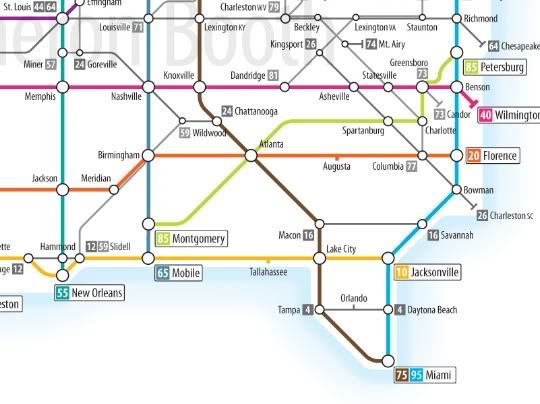
The blog at Good has a map of the US interstate highway system on the model of the London tube map:

US interstate system as tube map

A detail:

interstate map detail

Nice map, but I don't think Kent is the most important city between San Antonio and Las Cruces.

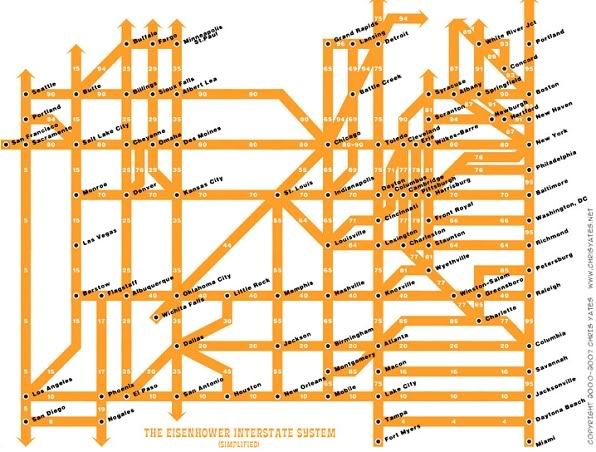
The author of this map cited a couple other interstate maps as inspiration, including this one by Chris Yates:

interstate system simplified

More inspiration here and here.

Wednesday, December 16, 2009

Deconstructing Metros

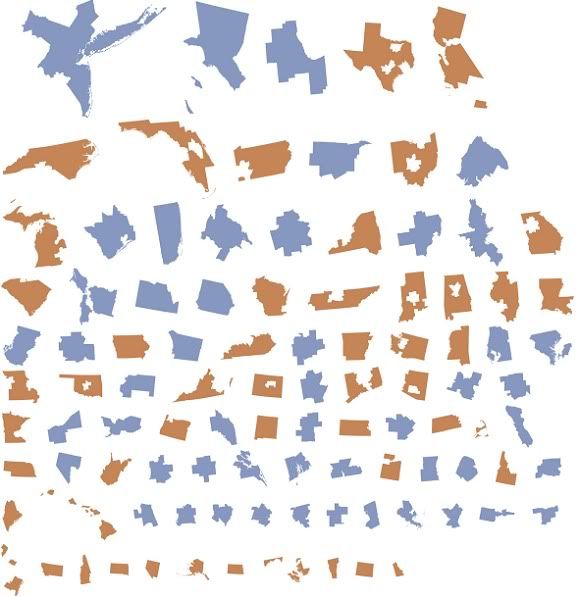
Neil Freeman's rather postmodern fake is the new real site has a graphic of the "fifty largest metro areas (in blue), disaggregated from their states (in orange). Each has been scaled and sorted according to population. The metro areas are US-Census defined CBSAs and MSAs":

metro state map disaggregation

This actually took me a while to figure out, but what seems to be going on is that metro areas and states minus their top-50 metro area populations are scaled to population and ranked in that order. Actually pretty interesting: it shows how much of the US population lives in those 50 cities vs. the rest of the country.

And by the way, I still don't believe Jacksonville actually exists, let alone that it's one of the 50 largest urban areas in the US. Have you ever met anyone from there? Have you ever, like, heard of someone taking a trip to Jacksonville? Didn't think so. And yet we're supposed to believe it's home to 1.3 million people? Please.

Via urban cartography.

Tuesday, December 15, 2009

Yet More on the Fate of the Planet

Via The Map Room and mapperz, here's another nice visualization of the calamity coming down the pike.


The image on the left anticipates increasing greenhouse gas emissions over the course of the century, which leads to a rise of just over 4C; the one on the right shows what'll happen if emissions gradually decrease - a rise of only 2C.

But obviously the warming, in either scenario, won't be uniform. The images really show how much more dramatic warming is forecast to be over land than over the ocean. Bear that in mind when you hear forecasts of like 4C warming by the end of this century: that's a global average, but it'll be considerably higher over land, which of course is where humans and cute baby elephants and things tend to live.

Meanwhile, talks in Copenhagen are hitting various sorts of predictable roadblocks:
China and the United States were at an impasse on Monday at the United Nations climate change conference here over how compliance with any treaty could be monitored and verified.

China, which last month for the first time publicly announced a target for reducing the rate of growth of its greenhouse gas emissions, is refusing to accept any kind of international monitoring of its emissions levels, according to negotiators and observers here. The United States is insisting that without stringent verification of China’s actions, it cannot support any deal.
If there's reason for optimism about the world's ability to do anything useful to slow our eminently foreseeable slide into global environmental devastation, it is this: if the US and China can just work out a framework for tackling the problem in a meaningful way, then Europe and Japan would surely follow; and just like that the countries producing a substantial majority of emissions will be on board. The rest of the world would not stand in the way (though OPEC would surely throw a fit).

If there's reason to be pessimistic about same, however, it's that the US and China would both have to agree to do something to meaningfully thwart global warming. For China, that would mean altering the model of industrialization that has brought them unprecedented and almost miraculous wealth in the last couple of decades, not to mention a growing role as a global power. For the US, it would mean overcoming the ossification of decline, including the extensive corruption of the political process and Versaillization of the political media, that appears to have compromised our ability to achieve any significant reforms on any front. In other words...

Sigh.

UPDATE: But here is some good news:
Negotiators have all but completed a sweeping deal that would compensate countries for preserving forests and in some cases other natural landscapes like peat soils, swamps and fields that play a crucial role in curbing climate change.

Environmental groups have long advocated such a compensation program because forests are efficient absorbers of carbon dioxide, the primary heat-trapping gas linked to global warming. Rain forest destruction, which releases the carbon dioxide stored in trees, is estimated to account for 20 percent of greenhouse gas emissions globally.

The agreement for the program, once signed, may turn out to be the most significant achievement to come out of the Copenhagen climate talks, providing a system through which countries can be paid for conserving disappearing natural assets based on their contribution to reducing emissions.
So it's good to hear some concrete good will come out of this meeting. And of course preserving ecosystems carries all sorts of environmental benefits along with it, beyond the increased absorption of greenhouse gases. But on the other hand:
A final agreement on the program may not be announced until the end of the week, when President Obama and other world leaders arrive — in part because there has been so little progress on other issues at the climate summit, sponsored by the United Nations.
Baby steps... Who knows. we may yet manage to cobble together a decent approach to global warming by the end of the century or so.

Tuesday, December 8, 2009

Global Warming is Gonna Be Bad for the Midwest

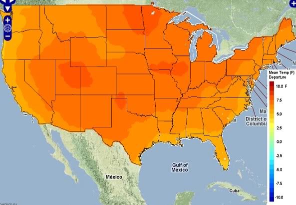
While bureaucrats from around the world are in Copenhagen haggling over an arcane agreement that may have profound effects on the state of the entire planet a century from now, you can enjoy this interactive map, which projects temperature rise across the the lower 48 states by the 2080s:

21st century global warming map of the us

It's based on a "medium" projection of greenhouse gas emissions. It shows at least a 4F temperature rise relative to a 1961-1990 baseline pretty much everywhere and 6-8F in much of the Interior West and Midwest (a.k.a. where our food comes from). In fact the seven states that are expected to heat up the most are all in the Midwest or thereabouts: Nebraska and Iowa (9.4F according to the moderate scenario), South Dakota (9.3), Missouri (9.2), Illinois (9.1), Kansas (9.1), and North Dakota (9.0).

The maps are based on a report (pdf) from The Nature Conservancy:
To help average Americans, policy makers and other local stakeholders better understand how climate change will directly impact their states, The Nature Conservancy has analyzed the latest and most comprehensive scientific data available to calculate specific temperature projections for each of the 50 US states over the next 100 years.

The Nature Conservancy also worked with the University of Washington and the University of Southern Mississippi to develop a new on-line tool that combines the latest scientific data and climate models with geographic information systems (GIS), statistical analysis and web-based mapping services. This tool, Climate Wizard (www.climatewizard.org), represents the first time ever that the full range of climate history and future projections for specific landscapes and time frames have been brought together in a user-friendly format that is available to a mass audience.
It also predicts rainfall:

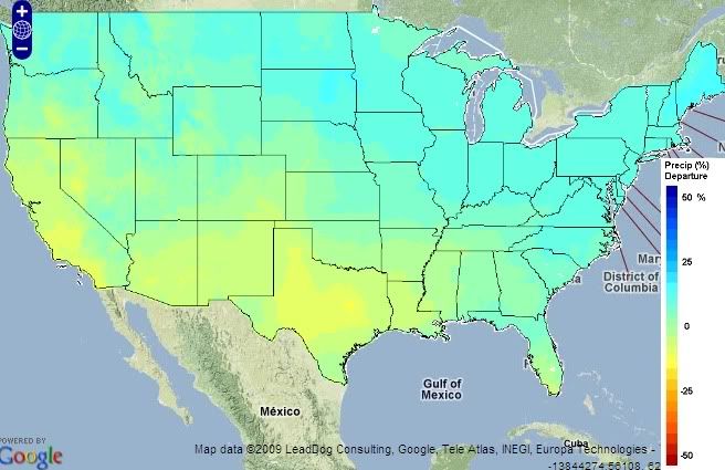
us global warming precipitation prediction map

Bad news for California and Texas. Oh well, at least they're not the two most populous states in the country or anything.

Via Huffington Post.