Via Jeff Masters, an animation of the Japanese tsunami's propagation across the Pacific basin:
The abstract yet brute physicality of the phenomenon makes it all the more horrifying to think about the lives lost to this disaster.
Says Masters, "Today's quake was the strongest in Japanese history, and will likely be the most expensive natural disaster in world history, surpassing the $133+ billion dollar price tag from Hurricane Katrina." He also has a nice map of the force distribution of the tsunami across the Pacific. The irregularities are interesting, as they were for the (obviously far less destructive) tsunami spawned by the Chile earthquake a year ago. I cannot explain them, but I do suspect fractal patterns may be involved.
Saturday, March 12, 2011
Monday, February 28, 2011
The Arab League
An interactive map from The Economist lets you click on member-states of the Arab League for relative scores on democracy, corruption, and press freedom, as well as overall stability:
You know what country looks pretty damn shaky? Iraq. Odd, what with our having bombed them into the age of liberal pluralism just eight years ago... Syria is similarly close to head of the line on the instability index, though most indications are that the government there would have no compuntion about brutally dispatching the opposition at the slightest whiff of unrest. Then again, the same could be (could have been) said for Qaddafi in Libya. And while the Gulf oil states mostly look pretty quiet for now (Bahrain excepted), no one's holding the reins on this tiger.
For what it's worth, here's an interesting take on what the future of the House of Saud may look like.
Thursday, January 6, 2011
The 2010 Census: The Ridiculously Detailed New York Times Map
(Ahem: Based on 2005-2009 American Community Survey data, for the sticklers out there.) A racial profile of the United States, block by block, courtesy of the New York Times:
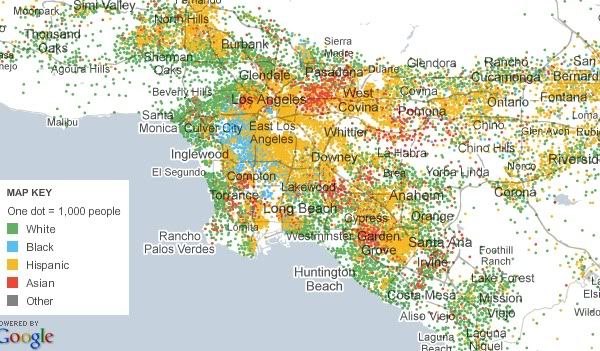
As you can see, this map divides human beings into the five standard types: white, black, Asian, Hispanic, and other. And it characterizes every single city block in the country according to those types. It scales up show whole regions of the country, and scales down so you can check out your own corner of your neighborhood. It is, as the title of this blog post indicates, ridiculously detailed. Which is to say, if you are the sort of person who can spend hours pouring over the patterns of segregation/integration in various US cities (hi!), an enormous time sink.
And, for good measure, they include maps like this, which shows Hispanic population by county, and scales down to individual census tracts:

Tuesday, January 4, 2011
The 2010 Census: Population and Congressional Apportionment
Hey look, I have a blog! Guess I'll post something.
Yep, it's census stuff, from here. Roll over states for their particulars. I think it mostly speaks for itself - the Rust Belt continues to Rusts, the Sun Belt continues to... not rust. One thing I notice about the latter, though, is that there seems to be a bit of consolidation relative to earlier decades. Whereas growth had been widespread across many southern and western states from the 70s through the 90s, it seems a bit more focused in the last ten years, mainly centering on the states associated with megaregions: the Piedmont Atlantic (Georgia and the Carolinas), the Texas Triangle (Texas), and Florida (Florida) in particular. Less urbane states in the broader region, like Tennessee or New Mexico didn't gain as much in the past decade, relatively speaking. Blip? Trend? I speculate half-heartedly, you decide.
Yep, it's census stuff, from here. Roll over states for their particulars. I think it mostly speaks for itself - the Rust Belt continues to Rusts, the Sun Belt continues to... not rust. One thing I notice about the latter, though, is that there seems to be a bit of consolidation relative to earlier decades. Whereas growth had been widespread across many southern and western states from the 70s through the 90s, it seems a bit more focused in the last ten years, mainly centering on the states associated with megaregions: the Piedmont Atlantic (Georgia and the Carolinas), the Texas Triangle (Texas), and Florida (Florida) in particular. Less urbane states in the broader region, like Tennessee or New Mexico didn't gain as much in the past decade, relatively speaking. Blip? Trend? I speculate half-heartedly, you decide.
Subscribe to:
Posts (Atom)
