Tuesday, August 10, 2010

A Map Animation of the Atomic Age

Via Boing Boing and The New Yorker, a map animation that shows every detonation of a nuclear bomb until 1998, by Japanese artist Isao Hashimoto:


Says The New Yorker:
It is the sort of set of pictures that makes you want to read—to learn more, for example, about how it came to be that France exploded more than a tenth of those bombs (two hundred and ten); China blew up forty-five. Not that anyone was taking cover in Provence: if you don’t watch the icons above and below the map, you might think that Algeria, and not France, was the world’s fourth nuclear-armed power (and that Australia, not Britain, was the third). The Gerboise Bleue explosion, of a seventy-kiloton device, took place in 1960, in the Sahara desert, in the midst of the Algerian war; several others followed. (Later, after Algeria gained its independence, France’s tests moved to French Polynesia; its last one was in 1996.)
It's a wonder Nevada's even still habitable - though I guess you could make an argument that it's not, really...

Sunday, August 8, 2010

Russia's Portentous Summer

Jeff Masters says, "one of the most remarkable weather events of my lifetime is unfolding this summer in Russia" where the current heat wave is pretty much entirely off the historical charts. For comparison, the 2003 heat wave across Western Europe killed more than 40,000 people - and the present heat wave in Russia is far more extreme than that:


Says Masters:
The past 25 days in a row have exceeded 30°C (86°F) in Moscow, and there is no relief in sight--the latest forecast for Moscow calls for high temperatures near 100°F (37.8°C) for the majority of the coming week. As I reported in yesterday's post, the number of deaths in Moscow in July 2010 was about 5,000 more than in July 2009, suggesting that the heat wave has been responsible for thousands of deaths in Moscow alone. I would expect that by the time the Great Russian Heat Wave of 2010 is over, the number of premature deaths caused by the heat wave will approach or exceed the 40,000 who died in the 2003 European Heat Wave. As seen in Figure 2, the Russian heat wave of this year is more intense and affects a wider region than the great 2003 heat wave, though the population affected by the two heat waves is probably similar.
Another commentator writes:
To put this in rough perspective -- and note this is not absolutely precise, it's purely ballpark to give you some feel for what the Russian people are enduring -- if this heat wave was hitting North America, it would be near 100°F in Fairbanks, Alaska. Most of Canada would be baking at 100° or higher, the northeast, from Maine to the Great Lakes region would be hitting upwards of 105° everyday, even the nightly low in the massive urban heat islands of New York and Chicago would be over 90°! The midwest grain belt and parts of the Pacific Northwest would not see a drop of rain for two months and pushing as high as 110° in places. The desert southwest, even some of the higher elevations of Nevada, Arizona, New Mexico, and West Texas, would be as uninhabitable as Death Valley or the Sahara.

It would mean nation-wide massive power brownouts, unprecedented crop failures, water rationing like you have never seen, record wildfires raging in dozens of states, thousands of deaths [Correction: Dr. Jeff Masters at WeatherUnderground informs me it would probably more like tens of thousands of deaths] and life threatening heat related illness, roads and highways clogged with broken-down, over-heated cars, and emergency services stretched beyond the breaking point across the US and Canada. The conditions could be so severe in places, especially if the wave persisted for a couple of years, that it could produce mass migration, i.e., refugees, the likes of which haven't been seen since the Great Depression.
Tens of thousands of deaths from the sort of weather event that will become more common as global warming continues apace. The usual caveat applies about the fallacy of attributing individual weather events to long-term climate trends, but needless to say, a warming planet will experience more severe heat waves. As Masters notes:
Looking back at the past decade, which was the hottest decade in the historical record, Seventy-five countries set extreme hottest temperature records (33% of all countries.) For comparison, fifteen countries set extreme coldest temperature records over the past ten years (6% of all countries).
Weather events like these heat waves have proven their capacity to have death tolls in the five figures. But perhaps the most ominous portent of the Russian heat wave has been the government's move to ban grain exports - a response to the decimation of wheat crops due to the wildfires and drought that have attended the heat wave. Natural calamity leading to resource nationalism, causing food prices to spike across the globe: this story will be written again in the decades to come.

Wednesday, August 4, 2010

Human Development and the US-Mexico Border

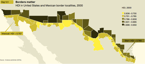
Andrew Sullivan links to a map from the 2009 Human Development Report, which uses HDI, the Human Development Index, as a measure of the general level of development for jurisdictions on both sides of the US-Mexico border:
us mexico border hdi map

As Steven Taylor notes:
What is interesting is that the lowest HDI county on the US side (Starr County Texas) is higher than the highest HDI municipality in Mexico (i.e., Mexicali).

This is, of course, likely not a shock to anyone paying even a modicum of attention to the situation. Still, it continues to underscore that fundamental aspect of this situation: it is the disparity of wealth between the two countries that continues to create the synergy of migration over the border. As I keep saying: any policy that ignores this fact will fail. As such, calls for massive deportations or that assumes it is possible to stop migration over the border is naught more than fantasy. “Seal the border!” is a slogan, not a viable policy.
That's true. It also points up what ought to be an obvious truth about immigration from Mexico and other relatively poor countries to the United States: it is comprised mostly of individuals who are driven by lack of economic opportunity to leave their homeland in order to exchange their labor for money. That many people feel so threatened by this class of people, which is already among the most powerless in society, has always baffled me.

Also: as long-time readers of this blog know, I like nothing better than using HDI for various countries as a frame of reference for apprehending the significance of HDI ratings for various sub-national jurisdictions! And so, here are selected HDI-comparable nations (based on this table (pdf) from the same organization) for each of the five HDI ranges indicated on the map (with countries listed in ascending order of HDI):

.636-.700 - Morocco, Botswana, South Africa, Tajikistan, Vanuatu, Kyrgyzstan, Guatemala, Nicaragua

.701-.765 - Uzbekistan, Honduras, Egypt, Vietnam, Mongolia, Bolivia, Indonesia, Philippines, El Salvador, Algeria, China, Georgia

.766-.830
- Dominican Republic, Jordan, Belize, Tonga, Ukraine, Thailand, Peru, Turkey, Kazakhstan, Brazil, Serbia, Malaysia, Venezuela

.831-.895
- Panama, Bulgaria, Oman, Mexico, Costa Rica, Cuba, Argentina, Lithuania, Chile, Hungary, Malta

.896-.950 - Czech Republic, Portugal, UAE, Singapore, Slovenia, South Korea, Israel, Germany, UK, Italy, Belgium, United States