Tuesday, September 29, 2009

Deutschland Wahlergebnisse

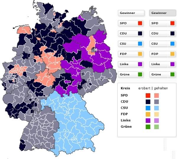
Germany had an election; Der Spiegel has a map (under the Wahlkriese tab):

germany election map

(According to Babel Fish, 'erobert' means 'conquered' (evocative!) and 'gehalten' means 'held,' so you can see where parties made gains, especially the CDU and Linke.)

The link comes from the San Francisco Examiner, which says:
The results are in on Sunday’s elections in Germany, and the big news is that it is a big win for the center-right. In the vote for proportional representation (Zweitstimme), Chancellor Angela Merkel’s Christian Democrats (the Christian Democratic Union and the Bavarian Christian Social Union, CDU/CSU) got 33.8% of the vote and the free-market Free Democrats (FDP), Merkel’s preferred coalition partner, got 14.6%, for a total of 48.4%. The Social Democrrats (SDP) got only 23.0%, their lowest share in history, while the Greens (GrĂ¼ne) got 10.7% and the Left (Linke, more or less the former Communists) got 11.9%. The SDP has been willing to enter into a coalition with the Greens, as it did in 1998-2005, and with the CDU/CSU, as it has in the so-called Grand Coalition since the 2005 election, but not with the Left.

Both of the two largest parties got smaller percentages than in the last election, in September 2005, but the drop for the CDU/CSU was minimal, while the SDP share dropped from 34.2% to 23.0%--one out of its three voters went elsewhere. The percentages for the three minor parties all rose, with the FDP getting the largest percentage in the 60-year history of the Federal Republic. My sense is that voters in Germany, as in Britain, are engaging here in tactical voting.
If my brain is functioning properly (not certain!) that means right/center-right parties got 48.4% of the vote, and left/center-left parties got 45.6%.

You can click on the Interaktive Grafik to see where each parties had strengths. The Christian Democrats did best in northwestern Germany, but showed strength in the southwest and parts of the east as well. The CSU, which appears to stand in relation to the CDU in Bavaria as the DFL party stands in relation to the Democrats in Minnesota, did well on their home turf. The Free Democrats did best in the south and in Schleswig-Holstein in the north. The opposition Social Democrats, who sort of tanked a little, had their best showing in the west, especially in Hessen, Nordrhein-Westfalen, and Niedersachsen. Linke, a left-wing party, did best in East Germany but poorly pretty much everywhere else. The Green Party, kind of oddly, did best in many of the same regions as the Free Democrats; those areas appear to be amenable to third parties, for whatever reason. They also did wellish in and around Berlin.

Michael Barone, the author of the Examiner article, notes: "What strikes me as uncanny is that the CDU/CSU tends to win in the historically Catholic parts of Germany (the south, much of the Rhineland) while the SDP and, in 2009, the Left tends to win in the historically Protestant parts of Germany." He's got some other observations about the vote (and also a few dubious conclusions about what this says about Europeans' desires for smaller government).

Meanwhile, Matt Yglesias notes that the Pirate Party got a decent 2% of the vote in their first election. Not bad!
Friday, September 25, 2009

"Where the Buffalo Roamed"

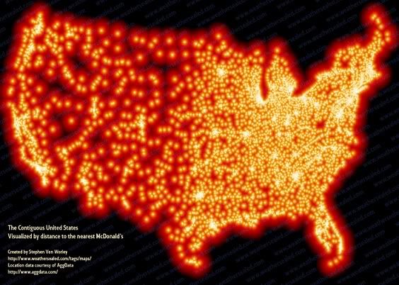
I can't improve on the blog post title from Stephen Von Worley, who maps the US by distance to the nearest McDonalds:

nearest mcdonalds us map

We here at the Map Scroll would also like to endorse the ironic detachment of Von Worley's post - such a mood being really the only way to cope with the bombardment of consumerist waste the US landscape has endured over the course of the last 60-odd years - which begins thus:
This summer, cruising down the I-5 through California’s Central Valley to the Los Angeles Basin, I unwittingly stumbled upon a most exasperating development: the country strip mall. First, let me state that I don’t hate. I’ve got nothing against Petco, Starbucks, OfficeMax, et al. When overcome by the desire for a cubic yard of kitty litter, a carafe of pre-Columbian frappasmoochino, or fifty gross of pink highlighter pens, I’m there in a jiffy!

But, Mr. Real Estate Tycoon, did you have to plop your shopping center smack dab in the middle of what was previously nowhere? Okay, the land was cheap. And yes, you did traffic studies and proved that the interstate and distant suburbs would drench whatever you built in a raging torrent of eager consumerism. But your retail monstrosity drains the wildness from the countryside for twenty miles in every direction! Sure, you can’t see it from everywhere - but once you know it’s there, you feel it. In the rural drawl of a neighboring rancher, that flat-out sucks!

Which begs the question: just how far away can you get from our world of generic convenience? And how would you figure that out?
He got data on the locations of all 13,000 McDonald'ses in the lower 48, applied some "technical know-how," as the kids call it, and made this map. As you can see, there's really no escaping the Gilded Parabolas in the eastern half of the country. There are, though, a few pockets in the West where the hegemony of the arches needn't weigh quite so heavily on the spirit:
For maximum McSparseness, we look westward, towards the deepest, darkest holes in our map: the barren deserts of central Nevada, the arid hills of southeastern Oregon, the rugged wilderness of Idaho’s Salmon River Mountains, and the conspicuous well of blackness on the high plains of northwestern South Dakota. There, in a patch of rolling grassland, loosely hemmed in by Bismarck, Dickinson, Pierre, and the greater Rapid City-Spearfish-Sturgis metropolitan area, we find our answer.

Between the tiny Dakotan hamlets of Meadow and Glad Valley lies the McFarthest Spot: 107 miles distant from the nearest McDonald’s, as the crow flies, and 145 miles by car!
I'm totally moving to Spearfish.

Via Felix Salmon.

Thursday, September 24, 2009

Things Change

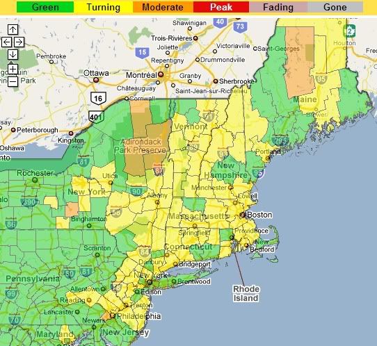
Yankee Magazine crowd-sources autumn:

northeast us foliage map

Reports are made by people (qualification: have color vision!) around the northeastern US, who write in and say stuff like
Hi folks, Things around here are really starting to look diferent around here [sic]. We had those last few nights that got alittle [sic] cooler and it seemed like the swamp maples took the hint. Like popcorn when it starts to pop [sic]. The colors realy [sic] started to show, see ya for now [sic]
which you can read by clicking on the map. You can also register to do it yourself. It all strikes me as somehow breathtakingly wholesome.

I also like the existential connotations of the map legend.

Via Andrew Sullivan

Saturday, September 19, 2009

Who's Your Polluter?

The New York Times has another one of their ridiculously information-rich maps which shows all of the 200,000+ facilities around the US that have pollution discharge permits, viewable by state:


The orange dots are facilities that have been cited for violations, and you can mouse-over them to see who they are and how many times they've been cited.

All this information is thanks to the 1972 Clean Water Act. It makes you think: thank heavens for that progressive Nixon administration! If not for them, there'd be no Clean Water Act and no EPA. And given the paralysis of the political system these days, as the wealthy classes become ever more shameless about claiming their ever-larger slices of an ever-shrinking pie, even as a sense of social responsibility towards the society which allowed them to garner that wealth continues to erode, it seems very unlikely that political initiatives like that would be able to pass now.

An accompanying article starts off this way:
Jennifer Hall-Massey knows not to drink the tap water in her home near Charleston, W.Va. In fact, her entire family tries to avoid any contact with the water.

Her youngest son has scabs on his arms, legs and chest where the bathwater — polluted with lead, nickel and other heavy metals — caused painful rashes. Many of his brother’s teeth were capped to replace enamel that was eaten away.

Neighbors apply special lotions after showering because their skin burns. Tests show that their tap water contains arsenic, barium, lead, manganese and other chemicals at concentrations federal regulators say could contribute to cancer and damage the kidneys and nervous system.

“How can we get digital cable and Internet in our homes, but not clean water?” said Mrs. Hall-Massey, a senior accountant at one of the state’s largest banks.
Imagine if we didn't have the Clean Water Act.

Saturday, September 5, 2009

How Americans Carpe Their Diems

This is not reallya map. Or maybe you could say it's a kind of time-map. But whatever, I'm posting it anyways:

how americans spend their days

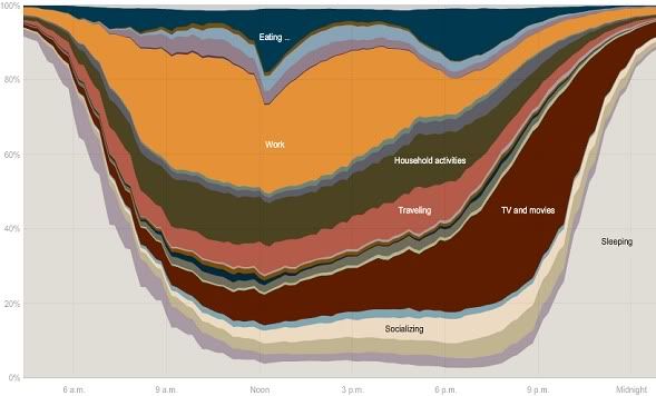
From the NY Times, it shows how Americans spend their days. It's based on the American Time Use Survey, which asked thousands of people to record how they spent every minute of the day. It, if interacted with, breaks down into demographic sub-categories for potentially many minutes of data-representational fun. The Times observes some things:

  • The average American spends 2/3 of their day sleeping, eating, working, and watching TV
  • Unemployed people spend more than two hours a day doing laundry and yard work
  • People who aren't in the labor force watch four hours of TV a day
  • Hispanics are as likely as whites to be eating at noon, but whites are much more likely than Hispanics to be eating at 6:30
I also notice that at 8:50pm, 39% of Americans are watching TV; at no time are more than 33% working. And at no time are more than 7% of people socializing. That seems low!

H/t to CC.