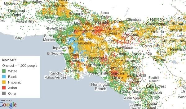
As you can see, this map divides human beings into the five standard types: white, black, Asian, Hispanic, and other. And it characterizes every single city block in the country according to those types. It scales up show whole regions of the country, and scales down so you can check out your own corner of your neighborhood. It is, as the title of this blog post indicates, ridiculously detailed. Which is to say, if you are the sort of person who can spend hours pouring over the patterns of segregation/integration in various US cities (hi!), an enormous time sink.
And, for good measure, they include maps like this, which shows Hispanic population by county, and scales down to individual census tracts:

