Saturday, February 27, 2010

Pacific Tsunami

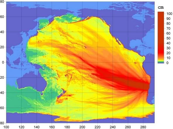
There was an 8.8 magnitude earthquake in Chile this morning. That is one of the ten strongest quakes in history, and a hundred times stronger than the 7.0 that leveled Port-au-Prince last month. It struck a relatively unpopulated area, though, and also a far more developed country, so the damage and number of deaths won't be nearly as high as in Haiti. It was expected to produce a tsunami, however, and NOAA's West Coast and Alaska Tsunami Warning Center has a map showing the predicted energy of the tsunami as it crosses the Pacific:

Photobucket

They also have a map showing predicted arrival times of the tsunami. From the time of the earthquake it was expected to take 7-8 hours to reach Central America, 15 hours to reach Hawaii, and ~22 hours to reach Japan. They've issued a tsunami warning for the entire Pacific basin, though the tsunami isn't expected to be catastrophic.

The wave is expected to be about eight feet high when it reaches Hilo.

Thursday, February 25, 2010

Olympic Medals Map

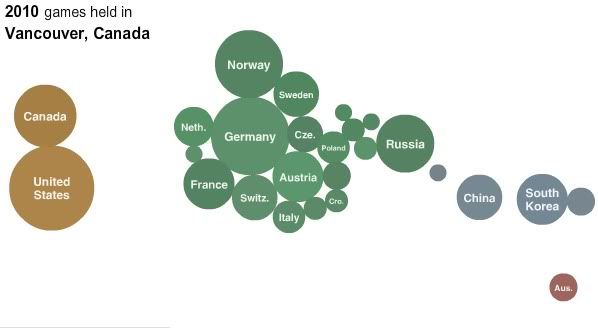
The NY Times has an interactive map of Olympic medals won by country:

vancouver winter olympics medals map

This represents medals won in the Vancouver Olympics thus far. You'll notice that the United States has a larger circle than Canada. This is because the United States has won more medals than Canada. I draw attention to this fact because the Canadians were all bragging about how they were going to win the most medals. Clearly they are going to fail to do so. Their hubris rankles; hubris belongs to Americans and Russians. In Canadians it is just... unbecoming. Also, as a United Statesian, it's fun to root for my country on the rare occasions when we are the underdog, like in the winter Olympics and the World Cup.

The map has medal winners going back to the first Winter Olympics in 1924. You can see that it was basically a meeting of Europeans, with a few odd North Americans thrown in, until the last few cycles. Now the North Americans are a much bigger presence, as are the Asians and even the bleepin' Australians, who need to knock it off with the excelling at sports all the time. Are there even any ski resorts in Australia?

Meanwhile, The Vancouver [de]Tour Guide 2010 team sends along their effort to google map some stuff of interest around Vancouver. They describe it as "a mixture of google bombing, counter-cartography and psychogeography that uses Google Maps to contest the online/offline representations of Vancouver during the Olympics." I link to them here mainly because I enjoy the words "counter-cartography" and "psychogeography."

Tuesday, February 16, 2010

The United States of Facebook

PeteSearch finds some patterns in the ways Facebook users are connected to each other:


The colored clumps represent areas within which users' friends tend to be found. That is, someone within Greater Texas, for instance, will tend to have more friends within that region than outside of it. Lines connect cities which tend to have more friend connections.

Says Pete: "Some of these clusters are intuitive, like the old south, but there's some surprises too, like Missouri, Louisiana and Arkansas having closer ties to Texas than Georgia." On Stayathomia:
Stretching from New York to Minnesota, this belt's defining feature is how near most people are to their friends, implying they don't move far. In most cases outside the largest cities, the most common connections are with immediately neighboring cities, and even New York only has one really long-range link in its top 10. Apart from Los Angeles, all of its strong ties are comparatively local.

In contrast to further south, God tends to be low down the top 10 fan pages if she shows up at all, with a lot more sports and beer-related pages instead.
On Dixie:
Dixie towns tend to have links mostly to other nearby cities rather than spanning the country. Atlanta is definitely the hub of the network, showing up in the top 5 list of almost every town in the region. Southern Florida is an exception to the cluster, with a lot of connections to the East Coast, presumably sun-seeking refugees.

God is almost always in the top spot on the fan pages, and for some reason Ashley shows up as a popular name here, but almost nowhere else in the country.
On Mormonia: "It's worth separating from the rest of the West because of how interwoven the communities are, and how relatively unlikely they are to have friends outside the region." The Nomadic West has much longer lines of connection than other regions, which is not terribly surprising. Socalistan is not simply Californiastan (or California for that matter) because the center of gravity clearly bends LA-wards. And Pete observes that Pacifica is "the most boring of the clusters."

All this, Pete notes, is "qualitative, not quantitative," so data caveat emptor and all that. Still, an interesting representation.

Via Andrew Sullivan.

Sunday, February 14, 2010

Satisfaction

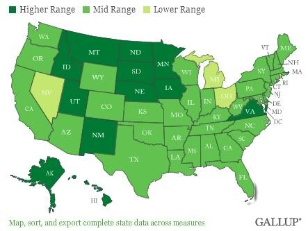
Gallup asked some people how satisfied they were with their standard of living, which yielded this result:

us satisfaction map

Says Gallup:
The 2009 satisfaction results are based on combined data for Gallup Daily tracking from Jan. 2 through Dec. 30, 2009, including more than 350,000 interviews for the entire year. The state sample sizes range from 632 in the District of Columbia and 878 in Wyoming to 37,203 in California. Forty-one states had more than 2,000 respondents...

Overall, 31 states showed an increase in satisfaction of at least one percentage point between 2008 and 2009, whereas 5 showed a decrease of at least one point (the greatest decrease, Hawaii's, was less than four points.) The remaining 14 states plus the District of Columbia changed by less than one point.
Now that just doesn't make any sense. Obviously things went downhill from 2008 to '09. Don't people know that? Don't they realize they must be less satisfied now than they were a year ago? Or is it that lean times make people feel more fortunate about their relative prosperity? After all, even now more than four-fifths of people who want jobs have them. That's 80% of the country that probably realizes they could be worse off than they are.

At any rate, it's interesting that the most satisfied states seem to be those that have been least affected by the recession, rather than the ones that have the highest standard of living. And for the least satisfied states it's the same deal: they don't have the lowest objective standards of living, but they have been hard hit by the current recession. I take this to mean that satisfaction, in this context, correlates with perceptions of change in economic conditions, rather than economic conditions as such. (Which makes some sense: if you have a net worth of $1,000, and you find a hundred dollar bill on the street, you'll probably feel a lot more satisfied than someone who's got $10,000 in the bank, but just lost $50,000 at the craps table in Vegas (Nevada, by the way, is the least satisfied state in the country).)

But overall there's not a real huge range from least to most satisfied. Nevada, like I say, is the least satisfied, but 69% there still express satisfaction with their standard of living. The most satisfied is North Dakota, at 82.3%, followed by South Dakots, at 80.8%. (The Dakotas, by the way, are the two ugliest states in the country as well. The reader may make of that what she will.)

BONUS FUN FACT: Did you know the Rolling Stones' (Can't Get No) Satisfation is only the third-best version of that song? It's true! Here's the best:

Saturday, February 13, 2010

Russians Call it 'Sneg'

I know what you're thinking. You're thinking: how much of the Northern Hemisphere is currently covered in snow, and can this information be represented in mustard yellow? Well, aren't you in luck:


That's from the Rutgers University Global Snow Lab. By way of commentary, Jeff Masters says:
We live in the United States of Snow. A rare Deep South heavy snowstorm whipped across the southern tier of states yesterday, dumping six-plus inches of snow over portions of Louisiana, Mississippi, Alabama, Georgia, South Carolina, and North Carolina. Even Florida got into the act, with up to two inches recorded in the extreme northwestern Panhandle. The snowstorm left 49 of the 50 states with snow cover, according to an article by Associated Press. Hawaii was the lone hold-out. David Robinson, head of the Rutgers Global Snow Lab, said that 67.1% of the U.S. had snow cover on Friday morning, with the average depth a respectable 8 inches. Normally, the U.S. has about 40 - 50% snow coverage during the 2nd week of February. January had the 6th greatest snow cover in the 44-year record over the contiguous U.S., and December 2009 had the most snow cover of any December on record. The current pattern of record heavy snows over the the Eastern U.S. is primarily due to a natural oscillation in the Earth's climate system called the North Atlantic Oscillation (NAO).
If one single person comments that this proves global warming does not exist, as God is my witness I will reach through the Internet and pop you right in the nose. I will then proceed to make a substantive argument as to why all this snow is actually just what you'd expect (in the short term) in a warming world, but I'd really prefer to not have to do that.

Wednesday, February 3, 2010

The Reformed State Map of the US

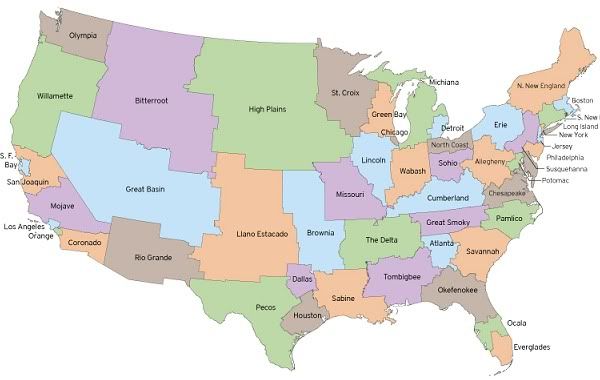
A proposal for electoral reform from fakeisthenewreal:
electoral reform map of the US

It's neat and all that the US was the first modern country to adopt many democratic institutions - we did it way back in the 18th Century, before the French Revolution even. Bully for us! However, a side effect of our early adoption of 'democracy' is that we have a lot of weird anachronistic leftovers from the pre-1789 era. Slavery was one, but fortunately we finally managed to get rid of that. But other, less significant but still not insignificant pre-democratic inconveniences remain. This map is meant to address some of these issues. Says fitn:
The electoral college is a time-honored system that has only produced results in conflict with the popular vote three times in over 200 years. However, it's obvious that reforms are needed. The organization of the states should be altered. This Electoral Reform Map redivides the territory of the United States into 50 bodies of equal size.... [This plan] overrepresentation of small states and underrepresention of large states in presidental voting and in the US Senate. Preserves the historical structure of the electoral college and the United States unique federal system, balancing power between levels of government. States could be redistricted after each census - just like house seats are distributed now.
Fifty states, as you see here, each with just about the same population. Yes, this would help with the problem of the electoral college system for picking presidents, which is insane by any reasonable standard and without which we might have avoided a certain period of unpleasantness from 2001-2009.

But the real advantage is in the Senate. Right now, Wyoming has as many senators as California. Vermont has as many as Texas. That's just straight up retarded. It's certainly not democratic. And don't give me any of that crap about how it preserves the sovereignty of states as the Great and Omniscient Founding Fathers intended, because do you know why they ended up with this provision that every state have an equal number of senators? To protect regional interests from the will of the majority; i.e., to protect southern interests; i.e., to protect slavery from meddlesome northerners. (And like just about everything unseemly in American politics, it all somehow goes back to the legacy of slavery...) Nothing approaches this level of blatant anti-democratic institutional structure in the free world. What's more, we can't even amend the constitution to allow for proportional representation in the Senate: the Founders made sure of that by making it the one thing that couldn't be repealed by amendment. Brilliant! So we would have to hold a constitutional convention and start over from scratch if we wanted to reform the Senate in a way that would really live up to modern norms.

Or - we could follow this guy's plan: just take the scissors to the ol' state map and produce what you see above. There would still be two senators per state, but every state would have equal population, so representation would be proportional. A fantastic idea! This would be much fairer than the system we've got going on now. In particular, as it stands, rural areas are way, way overrepresented in the Senate; having two senators each for neo-states like SF Bay, Los Angeles, Boston, New York, and Dallas would remedy that.

As for the electoral college, it wouldn't solve the problem entirely. It would still be possible to lose the popular vote and win the electoral college, but at least it wouldn't be due to the fact that the smallest states get overrepresented in the electoral college (e.g., North Dakota gets 3 EVs, because of its 1 representative + 2 senators, though it only has the population to justify 1).

Of course, there would be some logistical problems in re-organizing state governments throughout the country. But bah, I say. Small potatoes: the senate is dysfunctional as it is and it is going to end up killing the country. My own personal choice would be for us all to just ignore the Senate until it went away, sort of like the House of Lords. But this plan strikes me as the next best thing.