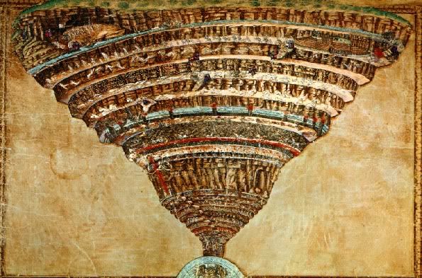
Dante's Divine Comedy is one of those classics I've been meaning to read for years and just haven't gotten around to. Likening the mild stickiness of the London tube to the allegorical cosmology of Inferno, the first part of The Divine Comedy, led me to look up the infamous nine circles that comprise that cosmology, and as it turns out, the London Underground is far worse than the first circle of hell! So is London, for that matter.
Botticelli's map of Dante's Inferno.
Here are descriptions of the nine circles, based on this tour of Dante's hell (with an assist from Wikipedia).
First Circle. Aka Limbo. The realm of non-sinners who don't get their Heaven ticket punched on account of being non-Christians. Includes green meadows and a nice castle - a sort of eternal retirement home for many of history's greatest poets and philosophers including Avicenna, Horace, Ovid, Aristotle, Socrates, Plato, Virgil and Homer. Sounds way, way cooler than Heaven itself.
Second Circle. Realm of the lustful - the "carnal sinners who subordinate reason to desire." Violent storms whip sinners' souls here to and fro. Some famous romantics ended up here, including Cleopatra, Dido, Achilles, and Helen.
Third Circle. A punishment for gluttons. Snowballs actually have a pretty decent chance here, as its inhabitants are forced to lie in a slushy mix of snow, hail, and freezing rain. Guarded by a three-headed dog.
Fourth Cirlce. Destination for the avaricious (though certain Christians might not realize their souls are headed here). Medievals saw this sin as "most offensive to the spirit of love." Actually, for Dante both the free-spenders and the tight-fisted would end up here, where they could annoy each other for all eternity.
Fifth Circle. A swampy place, and the realm of the angry, who take two forms: the wrathful (who express their anger), and the sullen (who repress it); the former spend eternity picking fights with each other, and the latter grumble and gurgle in a muddy bog. Beyond the fifth circle, the really heavy-duty hells begin, as the punished sins become more serious.
Sixth Circle. This hell reserved for heretics, who Dante defines as those who deny the immortality of the soul. They included epicureans, who saw the soul as mortal and enjoyed the boozin' and the feastin'. This circle also would seem to be more fun than Heaven, if not for the flaming tombs...
Seventh Circle. Getting into some serious damnation now... the seventh circle is for violent sinners - murderers, suiciders, blasphemers, userers, and sodomites. Those who commit violence against others are punished in a river of blood; those who do violence against themselves (suicides and "squanderers") are condemned to a horrid forest; a third region - a barren desert, torched by "flakes of fire" - is for those who commite violence against God.
Eighth Circle. Land of the fraudsters, including thieves, falsifiers, and specialists in fraudulent rhetoric, including "divisive individuals who sow scandal and discord." Presumably where Glenn Beck will find himself after the sad day he passes on. Punishments include being licked by flame and getting turned into a lizard.
Ninth Circle. The helliest hell of all and the realm of the worst of the worst: traitors. Like the third circle, it's a cold place, as the sinners in the ninth circle are entombed in ice at least up to their necks. Certain folks here like to gnaw on each other's heads. Satan is at the very center of this circle, waist-deep in ice, perpetually weeping, and munching on traitors (Brutus and Cassius in particular - one for each of his mouths).
Here's another map of Dante's hell - not quite as artful as Botticelli's version, but sort of mappier.
Tuesday, August 25, 2009
Monday, August 24, 2009
London's Underground: The First Circle of Hell?
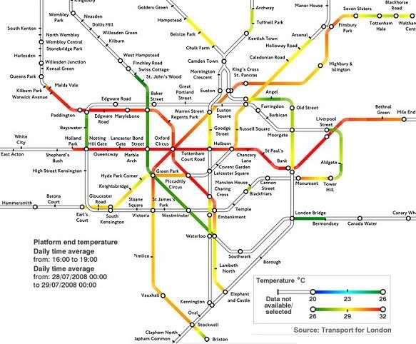
The Underground is hot, according to this heat map of heat:
Says Times Online:
My point: that's not all that hot, especially for the hottest day of the year. How did the Brits ever manage to stick around India long enough to comprehensively exploit the place?
Says Times Online:
It is easy to feel sorry for commuters on the London Underground at this time of year, crammed into stuffy carriages with the temperature rising. But some passengers, it appears, are more deserving of pity than others.The hottest parts of the Central Line were above 30C (that's 86 in 'Merican numbers) on the hottest day of 2008. Notes the Times: "In previous tests, temperatures in some carriages during the summer have exceeded 35C [95F], which would make the network officially unfit for transporting cattle." Upon reading this line, the hooved population of Texas collectively burst into derisive laughter, rolling gaily among the prickly pears and bullnettles for some hours. (They're big readers of Times Online, oddly.)
A map compiled by Transport for London (TfL) has revealed the hottest spots on the Tube network, notorious for its lack of air-conditioning.
The map, which covers most of the Underground lines in zones one and two, was compiled by TfL officials to identify areas most in need of cooling, but it will be a handy aid for travellers anxious to avoid the worst spots.
My point: that's not all that hot, especially for the hottest day of the year. How did the Brits ever manage to stick around India long enough to comprehensively exploit the place?
Labels:
great britain,
heat,
london,
london underground,
mass transit,
subways
Fun With Epidemiology!
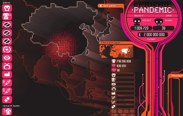
This game lets you respond to outbreaks of disease!
Deliver face masks, develop vaccines, and watch verite videos of indeterminately Teutonic scientists and panicky masses as you try to slow the spread of mean-looking red dots across a Risk-like map of the world. Note with equanimity the catastrophic consequences of your misallocations of resources as millions die, and consider the fundamental absurdity of a universe in which such picayune decision-making can lead to such widescale suffering and death. Fun for all ages!
Thursday, August 20, 2009
The Unhealthy Behaviour Axis
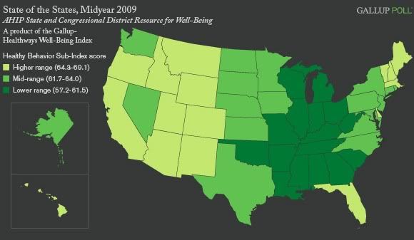
A new map from Gallup and AHIP (and a continuation of their study of well-being across the states, covered here before), measures states by healthy behaviour:
Says Gallup:
This is sort of a weird map. On the one hand, there is a very clear nexus of unhealthy states - all of the 'higher range' states are contiguous, in fact, with 'mid-range' states mostly forming a periphery around that core. But the weird thing is that the group of unhelthy states, despite its contiguity, transcends just about every other cultural and geographical distinction youcould try to make: North/South; warm-weather/cold-weather; urban/rural; manufacturing/service/agricultural economy; liberal/conservative; Obama/McCain; large/small minority population... If you break down these states by any intuitive metric, they seem to form no pattern at all, yet they create as tight a spatial clustering as you'll find on any map of the states. Is it a coincidence, or is there some hidden variable here that would explain the pattern?
The map does vaguely remind me of the personality type maps from Richard Florida. In particular, there are a few personality traits which seem to notably predominate both in the South and in the Midwest, in roughly the same areas as the "unhealthy behaviour" states in the map above: people in those regions tends to be extroverted, conscientious, and not very open to experience. Do those traits correlate with smoking, eating junk food, and not exercising? Don't see any reason why they should, but who knows.
Via M. Yglesias.
Says Gallup:
The midyear results from the AHIP State and Congressional District Resource for Well-Being, a product of the Gallup-Healthways Well-Being Index, find the nation as a whole dropping substantively on the Healthy Behavior Sub-Index, from 63.7 in 2008 to 62.6 in the first half of 2009. The Healthy Behavior Sub-Index is one of six sub-indexes that make up the Gallup-Healthways Well-Being Index, and asks Americans four questions: do you smoke; did you eat healthy all day yesterday; in the last seven days, on how many days did you exercise for 30 minutes or more; and in the last seven days, on how many days did you have five or more servings of fruits and vegetables. The Healthy Behavior Sub-Index scores for the nation and for each state are calculated based on a scale from 0 to 100, where 100 would be a perfect score.The healthiest states, in order, are Vermont, Hawaii, Montana, California, New Mexico, New Hanpshire, Maine, Delaware, Idaho, Wyoming, and Oregon. The least healthy is Kentucky, followed by Arkansas, West Virginia, Indiana, Ohio, Alabama, Tennessee, Oklahoma, Mississippi, Illinois, and Louisiana.
Healthy Behavior scores in most states are trending down in the first half of 2009 compared with 2008, though many have not decreased by a statistically significant degree. Mississippi, whose score ranks among the bottom 10, is the only state to record a statistically significant increase in its healthy behavior score thus far in 2009.
This is sort of a weird map. On the one hand, there is a very clear nexus of unhealthy states - all of the 'higher range' states are contiguous, in fact, with 'mid-range' states mostly forming a periphery around that core. But the weird thing is that the group of unhelthy states, despite its contiguity, transcends just about every other cultural and geographical distinction youcould try to make: North/South; warm-weather/cold-weather; urban/rural; manufacturing/service/agricultural economy; liberal/conservative; Obama/McCain; large/small minority population... If you break down these states by any intuitive metric, they seem to form no pattern at all, yet they create as tight a spatial clustering as you'll find on any map of the states. Is it a coincidence, or is there some hidden variable here that would explain the pattern?
The map does vaguely remind me of the personality type maps from Richard Florida. In particular, there are a few personality traits which seem to notably predominate both in the South and in the Midwest, in roughly the same areas as the "unhealthy behaviour" states in the map above: people in those regions tends to be extroverted, conscientious, and not very open to experience. Do those traits correlate with smoking, eating junk food, and not exercising? Don't see any reason why they should, but who knows.
Via M. Yglesias.
Wednesday, August 19, 2009
Incarceration Nation II
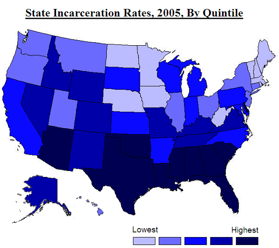
It occurs to me, regarding incarceration rates, that it would make sense to simply show per capita incarceration rates by state. So here you go - a map that is adapted, again, from Pew's One in 100: Behind Bars in America 2008 (pdf):
More so than in the map of prison funding, some clear geographical tendencies emerge here. One way to characterize the deepest blue states here would be as all the Gulf Coast states plus South Carolina, Oklahoma, Delaware and Arizona. Another way would be: the Deep South plus a few outlying states. Yet another would be: the states Goldwater won in the 1964 US presidential election, plus Texas, Oklahoma, Delaware and Florida. And another still would be: 10 of the 21 states (+ DC) with the lowest proportion of non-Hispanic whites.
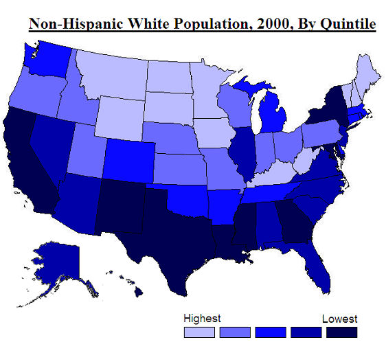
I think all of these characterizations, actually, tell us something about why these states, in particular, have the highest incarceration rates: I mean, is anyone surprised that the Deep South has most of the highest incarceration rates in the country? But I think the last characterization is especially interesting. Look at this map based on data from censusscope.org:
Someone who actually knows a thing or two about statistics would be able to run some sort of regression analysis to check this hypothesis, but it looks to me like there's a pretty strong correlation between a state's incarceration rate and its non-white population, but that that correlation is somewhat mitigated by certain regional variables (if the state is in the Interior West, it will have a relatively high number of prisoners; if it's in the Northeast or Far West, a relatively low number). And actually, it might be more correct to say that the correlation holds for states with the smallest white majorities, since for three of the four states which actually have majority-minority populations (Hawaii, New Mexico, and California, but not Texas), the incarceration rates are not notably high.
And really, all of this is totally unsurprising, if you accept this premise: that most of what happens in American politics is inflected by race, and in particular, by the white majority's fears about non-whites. Given this premise, you would expect crime and punishment policies to tend towards the more punitive in places where a large minority population would seem to pose a threat to the white majority, since in those places the (white) majority will be more likely to support policies driven by emotional gratification (i.e., 'lock up the bastards!'). In such places, since non-whites tend to be poorer and have less social capital, the 'bastards' will tend to be equated with non-whites. (And indeed, the incarceration rate for non-whites is much, much higher than it is for whites (one of the strongest bits of evidence that we are still a long ways from a "post-racial" era).) But in places like northern New England, the Upper Midwest, and the northern Plains, non-whites constitute a minuscule portion of the population, so there's less racial anxiety among the white majority. And, since almost everyone in places like North Dakota and Vermont is white, it ends up being mostly white people that are sent to prison; it makes it a little harder to work up the old "lock up the bastards!" dander when the bastards in question (or in the mind's eye, at least) don't have a different (which is to say, dismissable and otherizable) racial identity from one's own.
This could also explain why three of the four states with the highest non-white populations - the aforementioned Hawaii, California, and New Mexico - aren't in the top quintile of highest incarceration rate states. In those states, whites are in the minority, so you'd expect them to be much less able to translate their collective interests into actual policy.
I don't mean to suggest that high incarceration rates are just a function of white racial anxiety. Like I said, there are regional patterns too - I don't think the high rates in the Interior West have especially much to do with race. And I guess it's possible that crime rates might be somehow related to the number of prisoners in a given state. But really: it's the United States we're talking about here. That pretty much means that race is a factor.
Thursday, August 13, 2009
Incarceration Nation
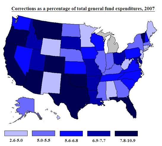
At Criminal Justice, Matt Kelley posts a chart from the Pew Center's report "One in 100: Behind Bars in America 2008" (pdf) showing state spending on prisons as a percentage of their overall budgets. Here's the data mappified:
(No, Michigan, I don't know why PEW doesn't love you.) Kelley has the original chart, which also shows percentage point changes (which only went down for eight states) from 1987-2007. Says Kelley: "These numbers are hideous. Oregon spends more than 10% of its general fund on corrections. Vermont, Michigan, Oregon, Connecticut and Delaware spend more on corrections than on higher education."
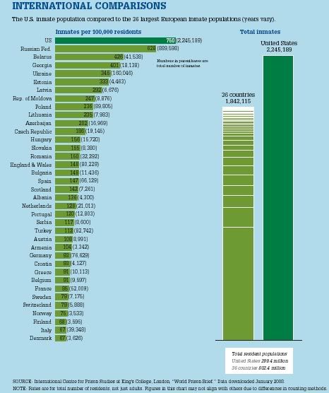
The Pew report also includes this chart, which shows just what an outlier the US is among western nations in terms of prison populations:
Let's hear it for American exceptionalism!
Labels:
american exceptionalism,
prison,
society,
united states
Tuesday, August 11, 2009
Whither the Bailout?
ProPublica has an interactive US map of the recipients of bank bailout funds:
On this map, "Each marker represents the headquarters of a financial institution that expects or has already received money from the Treasury Department under the TARP (Troubled Asset Relief Program). The size of each marker represents the amount of bailout money given to each institution." You can click on ProPublica's map to see the identities and amounts received for each institution.
They also have amounts received listed by state (and state-like, albeit less than fully represented despite being taxed, entities). The top ten are:
1. New York - $175 billion
2. Michigan - $80.7 (with most of that going to General Motors)
3. North Carolina - $56.3
4. Virginia - $54.9
5. District of Columbia - $44.9
6. California - $34.4
7. It drops off a bit here with Pennsylvania, at $11.3
8. Ohio - $8.1
9. Minnesota - $7.2
10. Georgia - $6.3
Bailed out institutions run the gamut from such big-city cauldrons of decadence and perfidy as AIG ($70 billion) to wholesome mom-and-pop operations like Festus, MO's Midwest Regional Bancorp (on the hook for a trifling 700 grand).
For more of ProPublica's comprehensive bailout coverage, go here.
Thursday, August 6, 2009
America 2050's Rail Plans
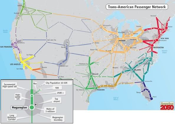
I have yet to see a forward-thinking and possibly pie-in-the-sky rail plan for the United States that I didn't feel like posting here, and this plan from America 2050 is no exception. They have a passenger rail plan map which includes megaregions, which points up the usefulness of rail in integrating the country's magalopoli:
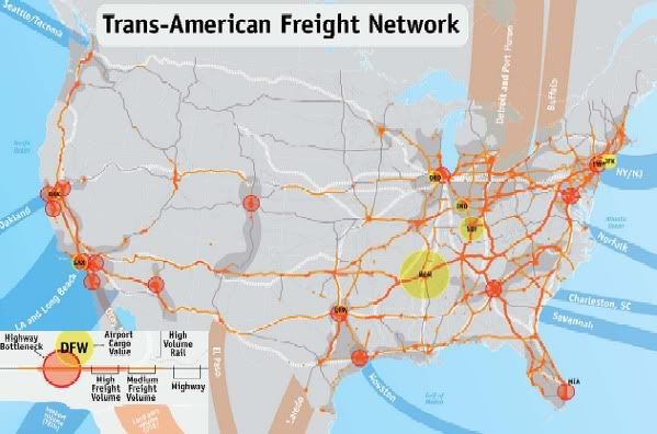
They also have a plan for a freight network:
You can read their policy brief here (pdf), though it's pretty much your standard pro-rail boilerplate. Which is to say: I heartily endorse it!
They also have a plan for a freight network:
You can read their policy brief here (pdf), though it's pretty much your standard pro-rail boilerplate. Which is to say: I heartily endorse it!
Labels:
freight rail,
high-speed rail,
transportation,
united states
Sunday, August 2, 2009
Catastrophe Cartography
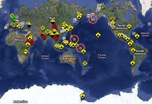
Tired of the staid monotony that is life in the 21st Century? Feel like there just aren't enough calamities in the day? Crave the delicious sense that Armageddon is threatening at any moment to bust through the seams of our loosely-stitched planet? Then the Hungarian government has just the thing to turn your placidity upside-down. Their Emergency and Disaster Information Service offers a global map of the latest calamities, catastrophies, and cataclysms to wreak havoc on our weary world:
Icons (and an extensive table) indicate recent seismic, volcanic, epidemiological, autocatastrophic, flooding, "technological disaster," heat wave, drought, storm, and other such events. A partial list of the most recent include:
- Magnitude 3.9 earthquake in the Aleutian islands
- Unspecified biological hazard in Wallonia
- Drought in Liaoning affecting 160,000 people
- Ubinas Volcano erupting in Peru
- 19 persons infected in an unspecified outbreak in Mogadishu
- 23 persons evacuated from a storm surge in Maharashtra
- Forest fire in Fresno
- Outbreak at a boys' high school in Christchurch
- Flash flood in Turkey
Subscribe to:
Posts (Atom)