Tuesday, November 24, 2009

Nine Chinas

Patrick Chovanec, an associate professor of business-type stuff at Tsinghua University in Beijing, has a map of what he calls the Nine Nations of China up at The Atlantic:

nine nations of china map

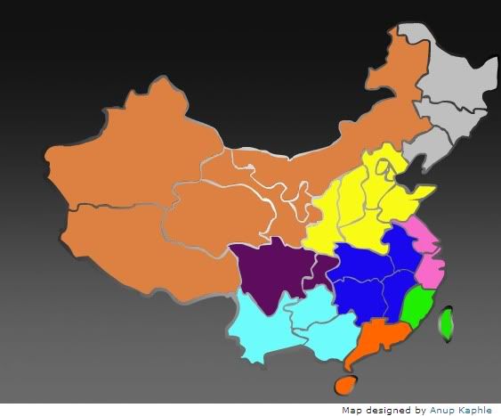
Chovanec, inspired by Joel Garreau's Nine Nations of North America, sees China as "a mosaic of several distinct regions, each with its own resources, dynamics, and historical character," and notes that "taken individually, these 'nations' would account for eight of the 20 most populous countries in the world." The nine regions are:

The Frontier (colored salmonish on the map): Population a mere 86 million. It's China's outback, or more pertinently, its Empty Quarter. Lots of wild landscapes, ethnic minorities, and exploitable resources - a milieu Americans might find faintly familiar!

The Refuge (contemplative purple): Pop. 110 million. An agricultural breadbasket consisting of the provinces of Sichuan and Chongqing, it's remote but close to self-sufficient; sheltered by high mountains, the be-pandaed region sounds like a Chinese pastoral idyll, albeit one that's now lurching somewhat gawkily into industrialization and increasing integration with the rest of China and the world.

Shangri-La (ethereal light blue): Pop. 132 million. Purported home of the legendary paradise on earth, Shangri-La is, naturally, beset by environmental degradation, drug cultivation (an historic producer of opium and, more recently, the far deadlier tobacco), and poverty: it's the poorest of the nine regions. It's also comprised of about 30% non-Han minorities.

The Yellow Land
(a very yellowy yellow): Pop. 359 million. A massively fertile land watered by the Yellow River, this region has more people than the United States. It has also served as the center of Chinese political power since roughly forever; it's the real belly of the whatnot.

The Crossroads (sullen dark blue): Pop. 226 million. So named because of its geographical centrality, and because it has historically stood between regions that compete for its resources; the region's never risen to a position of dominance within China, despite its placement on the Yangtze and main transportation corridors of the country.

The Back Door (debauched orange): Pop. 112 million. Once known as Yueh, this region in the south of China was a sort of Wild South for northern elites: a place of exile, full of jungles, gambling, smuggling, shadowy secret societies, and monkey-eating. Anchored by Hong Kong, it's boomed on the back of massive exports of late; presumably becoming less awesome.

The Straits (green like money): Pop. a paltry 59 million. Formed by Fujian on the mainland and the ever-ambiguous Taiwan, the region has been primarily a sea-faring one for centuries; its colonies throughout southeast Asia still remain tied together in many ways. The Asian tiger-dom of Taiwan has driven this to become the wealthiest of China's regions, though its political future is anyone's guess.

The Metropolis (tawdry pink): Pop. 147 million. The area around Shanghai and the mouth of the Yangtze has been the one region to seize preeminence from the Yellow Land at various points in Chinese history. After a period of neglect during the years of High Communism in China, Shanghai has led the country towards what seems to be its ever more urbane, cosmopolitan, and capitalistic future.

The Rust Belt (industrial alienation gray): Pop. 109 million. This is Manchuria, the locus of a certain prickliness between Russia and Japan a century ago. Japan held the region from 1931 until World War II; it went quickly to the Communists, and it became a stronghold of the socialist state. The reform era, though, hasn't been kind to the region; parts are almost as bad off as Michigan, if you can believe it. Pastimes include grain alcohol, decline.

Chovanec's got much more in his capsule descriptions, not to mention his blog.

Sunday, November 22, 2009

The Decline and Fall of Assorted Empires

A visualization of four European empires over the course of the 19th and 20th Centuries:


The bubbles respresent "the evolution of the top 4 maritime empires of the XIX and XX centuries by [areal] extent"; hence Britain's loss of Canada looks like a more significant bursting of the imperial bubble than its loss of India, even though India is obviously a far more important place than Canada.

Via Andrew Sullivan and 3quarksdaily.

Thursday, November 19, 2009

Support for US Health Care Reform in Three Dimensions

A nice map repetition from a New York Times op-ed shows support for health care reform along axes of income and age:

health care reform support map

The accompanying opinion piece is by Nate Silver, Andrew Gelman, and Daniel Lee. Say the authors:
Using a statistical method called multilevel regression and post-stratification, we ... mapped opinion on health care, breaking down voters by age, family income and state. We’re used to thinking about red states and blue states, but the geographic variation is dwarfed by the demographic patterns: younger, lower-income Americans strongly support increased government spending on health care, while elderly and well-off Americans are much less supportive of the idea. But in general, senators seems to be less interested in what their constituents, old and young, rich and poor, might think about health care, and more interested in how they feel about President Obama.

This may actually be good news for the Democrats. Although the Annenberg surveys had shown health care subsidies to be quite popular — they had 67 percent support nationally in 2000 and 73 percent support in 2004 — that was back when they were a mere abstraction, and before voters might have been considering how to pay for them. Nowadays, President Obama enjoys higher approval ratings — in the low to mid-50s, according to most polls — than do the Democrats’ health care reform plans, which are mired in the mid-40s in most surveys. Conditions being what they are, Democrats would rather have a referendum on the president than one on the health care bill itself.
Support for Obama seems to be driving attitudes about health care reform to some extent, and not the other way around. Of course, a lot of what this has to do with is trust. As Machiavelli said, reform is hard: vested interests who benefit from the status quo will oppose it at every turn, and they tend to be well-organized, while support for reform tends to be diffuse and shallow. Whether you're going to support a large intervention in a system that, for all its shortcomings, is our system - the one most of us have grown accustomed to - will depend in large part on whether you trust the folks who are doing the reforming. And of course, if you're already a beneficiary of guaranteed government-provided health care, like everyone in the US over the age of 65, you really don't have much incentive to support reform; unless, that is, you aren't entirely self-interested, and actually care about, for instance, the ability of young people to acquire health care when they're in their 20s and don't have access to the kind of job stability that's necessary to acquire employer-based health insurance; or who can't get health care in the free market because of a pre-existing condition like asthma; or are just too poor to afford quality health care.

But of course the maps show a geographical dimension too. Support tends to be lower in Republicaan-leaning regions like the Plains and the Utah-Idaho-Wyoming triad of conservative Western states; it tends to be higher in the Northeast and Great Lakes states. (By the way, when and why did Wisconsin become more liberal than Minnesota?) What will be interesting to me is to see how support shifts once a bill is actually passed. My guess is that support will increase across the board, once there are a bunch of headlines about Obama signing "historic leegislation" and all that. On the other hand, I wouldn't put it past Congress to end up with such a watered-down bill, with so many sops to the health insurance and health care industries, that it just pisses everyone off.

Tuesday, November 17, 2009

El Niño Heats Up

El Niño is growing stronger:

El Niño map

This image, from the NASA/JPL Ocean Surface Topography Team, is based on measurements taken from a US/French satellite over ten days around November 1.

Says NASA:
El Niño is experiencing a late-fall resurgence. Recent sea-level height data from the NASA/French Space Agency Ocean Surface Topography Mission/Jason-2 oceanography satellite show that a large-scale, sustained weakening of trade winds in the western and central equatorial Pacific during October has triggered a strong, eastward-moving wave of warm water, known as a Kelvin wave. In the central and eastern equatorial Pacific, this warm wave appears as the large area of higher-than-normal sea surface heights (warmer-than-normal sea surface temperatures) between 170 degrees east and 100 degrees west longitude. A series of similar, weaker events that began in June 2009 initially triggered and has sustained the present El Niño condition.

This image... shows a red and white area in the central and eastern equatorial Pacific that is about 10 to 18 centimeters (4 to 7 inches) above normal. These regions contrast with the western equatorial Pacific, where lower-than-normal sea levels (blue and purple areas) are between 8 to 15 centimeters (3 and 6 inches) below normal. Along the equator, the red and white colors depict areas where sea surface temperatures are more than one to two degrees Celsius above normal (two to four degrees Fahrenheit).

"In the American west, where we are struggling under serious drought conditions, this late-fall charge by El Niño is a pleasant surprise, upping the odds for much-needed rain and an above-normal winter snowpack," said JPL oceanographer Bill Patzert.
Swell. More here, including a map animation.

Californiaishness

This slightly odd map ranks states according to how similar they are to California, on a 1-30 scale:

map of states similar to california

Leading the way is California - it gets a full 30, which means it's very similar to California, indeed. The next most California-like state is Rhode Island, in a bit of an upset, along with Arizona and then the other two states that border California. Coming in an impressive 5th place is Michigan, followed by Florida. New Jersey, Wisconsin, and Illinois round out the top ten most Californiaish states.

Most unlike California honors go to Wyoming.

Via Yglesias.

Monday, November 16, 2009

Parag Khanna's Crystal Ball is a Globe

Fantastic. Just came across this at the atlas(t) blog. It's the mappiest TED talk ever:


It's Parag Khanna, who has the very important-sounding title of Director of the Global Governance Initiative and Senior Research Fellow in the American Strategy Program at the New America Foundation, talking about political geography. He uses lots of maps to illustrate the most salient changes that are going on in the global order today. One focus is on the expanding profile of China, which is touched with perhaps just a tinge of Sinophobia - Khanna suggests that Siberia may be a remote region of China, rather than Russia, before too long, and raises the specter of a sort of fifth column of ethnic Chinese working their way up the ladders of economic power in various foreign countries throughout East Asia.

Khanna also discusses Iraq - he's keen to let Kurdistan go indie, claiming that Iraq would still be the second largest oil producer in the world (though I think he might be forgetting about Russia, and the US as well, for that matter). He also suggests the Palestinians' problems could be solved by infrastructure development. I'm going to give him the benefit of the doubt on that one, and assume that he would make a more nuanced argument if time permitted.

Looking eastward, he sees the development of the energy resources in Central Asia and the Caucasus as leading towards a new, decidedly more carbon-oriented, Silk Road for the 21st Century. Most intriguing is his discussion of the future of Europe. He sees it as growing (which the EU has been, of course, for decades); in particular, he sees further regions of Eastern Europe, North Africa, and the Middle East moving increasingly into the orbit of what he variously calls the European "zone of peace" or the "Euro-Turkish superpower."

Khanna also raises the prospect of several new countries coming into the world in the next few years. All very interesting stuff.

Friday, November 13, 2009

The Spread of Swine Flu: Blame it on Louisiana

Nate Silver has a map based on data from Google Flu Trends that shows the timeline of the spread of swine flu around the US:

spread of swine flu us map

Google Flu Trends works by applying the Google Panopticon to searches that correlate with CDC data on actual flu cases, and has the benefit of being immediately responsive to trends in outbreaks of influenza (CDC data tends to lag by a week or two).

Says Silver:
This map is fascinating on a number of levels. Although the initial outbreak of H1N1 back in April was centered on Texas, California, New York, Illinois and South Carolina, the place where the flu first hit critical mass several months later was in Louisiana. It then slowly radiated its way outward to most of the neighboring states -- Maine finally hit the 5,000-point threshold just last week. There also appear to be other points from which the flu spread -- a less prominent 'epicenter', for instance, centered in Minnesota and the Dakotas. And somehow, there came to be quite a lot of flu at various points in both Alaska and Hawaii -- Hawaii's peak actually came way back in June and July, well before the one in the Deep South.
Here's something I don't begin to understand: everyone kept saying there'd be a second wave of swine flu in the fall, because the slu likes colder temperatures. Sure enough that second wave came to pass - but it looks like it actually erupted in one of the warmest regions of the country at the height of summer. That makes the opposite of sense to me.

Anyhoo, here's some good news, according to Nate: "the flu is pretty much on the decline in all states except Northern New England." Though if you're looking for a reason to feel glum, you should be informed that more people have died in the US from swine flu than died in the attacks of September 11, and most of them were fairly young.

Meanwhile, I see that Google is going global (or at least semi-global) with their flu map:

google flu map of the world

Bad times for cold places.

Monday, November 9, 2009

Because I Haven't Gotten Extremely Depressed About Global Warming in the Last Couple of Weeks...

The British government recently came out with a new interactive map, posted by The Guardian here, that shows the likely impacts of global warming, assuming our species continues our sit-on-our-asses-till-we're-all-fried approach to this looming catastrophe:

uk met global warming map

Says The Guardian:
The map was launched to coincide with the London Science Museum's new Prove it climate change exhibition by David Miliband, foreign secretary and his brother Ed Miliband, energy and climate change secretary. It comes in advance of key political talks on climate change in December in Copenhagen, where British officials will push for a new global deal to curb emissions.

The Miliband brothers said a new deal needed to be strong enough to limit global temperature rise to 2C, although many involved in the negotiations privately believe this to be impossible. A joint press release from the government and the Met Office released to promote the map says the government is aiming for an agreement that limits climate change "as far as possible to 2C".
The map presumes a global average rise of 4 degrees Celsius, a disastrous scenario which is nonetheless where we are very probably headed (as the UK Met Office says itself). That is, again, assuming that we don't take significant action to thwart such a catastrophe.

I personally consider such action highly unlikely for a number of reasons, which is really too bad, because this forecast is a terrible one. It calls for temperatures to be 6-7C warmer across most of the continental US, for instance. That's about 10-13 degrees Fahrenheit; that's like the difference between spring and summer. The "hottest days of the year could become as much as 10-12C (18-22F) warmer [!] over eastern North America," says the map; it's even worse for the Arctic, where a rise of 15C is so off-the-charts huge that's it's just impossible to predict what sort of effects it will have; beyond the prospect of a positive feedback from Arctic methane release, it's really not much fun to think about it anymore.

I will just stand up on my little digital soapbox here and make the point, not for the first time, that this dystopic future is the price we're paying for our cheeseburgers and our SUVs. It is really a profoundly, spectacularly, stupidly high price to pay for a lifestyle that, frankly, is not all that great to begin with. But no doubt this lesson will sink in... oh, right about the time that Bangladesh does.

Via The Map Room.

Friday, November 6, 2009

Bloomberg Wins, More or Less

The New York Times has an interactive block-by-block map of Tuesday's vote for mayor in New York City:

new york city mayoral election map

Plutocrat Michael Bloomberg beat out bureaucrat William Thompson to win a third term as mayor. He is a popular mayor, but he rammed a repeal of term limits through the city council and spent roughly nine gajillion dollars of his personal fortune on his re-election, which may have turned off some New Yorkers, and the election ended up much closer than most anyone expected - he won only 51-46. (The Times says, "[t]he results in the mayor’s race are likely to be personally bruising to Mr. Bloomberg, a man of no small ego who told the public last fall that his financial acumen made him uniquely qualified to pull the city out of a deep economic funk.") I would also like to believe that voters were squeamish about continuing to name the city's wealthiest resident as its civil leader, the sort of practice that makes it really hard to stifle the chortles when you start talking about "American democracy."

At any rate, says the Times:
Mayor Michael R. Bloomberg won re-election Tuesday, but voters were less enthusiastic about him than the last time he ran in 2005. The mayor did well in high-income white areas of Manhattan and Queens, and also in election districts dominated by immigrants, like Flushing and Brighton Beach. But his vote fell sharply in black neighborhoods, especially southeast Queens, where the black middle class has been hard-hit by foreclosure.
Those big blue splotches mostly correspond to the majority African-American neighborhoods in Queens, Brooklyn, and El Bronx. Bloomberg got like 90% in the swankier districts of the Upper East Side, and Thompson did about as well in his best districts in places like Bed-Stuy and Brownsville. Bloomberg did well among Jews and white Catholics; it seems like the Hispanic vote leaned toward Thompson, though it's a bit hard for me to tell from this map.

UPDATE: Commenter Gaurav links to a New York Magazine post that compares the NYC election map to the city's white population, based on a map from the Digital Atlas of New York City (which I posted about before). Here's the distribution of the city's white population:

new york city white population map

That's a tasty correlation! And Andrew B links to this map from the Digital Atlas showing Hispanic population. Definitely looks like they went for Thompson pretty strongly.

Monday, November 2, 2009

A Season of Storms

A beautiful animation of the entire 2008 Atlantic hurricane season:


It was produced by NOAA's National Hurricane Center and can be downloaded here.

Here's a map of all the tropical storms and hurricanes from that busy year. This year, by constrast, has been rather quiet.

Sunday, November 1, 2009

Maoists in India

The New York Times has an article about the escalating fight against Maoist rebels in India. It includes this map:

maoists in india map

Says the Times:
India’s Maoist rebels are now present in 20 states and have evolved into a potent and lethal insurgency. In the last four years, the Maoists have killed more than 900 Indian security officers, a figure almost as high as the more than 1,100 members of the coalition forces killed in Afghanistan during the same period.

If the Maoists were once dismissed as a ragtag band of outdated ideologues, Indian leaders are now preparing to deploy nearly 70,000 paramilitary officers for a prolonged counterinsurgency campaign to hunt down the guerrillas in some of the country’s most rugged, isolated terrain.
The rebels claim to represent many of India's impoerished people, especially among its indigenous tribal groups. Despite their violent tactics, they have some support among intellectuals in India, including the writer Arundhati Roy. They're not to be confused with the above-ground Communist Party, which is a force in Indian politics.