Dear Internets,
Busy busy busy. Changes are afoot, as I'm taking on a... well, a sort of government job on the East Coast. That means moving, and that means I'm rather busy these days and probably won't be able to post much for a little while. And, frankly, when I get back to posting, it's gonna be hard to meet my once every goddamn day posting quota, though I'll do my best to keep up a respectable pace. But let me just take this opportunity to thank everyone who's been reading the blog - it's really, really cool that I can express my weird love of looking at the world and human society through maps, and connect with folks out there who seem to dig it as much as I do.
Meanwhile, if you haven't had your daily fill of undulations, check out these pics by Marcin Sacha (via Chris Boddener at The Daily Dish).
Best,
Chachy
Monday, July 27, 2009
Wednesday, July 22, 2009
The Coming European Crack-Up?
Coming Anarchy imagines a future Europe where the continent's various semi-latent separatist movements have achieved their goals:
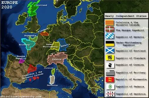
The cartographer lists two conditions as necessary for a successful devolutionary/secessionist movement:
That was less than 70 years ago; it's still within living memory. But since that time Western Europe has become the most stable, peaceful, and prosperous region in the world. The European Union is developing into a real trans-national sovereignty, something I don't believed has ever happened in a non-colonialist context in the history of the world. But all of this stability and prosperity has been so world-historically anomalous; if, in 70 years, we've gone from the Warsaw Ghetto to dickering over farm subsidies in Brussels, would an inverse movement - away from peace, away from cultural and economic integration - be just as possible?
The map above actually represents a benign vision of the future; European stability is a precondition for the success of the separatist movements this map highlights. But it makes me wonder if the stability and current shape of Europe is something we take too much for granted. There's one sure bet, at any rate: if you try to predict the future simply by extrapolating current trends, you're bound to be wrong.
By the way: Brittany has a separatist movement??
(Via The Map Room via Andrew Sullivan.)

The cartographer lists two conditions as necessary for a successful devolutionary/secessionist movement:
First, the state must be well off economically and able to hold it’s own, i.e. it must have more to gain than lose. Hence, states like Baden-Württemberg and Bavaria are the two richest in Germany, essentially subsidizing the rest would have more motivation than the poor underdeveloped east German states which feed off the rest. The second condition is that the region must have a well developed and unique identity which comes in the form of a strong dialect or different language, history of independence or autonomy and other characteristics that go into defining a culture. Thus, Bavaria (which is actually what most people think about when they think of Germany) is both rich and has a long cultural past and different identity. It has its own dialect, a history of independence and a host of other unique traits including traditional song, dance, clothes etc that other regions lack.I was recently reading an article about World War II. Specifically, I was reading an article about the horrific paroxysms of ghoulish violence that constituted World War II, something about which it's good, if unpleasant, to be reminded from time to time. That violence is epitomized by the Holocaust, of course, but there was far more to it than that: fire-bombings, mass starvation, death marches through the countryside, castration, rape, torture... For all intents and purposes, Armageddon came to Europe in the 1940s.
That was less than 70 years ago; it's still within living memory. But since that time Western Europe has become the most stable, peaceful, and prosperous region in the world. The European Union is developing into a real trans-national sovereignty, something I don't believed has ever happened in a non-colonialist context in the history of the world. But all of this stability and prosperity has been so world-historically anomalous; if, in 70 years, we've gone from the Warsaw Ghetto to dickering over farm subsidies in Brussels, would an inverse movement - away from peace, away from cultural and economic integration - be just as possible?
The map above actually represents a benign vision of the future; European stability is a precondition for the success of the separatist movements this map highlights. But it makes me wonder if the stability and current shape of Europe is something we take too much for granted. There's one sure bet, at any rate: if you try to predict the future simply by extrapolating current trends, you're bound to be wrong.
By the way: Brittany has a separatist movement??
(Via The Map Room via Andrew Sullivan.)
Tuesday, July 21, 2009
If Aliens are Watching Us...
this is what they are seeing:

It is humbling and awe-inspiring to think that we humans are the seat of self-consciousness in the universe - the organs through which the universe imagines itself. Just contemplating that fact can be akin to a spiritual experience.
Contemplating old episodes of Three's Company zipping out past Pollux and Arcturus, on the other hand, is humbling in a really quite different way.
Labels:
astromapping,
self-awareness of the universe,
space
Monday, July 20, 2009
Mapping Peak Oil
David Strahan, the journalist and author of the peak oil tome The Last Oil Shock, has an interactive Oil Depletion Atlas:
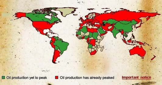
You can roll over countries to get their peak oil output, their 2007 output, and their historical or (somewhat speculatively) projected year of peak production. For example, the United States peaked in 1970 with production of 11.5 million barrels/day; its 2007 production was 6.88 mb/d. According to Strahan:
Meanwhile, Gail the Actuary (best superhero name ever, by the way) has a post up today at TOD that gives a nice overview of the global oil production situation, complete with nice charts. Her take is that we've already passed the global peak in oil production, and she gives these main reasons:
1) World oil production is down in 2009.
2) The big run-up in oil prices from 2003-2008 was not matched by a rise in oil production.
3) An analysis of scheduled oil development projects, plus decline in older oil fields, points to an overall decline in production over the coming years.
4) OPEC wells are aging and are likely to decline soon. And
5) The Former Soviet Union seems unable to compensate for declining production elsewhere.
It's a very interesting analysis, and well worth the read. I am not personally sold on the notion that world oil production has peaked however (and you should remember that, as the president of the International Energy Agency, I am an expert on the matter). The problem is that there's just a huge amount of uncertainty about oil reserves in OPEC countries and their production capacity, both present and future. This is especially true of Saudi Arabia, the lynchpin of global oil production, which, given their role as chief donor of life-blood for the global economy, has been able to get away with being shockingly opaque about their reserves situation. Nonetheless, they clearly have some production capacity they're not currently using, as they significantly ramped down production when the economy went parasailing with a concrete board last fall. The question is how much extra capacity they have, and how likely is near-term decline in production from aging and gargantuan fields like Ghawar, and I don't think anyone who doesn't have the title of Prince or Chief Geologist for ARAMCO knows the answer to that question.
Still, the most worrisome element in Gail's analysis is that nettlesome #2. Oil prices soared for five straight years, far outside any price range that could be anticipated sans a severe OPEC cutback like those orchestrated in the 1970s. And in those same years production was simply flat, despite surging demand in China and India. I just don't see any way to account for this unless the flat production was due to constraints on global production capacity. And if there have been such constraints over the past half-decade or so, then if we haven't yet reached peak oil, we're certainly not far from it.

You can roll over countries to get their peak oil output, their 2007 output, and their historical or (somewhat speculatively) projected year of peak production. For example, the United States peaked in 1970 with production of 11.5 million barrels/day; its 2007 production was 6.88 mb/d. According to Strahan:
There are currently 98 oil producing countries in the world, of which 64 are thought to have passed their geologically imposed production peak, and of those 60 are in terminal production decline. A few countries such as Iran, Libya, and Peru are anomalous in that although they are thought to have passed their production peak, their output is growing at the moment. However they are not expected to regain their previously-established highs. Other post-peak producers may also grow their production temporarily within a long-term downward trend. According to analysis by Energyfiles.com, another 14 countries could peak within the next decade. The numbers given here are a snapshot, and Energyfiles' forecasts are continuously updated in the light of emerging data.Strahan's map shows that oil production in about 28 countries had yet to peak as of 2007. But a recent post at The Oil Drum inventoried the world's oil producers and found that, of 54 oil producing countries, production was growing in only 14 of them: Saudi Arabia, Canada, Algeria, Equatorial Guinea, China, United Arab Emirates, Brazil, Angola, Kazakhstan, Qatar, Azerbaijan, Sudan, Thailand, and Turkmenistan. Those countries represent less than 40% of global oil production.
Meanwhile, Gail the Actuary (best superhero name ever, by the way) has a post up today at TOD that gives a nice overview of the global oil production situation, complete with nice charts. Her take is that we've already passed the global peak in oil production, and she gives these main reasons:
1) World oil production is down in 2009.
2) The big run-up in oil prices from 2003-2008 was not matched by a rise in oil production.
3) An analysis of scheduled oil development projects, plus decline in older oil fields, points to an overall decline in production over the coming years.
4) OPEC wells are aging and are likely to decline soon. And
5) The Former Soviet Union seems unable to compensate for declining production elsewhere.
It's a very interesting analysis, and well worth the read. I am not personally sold on the notion that world oil production has peaked however (and you should remember that, as the president of the International Energy Agency, I am an expert on the matter). The problem is that there's just a huge amount of uncertainty about oil reserves in OPEC countries and their production capacity, both present and future. This is especially true of Saudi Arabia, the lynchpin of global oil production, which, given their role as chief donor of life-blood for the global economy, has been able to get away with being shockingly opaque about their reserves situation. Nonetheless, they clearly have some production capacity they're not currently using, as they significantly ramped down production when the economy went parasailing with a concrete board last fall. The question is how much extra capacity they have, and how likely is near-term decline in production from aging and gargantuan fields like Ghawar, and I don't think anyone who doesn't have the title of Prince or Chief Geologist for ARAMCO knows the answer to that question.
Still, the most worrisome element in Gail's analysis is that nettlesome #2. Oil prices soared for five straight years, far outside any price range that could be anticipated sans a severe OPEC cutback like those orchestrated in the 1970s. And in those same years production was simply flat, despite surging demand in China and India. I just don't see any way to account for this unless the flat production was due to constraints on global production capacity. And if there have been such constraints over the past half-decade or so, then if we haven't yet reached peak oil, we're certainly not far from it.
Sunday, July 19, 2009
Hot Hot Heat
Another map from that Jeff Masters post confirms something I had strongly suspected: Texas was hot in June!
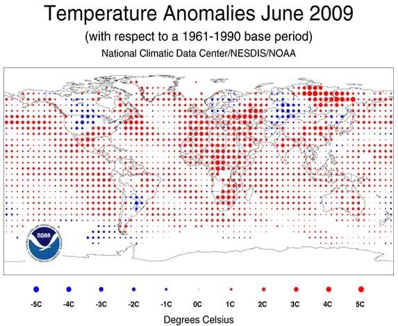
But then, so was the Southeast, the Maritime Provinces, the North Pacific, the East Pacific, Western Europe, Eastern Europe, Siberia, China, India, the Middle East, just about all of Africa... in fact, Masters says, it was the second-warmest June in history, just a hair shy of 2005's blistering record. Says Masters:

But then, so was the Southeast, the Maritime Provinces, the North Pacific, the East Pacific, Western Europe, Eastern Europe, Siberia, China, India, the Middle East, just about all of Africa... in fact, Masters says, it was the second-warmest June in history, just a hair shy of 2005's blistering record. Says Masters:
The period January - June was the fifth warmest such period on record. Global temperature records go back to 1880. The most notable warmer-than-average temperatures were recorded across parts of Africa and most of Eurasia, where temperatures were 3°C (5°F) or more above average. The global ocean Sea Surface Temperature (SST) for June 2009 was the warmest on record, 0.59°C (1.06°F) above the 20th century average. This broke the previous June record set in 2005. The record June SSTs were due in part to the development of El Niño conditions in the Eastern Pacific. If El Niño conditions continue to strengthen during the coming months, we will probably set one or more global warmest-month-on-record marks later this year. The last time Earth experienced a second warmest month on record was in October 2008.Of course, if you are Rep. Blaine Luetkemeyer (R-MO), you may see this as evidence that we are in a period of global cooling. But also you would be an idiot.
Northwest Passage Becoming Alarmingly Passable
Jeff Masters says: "The fabled Northwest Passage is more than half clear now, and has a good chance of melting free for the third consecutive year--and third time in recorded history." This map shows "ice extent as measured by an AMSR-E microwave satellite sensor on July 15, 2009."
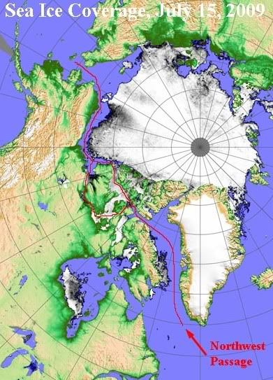
The sea ice extent in the Arctic in June was the 4th-lowest ever recorded. (Records only go back to 1979, but it's unlikely any year before that would have challenged the recent records since at least the Medieval Warm Period.) And, Masters notes, "The ice-free seas that nearly surround Greenland now have contributed to temperatures of 2 - 3°C above average over the island over the past ten days. With clear skies and above-average temperatures likely over most of the island for at least the next week, we can expect near-record July melting over portions of the Greenland Ice Sheet this month." Nothing ominous about that!

The sea ice extent in the Arctic in June was the 4th-lowest ever recorded. (Records only go back to 1979, but it's unlikely any year before that would have challenged the recent records since at least the Medieval Warm Period.) And, Masters notes, "The ice-free seas that nearly surround Greenland now have contributed to temperatures of 2 - 3°C above average over the island over the past ten days. With clear skies and above-average temperatures likely over most of the island for at least the next week, we can expect near-record July melting over portions of the Greenland Ice Sheet this month." Nothing ominous about that!
Friday, July 17, 2009
Job Prospects in the 50 Biggest US Cities
Via Matt Yglesias (via Ryan Avent), an interactive map of job listings per capita for US cities:
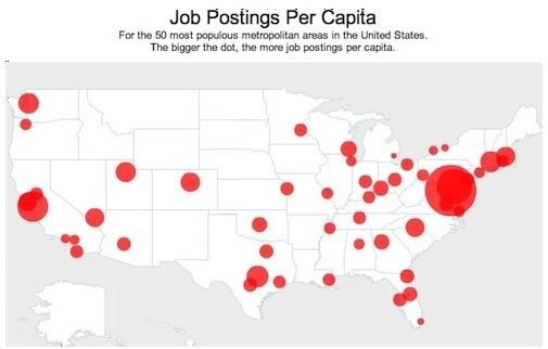
Washington, DC has far and away the most job listings - more than 132 per 1000 people. And Baltimore easily takes second, with more than 90. As Yglesias notes, "the metro DC economy is in better-than-average shape and I think that may have a distorting influence on how the hill and the press are seeing the national economic picture which continues to be very bleak despite the fact that the financial panic has ameliorated." The media centers of the US, however, aren't doing nearly so well: New York has less than 28 job listings per 1000 people, and LA has less than 24.
The techie cities of San Jose, Seattle, and Austin are all doing relatively well; the Rust Belt not so much - of Midwestern cities, only Milwaukee has more than 40 jp/k, and Detroit has the fewest of any city: less than 15. Miami is in second-worst shape, with just over 17. The full ranking of the 50 metros are listed with the map here.
Wednesday, July 15, 2009
More on the Geography of Drugs in the US
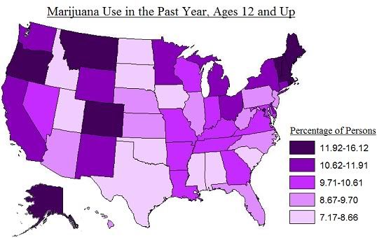
Some people wanted to see maps of the distributions of specific drugs, to which I say: very well! Here are some more maps derived from the SAMHSA report's own maps. First, weed:
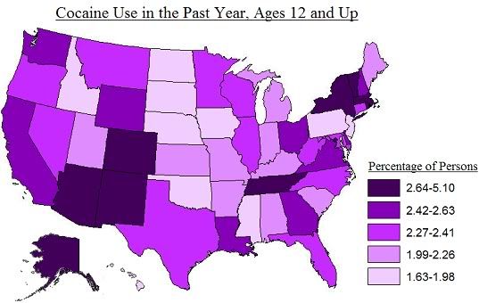
Here's coke:
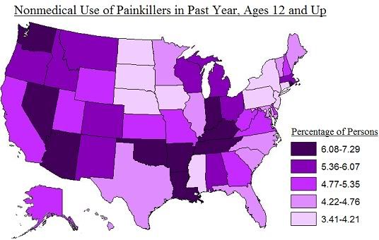
Here's painkillers:
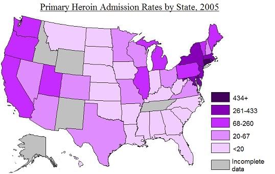
Here's a heroin map, based on a different SAMHSA report (note this one shows "TEDS treatment admissions," rather than actual use):
And here's a map for meth (from a previous post; also shows admissions rather than drug use per se):

Some interesting stuff here. I wonder how it's possible for New York to be in the top quintile for cocaine use, and New Jersey to be in the bottom quintile. And I wonder why heroin is so heavily concentrated in the Northeast Corridor while that same region is practically meth-free. And I wonder why the Mountain West uses tons of drugs, but the Plains states not so much. And I wonder why Mississippians don't like to do drugs. I wonder many things.
There are more maps in the SAMHSA report, but again I warn you: their color scheme is profoundly misguided.
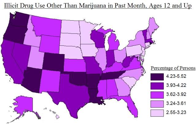
UPDATE: All right, one more. Here's overall drug use, non-marijuana division:

Here's coke:

Here's painkillers:

Here's a heroin map, based on a different SAMHSA report (note this one shows "TEDS treatment admissions," rather than actual use):

And here's a map for meth (from a previous post; also shows admissions rather than drug use per se):

Some interesting stuff here. I wonder how it's possible for New York to be in the top quintile for cocaine use, and New Jersey to be in the bottom quintile. And I wonder why heroin is so heavily concentrated in the Northeast Corridor while that same region is practically meth-free. And I wonder why the Mountain West uses tons of drugs, but the Plains states not so much. And I wonder why Mississippians don't like to do drugs. I wonder many things.
There are more maps in the SAMHSA report, but again I warn you: their color scheme is profoundly misguided.
UPDATE: All right, one more. Here's overall drug use, non-marijuana division:

Labels:
cocaine,
drugs,
heroin,
marijuana,
methamphetamines,
painkillers,
united states
Tuesday, July 14, 2009
Drug Use in the United States
This report from the Substance Abuse and Mental Health Services Administration (SAMHSA) details drug use across the 50 states based on the 2006 and 2007 National Surveys on Drug Use and Health, which involved interviews with over 135,000 people around the country. It revealed a rather wide range of reported drug use between states, as you can see in this map, which is derived from a map in the report:
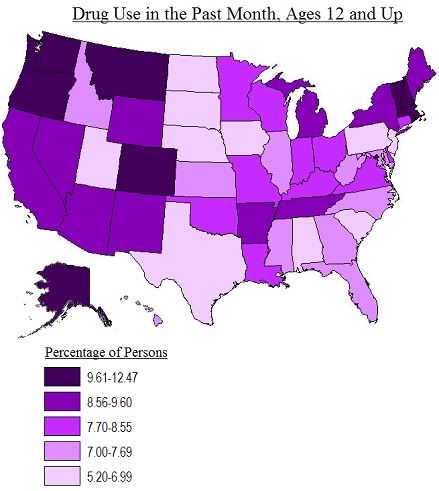
The report actually has its own maps, but I warn you that they are very ugly. That's why I had to make my own.
A couple things are striking about this map. The less surprising of these things is that there's a very wide range in the numbers of people who report using drugs in the past year - from 5.55% in North Dakota to 11.10% in Alaska. I should say: in itself this isn't surprising, but the particular pattern of the distribution does surprise me somewhat. I would expect higher rates of drug use in states with smaller rural populations, but this map seems to show that that's just a false intuition.
The other striking thing about the map - and another thing that challenges my prejudices - is that there doesn't seem to be any correlation between the wealth or human development of states and their level of drug use. Some high-development states, like New Jersey and Pennsylvania, have low levels of drug use; and some, like Massachusetts and Colorado, have high levels of drug use. And some low-development states, like Arkansas and Tennessee, have high levels of drug use, while others, like South Carolina and Alabama, have low levels of drug use. There do seem to be some regional trends - especially the high rates of drug use in the non-Mormon West - but a lot of variation within regions as well. All in all it just looks pretty random. What do you think - am I missing something here?
(Thanks to Nikolas Schiller for the link.)
UPDATE: Richard Florida has some interesting follow-up in a couple of posts; he uses actual statistics and stuff do dig into this data a bit more. (One tidbit: more people do drugs in Obama states! Republicans ought to appreciate that. Come to think of it, Democrats might appreciate that as well...)
Monday, July 13, 2009
The Happy Planet Index Redux
Not long ago, I did a post about the Happy Planet Index, a quantification of 'ecological efficiency' from the New Economics Foundation. Roughly speaking, it measures the satisfaction of basic human needs per unit of resource consumption, so that the "happiest" countries are those that achieve higher standards of living while minimizing environmental impacts.
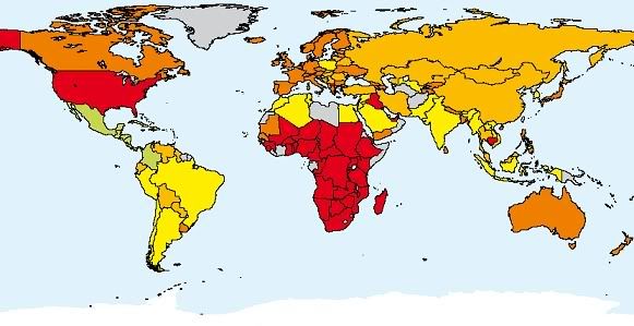
Well, now the NEF has come out with a rather souped-up HPI 2.0, complete with think-tanky 64-page report. Here's the new map:

The NEF regards the equivocation of economic growth with human progress as a foolish fallacy, a position The Map Scroll heartily endorses. They make this observation in their report (pdf), which includes this fascinating paragraph:
And the report notes this: "once our basic material needs are met, more concumption tends to make little difference to our well-being." This should be obvious and common-sensical; the marginal utility of consumption or wealth decreases dramatically once our basic physiological and safety needs are met. But the negative environmental externalities of consumption only become very onerous when we're talking about further consumption; the man compensating for his low self-esteem and need for acceptance by driving his Hummer does far more damage to the planet than the Malian woman getting inoculations for her infant, though the latter's actions do much, much more to increase happiness and limit suffering. But of course, buying a Hummer contributes orders of magnitude more to economic growth than does getting inoculations. On one hand, this is tragic: all our Hummer-driving and cheeseburger-eating is destroying the planet, and at the same time isn't even contributing much to our collective well-being. On the other hand, it also represents an enormous opportunity: if we could just see this fact, and re-order our priorities in accordance with it, we have a lot of room to limit our negative impacts on the environment while maintaining, or even improving, our level of well-being.
So that's the insight behind the HPI, and it's reinforced by some of their findings. Life expectancy correlates with higher GDP/capita, but not perfectly; Cuba, which is much poorer than the US, has a life expectancy that's nearly as high. And, the report says, "the most important gains in terms of both life expectancy and life satisfaction occur over the first 10,000 pounds of GDP distribution - beyond that there is little systemic difference between nations." This is evident in the map of life satisfaction by country:
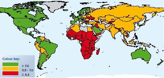
The country with the greatest value of "happy life years" (a combination of life expectancy and satisfaction) is Costa Rica, with a GDP/capita about one-fourth that of the wealthiest countries. Even countries like Vietnam and China do better than the fairly wealthy Portugal.
The measures are set against the ecological footprint, a measure of resources used per capita. This is measured in terms of global hectares; the world average is 2.1 global hectares per person. The poorest countries have the lowest gha consumption; the largest ecological footprint is Luxembourg's, at 10.2 gha. The US is third, at 9.4. Here's the map of ecological footprints:
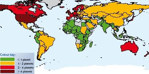
There's a broad correlation between wealth and ecological footprint, but it's not like all wealthy countries are interchangeable on this metric. South Korea uses only 3.7 gha, and the Netherlands uses only 4.4.
The map at the top of this post assigns countries a valuation of 'good,' 'middling,' or 'bad' for each of the three components of the index: life expectancy, life satisfaction, and ecological footprint, with a further very bad category for countries with exceptionally large ecological footprints. Countries that score poorly on life ecpectancy and satisfaction, like many of the poorest countries in Africa, show up as red even though they have small footprints. Coutries with high life expectancy and satisfaction, but very large footprints, are also red.
Comparing happy life years to ecological footprint yields some interesting regional patterns:
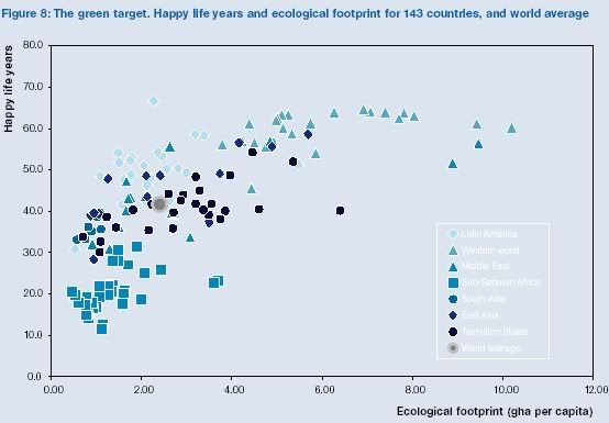
Where you want to be on this chart is in the upper left-hand corner: high on the happy life years scale and low on the ecological footprint scale. Most of the countries that come closest to that ideal are Latin American, with a few East Asian and Middle Eastern countries in that group as well. Sub-Saharan Africa tends to be low on both scales, and Western nations tend to be high on both.
Overall, the report says, the world has a life expectancy of 68.3 years, a life satisfaction of 6.1, and an ecological footprint of 2.4, for an overall HPI score of 49 out of 100. In other words, as a global society we're overshooting our resource limits, and we're not even all that happy. Hopefully we'll learn to look to places like Costa Rica to see how to find a balance between our desire to lead happy and fulfilling lives and our need to preserve that same opportunity for future generations, rather than blithely drive our SUVs over the precipice of catastrophe. And when you frame it that way, the choice we ought to make seems obvious. If only we weren't humans, I'd feel pretty confident that we'd make the right one.
Well, now the NEF has come out with a rather souped-up HPI 2.0, complete with think-tanky 64-page report. Here's the new map:


The NEF regards the equivocation of economic growth with human progress as a foolish fallacy, a position The Map Scroll heartily endorses. They make this observation in their report (pdf), which includes this fascinating paragraph:
For most of human history, economic growth was a minor phenomenon: a side effect, where it existed, of the pursuit of other goals. It only attained its quasi-mystical role when GDP was placed atop the podium of indicators with the development of the United Nations system of National Accounts in 1947. At that time, focusing on productivity growth made sense. Much of the world needed to be rebuilt following the war, and that required growing economies. Furthermore, economic growth helped avoid distributional debates. The rising voice of the working classes demanded more of the material cake. The only way elites could respond to that voice without having to give up anything themselves was by growing the cake.Our needs have changed since then, but "systems carry their own momentum, and even the wealthiest countries still pursue economic growth as if they were still struggling to recover from the war."
And the report notes this: "once our basic material needs are met, more concumption tends to make little difference to our well-being." This should be obvious and common-sensical; the marginal utility of consumption or wealth decreases dramatically once our basic physiological and safety needs are met. But the negative environmental externalities of consumption only become very onerous when we're talking about further consumption; the man compensating for his low self-esteem and need for acceptance by driving his Hummer does far more damage to the planet than the Malian woman getting inoculations for her infant, though the latter's actions do much, much more to increase happiness and limit suffering. But of course, buying a Hummer contributes orders of magnitude more to economic growth than does getting inoculations. On one hand, this is tragic: all our Hummer-driving and cheeseburger-eating is destroying the planet, and at the same time isn't even contributing much to our collective well-being. On the other hand, it also represents an enormous opportunity: if we could just see this fact, and re-order our priorities in accordance with it, we have a lot of room to limit our negative impacts on the environment while maintaining, or even improving, our level of well-being.
So that's the insight behind the HPI, and it's reinforced by some of their findings. Life expectancy correlates with higher GDP/capita, but not perfectly; Cuba, which is much poorer than the US, has a life expectancy that's nearly as high. And, the report says, "the most important gains in terms of both life expectancy and life satisfaction occur over the first 10,000 pounds of GDP distribution - beyond that there is little systemic difference between nations." This is evident in the map of life satisfaction by country:

The country with the greatest value of "happy life years" (a combination of life expectancy and satisfaction) is Costa Rica, with a GDP/capita about one-fourth that of the wealthiest countries. Even countries like Vietnam and China do better than the fairly wealthy Portugal.
The measures are set against the ecological footprint, a measure of resources used per capita. This is measured in terms of global hectares; the world average is 2.1 global hectares per person. The poorest countries have the lowest gha consumption; the largest ecological footprint is Luxembourg's, at 10.2 gha. The US is third, at 9.4. Here's the map of ecological footprints:

There's a broad correlation between wealth and ecological footprint, but it's not like all wealthy countries are interchangeable on this metric. South Korea uses only 3.7 gha, and the Netherlands uses only 4.4.
The map at the top of this post assigns countries a valuation of 'good,' 'middling,' or 'bad' for each of the three components of the index: life expectancy, life satisfaction, and ecological footprint, with a further very bad category for countries with exceptionally large ecological footprints. Countries that score poorly on life ecpectancy and satisfaction, like many of the poorest countries in Africa, show up as red even though they have small footprints. Coutries with high life expectancy and satisfaction, but very large footprints, are also red.
Comparing happy life years to ecological footprint yields some interesting regional patterns:

Where you want to be on this chart is in the upper left-hand corner: high on the happy life years scale and low on the ecological footprint scale. Most of the countries that come closest to that ideal are Latin American, with a few East Asian and Middle Eastern countries in that group as well. Sub-Saharan Africa tends to be low on both scales, and Western nations tend to be high on both.
Overall, the report says, the world has a life expectancy of 68.3 years, a life satisfaction of 6.1, and an ecological footprint of 2.4, for an overall HPI score of 49 out of 100. In other words, as a global society we're overshooting our resource limits, and we're not even all that happy. Hopefully we'll learn to look to places like Costa Rica to see how to find a balance between our desire to lead happy and fulfilling lives and our need to preserve that same opportunity for future generations, rather than blithely drive our SUVs over the precipice of catastrophe. And when you frame it that way, the choice we ought to make seems obvious. If only we weren't humans, I'd feel pretty confident that we'd make the right one.
Thursday, July 9, 2009
The Yuppie Map of San Francisco
Town Me, a community website for San Francisco, takes the always fascinating project of demographic sub-group cartography (and you may take it as a mark on my character, for good or bad, that that was a non-ironic use of the word 'fascinating') and cleverizes it. Here, for instance, is the Yuppie map of San Francisco:

What they've done here is take an arcane sociodemographic category and translated it into a more sensible terms. In this case, "Yuppies" represent "young professionals (ages 25-35) who make $100,000 or more." They've given a similar treatment to several other categories, which they describe as follows:
Cougars - Single or divorced women ages 35-50
Sugar Daddies - Single or divorced men ages 45-60
Starving Students - People ages 18-34 currently enrolled in college
Baby Momma - Female householder, no husband present, with children aged 18 or under
Baby Daddy - Male householder, no wife present, with children aged 18 or under
People Overextending Themselves on Rent - People who spend a lot on rent
The only thing I might change here would be that rather unmellifluous last category; maybe they could change it to "Housing Crises"? Or the "Upwardly Immobile"? Regardless, as a fan of the English language, I always glory to see arcane and abstruse semiotic formulations reconstituted as more quotidian, but invariably more vividly delineative, linguistic signifiers.
Wednesday, July 8, 2009
Touring the Tour de France
Like cycling? Like maps? The New York Times has a nice interactive map of the Tour de France course:
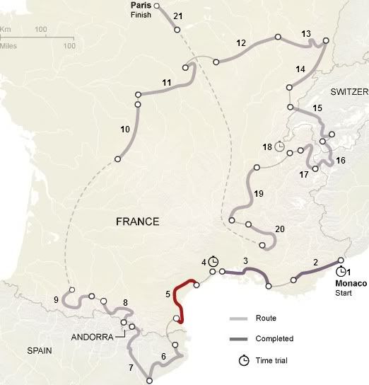
Stages are numbered; Wednesday's 5th stage is highlighted.
Clicking on a stage lets you view its profile, like this one of the Pyreneesian 8th stage:

Tour de France, if my language skills are not failing me, translates literally as "Tour of France." But France only amounts to 1/6 of the countries through which the Tour travels. Clearly the planning for the Tour suffered from an appalling oversight in this regard; must be embarrassing for the organizers...

Stages are numbered; Wednesday's 5th stage is highlighted.
Clicking on a stage lets you view its profile, like this one of the Pyreneesian 8th stage:

Tour de France, if my language skills are not failing me, translates literally as "Tour of France." But France only amounts to 1/6 of the countries through which the Tour travels. Clearly the planning for the Tour suffered from an appalling oversight in this regard; must be embarrassing for the organizers...
Tuesday, July 7, 2009
The "Politicosphere"
I've posted before on a map of the Iranian blogosphere. But now I discover, via Matt Yglesias, that PoliticoSphere.net has such a map for the US:
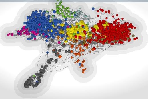
The map represents the "612 most visible and influential websites and blogs." Each node represents a website, and the sizes of nodes are determined by number of inbound links. Colors represent ideological or issues orientation; here's what they mean:
Green - Environment and Energy
Pink - Feminism
Brown - Defense
Orange - Education
Light blue - Health Policy
Peach - International Affairs
Gray - Law
Red - Conservative
Blue - Liberal
Yellow - Infopros (sites like Huffington Post and TPM, as well as mainstream media sites)
At the PoliticoSphere site, you can click on nodes to show the corresponding sites' links to other sites. Unrelatedly, the map seems to be shaped like a hawk in flight or the nation of Kyrgyzstan.
Thursday, July 2, 2009
The Changing Hardiness Zones of the US
From the Baltimore Sun's B'More Green blog comes news (via the Sun's Garden Variety blog) that the US Department of Agriculture is planning to revise its map of plant hardiness zones across the country by this fall. But the Arbor Day Foundation has already updated changes in hardiness zones from 1990 to 2006, which they show in their interactive map:
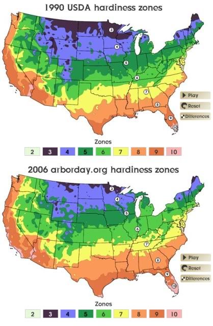
This shows the changes in zone classification over that time period:

Some isolated areas of the interior West and Midwest have actually warmed enough to move up two zones, while a few areas in the Southwest have actually gone down a zone. But you can infer from the streaked pattern that most areas, especially in the eastern two-thirds of the country, have warmed by the equivalent of about half a zone. That actually strikes me as a bit extreme; zones are classified by average annual low temperature, as per the scale on the left; so if I'm reading it right, a half-zone change would correspond to the average annual low being about 5 degrees F warmer in 2006 than it was in 1990. Is that really plausible? Average temperatures certainly haven't warmed by that much; but maybe the climate has changed in such a way that especially cold snaps are less common at the height of winter. I don't know.

This shows the changes in zone classification over that time period:

Some isolated areas of the interior West and Midwest have actually warmed enough to move up two zones, while a few areas in the Southwest have actually gone down a zone. But you can
 infer from the streaked pattern that most areas, especially in the eastern two-thirds of the country, have warmed by the equivalent of about half a zone. That actually strikes me as a bit extreme; zones are classified by average annual low temperature, as per the scale on the left; so if I'm reading it right, a half-zone change would correspond to the average annual low being about 5 degrees F warmer in 2006 than it was in 1990. Is that really plausible? Average temperatures certainly haven't warmed by that much; but maybe the climate has changed in such a way that especially cold snaps are less common at the height of winter. I don't know.
Labels:
agriculture,
climate,
global warming,
united states
Wednesday, July 1, 2009
NASA Creates Best Topographical Map of the World Yet
Via New Scientist, the most detailed and complete topographical map of the world ever produced has been created with data from NASA's Terra satellite.
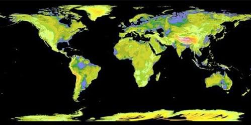
Says NS:

And, via The Daily Mail, which has several large images, here's Europe:

The full data set is online and available for free.

Says NS:
The map incorporates more than 1 million digital images and covers 99 per cent of the globe, a substantial increase over previous maps, which surveyed just 80 per cent of the planet. The new map covers latitudes between 83° north and 83° south, resolving patches of land as narrow as 30 metres across – three times the resolution of the next best digital topographical map, which was made by the space shuttle Endeavour during an 11-day mission in 2000.According to the LA Times' L.A. Now blog, "the resolution is so clear that you can plainly see Dodger Stadium and other landmarks in pictures of Los Angeles," viz. this one:

And, via The Daily Mail, which has several large images, here's Europe:

The full data set is online and available for free.
Subscribe to:
Comments (Atom)
