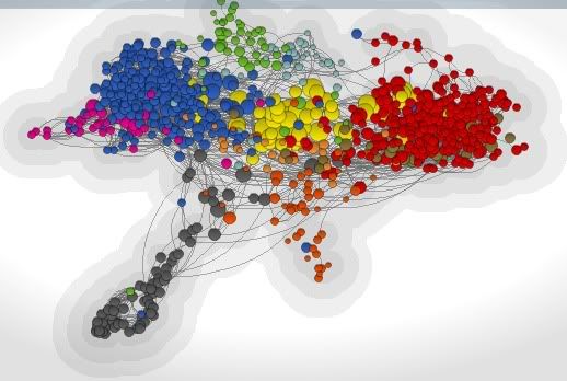
The map represents the "612 most visible and influential websites and blogs." Each node represents a website, and the sizes of nodes are determined by number of inbound links. Colors represent ideological or issues orientation; here's what they mean:
Green - Environment and Energy
Pink - Feminism
Brown - Defense
Orange - Education
Light blue - Health Policy
Peach - International Affairs
Gray - Law
Red - Conservative
Blue - Liberal
Yellow - Infopros (sites like Huffington Post and TPM, as well as mainstream media sites)
At the PoliticoSphere site, you can click on nodes to show the corresponding sites' links to other sites. Unrelatedly, the map seems to be shaped like a hawk in flight or the nation of Kyrgyzstan.

2 comments:
thanks for this article, if you are not busy, please click:
jual limasan murah
termasuk dalam tindakan pencegahan supaya anda tidak perlu melakukan pengobatan penyakit ini http://herbal234.pbworks.com/w/page/104649160/Jual%20Obat%20Herbal%20Tradisional%20Atasi%20Ambeien%20Luar , Obat Herbal Untuk Ambeien Hemoroid Tanpa Dipotong Anda jadi tidak bisa menikmati masa-masa kehamilan karena terganggu keluhan-keluhan ambeien. Ambeien biasanya muncul pada saat wanita memasuki masa 16 minggu kehamilannya. Ambeien adalah gangguan atau penyakit yang muncul disekitar bibir anus baik didalam maupun diluar anus yang dikarenakan oleh pembengkakan pembuluh darah balik yang ada didaerah sekitar bibir anus. http://herbal234.sosblogs.com/The-first-blog-b1/Obat-Herbal-Untuk-Ambeien-Hemoroid-Tanpa-Dipotong-b1-p444.htm Di Penis Mengeluarkan Nanah Kental Berwarna Kuning Untuk mencegah penyakit ini, hindari hubungan seksual yang tidak aman seperti hubungan seksual tanpa kondom, seks bebas, atau bisa juga menular melalui jarum suntik. Pengguna narkoba juga berpotensi tertular penyakit ini dari jarum suntik yang mereka gunakan. Kemudian, untuk ibu hamil, baik bagi mereka untuk memeriksakan apakah mereka mengidap kencing nanah. Ibu hamil yang menderita kencing nanah bisa menyebabkan kebutaan pada anaknya. Bakteri gonorrhea bisa menyerang bagian putih pada mata yang menyebabkan kebutaan. http://herbal789.tumblr.com/post/138063358365/di-penis-mengeluarkan-nanah-kental-berwarna-kuning , Dari Ujung Penis Mengeluarkan Banyak Nanah Ada banyak gejala yang bisa timbul akibat penyakit ini. Satu gejala yang umum berkaitan dengan penyakit ini adalah adanya cairan seperti nanah yang keluar dari kelamin. Nanah ini mungkin akan seperti keputihan yang sering dialami wanita, namun pada kencing nanah cairannya tidak bening. http://kembalisehat123.blogspot.com/2016/01/dari-ujung-penis-mengeluarkan-banyak.html Pengobatan Alternatif Untuk Kanker Stadium 4 kita harus waspada dini dan mengatasi penyakit yang sudah muncul dengan segera sehingga penyakit tidak akan berkembang di dalam tubuh kita dan menjadi semakin parah. Salah satu penyakit mematikan ialah kanker. Jika ada salah satu keluarga anda yang didiagnisis terkena kanker, anda harus segera mengambil tindakan karena kanker berkembang sangat cepat jika tidak segera ditanggulangi. http://herbal234.tumblr.com/post/137332285923/pengobatan-alternatif-untuk-kanker-stadium-4 , Pengobatan Alternatif Kanker Usus Besar Stadium 3 Diagnosis kanker tiroid bukanlah hukuman mati . Latihan pernapasan, meditasi atau waktu tenang , tawa ria , dan dikelilingi oleh orang-orang yang positif sangat penting untuk mengatasi kanker anda . http://juragan-obat-herbal.blogspot.com/2016/01/pengobatan-alternatif-kanker-usus-besar.html
http://herbal234.blog.com/2016/01/27/obat-kutil-jengger-ayam-di-sekitar-kemaluan/
http://denature201.bravesites.com/entries/general/obat-kutil-di-sekitar-kemaluan-perempuan
http://caramengobati321.blogspot.com/2016/01/resep-obat-kutil-di-sekitar-kelamin-pria.html
Post a Comment