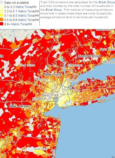
The numbers go way, way down as you move towards the urban center. Of course, most people in New York City don't even own cars. But maybe a bit more surprisingly, the pattern is almost as striking in cities where sprawl is rampant. Here's Atlanta, for instance:

The gray lines are freeways and the black lines are Marta rail lines. It looks like per capita CO2 use is highest both along the Marta lines and near freeways; in the case of the latter, that's presumably because the sprawl is somewhat more dense near freeways. But, of course, the general rule is that the closer you are to the city center, the smaller your carbon footprint.
There are many, many more maps here on a number of variables pertaining to housing and transportation. To pick one at random, here's transit ridership as a percentage of workers in the Bay Area:
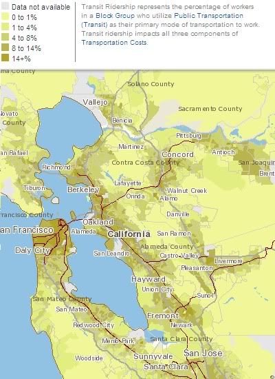
There's much more like this - average rents, gasoline expenses, travel time to work, etc.; it's a ton of information that's both fascinating and useful. And all in map form. If you're like me, in other words, this site has the potential to waste a tremendous amount of your time.

16 comments:
The obvious conclusion here is that if no one lived in the country and everyone lived in the city we would have much lower CO2 output. So liberals really are on average environmentally concious.
I am thoroughly convinced in this said post. I am currently searching for ways in which I could enhance my knowledge in this said topic you have posted here. It does help me a lot knowing that you have shared this information here freely. I love the way the people here interact and shared their opinions too. I would love to track your future posts pertaining to the said topic we are able to read.
All I hear is a bunch of whining about something that you could fix if you werent too busy looking for attention.
Surely, the guy is totally just.
reverse cell phone lookup
reverse address lookup
cell phone directory
phone number search
free people search
criminal background check
reverse phone lookup
reverse phone lookup
I think people fear idea management and innovation because there's a significant number of ideas that simply won't plan out.......Nice statement.....keep posting
this day I've been searching for information on various issues, this I found very good and I would like to congratulate you for your work.
I think that this post is one of the best that i have read in my life, congrats you did a great job,.
the difference between the content spammers and most corporate innovators is that the smaller
I'm writing to you because I just came across a business that I think has great potential. It lets you save money on almost everything. Make money from almost everything,
If growth is important to a firm, and if growth is dependent on offering existing products and services to new customers
innovation is very natural and happens in the "real world" as new plants and animals colonize new ecological niches.
I wonder how you got so good. This is really a fascinating blog, lots of stuff that I can get into. One thing I just want to say is that your Blog is so perfect
We generally think most specifically about the risk associated with a new product introduction
I would be aware that as somebody who really doesn’t comment to blogs a lot (in actual fact, this may be my first put up), I don’t think the time period “lurker” is very flattering to a non-posting reader.
I have really enjoyed reading your blog posts.
Post a Comment