Tuesday, June 30, 2009

Agricultural Production in a Warming World

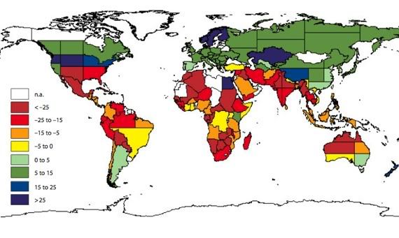
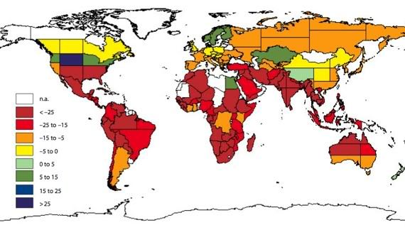
More on global warming, this time from Conor Clarke, who links to William Cline's study Global Warming and Agriculture: Impact Estimates by Country. Clarke reproduces two maps from that study; this one shows "the change in agricultural productivity (by 2080) taking into account the potential benefits of 'carbon fertilization' (the increase in yield that occurs in a carbon rich environment"):

gw ag prod proj map

And this one shows the same without projecting carbon fertilization benefits:

gwappm2

Says Clarke:
The basic points of Cline's book are that, by the end of the 21st century, (1) climate change will lead to a slight decline in global agricultural productivity; and (2) climate change will lead to a giant decline in agricultural productivity in Africa, South America and India...

As a sidenote, I think it's important to recognize that deep brick color falling over most of Africa, South Asia and Latin America -- all places where agricultural productivity will fall by more than 25% -- actually hides big differences. For example, Cline reports that the southern regions of India would experience potential output declines of 30-35%, while northern regions would experience declines of 60%.
These maps, besides being delightfully Mondrianesque, illustrate beautifully (if that's the right word) the extent to which the business end of the global warming Howitzer is aimed squarely at the developing world (though the souther half of the UScould have some tough times ahead as well. The forecast for South Asia, which has enormous populations and is not that far removed from historically experiencing famine, and which could be among the most catastrophically inundated by rising seas starting near the end of the century, is especially distressing.

By contrast, under a favorable 'carbon fertilization' scenario much of the developed world actually comes out ahead (again, with the exception of the southern US, as well as much of Australia). China - around which the future track of global warming increasing hinges - also does rather well in the favorable scenario, and only somewhat poorly in the non-fertilization scenario. (By the way, as Clarke notes, "The effects of carbon fertilization are very uncertain, and depend crucially on the availability of other resources -- water for irrigation, say -- that will also be affected by global warming... [But] even if carbon fertilization yields large benefits, Cline estimates a decline in global agricultural productivity.)

As always with climate projections, there is a lot of uncertainty involved here. Things might not turn out so bad in a given region, or they might turn out far worse; but it's worth noting that the consequences of global warming so far have tended to meet or exceed climate scientists' most pessimistic forecasts.

Monday, June 29, 2009

The Cost of Cap-and-Trade by State

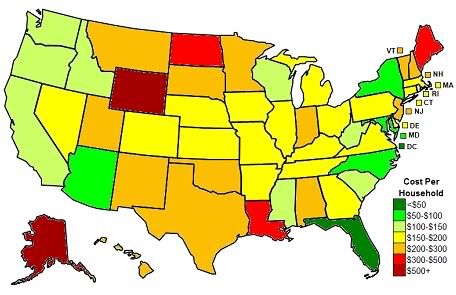
So there's a bill to do something about global warming that's wending it's way through the US Congress; it's known as Waxman-Markey, after its two main sponsors. The bill would institute a cap-and-trade system that would limit CO2 emissions; if implemented, it would ultimately have some cost to consumers - about $175/annum for the average American household by 2020. But those costs wouldn't be distributed evenly, and Nate Silver has a map of how those per-household costs would break down by state:

cap and trade cost by state

Nate has all the gory methodological details in his post. I just want to make two points:

1) This bill is, by itself, inadequate, has gotten watered down considerably already, and will undoubtedly be further watered down in the Senate; and, indeed, I'd be shocked if it passed the Senate at all. But the way to think about it, I think, is as a contribution to a conditional chain: if the US government fails to do anything in the reasonably near future to fight global warming, then horrible catastrophe is inevitable; but if the US does pass even a weak bill, then an international agreement becomes more likely; and if that happens, then altering the energy-intensive development of China becomes a possibility; and if that happens, then we might be able to moderate the slew of catastrophic consequences that are gathering for the end of this century.

2) The United States is not really a democracy, not by modern standards. I'm not talking about all the corruption, the lobbying, and the tilting of the playing field toward special interests, though you could surely make a decent case for the non-democraticness of the US on those grounds alone.

What I'm talking about, though, is the US Senate. Wyoming, which has about half a million people, has two senators. And New York, which has about 19,000,000 people, also has two senators. Florida, which might well be drowned in a century or two by rising seas, has 18,000,000 people and two senators. West Virginia, which produces a lot of coal, has less than 2 million people - and two senators. You see where I'm going with this? The United States government, which was revolutionary and awesome back in the 18th Century, should no longer be considered to have a legislature that meets modern standards for representative democracy. I'm not the first to point this out, of course, but it really doesn't get the attention it deserves. I mean, the form of government of the US is obsolete: why isn't this a matter for public discussion? And of course, the skewing of representative democracy tends to pull in favor of rural areas, which tend to both use and produce more in the way of CO2-heavy fossil fuels, and against urban areas, which are more energy-efficient and more supportive of efforts to fight global warming. So, to the litany of insidious aspects of the global warming challenge, add this: the outmoded institutional structure of the United States government.

Saturday, June 27, 2009

Ballparks of the Major Leagues

Via Bats Blog at the New York Times, flipflopflyball.com, by graphic designer Craig Robinson, has a bunch of infographics about baseball. Some of them are definitely maps. Some of them, like the following, are arguably maps:

MLB baseball parks comparison chart

The stadia of the major leagues. I don't know if these are to scale; it looks like they might be. But here's one thing I would like to see, have looked for, and cannot find: major league ballpark dimensions overlaid on each other at scale, so you could make direct comparisons. Maybe Mr. Robinson would be interested in such a project...

By the way, Robinson is also responsible for Atlas, Schmatlas, which I have a feeling many of you might appreciate.

Friday, June 26, 2009

Human Development in the United States, Part II

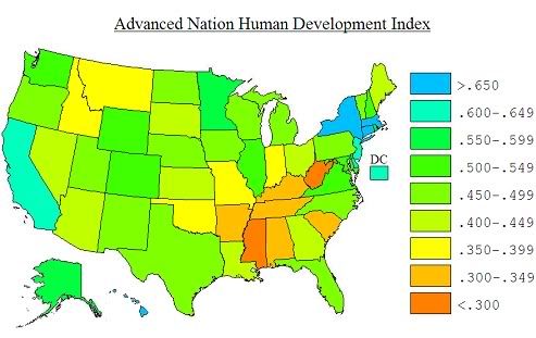
Going above and beyond the call of duty, Mark Sadowski has also created his own human development index. The Advanced Nation Human Development Index, as he calls it, is meant particularly to compare US states to other developmed economies. It uses a different scale than his application of the UN HDI methodology, and it results in a map which, though broadly similar, is not without differences from the map based on UN HDI methodology (note the relative positions of Louisiana and Indiana, for instance):

Advanced Nation Human Development Index Map of the United States

Here's Mark on the methodology he uses for his ANHDI:
On reflection, what I thought what was needed was not an index that is consistent with the UN, as it is designed for comparisons between developing nations, nor even an index based on US standards like the AHDP. What I thought was needed was an index that is designed to compare the US states to the advanced states of the world.

Thus I decided to construct my own index. I have decided to call it the Advanced Nation Human Development Index (ANHDI). I wanted it to be an index that was conceptually consistent with the UNHDI but that would compare the US states with other advanced nations in a manner that was intentionally challenging for the US.

Since it was clear that the life expectancy index was already challenging for the US I saw no need to use a different set of data for the health component. Life expectancy data for the US states and the advanced nations is from the year 2005 and comes from the AHDP and the UN HDI. For the education index it was also clear that there were a number of advanced nations that led on the gross enrollment index. Thus I decided to base the education index solely on combined enrollment data. Combined enrollment data for the US states is calculated in the same fashion as described previously. Combined enrollment data for the advanced nations comes from the UNHDI. All life expectancy data is for the year 2005.

The US easily leads almost the entire world in terms of GDP per capita but much of this lead is due to the fact that Americans simply work longer hours than people in other advanced nations. Thus it seemed to me that a more appropriate measure of standard of living would be GDP per hour worked or productivity. The OECD already computes such numbers for its thirty member nations and the most recent data available was for the year 2007. Productivity data for 20 additional nations was available from the Human Conference Board website. Unfortunately, although it was consistent with the OECD data in other respects, their PPP GDP data was not equivalent to OECD data. Since the most similar data to the OECD PPP GDP data is from the IMF, I adjusted the Human Conference Board’s productivity data using IMF data. I used 2007 data in order to be consistent with the OECD.

To come up with estimates of productivity for the US states I had a slightly greater challenge. The method for calculating productivity involves calculating GDP per employed person and then dividing that by the average number of hours worked per employed person. Employed person data used by the OECD (and the Human Conference Board) is not consistent with the usual data. For the US as a whole it is greater by a factor of 1.0529. To come up with an estimate of the state level employed person data that was equivalent to OECD data I multiplied state level employed person data taken from the Census Bureau by 1.0529.

State level data on the average number of hours worked per employed person is not released by the BLS. As a proxy I used state level average manufacturing work week data from the BLS website and adjusted the national level average hours worked per employed person estimated by the OECD. This should be a good estimate since manufacturing workers are a subset of all employed persons and casual inspection of the data reveals patterns that are consistent with expectations (e.g. Alaskans and Kansans probably do work longer hours). Again all data was for 2007 to be consistent with the OECD and the Human Conference Board.

The final step was to come up with formulas for each of the three index components. Like the UN HDI all three indices were computed as a ratio of differences. Unlike the UN HDI index I chose not to take the log of the standard of living data. This was because differences in standard of living among the advanced nations is not as great as among all nations and it also served my admitted purpose of making the index more challenging to the US states. I chose upper and lower bounds for each of the three data sets based on a little trial and error (again with this purpose in mind) and in the process I found it necessary to drop 19 nations for which I had productivity data because they performed below the minimum level of one or more of the indices. The overall ANHDI score is simply the average of the three indices.
Here are those formulas:

Life Expectancy Index = (life expectancy – 73)/(83-73)

Education Index = (combined enrollment rate – 76)/(113-76)

Economic Index = (GDP per hour worked as % of US – 42)/(143-42)

Mark calculates the ANHDI for other developed nations, which yields this ranking, with US states interposed:

1. Norway - .717
2. Australia - .709
Connecticut - .685
New York - .680
Hawaii - .666
Massachusetts - .660
DC - .639
California - .626
New Jersey - .617
Delaware - .603
3. Ireland - .598
4. France - .596
5. Netherlands - .588
Alaska - .588
6. Iceland - .578
7. Luxembourg - .573
Rhode Island - .564
Minnesota - .561
8. Belgium - .555
9. Sweden - .552
10. Spain - .552
11. New Zealand - .548
12. Finland - .537
Maryland - .532
Illinois - .531
Colorado - .525
13. Denmark - .521
Virginia - .514
New Hampshire - .511
Washington - .509
14. Canada - .503
Wyoming - .501
15. United States - .496
Texas - .493
Vermont - .491
16. Austria - .485
North Dakota - .483
Wisconsin - .481
17. United Kingdom - .476
Oregon - .474
Iowa - .473
Florida - .472
Nebraska - .471
New Mexico - .468
18. Switzerland - .468
Utah - .468
19. Japan - .467
20. Germany - .467
Pennsylvania - .465
Michigan - .463
21. Italy - .461
North Carolina - .455
22. Greece - .445
Arizona - .443
Kansas - .431
Nevada - .424
Georgia - .414
Ohio - .413
Maine - .412
23. Taiwan - .407
Louisiana - .403
South Dakota - .402
24. Singapore - .390
Indiana - .390
Missouri - .379
Idaho - .372
Montana - .363
25. Hong Kong - .353
Oklahoma - .351
Kentucky - .342
South Carolina - .330
Tennessee - .330
26. South Korea - .330
Arkansas - .320
27. Slovenia - .319
Alabama - .314
28. Portugal - .300
West Virginia - .299
Mississippi - .257
29. Barbados - .228
30. Czech Republic - .163
31. Slovakia - .098

Mark concludes:
Keeping in mind that productivity data was not available for more than fifty nations, nevertheless what I think the ANHDI shows is the following. There are at least 28 nations, mostly in Western Europe, East Asia and Oceania that perform at a level, by the standards of ANHDI, above the worst performing US state. In addition as a whole the US ranks 15th on the ANHDI, not only behind the twelve nations that lead it on the UNHDI, but also behind Spain, Denmark and Luxembourg. I hope it will be eye opening to Americans as they see how their country and their state compares with the other advanced nations of the world as well as the other states by this standard.
Huge thanks again to Mark for all his work on this topic. All the statistical work is entirely his, and goes way beyond anything I would be able to do.

Thursday, June 25, 2009

Human Development in the United States, Part I

EDIT: The original post reflected an error in the data on education. The map below has been corrected.

The human development index, which I've discussed here before, incorporates measures of income, life expectancy, and educational attainment to quantify the overall development of countries. I've wanted to compare HDI ratings for US states to those for other countries, but it's been a surprisingly hard thing to do; no one seems to have used the formula for the UN's HDI and applied it to the states. But it strikes me as such an inherently interesting question: how do the levels of development of states compare to other countries? And how much variation is there in the development of different states relative to other countries? It seems to me like answering these questions would give us a more fine-grained understanding of how the US compares economically to other developed nations. But, despite various efforts to compare the development levels of states to each other, no one seems to have made the direct comparison between states and other countries.

But thanks to a reader of this blog, we can finally make such a comparison. Mark A. Sadowski has made an attempt to apply the UN's HDI formula for US states, and this map is based on his results:


Here's how Mark describes his methodology:
In constructing an UN HDI consistent index for the US states I did the following:

1) To calculate the life expectancy index I merely used the state level data from the AHDP website.
2) To calculate the education index I had come up with estimates of state level literacy and combined enrollment rates.
a) The last time the Census collected state level literacy statistics was 1970. The last time they collected it on a national level was 1979. This was because literacy was essentially universal by the 1970's in the United States. For the UN HDI, any nation that has literacy rates above 99% or that does not collect such stats is allotted a score of 0.99 for that component. If one looks at the 1970 state level stats you will observe that the lowest literacy rate was for Louisiana or 97.2%. Based on even the lowest rate of decreases in the rate of literacy it is clear that by 1990 all the states in the United States probably would have had a literacy rate of 99% or higher by the UN's low standards. Thus all the US states were assigned an adult literacy index of 99.0.
b) The combined educational enrollment rate turned out to be more of a problem. The AHDP website lists such data but it is not consistent with the data reported in the UN HDI report. It is lower by a factor of 0.93. I suspect that the problem is not with the numerator (total enrollment) but with the denominator (population in relevant age group). Thus I estimated the state level gross enrollment index by multiplying the combined enrollment rates listed at the AHDP website by a factor of 1.075.
3) To calculate the GDP index I took state level real GDP per capita data from BEA and multiplied it by the US GDP deflator for 2005 (1.13039) in order to convert it to nominal GDP.

What did I learn from this exercise? The biggest differences in HDI by the UN standards occurred because of the differences in longevity. Twenty-two of the US states (plus DC) max out on the GDP index. All perform well by the low educational standards of the UN education index. On the life expectancy index in general the US states did not perform very well.
(EDIT: Corrected the following bit too.)

So how do states compare to the other countries of the world on the HDI scale? Well, the top state in Mark's analysis is Hawaii at .973. By comparison, Iceland has the highest HDI in the world at .968, according to this table from the UN (pdf) (which uses data from 2006). Only five countries in the world are at or above .960. Thirty-six US states are at or above .940, which is the HDI of Germany; the United Kingdom has an HDI of .942. The states in this range are essentially comparable to the wealthiest nations of Western Europe.

At the lower end of the scale, though, it's a different story. Mark finds that six states have an HDI below .920: Louisiana (.919); Arkansas, Oklahoma, and Alabama (.918); West Virginia (.911); and Mississippi (.901). The nations in this HDI range are typically either small East Asian countries or Middle Eastern petrostates: they include Brunei, Kuwait, United Arab Emirates, and Bahrain. A few peripheral European and Mediterranean nations are in that ballpark as well, including Slovenia (.923), Cyprus (.912), Portugal (.900), and the Czech Republic (.897). All of these countries are wealthy by global standards; nonetheless, it's clear that there's a group of states in the Upland and Deep South that, unlike states in the northern and western United States, has not achieved a level of development comparable to the largest Western European economies - and, as Mark notes, this is mostly due to relatively short life expectancies.

Thanks to Mark for compiling this data; I'll have another post based on Mark's work in a bit.

Wednesday, June 24, 2009

The Slow Melt of Antarctica

A little while ago the New York Times' Andrew Revkin had a post about a study by David Pollard and Robert DeCanto that found that even in the worst case, global warming would lead to a collapse of the Antarctic ice sheet much more slowly than was previously thought. That process is illustrated in this video:


Says Revkin:
The bottom line? In this simulation, the ice sheet does collapse when waters beneath fringing ice shelves warm 7 to 9 degrees Fahrenheit or so, but the process — at its fastest — takes thousands of years. Over all, the pace of sea-level rise from the resulting ice loss doesn’t go beyond about 1.5 feet per century, Dr. Pollard said in an interview, a far cry from what was thought possible a couple of decades ago. He, Dr. DeConto and other experts on climate and polar ice stressed that when Greenland’s possible contribution to the sea level is added, there’s plenty for coastal cities to consider. But for Greenland, too, some influential recent studies have cut against the idea that momentous coastal retreats are likely anytime soon.

Over all, the loss of the West Antarctic ice from warming is appearing “more likely a definite thing to worry about on a thousand-year time scale but not a hundred years,” Dr. Pollard said.
Well, that's good. I have to say, though, that rising sea levels have never seemed like the scariest threat from global warming. Terrible for Bangladesh, yes, and a few other places around the world; but something that, even on the scale of hundreds of years, let alone thousands, is something to which we could adapt. The collapse of ecosystems, the desertification or aridification of productive agricultural land, and the resultant famine, mass migrations, and political instability, though - those processes will play out in a much faster, unpredictable, and destructive way.

Tuesday, June 23, 2009

Global Peace Index

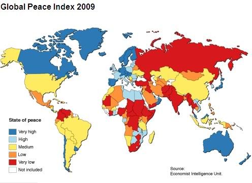
Vision of Humanity has updated their Global Peace Index for 2009. The results:

global peace index map

Says Vision of Humanity:
The results of the Global Peace Index for 2009 suggest that the world has become slightly less peaceful in the past year, which appears to reflect the intensification of violent conflict in some countries and the effects of both the rapidly rising food and fuel prices early in 2008 and the dramatic global economic downturn in the final quarter of the year. Rapidly rising unemployment, pay freezes and falls in the value of house prices, savings and pensions is causing popular resentment in many countries, with political repercussions that have been registered by the GPI through various indicators measuring safety and security in society.
This is the third annual edition of the report which "is composed of 23 qualitative and quantitative indicators from respected sources, which combine internal and external factors ranging from a nation’s level of military expenditure to its relations with neighbouring countries and the level of respect for human rights." Three categories of criteria were used in calculating the index: "measures of ongoing domestic and international conflict, measures of safety and security in society and measures of militarization." Examples of measures of ongoing conflict include number of external and internal conflicts fought between 2002 and 2007, number of deaths from organized conflict, and relations with neighboring countries; examples of safety and security include political instability, levels of violent crime, and levels of disrespect for human rights; examples of militarization include military expenditure/GDP, volume of weapons shipments, and ease of access to small arms. You can get full details on the methodology here.

The index ranks 144 countries, though they irritatingly omit Kyrgyzstan, along with Turkmenistan, Niger, and several other countries. The full rankings are here. Here are the most and least peaceful, along with a few other countries I semi-arbitrarily deem important:

1. New Zealand
2. Denmark
2. Norway
4. Iceland
5. Austria
6. Sweden
7. Japan
8. Canada
9. Finland
9. Slovenia
11. Czech Republic
12. Ireland
16. Germany
22. Netherlands
30. France
35. United Kingdom
40. Bhutan
74. China
83. United States
85. Brazil
99. Iran
108. Mexico
118. Thailand
122. India
129. Nigeria
136. Russia
137. Pakistan
138. Chad
139. Democratic Republic of the Congo
140. Sudan
141. Israel
142. Somalia
143. Afghanistan
144. Iraq

I don't think it will surprise anyone that the developed countries of Europe top this list or that a number of African countries rank rather low. I'm a little bit surprised at how low a few countries in Asia rank, especially India and Thailand, and at how high some of the countries in Africa rank, frankly. But overall the rankings here seem pretty intuitive.

Monday, June 22, 2009

Bubbletowns

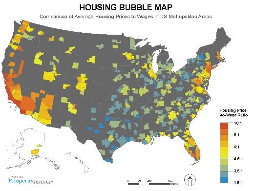
I've looked at this topic before, but this post by Richard Florida has a nice map, made by Scott Pennington, that shows the unevenness of the housing bubble across the metropolitan areas of the US:

housing bubble map

The big cities of the East Coast, Florida, and the West in general had, to use a Greenspanism, the most "froth." But a number of regions were substantially spared from the housing bubble, especially places that most people don't want to live - the Rust Belt, smaller cities in the South, Texas... Actually, a lot of people want to live in Texas; it's one of the fastest growing states - a classic Sun Belt economy - so I'm not sure why it was one of the regions least affected by the housing bubble (with the moderate exception of Austin).

Note that this map uses housing price-to-wage ration, rather than the more common housing price-to-income ratio. Says Florida:
The housing price-to-wage ratio may provide a better gauge of housing bubbles. Income is a broad measure that includes wealth from stocks and bonds, interests, rents, and government transfers and other sources. Wages constitute a more appropriate gauge of a region's underlying productivity, accounting for remuneration for work actually performed.
Some of the results:
The housing-to-wage ratio also generates a number of surprises. Greater New York's ratio (9.4) was slightly higher than Las Vegas (9), and Greater DC..'s (8.7) slightly bested Miami (8.4). Boston (8.1) and Seattle (7.6) topped Phoenix (7.2). Chicago's (5.9) was higher than Tampa (5.6) or Myrtle Beach (5.5).

What regions seem to have avoided the bubble? The cream of the crop on the housing-to-wage ratio are Dallas (3.5), Houston (3.2), Pittsburgh (3), and Buffalo (2.8).
So yeah, if you wanted to avoid the worst of the housing bubble, you would have done well to locate in either the negative-growth Rust Belt, or the rapidly growing big cities of Texas. Color me mystified.

Sunday, June 21, 2009

Murder and the City

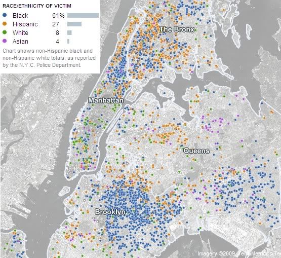
The New York Times has another interactive map that presents an absurd amount of information, so I am duty-bound to post it here:

homicide map of new york city

It's a grim inventory: every murder in New York City since 2003. This image shows the race of the victim; they also show age, sex, and weapon used, among other statistics. Every dot is a life snuffed out, and you can click on them for details.

Fun fact: murder rates in the Middle Ages were much higher than they are today. By like orders of magnitude. This is from a paper by Manuel Eisner:


So, you know... none of that claptrap about "the good ol' days"...

Sun Clock

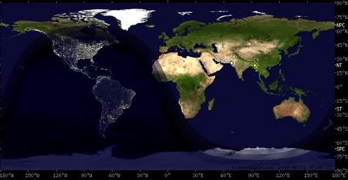
Happy solstice, everybody! Before you head out to jump your bonfires and search for your magic fern blossoms, you may want to check to see whether it is night or day. To that end, this map can help:

sun,closck,clock,sun clock

There are a bunch of versions of this out there, but this one's especially attractive. This image, from timeanddate.com, shows the division of night and day on the Earth's surface at 5:45am UTC, June 20, 2009 - this morning, the precise moment of the summer solstice.

What would be cool is if I could embed a sun clock in this post so that it would always be current. It seems like the sort of thing that ought to be possible, but unfortunately I am dumb, so I can't figure out how to do it. And, unlike the proverbial broken clock, this one will only be accurate once a year; still, you can click on it to see the present night/day situation.

Come to think of it, the next summer solstice will happen at a different time of day, so this clock won't ever be entirely accurate again. Shoot.

Saturday, June 20, 2009

The Revolution Will Be Variously Represented

Jeff Clark has made a word cloud of tweets from Iran:

iran election,iran,politics

Says Clark:
This is a Shaped Word Cloud created from the text of approximately 84,000 tweets containing the term #iranelection. The larger the word the more frequently it appears in the text. As usual you can click on a word to see the current twitter search results.
He's also maintaining a running tweet narrative that uses an algorithm to create a sort of synecdoche of tweets from Iran. Very interesting.

Friday, June 19, 2009

Unrest in Iran

Irantracker.org, from the American Enterprise Institute, is keeping track of protests and other incidents of unrest following the presidential election in Iran with this interactive map:


They also have day-by-day statistics for numbers of protesters, arrests, and deaths. They claim a total, through Thursday, of 33 deaths, 661 arrests, and more than 1.3 million protesters. They also have a lot of information and analysis on the political situation in Iran.

Via Andrew Sullivan, who's done excellent work following events in Iran and who's obsession with the situation has been feeding my own.

Thursday, June 18, 2009

Public Support for Gay Rights is Ahead of Policy

Sorry, FiveThirtyEight, I'm going to crib off of you again; this time I want to talk about a post by Andrew Gelman on public support for gay rights in the US. Gelman points to a post by Jeff Lax and Justin Phillips (pdf is here, but it's reproduced at FiveThirtyEight) that uses "multilevel regression and poststratification" (which I think is statisticsese for 'educated guess') to represent public attitudes about various gay rights issues in all 50 states.

It's a cool graphic, and very illustrative in itself. But I wanted to try to build on it a little by mappifying the data. Lax and Phillips looked at seven civil rights issues which are represented on the chart as same-sex marriage, 2nd parent adoption for same-sex couples, civil unions, health benefits for same-sex partners, job antidiscrimination, hate crimes protection, and housing antidiscrimination. The chart shows support for each of these for every state. The order I listed them in is generally the order of increasing popularity; for instance, same-sex marriage only has majority support in 6 states, but hate crimes protection and housing discrimination have support in all 50. So here is a map showing public support for gay rights policies:


It's the usual pattern: support for civil rights for gays is strongest in the Northeast, followed by the West, then the Midwest, and finally the South (and Utah).

But Lax and Phillips also include the actual status of those seven gay rights policies in each of the states, which creates quite a different looking map:


The trends are similar, but overall the map is just a whole lot paler, which is to say: public policies are lagging behind popular sentiment. I don't know whether this is because politicians tend to be behind the curve on gay rights issues, or because the legislative gears just need time to turn to catch up to public opinion, or what. But it does suggest there's a lot of room for gay rights legislation to advance in most states.

Here's one more way to look at it: the map below shows the number of Lax and Phillips' gay rights policies that have majority support but haven't been enacted.


The states in the Northeast, the West Coast, and the Upper Mississippi Valley don't just tend to have stronger support for gay civil rights - they've generally made more progress in legislating them. (Maine, Iowa, and Oregon have actually enacted more policies than have majority support.) But the biggest laggards aren't confined to the South; areas in the northern Interior West and the Rust Belt also tend to be behind the curve of presumed majority support (Alaska's the farthest behind, with support for five policies and none of them enacted).

It will be interesting to see how this map fills in over the coming years. I imagine we'll see consolidation for civil rights in areas outside the South first. And if the history of anti-miscegenation laws is prologue, it may take a Supreme Court decision to extend these rights throughout Dixie. Anti-miscegenation laws were obviously tied in to a very different history of discrimination; but nonetheless, if progress for gay rights were to follow a similar path, I wouldn't be surprised.

Wednesday, June 17, 2009

Red Iran, Blue Iran (False Iran, True Iran?)

We now have some supposedly "official" provincial election numbers from Iran, courtesy of Nate Silver at FiveThirtyEight, which means we can finally map the 2009 election. It was indeed - officially - a landslide:


Nate got the results on which this map is based from a student name Daniel Berman. The results are translated from Farsi, and supposedly represent the very much-disputed official results (the results that found Ahmadinejad defeating Mousavi even in Mousavi's home base of Eastern Azerbaijan). Here are the results broken down by province, with minor candidates omitted (Nate has detailed vote numbers). Provinces officially won by Mousavi are in bold:

Ardebil: Ahmadinejad 51% - Mousavi 47%
Boushehr: A 61 - M 36
Chaharmahal/Bakhtiari: A 73 - M 22
Eastern Azerbaijan: A 57 - M 42
Fars: A 70 - M 28
Ghazvin: A 73 - M 26
Ghom: A 72 - M 25
Gilan: A 68 - M 31
Golestan: A 60 - M 38
Hamedan: A 76 - M 22
Hormozgan: A 66 - M 33
Ilam: A 65 - M 31
Isfahan: A 69 - M 29
Kerman: A 78 - M 21
Kermanshah: A 59 - M 39
Khouzestan: A 65 - M 27
Kohgilouye/Boyerahmad: A 69 - M 27
Kordestan: A 53 - M 44
Lorestan: A 71 - M 23
Markazi: A 74 - M 24
Mazandaran: A 68 - M 21
Northern Khorasan: A 74 - M 25
Razavi Khorasan: A 70 - M 28
Semnan: A 78 - M 20
Sistan/Balouchestan: A 46 - M 52
Southern Khorasan: A 75 - M 24
Tehran: A 52 - M 46
Western Azerbaijan: A 47 - M 50
Yazd: A 56 - M 42
Zanjan: A 77 - M 22

This page has an Iranian province reference map, if you're curious. And Nate actually has his own map which represents the vote share on a continuous scale:


So now that we have these numbers, can we conclude that the election was a fraud? Well, as I said the other day, things are still hazy at this point and it's not really the time for definitive conclusions; but there is an awful lot of fishiness... Nate looks at the provincial votes and compares it to that 2005 election I was talking about; and he, having an actual proficiency in math and stuff, is able to do some statistical analysis of the correlations between the two votes. Here's his plot of Ahmadinejad's performance in that 2005 election against his performance in the currently disputed election (each diamond represents a province):


Says Nate:
These correlations are fairly weak, especially for the latter graph. Certainly not the kind of thing that will dissuade anyone who believes the election was tainted.

But, there are some important differences between the two races; in the first round in 2005, you had five candidates who were fairly competitive -- two conservatives, two reformists, and one (Rafsanjani) who is probably best considered a centrist (by Iranian standards). This time, you had only two candidates who received a competitive number of votes. And, obviously, Iran is a complicated and ever-changing place, with votes that may shift along ethnic fault lines in addition to political ones.
But Nate also points to a couple of specific discrepancies. In particular, conservative candidates collectively received about 20% of the vote in Lorestan in 2005, but Ahmadinejad won 71% of the vote this time around. Also, as I noted in that previous post on the portents of the 2005 election, Karroubi got more than 55% of the vote in Lorestan in 2005 (as he is an ethnic Lur and it's his home province). But in this election, with Karroubi still on the ballot, he supposedly only won 5% of the vote there. Could his vote really have cratered by 90%? And could those voters have almost universally moved to Ahmadinejad, rather than Mousavi? It scarcely seems possible, and this strikes me as one of the fishiest numbers in a whole school of them.

UPDATE: More numerical weirdnesses - one town had a turnout of 141%.

Tuesday, June 16, 2009

The Tight Fist of the Invisible Hand: The 'Free Market' for Health Insurance in the US

The Center for American Progress has an interactive map showing that the 'free market' for health care in the US, um, blows:


You can click on states for details; for instance, in Illinois, 69% are insured by the top two companies, Blue Cross Blue Shield (47%) and WellPoint (22%). Says CAP:
Today many Americans have few choices when it comes to health insurance. This is because many insurance markets are dominated by only a handful of firms, even though there are over 1,000 private health insurance carriers in the United States. This concentration limits employers’ and families’ health insurance options as well as the care they receive.

In many states small insurers compete against one another in the individual market to insure only low-risk, healthy individuals. They refuse to insure Americans with pre-existing conditions [ed.: like me!] such as high blood pressure, asthma, cancer, or diabetes and those who have ever taken certain prescription drugs—and they create barriers to needed care for those who are insured.

The map shows that in many states insurance markets are dominated by only one or two insurance carriers. In at least 21 states, one carrier controls more than half the market. More than half of the market is controlled by two carriers in at least 39 states. In 2007, a survey conducted by the American Medical Association found that in more than 95 percent of insurance markets, a single commercial carrier controlled at least 30 percent of the insurance market.
Fortunately, though, health insurance companies are entirely benign institutions that seek to promote the common good, and would never think of seeking to profit exorbitantly off of the health needs and suffering of the people who support their businesses.

Oh, wait:
Where markets are dominated by only a few firms, health insurers revenues are growing faster than health inflation as insurers maximize rates they charge employers and families and create barriers to care.
Listen, free marketeers: the insight that competition breeds innovation is wonderful - but it is not the end of economic analysis. It seems ridiculous to have to point this out, but it's not the case that efficiency and quality will be maximized for every single conceivable good by leaving it to the whims of the marketplace. National defense is not like that, education is not like that, and in a sane world - or in Europe - it would be manifestly obvious that health care is not like that.

Monday, June 15, 2009

Trade Wars

The World Trade Organization is up with a map of trade disputes among its members:


Blue lines represent complaints about other countries, red lines represent complaints from other countries; green countries aren't involved in any disputes. You can click on countries to get numbers of disputes and details on individual cases - quite handy.

Back around the time that various liberals, indigenous peoples, anarchists, labor unions, and environmentalists were staging massive and unprecedented protests against this obscure group of bureacrats known as the WTO back in 1999 and 2000 in places like Seattle, I became interested in the organization, the issue of trade liberalization, and the motives of the people who were running the WTO. To make a very, very long story short, it seemed as if the WTO existed mainly to enforce the prerogatives of multinational corporations around the world, particularly in developing countries, by exerting dangerously powerful mandate through extremely opaque mechanisms. Transparency, as much as anything, is the cornerstone of democracy, and it was sorely lacking in the WTO at the time.

Of course like most nefarious schemes, the WTO probably wasn't so much a cabal of greedy evil-doers as a collection of individuals, swayed by the power of money to some degree that they didn't understand themselves, but not with generally bad intentions - indeed, with a likely sincere faith in the ability of free markets to raise the standards of living for people around the world. Which is not to say that the structure of the WTO wasn't essentially anti-democratic, nor that it sufficiently accommodated the interests of people who would be negatively affected by some of its decisions; those were problems for the organization, and as far as I know they continue to be, though I haven't really kept up with the issue in recent years (and the specter of a sort of corporatist black-helicopter supra-national hobgoblin of the left seems to have waned since the failure of the Doha round of trade talks). At any rate, this map certainly represents a more transparent WTO than existed back at the turn of the century, and hopefully it's been evolving in that direction.

Also, one thing you'll note about the map is that the vast majority of trade disputes involve the major rich trading powers, especially the US and EU. Most countries in Africa, for instance, aren't involved in any trade disputes at all.

Via Resource Shelf.

Sunday, June 14, 2009

Reading the Geographical Tea Leaves in Iran

Did the conservatives steal the election in Iran? We don't know yet, but there's been more than enough fishiness to warrant asking the question. One place to look for signs that the election was stolen would be the distribution of the vote. The powers that be haven't released results by province yet, but Electoral Geography 2.0 does have this map of the Iranian presidential election of 2005:


This shows the first round of voting - again, from 2005 - in which Ahmadinejad actually came in second with 20.3% of the vote before winning the runoff against Akbar Hashemi Rafsanjani with more than 60%. In the first round Ahmadinejad won the provinces of Tehran, Qazvin, Qom, Markazi, Semnan, Esfahan, Chaharmahal and Bakhtiari, Yazd, and South Khorasan. His share of the vote varied widely; according to this table, his lowest showing was 5.6% in Sistan and Baluchestan, and his highest was 55.2% in Qom.

But apparently in this weekend's election, Ahmadinejad won rather consistently across the board. Juan Cole sees the apparently flat vote distribution as containing signs of fraud:
Top Pieces of Evidence that the Iranian Presidential Election Was Stolen

1. It is claimed that Ahmadinejad won the city of Tabriz with 57%. His main opponent, Mir Hossein Mousavi, is an Azeri from Azerbaijan province, of which Tabriz is the capital. Mousavi, according to such polls as exist in Iran and widespread anecdotal evidence, did better in cities and is popular in Azerbaijan. Certainly, his rallies there were very well attended. So for an Azeri urban center to go so heavily for Ahmadinejad just makes no sense. In past elections, Azeris voted disproportionately for even minor presidential candidates who hailed from that province.

2. Ahmadinejad is claimed to have taken Tehran by over 50%. Again, he is not popular in the cities, even, as he claims, in the poor neighborhoods, in part because his policies have produced high inflation and high unemployment. That he should have won Tehran is so unlikely as to raise real questions about these numbers. [Ahmadinejad is widely thought only to have won Tehran in 2005 because the pro-reform groups were discouraged and stayed home rather than voting.)

3. It is claimed that cleric Mehdi Karoubi, the other reformist candidate, received 320,000 votes, and that he did poorly in Iran's western provinces, even losing in Luristan. He is a Lur and is popular in the west, including in Kurdistan. Karoubi received 17 percent of the vote in the first round of presidential elections in 2005. While it is possible that his support has substantially declined since then, it is hard to believe that he would get less than one percent of the vote. Moreover, he should have at least done well in the west, which he did not...

5. Ahmadinejad's numbers were fairly standard across Iran's provinces. In past elections there have been substantial ethnic and provincial variations.
Indeed; see the map above. And some of these observations are confirmed by this BBC report, ehich says that "[t]he [vote] figures, if they are to be believed, show Mr Ahmadinejad winning strongly even in the heartland of Mr Mousavi."

Is that plausible? In the first round of 2005 voting, here is how each of candidates did in their home province, again according to this table (the home provinces are based on cursory Googlings of these candidates, so I may be wrong on a couple of them):

Ahmadinejad (Semnan province): 34.8%, first place
Karroubi (Lorestan): 55.5%, first place
Larijani (Qom): 2.3%, sixth place (though I'm not sure Qom should is really a "home"province for Larijani)
Mehralizadeh (East and West Azerbaijan; he is an ethnic Azerbaijani): 20.6% and 28.9%; first in both cases
Moin (Esfahan): 11.2%, t-fourth place
Qalibaf (Razavi Khorasan): 34.8%, first place
Rafsanjani (Kerman): 41.5%, first place

And here's how the candidates did overall:
Ahmadinejad: 20.3%
Karroubi: 18.0%
Larijani: 6.1%
Mehralizadeh: 4.6%
Moin: 14.5%
Qalibaf: 14.5%
Rafsanjani: 22.0%

The only candidates to not win their home or ethnic-base province were Moin and Larijani. Given this pattern, it would be shocking if Mousavi, a more-than-credible candidate, didn't win in his own base of support (which, like that of Mehralizadeh, is in the Azerbaijans). But apparently, according to the BBC, that is just what happened. What's more, Mousavi's broader demographic base of support is in the cities throughout Iran; so for Ahmadidinejad to have gotten 57% in Tabriz, which is one of Iran's largest cities and the capital of East Azerbaijan, as Cole reports has been reported, really seems impossible - it would be like McCain beating Obama in Chicago.

All right, all of this amounts to circumstantial evidence that something weird happened with these elections. But is it definitive? Well, again, this blog has stumbled into speculation that is a bit beyond my pay grade. Nonetheless, it's worth noting some of the things that have happened in the last few days: former President Rafsanjani has resigned from the Expediency Discernment Council and the Assembly of Experts in protest of the election results; Iranian authorities have asked foreign reporters to leave the country; Mousavi has written a letter to supporters in which he calls the election results "appalling" and "a dangerous plot"; the Election Commission is supposed to wait three days to certify the results, but they went ahead and did it right away; and, of course, there have been large and sometimes violent protests in cities across Iran. I'm no expert, but those don't strike me as the sorts of events you'd expect to see following a fairly decided election.
Saturday, June 13, 2009

The Shrinking of Detroit

Detroit is shrinking, and this map by architecture professor Dan Pitera shows just how great has been the extent of the depopulation:


Back at its mid-20th Century peak - before the race riots, before white flight, before the decline and fall of General Motors - Detroit had a population of close to 2 million. Since then it's shed more than half its population and now, according to City Farmer, "about 30% of Detroit is now vacant land — about 40 square miles, by one estimate." Forty square miles is roughly the size of San Francisco.

You can see the change in the city in these maps of population density from Wayne State's Center for Urban Studies:


For a concrete illustration of the effect of this diminution on the urban fabric, here's a Google maps image of a neighborhood in central Detroit:


This smattering of houses amidst vacant lots looks positively pastoral, but it's within walking distance of the old Tiger Stadium as well as the once-illustrious Michigan Central Station (pictured below). Places like this are common around Detroit

So what can be done to save a city that seems to be evaporating away? The Telegraph discusses one approach that might make sense:
The government looking at expanding a pioneering scheme in Flint, one of the poorest US cities, which involves razing entire districts and returning the land to nature.

Local politicians believe the city must contract by as much as 40 per cent, concentrating the dwindling population and local services into a more viable area.

The radical experiment is the brainchild of Dan Kildee, treasurer of Genesee County, which includes Flint.

Having outlined his strategy to Barack Obama during the election campaign, Mr Kildee has now been approached by the US government and a group of charities who want him to apply what he has learnt to the rest of the country.

Mr Kildee said he will concentrate on 50 cities, identified in a recent study by the Brookings Institution, an influential Washington think-tank, as potentially needing to shrink substantially to cope with their declining fortunes.

Most are former industrial cities in the "rust belt" of America's Mid-West and North East. They include Detroit, Philadelphia, Pittsburgh, Baltimore and Memphis.

In Detroit, shattered by the woes of the US car industry, there are already plans to split it into a collection of small urban centres separated from each other by countryside.

"The real question is not whether these cities shrink – we're all shrinking – but whether we let it happen in a destructive or sustainable way," said Mr Kildee. "Decline is a fact of life in Flint. Resisting it is like resisting gravity."
The problem is that economic growth in the US over the past several decades has largely been driven by urban development (for which read: suburban sprawl). In some ways, the old manufacturing base of the economy has been replaced by construction - of housing, strip malls, glass office boxes - and associated financial activities (a model for growth that met a bit of a notorious end in the last few years (at least one hopes it was an end)). As short-sighted as such a growth model might have been, its legacy - as well as the legacy of the history of a country that has grown from a few towns dotting the East Coast to a continental empire with the world's third-largest population - is that contraction seems synonymous, in the American context, with defeat. As Kildee says: "The obsession with growth is sadly a very American thing. Across the US, there's an assumption that all development is good, that if communities are growing they are successful. If they're shrinking, they're failing."

But changes in cities like Flint and Detroit don't have to follow a pattern of collapse. Kildee proposes another metaphor for the process of urban contraction in the Rust Belt:
Mr Kildee acknowledged that some fellow Americans considered his solution "defeatist" but he insisted it was "no more defeatist than pruning an overgrown tree so it can bear fruit again".
For more, see this Google street view tour from James Howard Kunstler's podcast, as well as this site on the ruins of Detroit.

Friday, June 12, 2009

MetaNews from MetaCarta: New Map Maps the News

This is pretty cool:


It's a joint project from moreover and MetaCarta that lets you search for news by geography. Says moreover of the map:
Scroll to the right location and the sad tragedy of the Air France crash is shown, south of the Cape Verde Islands. For brighter news, try a search for “new species” and see where they’re being discovered, and a personal favourite: check out Antarctica for news about hanging gardens long since lost in ice. (Leads to, what is the most geographically isolated news story out there?)
As someone who is pretty lousy at remembering names, but has an uncanny ability to remember where people are from, let me just say: information that is organized by geography - and a fortiori, that is presented on a map - is the bomb. (And yes, alas, my slang vocabulary is and forever will be trapped in the '90s.)

This map is kind of like this, only more comprehensive. And it's kind of like this, but it indexes by location of the news story, rather than of the newspaper. And it's the only mappy sort of thing I've seen that lets you search for news by location. For instance, if I want to know about what's going on in Kyrgyzstan - and I often do! - I can pull up a map with news stories from around that country, along with dozens of headlines just from the last 24 hours. (It's not perfect, though; one result for Kyrgyzstan was this story from Nogales, Arizona, about a Little League baseball team called 'Big Chuy.' Chuy is also an oblast in Kyrgyzstan.)

Via Resource Shelf.

Thursday, June 11, 2009

An Alternative High-Speed Rail Plan

the transport politic has an alternative proposal for a high-speed rail network for the US:


By contrast, here's the official high-speed rail plan as proposed by the White House in April:


Among the differences: the ttp plan includes a route for the Colorado Front Range which the gummint plan lacks; it also integrates the major components of HSR in the eastern half of the country, from the Northeast Corridor to Texas; and integrates the Arizona 'Sun Corridor' into the California network. Whence the differences? Well, these are among ttp's criteria:
the transport politic’s proposal was informed by an analysis of potential travel between metro regions of populations greater than 100,000 and between 50 and 500 miles apart... The vast majority of train travel would occur on trains running at 150 mph or above on routes of 500 miles or less. Roads and airports along these corridors would be significantly decongested as more people choose to take the train instead of a car for short to medium distances (50-200 miles) and the train instead of the airplane for long distance (300-500 miles) travel...

There is no transcontinental high-speed railroad proposed here because high-speed rail simply doesn’t attract particularly high ridership above the 500 mile travel distance; the best way to get from the East Coast to the West Coast will – and should, barring some unforeseen technological advance – remain via airplane...

In order to calculate the cost effectiveness of each route on the high-speed system, the transport politic used a relatively simple methodology based on travel between city pairs 50 to 500 miles apart. The calculations assume the following: that a big city to big city route attracts more passengers than a small city to small city route; that a big city to small city route attracts more passengers than a small city to small city route; that as distances increase, ridership decreases, though not proportionately. I recognize that these assumptions may be incorrect in many cases, but they provide a reasonable start for further research on this subject.
They also get into the nitty-gritty of how such a plan ought to be administered:
the transport politic’s suggestion is that the most appropriate way to get the ball rolling is to separate train operations – Amtrak – from track possession and maintenance by setting up a national infrastructure owner – let’s call it NatTrack. This agency would take hold of the Amtrak-owned Northeast Corridor and begin acquiring and assembling land for future high-speed rail corridors. Through eminent domain, it would also take possession of a large number of the nation’s freight lines, most of which are currently under-maintained and poorly managed, and begin converting them to standard-speed rail operations. NatTrack would manage route creation, not only in buying land and constructing track, but in prioritizing corridors to build new lines, deciding which to implement, and when.
Here's their proposal for order of implementation:


By the way, as a Texas-based blog, The Map Scroll heartily endorses the plan to include Houston in the Texas HSR plan along with San Antonio, Austin, and Dallas-Fort Worth, which the official plan stupidly fails to do. Intermodality shows a plan specifically for Texas:

texas map,map,texas

There are lots more details for the transport politic's plan, including scoring for every route based on a function of distance and expected demand. It's really a comprehensive analysis and well worth checking out.

Wednesday, June 10, 2009

Maps Can Save the World

Or make it a bit better, at least. The Economist has an article this week about using mapping tools for political advocacy. Here, for instance, is a map of Los Angeles that shows that areas with more parks (darker green) have lower rates of childhood obesity (smaller circles):


Says The Economist:
mapping technology has matured into a tool for social justice. Whether it is to promote health, safety, fair politics or a cleaner environment, foundations, non-profit groups and individuals around the world are finding that maps can help them make their case far more intuitively and effectively than speeches, policy papers or press releases.

“Today you are allowed to visualise data in ways you couldn’t even understand just a few years ago,” says Jeff Vining of Gartner, a consulting firm. Along with web-based resources, coalescence around more advanced tools has also helped, such as the emergence of ESRI, based in Redlands, California, as the market leader in mapping software. And the rise of open-source projects such as MapServer, PostGIS and GRASS GIS have made sophisticated mapping available to non-profit groups with limited resources.
I think what you've got here is another case where the proliferation of technology and information has a democratizing effect in that it allows people the means to form a clearer view of the world, and by extension a better understanding of how to redress injustices, improve their lives, or just become aware of opportunities which previously would have been obscure to them. New technologies don't always have such propitious effects, but this is one case where they do. Also note that maps are great.

Via gvlt.

Tuesday, June 9, 2009

The Sun Never Sets on Facebook

Via Andrew Sullivan, Vincos Blog has a world map of social networking sites:


With areas of dominance in North America, Latin America, Western Europe, Africa, and Southeast Asia, Facebook is the clear imperial hegemon in the world of social networking (and all that is despite its having one of the dumbest names in the business). But, according to Vincos, it is not actually the largest social networking site in the world; that superlative belongs to QQ, which dominates China with "300 million active accounts."

Good ol' Friendster, meanwhile, has been pushed back - a bit oddly - to a final redoubt in the Philippines. Hi5, which I had never heard of, has probably the weirdest distribution of strength: it's tops in Mexico and Central America, Ecuador and Peru, Portugal, Cameroon, Romania, Thailand, and Mongolia - and nowhere else. I defy you to find the family resemblance that ties that group of countries together.

There are several country or language-specific networks that are king in just one nation: Hyves in the Netherlands, CyWorld in South Korea, iWiW in Hungary, and Mixi in Japan, among others. A few networks are popular across a cultural region, like Maktoob in the Middle East, V Kontakte in the core areas of the former Soviet Union, and Odnoklassniki in the more peripheral areas of same. MySpace, meanwhile, has fallen from its perch everywhere but Guam.

Monday, June 8, 2009

Elections in the UK: Labour Gets Whomped

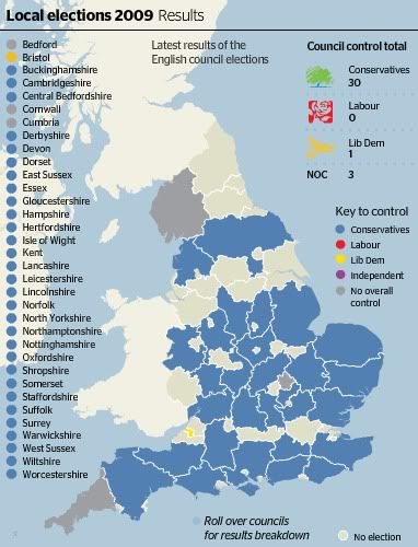
The center-left didn't just lose in the elections for European parliament - they got creamed in local elections in the UK. This map, from Times Online, shows the comprehensiveness of the shellacking:

england election map

Says the BBC:
The Tories took councils from Labour and the Lib Dems including Derbyshire, run by Labour since 1981.

The Lib Dems won control in Bristol while Labour lost control of all of its four councils.

Labour deputy Harriet Harman admitted the results were "disappointing" but said the party would learn from them.

The Conservatives took Staffordshire, Lancashire, Derbyshire and Nottinghamshire from Labour - which had run all of them for more than 25 years - as well as Devon and Somerset from the Lib Dems...

With all the results in from the 34 councils which held elections, the Tories gained 233 councillors while Labour lost 273 seats and the Lib Dems four - although Sussex's results are provisional pending a recount in one ward.

According to the BBC's projections, the Conservatives garnered 38% of the national vote with Labour falling to a historic low of 23%.

The Lib Dems polled an estimated 28% of the vote, with other parties on 11%.
I understand there are certain peculiarities in British politics at the moment. Nonetheless, the poor results for Labour are no doubt partly due to the fact that the economy has gone hang-gliding without a glider on Labour's watch. And it kind of points up one of the absurdities of representative democracy: utterly contingent factors play an enormous role in the outcome of elections. For instance, the Great Depression traumatized countries around the world. In the US, the response was to elect Franklin Roosevelt and the most liberal government in US history. In Germany, the response to elect Adolf Hitler and the Nazis. In both countries, the economy eventually improved; and in both countries, the new government got the credit. Likewise, the tanking economy didn't help the Republicans in the US last fall, and it's not helping Labour in the UK now. But all of this is quite aside from who's actually responsible for the tanked economy.

Socialists Lose Elections in Europe; Greens, Racists, Pirates Triumphant

Europe had some elections, and the left-of-center parties didn't do so hot. Here's a map from Financial Times:


Click on the map and scroll over countries for details. Losses were mostly absorbed by the center-left, but gains were made not just by the center-right but by parties of the far right and left. Turnout was low, about 43%; it's fallen in every Euro-election since 1979. Says the BBC:
Several governments battling the economic downturn are facing a heavy defeat, says the BBC's Oana Lungescu in Brussels.

However, governing parties in France and Germany appear to have done relatively well despite the crisis.

Angela Merkel described the increase in the vote of her Christian Democrats over the Social Democrats as "sensational" and said it boded well for her chances in the nation's general election in September.

In results so far:

* French President Nicolas Sarkozy's UMP trounced socialist opponents, while greens from the Europe-Ecologie party also made gains
* In Italy, Prime Minister Silvio Berlusconi's centre-right People of Freedom party won most votes - 35% - although that was well below his prediction. The anti-immigrant Northern League made strong gains
* In the UK, the governing Labour Party suffered a serious defeat, gaining its lowest share of the vote for a century
* Spain's conservative Popular Party beat the ruling Socialists, but the four percentage point margin was lower than they had expected
* Poland's governing centre-right Civic Platform gained ground at the expense of the Eurosceptic Law and Justice Party
* Portugal's conservative Social Democrats secured about 31% of the vote. The ruling Socialists fell a massive 18 percentage points from the last European election, to about 26%
* Austria's far right increased its vote on the last European election but was well down on its percentage in last year's national polls
* Greece's Socialist party, PASOK, bucked the European trend by securing the largest vote percentage, ahead of the ruling conservatives

Voters have been choosing representatives mainly from their own national parties, many of which then join EU-wide groupings with similarly-minded parties from other countries.
Also:
Sweden's Pirate Party, which wants to legalise internet file sharing, won 7% of the national vote and one of the country's 18 seats in the European Parliament.
The composition of the new parliament will be like yea:


And for those who need a primer on what these party labels mean (and bear in mind that these groups are represented at the European parliament level, and generally correspond to other parties with similar ideologies at the national level):

European People's Party (EPP)
: Major center-right party of Europe
Socialists: Major center-left party of Europe; aligned with the Parti Socialiste in France and the Social Democrats in Germany
Liberals (ALDE): Alliance of Liberals and Democrats for Europe; centrists
Green Party: left-wing party oriented around environmental and social justice issues, among others
Left (EUL-NGL): European United Left-Nordic Green Left; represents far-left and Communist national parties
UEN: Union for Europe of the Nations, a group of far-right nationalists (presumably working together at the Euro-level in a spirit of distrustful self-interest)
Ind/Dem: The Independence/Democracy Group, generally right-wing Euroskeptics, mostly from Northern Europe

UPDATE: And the Netherlands is now orange on the ft.com map, as ALDE takes the lead there. Seems appropriate.

Saturday, June 6, 2009

Mapping the Internet

Here's a fun Flickr slideshow of people's personal maps of the internet. One example:


It's a project by writer Kevin Kelly, who says:
The internet is vast. Bigger than a city, bigger than a country, maybe as big as the universe. It's expanding by the second. No one has seen its borders.

And the internet is intangible, like spirits and angels. The web is an immense ghost land of disembodied places. Who knows if you are even there, there.

Yet everyday we navigate through this ethereal realm for hours on end and return alive. We must have some map in our head.

I've become very curious about the maps people have in their minds when they enter the internet. So I've been asking people to draw me a map of the internet as they see it. That's all. More than 50 people of all ages and levels of expertise have mapped their geography of online.
Spirits and angels? I might have gone with 'credit' or 'waste' or some other intangibles that don't sound quite so froufy. But then, "the internet is intangible, like credit and waste" doesn't have quite the same ring to it, I suppose.

Anyways, it's a fun project. And you can take part, too, if you want.